




Celebrating the union of graphics, packaging design and cycling
Graphic design and cycling are mighty comfortable, oft-Lyrcra-clad bedfellows. And for many of those creatively savvy bicycle aficionados, their affection is shown in black, white and a very distinctive shade of pink. Yes, we’re talking about Rapha, a brand that’s heralded almost as much for its design sensibilities as its sports functionality. Great graphics in two dimensions are one thing though, but to translate them into great packaging takes a nuanced eye for design as well as structural concerns.
The nifty-handed Northerners behind the beautiful tins holding Rapha’s slick venture into eyewear earlier this year are Huddersfield-based Progress Packaging , who’ve worked with Rapha for the past five years. The relationship began when the Progress Packaging lot, themselves a bunch of cycling enthusiasts, worked on a series of cycling musette bags with design studios including M/M (Paris), Build and StudioMakgill. The screen printed bags were made to celebrate the synergy between cycling and design at the Feed My Ride event, held by Progress Packaging at bike-friendly London cafe Look Mum No Hands back in 2011, and Rapha was among those contributing designs. Since then they’ve worked together on numerous projects including gift packaging, shoe packaging and direct mail projects.
Simon Farrow, Progress Packaging managing director, says: “We’re all very keen cyclists, and like us Rapha are a high end brand. We try and position ourselves at the top end of bespoke packaging and they’re the same with cycling garments and accessories. Working together is always about quality, and making sure we’re delivering on quality.”
The crisp lines and luxurious feel of Rapha’s graphics meant that making the perfect packs for them was both a joy and a challenge. “When something’s so clean and pared back it’s all about the materials and delivery of the logo, so we had to reflect that,” says Simon.
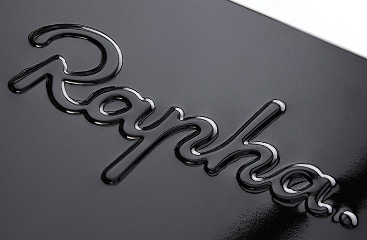
Rapha’s graphic designers and product designers presented Progress Packaging with a number of visual reference points, including some examples of 1920s and 30s sunglasses tins. “It was a key project for Rapha as it was their first piece of eyewear,” says Simon. “They’re all in a kind of retro, but classic design.” The shiny tin uses black gloss lacquer, and sees an embossed logo grace the lid. It’s a beautiful product of what happens when superb branding and quality structural design unite.
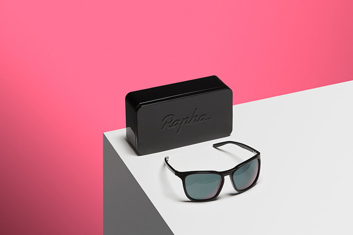
Progress Packaging: Rapha eyewear. Photography by Wig Worland.
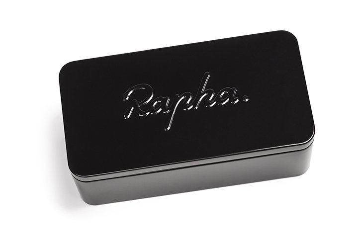
Progress Packaging: Rapha eyewear. Photography by Wig Worland.
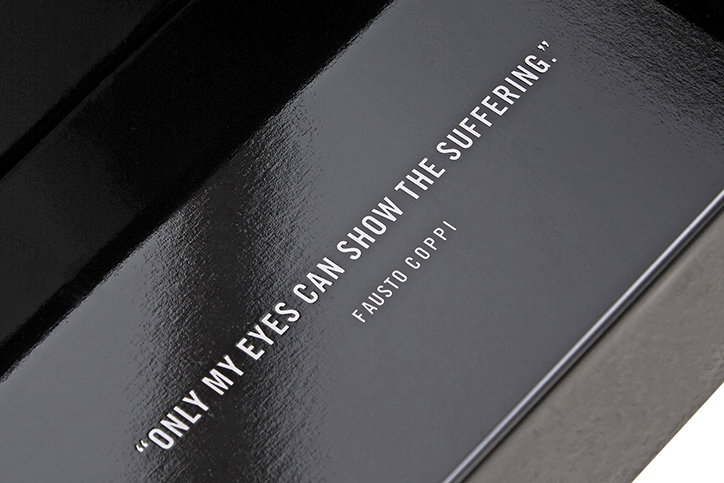
Progress Packaging: Rapha eyewear. Photography by Wig Worland.
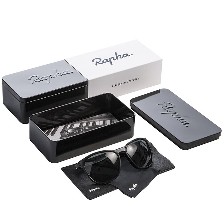
Progress Packaging: Rapha eyewear. Photography by Wig Worland.
Hero Header
Share Article
Further Info
About the Author
—
This article was sponsored by a brand, so is marked up by us as Sponsored Content. To understand more about how we work with brands and sponsorships, please head over to our Work With Us page.



