



Launch Recite Me assistive technology
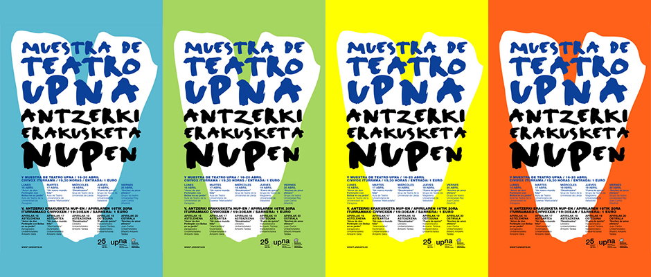
Four versions of a poster in blue, green, yellow and orange. Bold white and black typography reads “Muestra de Teatro Upna” and “Antzerki Erakusketa Nupen”. Smaller text at the bottom provides event dates and location details.

Woo! Pencil mountains! Crisp graphic design here by Barcelona's very own Roseta y Oihana

—
Date
3 October 2012

Statistics show that London graphic design is 40% more monochrome than that of our Spanish neighbours*. Perhaps it’s something to do with the extraordinary amount of sunshine and tomatoes they get compared to our abundance of concrete and chicken shops. But hey ho. Our cloudy day has been infinitely brightened by Roseta y Oihan, two Spanish graphic designers who have got editorial design down to a T. Their love for colour and eye-catching block colours are probably what’s enticing companies to hire them to design large, public displays advertising events in and around Spain. Our favourites? The pencil mountains — amazing!

(*By statistics we mean the ones in our head that we made up)
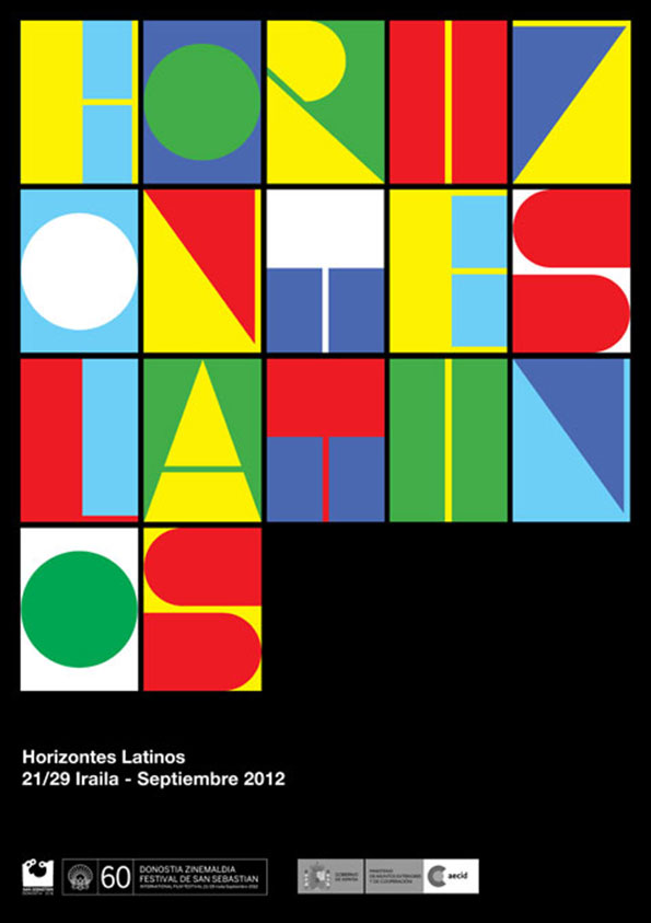
A bold typographic poster featuring the words “Horizontes Latinos” split across a colourful grid of squares. The letters are rendered in primary colours and geometric shapes. Below the grid, white text on a black background reads “Horizontes Latinos” and “21/29 Iraila - Septiembre 2012”.
Above

Roseta y Oihana: Festival de San Sebastián / Carteles
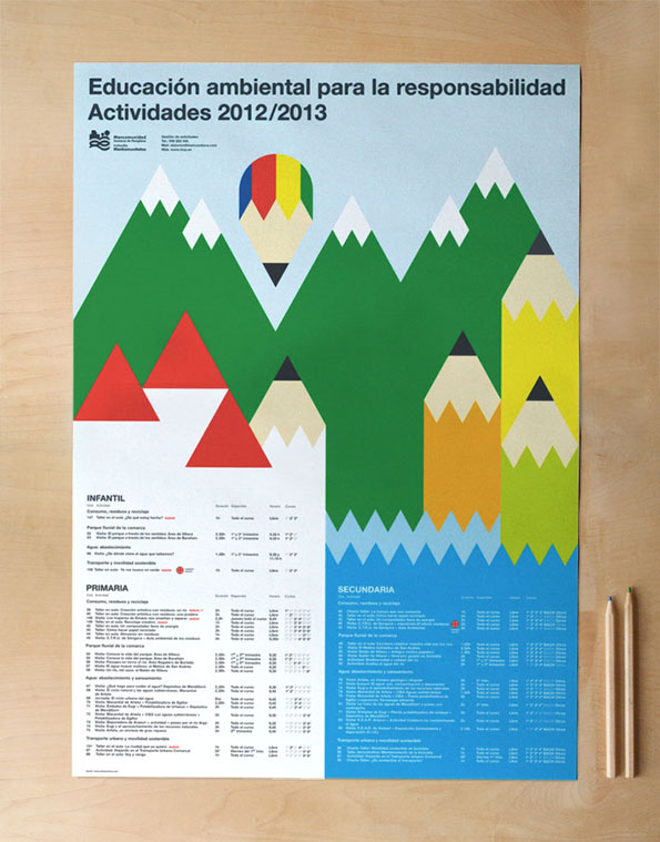
A graphic poster featuring a stylised landscape of green and red mountains. The peaks are formed by the tips of oversized pencils in yellow, red and blue. At the top, a headline reads “Educación ambiental para la responsabilidad Actividades 2012/2013”. The bottom half of the poster contains detailed tables of activities under the headings “Infantil”, “Primaria” and “Secundaria”.
Above

Roseta y Oihana: MCP / Educación Medioambiental
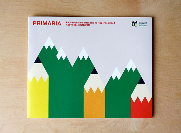
A booklet cover featuring a graphic illustration of five pencils of varying heights. The pencil tips are styled as green mountains with white snow-capped peaks. At the top, red text reads “PRIMARIA” alongside “Educación ambiental para la responsabilidad Actividades 2012/2013”.
Above

Roseta y Oihana: MCP / Educación Medioambiental
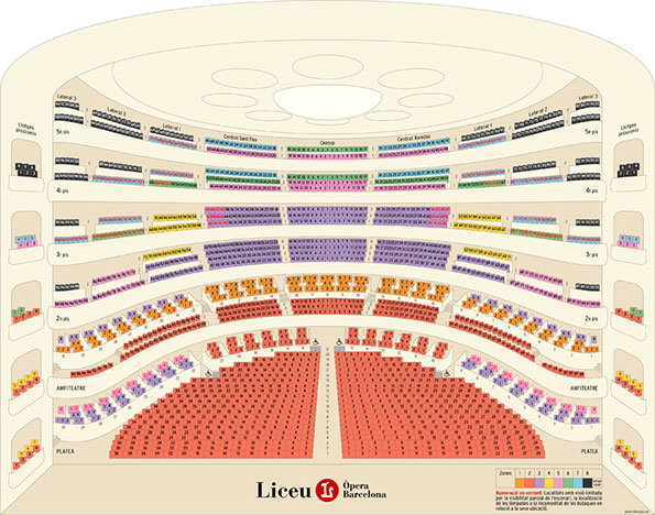
A colourful seating plan for the Liceu Opera Barcelona. The diagram shows a tiered auditorium with rows of seats in red, orange, purple and green.
Above

Roseta y Oihana: Gran Teatre del Liceu
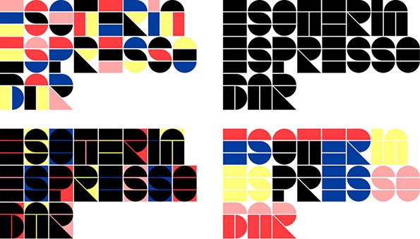
Four variations of a geometric logo for “Esoterin Espresso Bar”. The bold, blocky typography is constructed from semi-circles and rectangles in red, blue, yellow and pink.
Above

Roseta y Oihana: Esoteria Espresso Bar
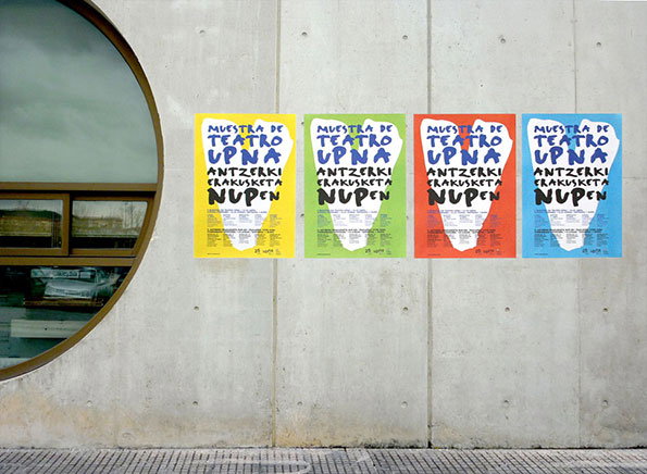
Four colourful posters are pasted in a row on a grey concrete wall. Each poster features a white silhouette and reads “Muestra de Teatro Upna” and “Antzerki Erakusketa Nupen”.
Above

Roseta y Oihana: UPNA / V Muestra de Teatro

Share Article

About the Author

Liv Siddall

—

Liv joined It’s Nice That as an intern in 2011 and worked across online, print and events, and was latterly Features Editor before leaving in May 2015.

It's Nice That Newsletters

Fancy a bit of It's Nice That in your inbox? Sign up to our newsletters and we'll keep you in the loop with everything good going on in the creative world.