Type knitter Rüdiger Schlömer makes fonts for screens and jumpers
An old project on soccer fan scarves opened Rüdiger’s eyes to the possibilities of textiles. Now he prototypes typefaces on screen and fabric.
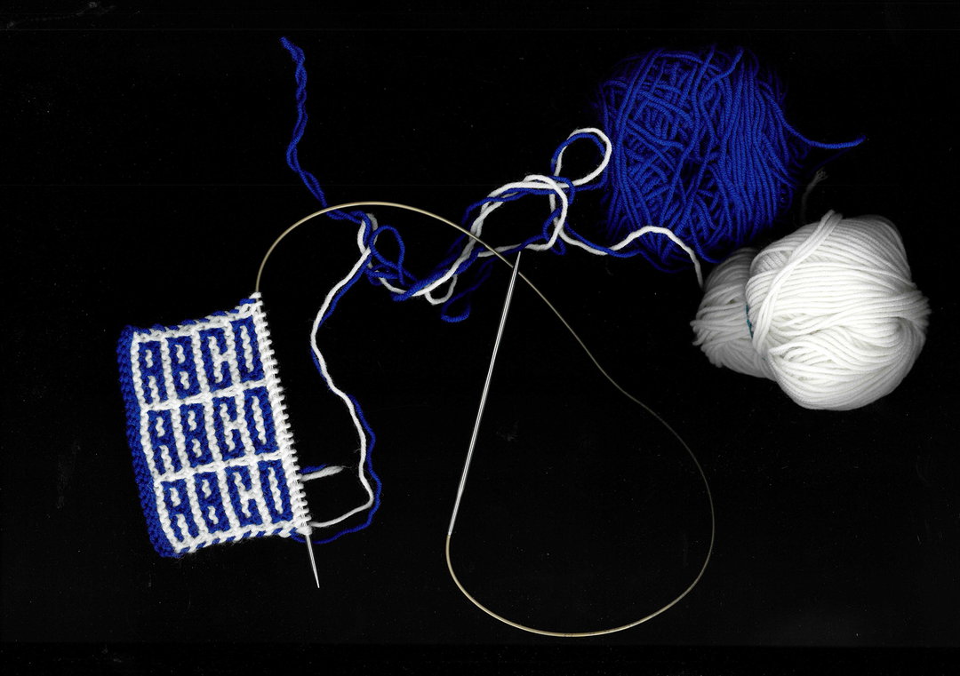
Rüdiger Schlömer loves knitting words, so much so that he’s forged an entire graphic design practice around Type Knitting, but he’s not blindly romantic – even he admits it can come with some stubborn obstacles. The stitch, for example, may seem like a simple, albeit slow, way of making text, with one pixel equalling one stitch. Until you put needle to wool and find out a stitch doesn’t create a neat square, but a ‘V’ shape, “totally mess[ing] up your neatly planned pixel design”, says Rüdiger. Then you really get into the weeds when you find out typing with wool is a bit like a street artist building the wall while they’re painting on it.
While a digital graphic designer layers images onto a base, a knitter constructs the typeface and designs with it as they create the canvas out of thin air – they are both the typographer, designer and the HP printer. But like any true love, Rüdiger accepts these knotty imperfections all the same. “These restrictions are exactly what makes typographic knitting so interesting,” he says.
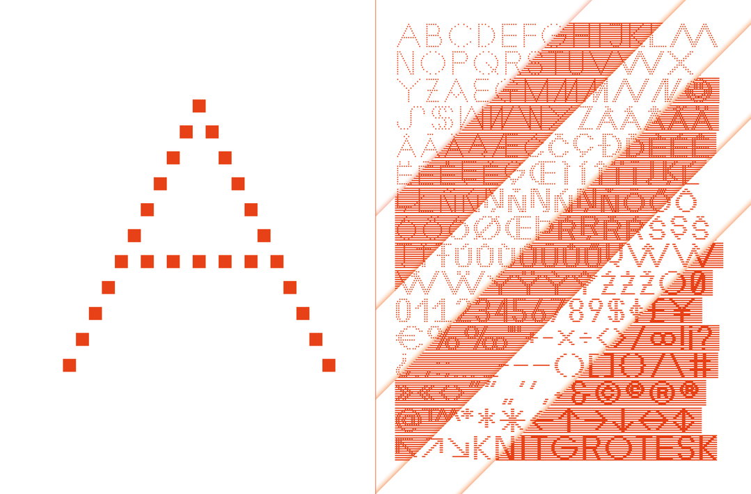
In 2023, Rüdiger released his first ever typeface for hand knitting, Knit Grotesk, published by Nouvelle Noire. Inspired by a low-res adaptation of Futura (an idea he got from a grid-based font by Studio Laucke Siebein), Knit Grotesk was “the first typeface that you can use to type your own knitting patterns”. But it can also be used for digital graphic design, for headlines, experimental signage and poster design, or even mosaic or laser-cut. Wherever there’s a pixel, Knit Grotesk, will work.
It was a major moment for Rüdiger, who has been working with knitting and typography for over 15 years, even publishing his own Typeknitting book with Hermann Schmidt in 2018. But while Typeknitting included knitting patterns for existing fonts, as well as essays from Typotheque and others on the overlap between textiles and text, this new typeface has the knitting process baked into its design from the off. Rüdiger developed the typeface using a simple knitting technique, slipstitch, which shaped how it behaved.
“The most characteristic element – the vertical line grid – derives from the alternating two-tone double rows used slipstitch knitting,” says Rüdiger. Even when Knit Grotesk is used on paper, Rüdiger thinks “you can somehow feel its textile origin”.
Rüdiger calls his prototyping process for typefaces “cross-medial”, which basically entails hopping between the computer and a knitting chair. He says this is particularly important to not get stuck in the logic of either medium. “Some details might look great on screen, but turn out to be problematic or boring when knitted.”
Rüdiger Schlömer: Knit Grotesk (Copyright © Linda Suter, 2023)
It’s this sweet spot between knitting and programming that appeals. In fact, despite the obstacles knitting brings, Rüdiger says there are more similarities between programming and sub-techniques of knitting than we might think. “As an example, patchwork knitting works better for large-scale pixel designs or modular typography. Mosaic knitting has a lot in common with geometric kufic calligraphy and works better for small letterforms and repeat patterns,” he says. With Type Knitting, Rüdiger hopes to pass along enthusiasm for what he sees as a synergy between graphic and textile craft.
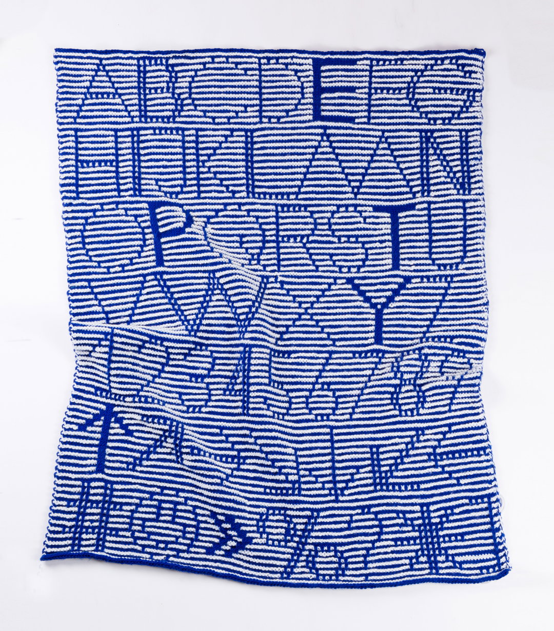
He has been met by people across the world who have mirrored his own interest, attending workshops or downloading Rüdiger’s free patterns. “The ABC-Blanket which I made as a knitted specimen has been knitted many times, and knowing how much work this takes, this means a lot to me.” So while Rüdiger is not long finished with the release of Knit Grotesk, he is already working away on more typefaces you can knit; true to form, his next will be for beginners – both “knitters without previous knowledge in type design or lettering, and graphic designers who have just picked up their needles”.
Rüdiger Schlömer: Knit Grotesk (Copyright © Rüdiger Schlömer, 2023)
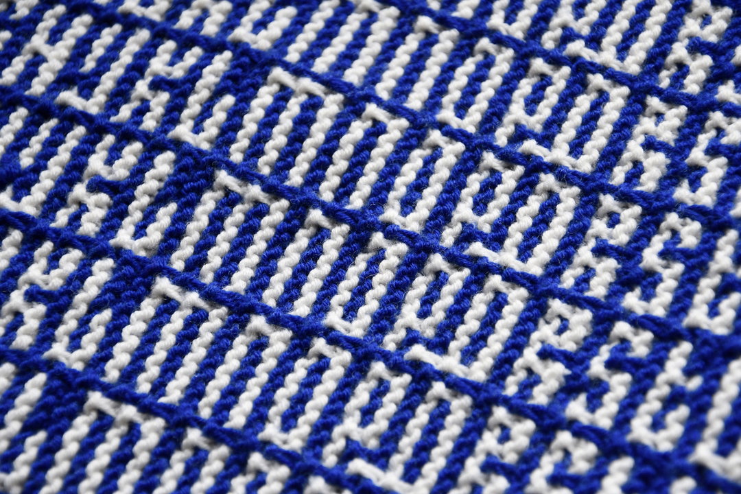
Rüdiger Schlömer: Knit Grotesk (Copyright © Linda Suter, 2023)
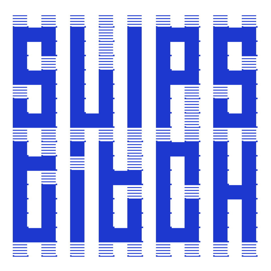
Rüdiger Schlömer: Knit Grotesk (Copyright © Rüdiger Schlömer, 2023)
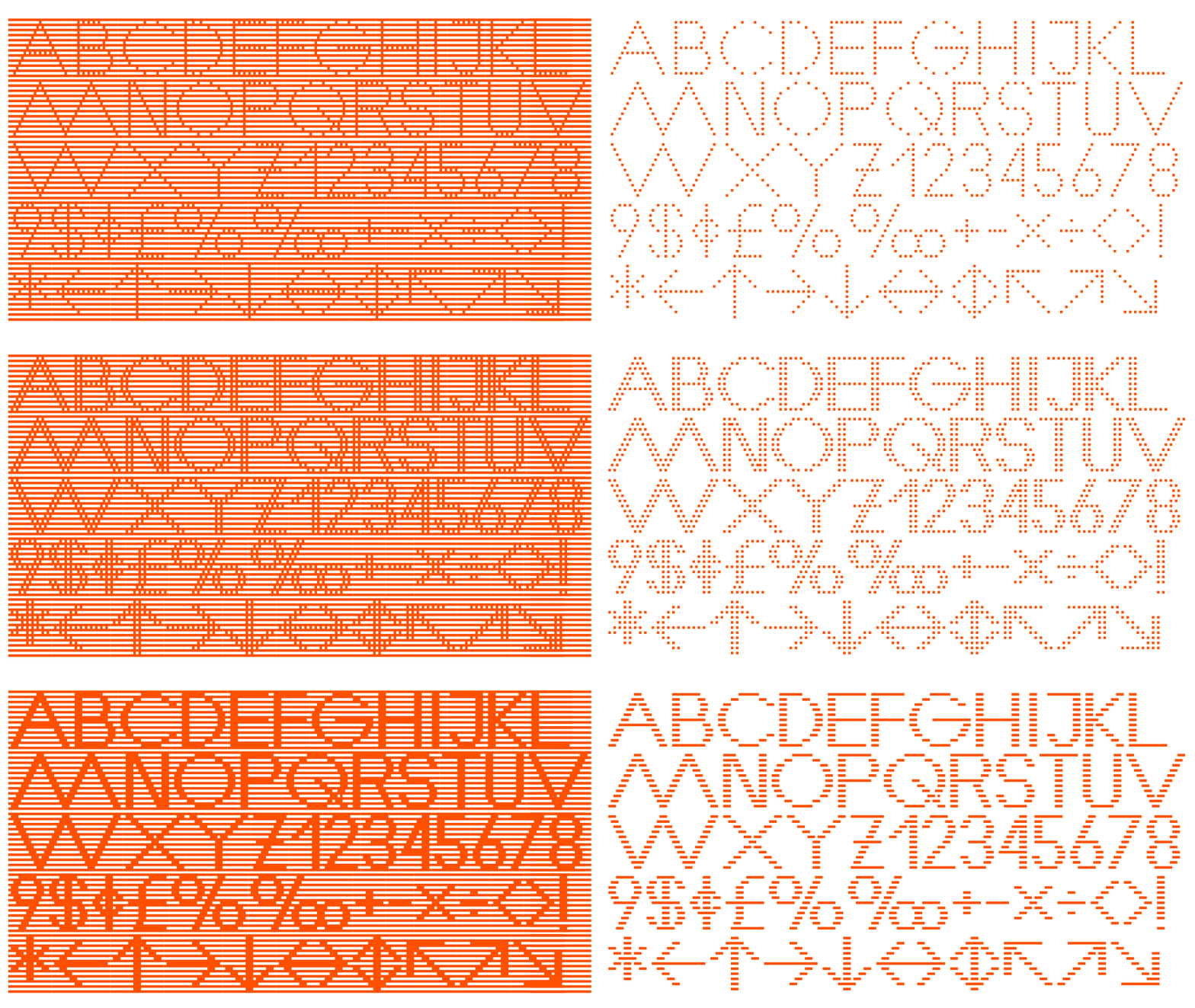
Rüdiger Schlömer: Knit Grotesk (Copyright © Rüdiger Schlömer, 2023)
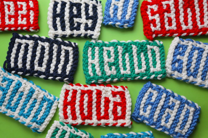
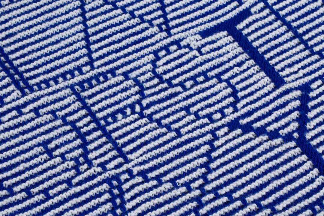
Rüdiger Schlömer: Knit Grotesk (Copyright © Linda Suter, 2023)
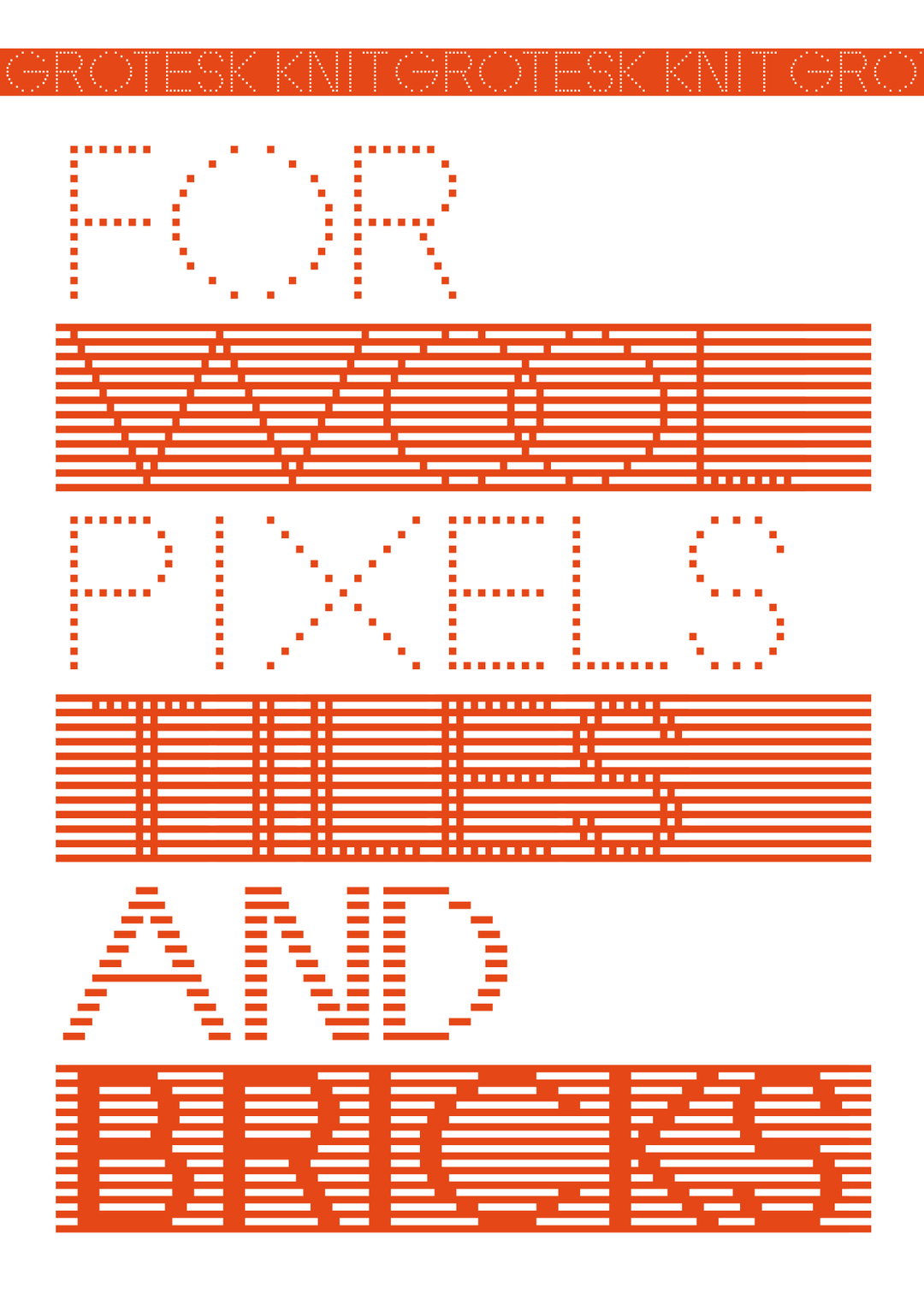
Rüdiger Schlömer: Knit Grotesk (Copyright © Rüdiger Schlömer, 2023)
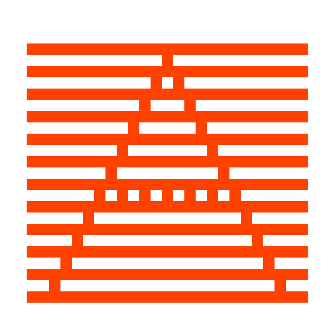
Rüdiger Schlömer: Knit Grotesk (Copyright © Rüdiger Schlömer, 2023)
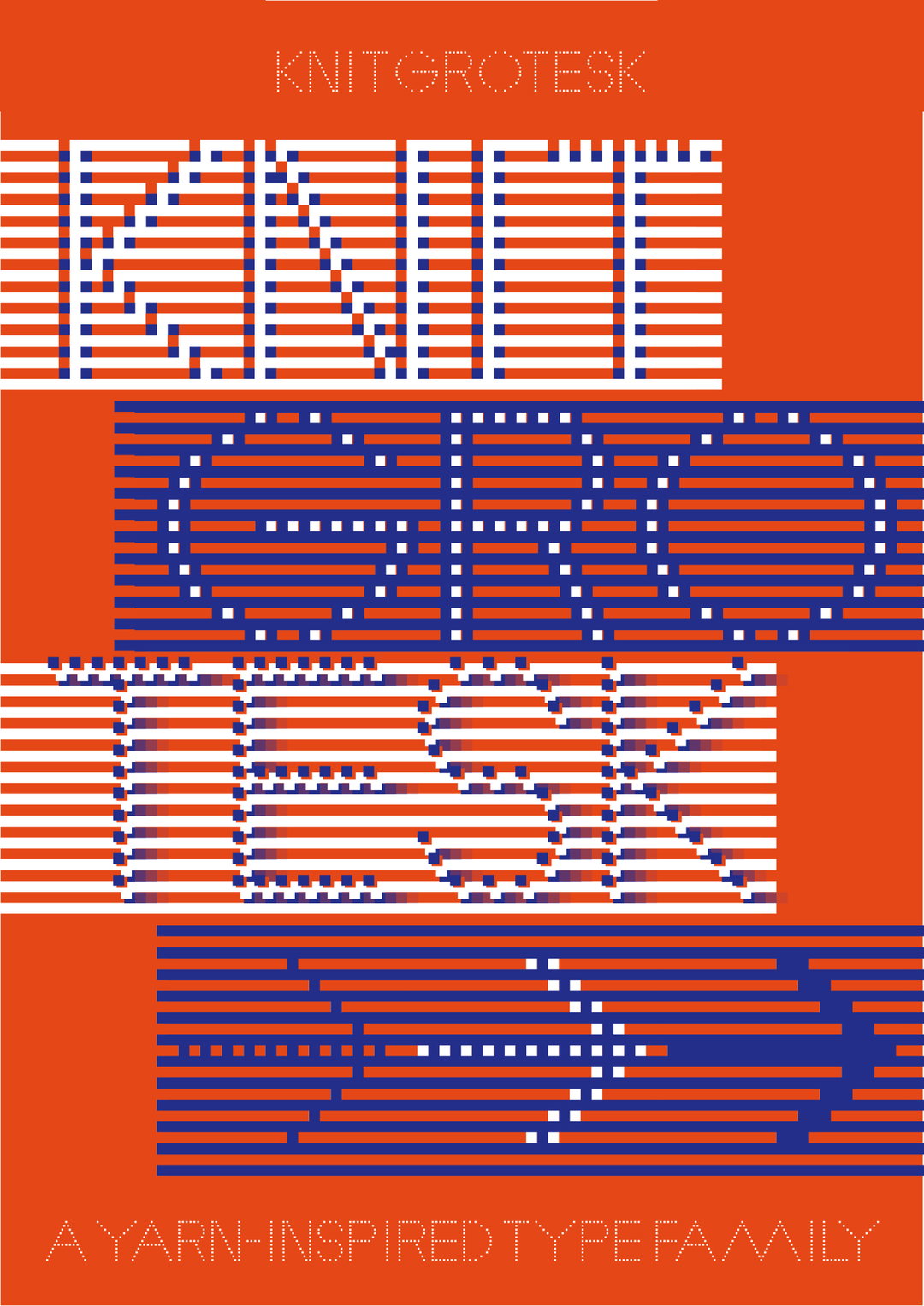
Rüdiger Schlömer: Knit Grotesk (Copyright © Rüdiger Schlömer, 2023)
Hero Header
Rüdiger Schlömer: Knit Grotesk (Copyright © Linda Suter, 2023)
Share Article
About the Author
—
Liz (she/they) is the senior editor at Insights, a research-driven department within It’s Nice That. They previously ran the news section of the website. Get in contact with them for potential Insights collaborations or to discuss Insights’ public-facing reports.