Launch Recite Me assistive technology
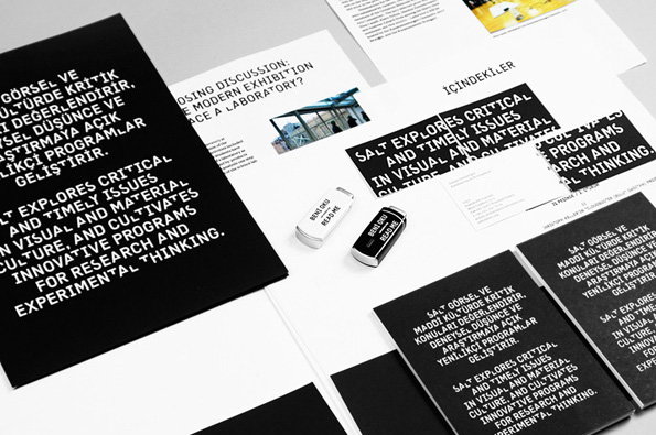
A collection of black and white printed materials, including booklets and leaflets, laid out on a grey surface. Bold white text on a black background reads “Salt explores critical and timely issues in visual and material culture”.

Salt's ever-changing identity takes an angular new shape for 2013

—
Date
10 January 2013

SALT is a cultural institution in Istanbul that merges a contemporary art space, architecture and design gallery and a scholarly archive; designed to promote research and experimental thinking across art and design. Straightforward enough, but how do you go about branding an institution that operates in a constantly shifting and evolving landscape and aims to promote a diverse range of? The idea of a permanent static identity just doesn’t seem to fit.

That’s the thinking behind Project Projects’ ongoing identity for SALT, for which they invite quarterly contributors to manipulate and reinterpret Kraliçe, a custom typeface that serves as the institute’s sole identity. There is no logo. Thus far the list of contributors includes Sulki & Min, Dries Wiewauters and Thirst, with the latest iteration coming from ECAL student Anna Bitzer.

Bitzer’s manipulation of Kraliçe takes the form of a custom algorithm that hacks OpenType scripting to display different iterations of the institution’s name. The results are remarkably effective, maintaining the coherence of the original typeface but bastardising it with glitches in the letterforms, contained neatly within the cap height. Check back in in three months time to see what SALT’s ever-changing face looks like mid-2013.
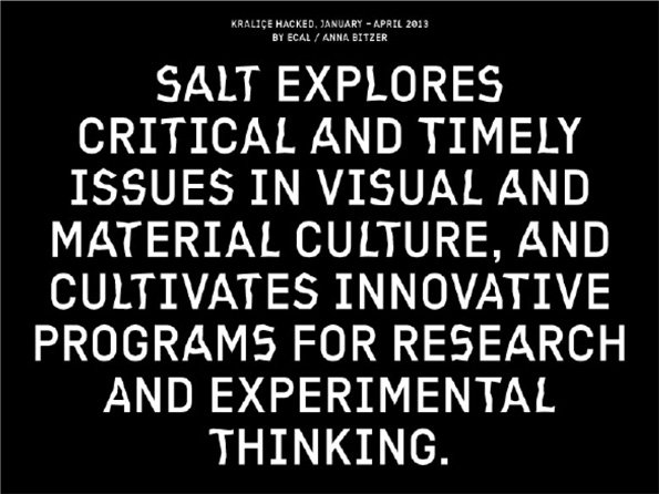
A typographic image with white text on a black background. It reads “Salt explores critical and timely issues in visual and material culture, and cultivates innovative programs for research and experimental thinking.” Smaller text at the top reads “Kralice Hacked, January – April 2013 by ECAL / Anna Bitzer”.
Above

Project Projects: SALT Identity – Anna Bitzer version
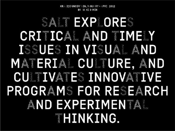
White text on a black background reads “Salt explores critical and timely issues in visual and material culture, and cultivates innovative programs for research and experimental thinking.” Small text at the top reads “Kralice Uncertain, January – April 2012 by U Ki & Min”.
Above

Project Projects: SALT Identity – Sulki & Min version
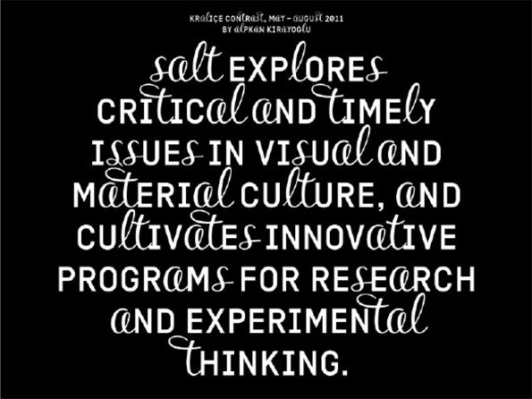
White text on a black background reads “salt explores critical and timely issues in visual and material culture, and cultivates innovative programs for research and experimental thinking.” Small text at the top reads “Kralice Contrast, May – August 2011 by Alpkan Kirayoglu”.
Above

Project Projects: SALT Identity – Alpkan Kırayoğlu version
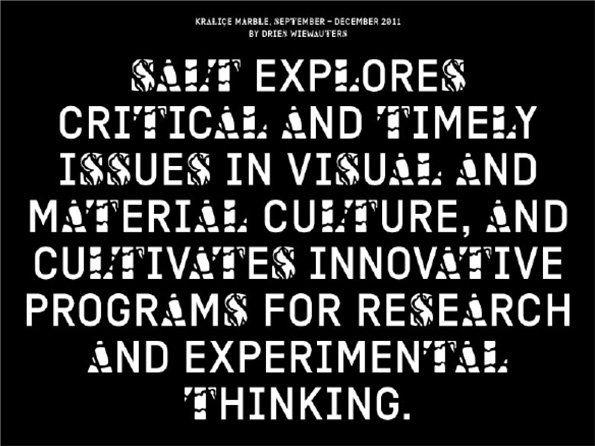
A typographic poster on a black background with white text. It reads “SALT EXPLORES CRITICAL AND TIMELY ISSUES IN VISUAL AND MATERIAL CULTURE, AND CULTIVATES INNOVATIVE PROGRAMS FOR RESEARCH AND EXPERIMENTAL THINKING.”
Above

Project Projects: SALT Identity – Dries Wiewauters version
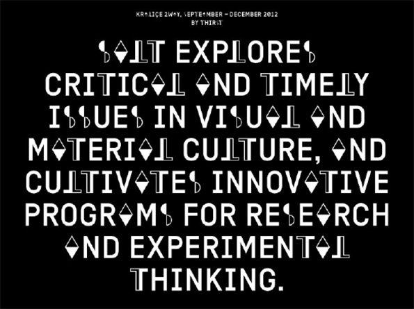
A typographic poster with white text on a black background. The main text reads “ALT EXPLORES CRITICAL AND TIMELY ISSUES IN VISUAL AND MATERIAL CULTURE, AND CULTIVATES INNOVATIVE PROGRAMS FOR RESEARCH AND EXPERIMENTAL THINKING.”
Above

Project Projects: SALT Identity – Thirst version
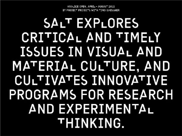
A black poster with bold white text reads “SALT EXPLORES CRITICAL AND TIMELY ISSUES IN VISUAL AND MATERIAL CULTURE, AND CULTIVATES INNOVATIVE PROGRAMS FOR RESEARCH AND EXPERIMENTAL THINKING.” Smaller text at the top reads “KRALICE OPEN, APRIL–AUGUST 2011 BY PROJECT* PROJECT’S WITH TIMO GAESSNER”.
Above

Project Projects: SALT Identity

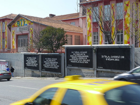
A pink building is decorated with yellow and red banners. Three large black signs stand in front, one of which reads “İstiklal Caddesi 136 9 Nisan 2011”.
Above

Project Projects: SALT Identity

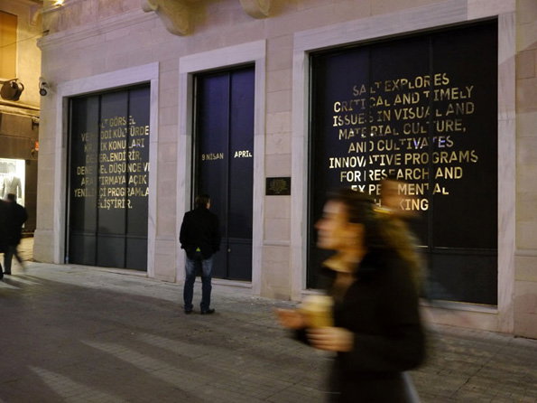
Three large, dark panels are set into a light stone wall. The panel on the right features gold text that reads “Salt explores critical and timely issues in visual and material culture, and cultivates innovative programs for research and experimental”. A person walks past the panels in the foreground, blurred by motion.
Above

Project Projects: SALT Identity

Share Article

About the Author

James Cartwright

—

James started out as an intern in 2011 and came back in summer of 2012 to work online and latterly as Print Editor, before leaving in May 2015.

It's Nice That Newsletters

Fancy a bit of It's Nice That in your inbox? Sign up to our newsletters and we'll keep you in the loop with everything good going on in the creative world.