Launch Recite Me assistive technology
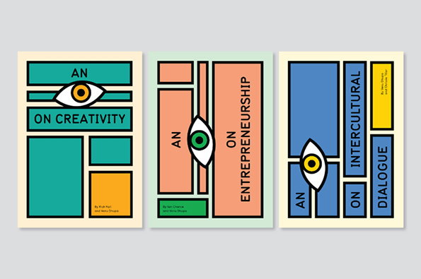
Three book covers featuring bold, geometric layouts and a stylised eye motif. The titles read “An Eye on Creativity”, “An Eye on Entrepreneurship” and “An Eye on Intercultural Dialogue”.

Graphic Design: Sarah Boris is the cream of the crop in designing for art institutions

—
Date
5 June 2014

Sarah Boris is of the creative calibre that she ups the game for everybody else around her. An award-winning graphic designer and illustrator, she has been working for some of Britain’s greatest art institutions since 2003, including the Barbican Centre, the Architecture Foundation, Tate and Phaidon Press, as well as being solely responsible for the redesign of the ICA’s identity, which was unveiled in 2009 and can still be spotted on posters and billboards across London. The result? A portfolio of work so strong that it doesn’t seem to need much introduction; graphic posters for the ICA sit alongside exhibition identities and editorial projects spanning some incredibly grand subjects, proving in the simplest terms that Sarah cut her teeth with some of the strongest in the industry. And judging by the rate at which she is producing work, she’s nowhere near ready to slow down yet.
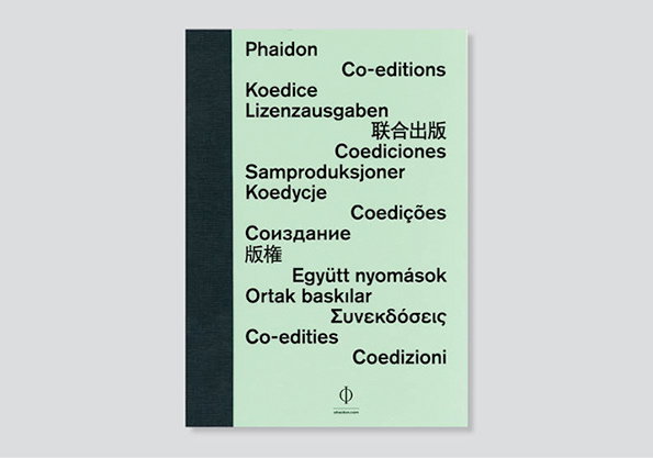
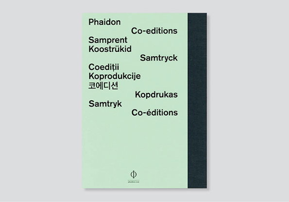
The cover of a pale green book features the word “Phaidon” at the top. Below it, the phrase “Co-editions” is repeated in various languages, arranged in a staggered layout.
Above

Sarah Boris: Phaidon

The cover of a pale green book features the word “Phaidon” and the phrase “Co-editions” repeated in several different languages. A thick black band runs vertically down the right edge of the cover.
Above

Sarah Boris: Phaidon

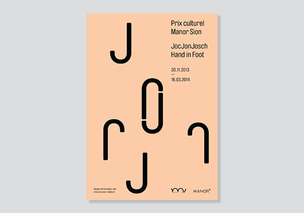
A peach-coloured poster featuring bold, black abstract shapes that resemble curved lines and letters. Text in the top right reads “Prix culturel Manor Sion”, “JocJonJosch Hand in Foot” and the dates “30.11.2013 – 16.03.2014”.
Above

Sarah Boris: JonJocJosch

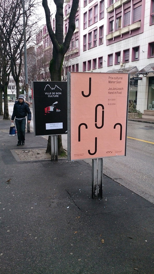
Two posters stand on a city pavement in front of a multi-storey building. The pink poster on the right reads “Prix culturel Manor Sion” and “JocJonJosch Hand in Foot”.
Above

Sarah Boris: JonJocJosch

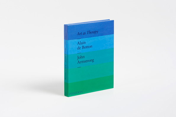
A hardcover book titled “Art as Therapy” stands against a plain white background. The cover features horizontal bands of blue and green, with the names “Alain de Botton” and “John Armstrong” printed across the stripes.
Above

Sarah Boris: Art as Therapy

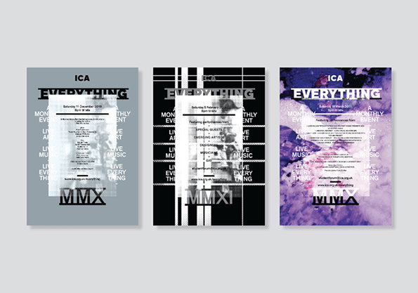
Three posters for an Ica event titled “Everything”. Each design features a white central block of text over different backgrounds: a grey field, black and white stripes, and a purple abstract wash.
Above

Sarah Boris: ICA

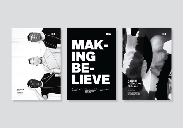
Three black and white posters for the Ica. The first shows three people entwined in white ropes, the second features the bold text “MAKING BELIEVE”, and the third shows a distorted, abstract figure.
Above

Sarah Boris: ICA

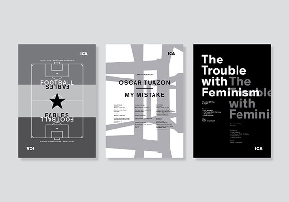
Three posters for the Ica. The first features a football pitch diagram with the words “Fables Football” mirrored across a central star. The second is a white and grey abstract composition reading “Oscar Tuazon My Mistake”. The third is black with bold white text that reads “The Trouble with Feminism”.
Above

Sarah Boris: ICA

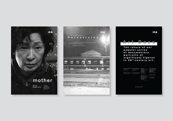
Three black and white posters for the Ica. The first shows a close-up portrait of a person with the word “mother” and the dates “20–29 August 2019”. The second shows a building at night with the title “Perestroika”. The third is a black page with white text that reads “Art Docs” and describes a series of documentary portraits.
Above

Sarah Boris: ICA

Share Article

Further Info

About the Author

Maisie Skidmore

—

Maisie joined It’s Nice That fresh out of university in the summer of 2013 as an intern before joining full time as an Assistant Editor. Maisie left It’s Nice That in July 2015.


It's Nice That Newsletters

Fancy a bit of It's Nice That in your inbox? Sign up to our newsletters and we'll keep you in the loop with everything good going on in the creative world.