- Words
- Arman Khan
- —
- Date
- 24 August 2026
- Tags
From Barbie logos to medieval manuscripts: step inside Teddy Blanks’ film title design process
Teddy Blanks, the Chips co-founder behind the title sequences for Barbie, Weapons and Robert Eggers’ upcoming Werwulf, explains how eBay dolls, hidden AA symbolism and a 14th Century manuscript all found their way into his lettering.
Share
Share
Having Lena Dunham as your first title-design client is a pretty good place to start. For the New York-based designer Teddy Blanks, Lena was the first person he knew who was making movies: directing short films on the Oberlin College campus, each one stranger and more experimental than the last. “So I said, ‘Would you let me do the titles for your short films?’ And she let me do whatever I wanted,” says Teddy. “I would make these wild title designs for her short films. After we graduated, she made Tiny Furniture, which was the first real feature that I worked on.”
Teddy co-founded the Williamsburg, Brooklyn-based graphic design studio Chips in 2009 with Adam Squires and Dan Shields. His beginnings with Lena – a collaboration that continues to this day – would go on to define his relationship with design. A certain levity about the whole process trickled in early on: “Ultimately, film titles are just a contractual obligation. You need to have them in the movie because various guilds and contracts say that you need to credit these people in this particular order.”
“There are a lot of great films with bad titles [and] there are a lot of bad films that have really cool titles, and the titles don’t necessarily help the film get better. It’s important, at least to me, to not have any grand illusions.”
Teddy Blanks
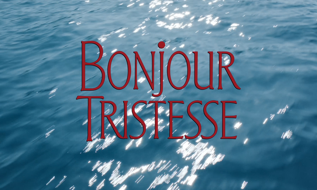
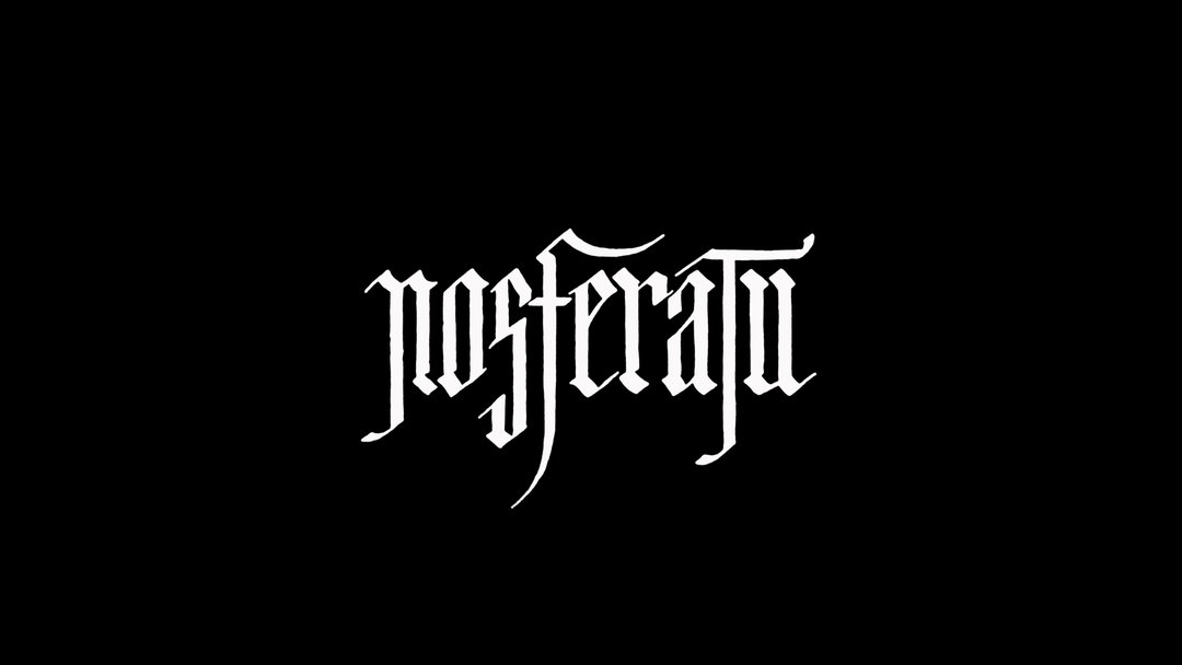
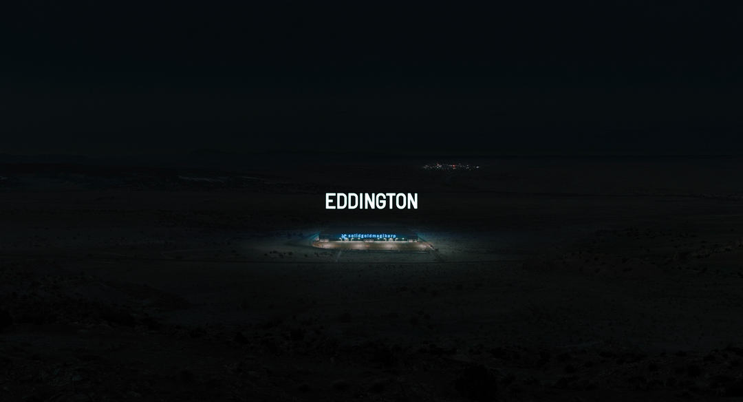
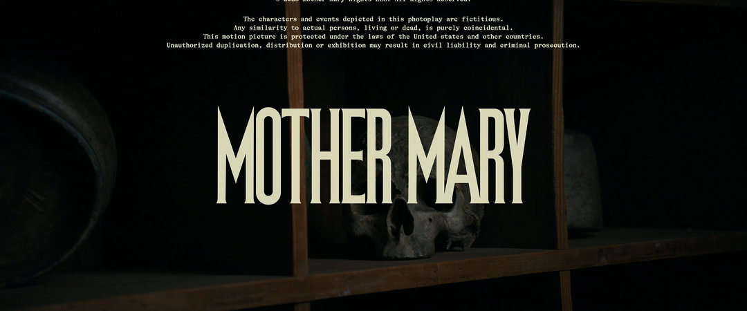
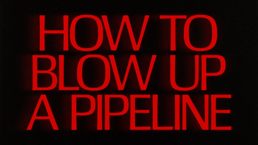
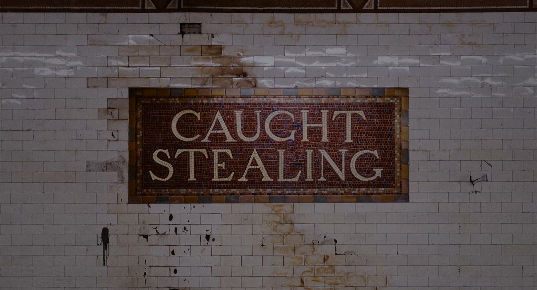
1 of 8
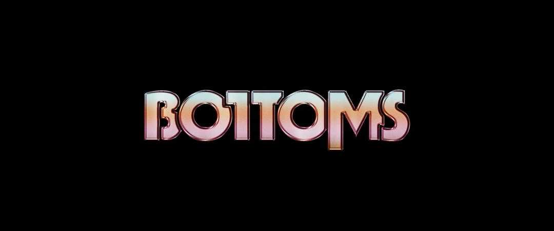
Chips: Bottoms titles (Copyright © Metro-Goldwyn-Mayer Pictures and Orion Pictures)
1 of 8
Chips: Bottoms titles (Copyright © Metro-Goldwyn-Mayer Pictures and Orion Pictures)
But film titles can still present an opportunity for a filmmaker who cares about them – to help set the mood, create a memorable moment or inject a dash of humour through clever design gymnastics. “There are a lot of great films with bad titles, and they are still great films. And there are a lot of bad films that have really cool titles, and the titles don’t necessarily help the film get better. It’s important, at least to me, to not have any grand illusions.” For Teddy, titles are a very small part of the film, their role limited to creating a special moment that, for all practical purposes, might go unnoticed.
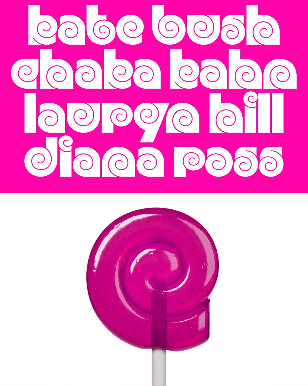
His own body of work, though, is hard to ignore. For the end credits of Greta Gerwig’s Barbie, he cut up Mattel’s high-res packaging scans by hand and animated the elements; a VFX company, PowerHouse VFX, shot 360-degree photography of the actual dolls and sent him the animated doll elements to layer on top. For the film’s main logo, he had to revive a logotype that Mattel discontinued more than 30 years ago. “There were various versions that people had made online with auto-tracing in Illustrator, but they weren’t at the fidelity required for the film,” he says. “It had to be redrawn, first of all, from an original source. I found a Barbie magazine from the late-80s, so I ordered a few copies. It had really big, high-resolution versions of the logo that I could trace and turn into a well-drawn vector object. The first thing was just getting a digital version of the logo that we could use and then building that out into a full font.”
The process didn’t end at Barbie. Barbie had lots of friends too – Skipper, Ken, the works. All of them had custom logos in the same Barbie style from the mid-70s to the early 90s. These were pieces of custom lettering, not based on an actual typeface, because they changed slightly over the years – letters slightly thicker here, thinner there. He went on eBay and bought every Barbie-related doll he could find from those years. By doing so, he had about “half an alphabet to start with”, and he could use that to extrapolate and build an entire font based on that style.
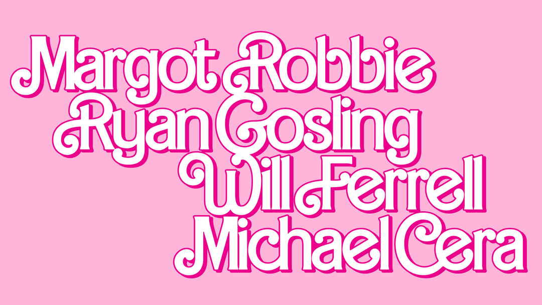
Chips: Barbie titles (Copyright © Warner Bros. Entertainment Inc. and Mattel)
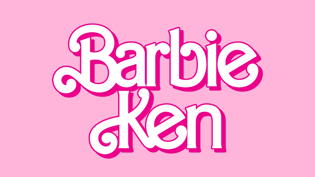
Chips: Barbie titles (Copyright © Warner Bros. Entertainment Inc. and Mattel)
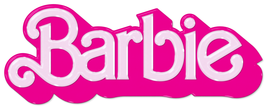
Chips: Barbie titles (Copyright © Warner Bros. Entertainment Inc. and Mattel)
“What matters is the impact that it has at that moment – not how it ties into some greater design system.”
Teddy Blanks
While Barbie made him tweak, distort and play with practically every medium available to a graphic designer – from scanning secondhand magazines to working with animated dolls – other films have sprung up their own surprises concealed in the garb of minimalism. For the 2025 film Weapons, Teddy initially designed a slightly more ornamental logo which the director, Zach Cregger, felt was too overdesigned and made too much of a statement. For the new logo, he took what he thought was a simpler approach. The focus was on the bell that Amy Madigan’s character, Aunt Gladys, rings, which has a tiny little triangle on it. In the film, its iconography is never explained but the audience interprets it as part of her witchcraft. “So I put the triangle inside of the O in ‘Weapons’. There is nothing particularly special about [the font], except the O is a perfect circle, and inside it is this triangle. When I sent this to Zach, he called me almost immediately, and said, ‘How did you come up with this?’ The film is an allegory about alcoholism and dealing with addiction, and the triangle in the circle is, well, the logo for Alcoholics Anonymous. That was eerie because I had no idea about this connection at all.”
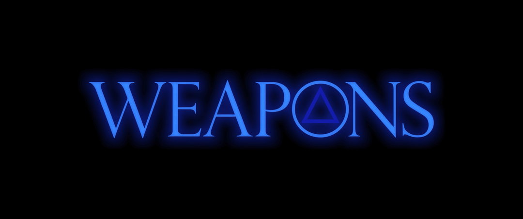
Chips: Weapons titles (Copyright © Warner Bros. Entertainment Inc. and New Line Cinema)
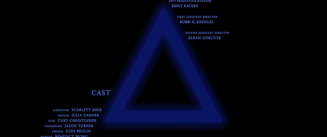
Chips: Weapons titles (Copyright © Warner Bros. Entertainment Inc. and New Line Cinema)
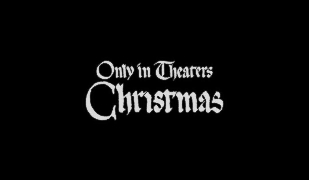
Chips: Werwulf titles (Copyright © Focus Features, Maiden Voyage Pictures, and Working Title Films)
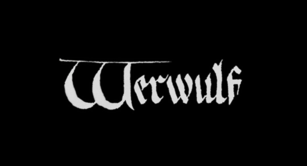
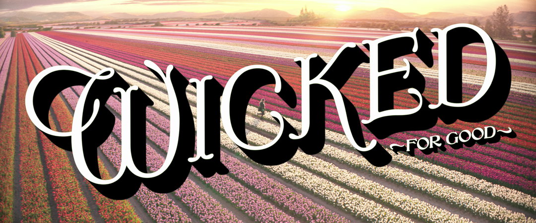
Weapons was a case study in the strange roads that design takes us on. His design decisions for the films of Robert Eggers, though, are far from being coincidental because he feels “almost bad taking credit” for his films. The final logo for Eggers’ upcoming Christmas horror release, Werwulf, was not that different from the initial design Eggers himself sketched on Photoshop. The uppercase W is a hard-edged take on a Lombardic Capital – a type of decorative uppercase letter used in inscriptions and medieval manuscripts – and the lowercase letterforms reflect rough, textured blackletter calligraphy. “He had already found a 14th Century manuscript whose lettering he liked,” says Teddy. “He had cut up the lettering and made the word ‘Werwulf’. He had a W, but he wasn’t so sure that the W was right. So – and this is funny, because it’s very similar to Wicked (2024) – we were looking at a bunch of different Ws and finally found one that felt right. Then I did it by hand, using Procreate, and gave it this old paper texture.”
The paper texture treatment was deceptively simple. The texture came from a scan of blank paper from a manuscript of the era, which Teddy used as a displacement map on the type: Filter > Distort > Displace in Photoshop, with a separate greyscale file as the map. Anything totally grey stayed put; anything darker or lighter shifted the image around. Used that way, he says, a displacement map can texturise almost anything. Even the horizontal line on top of the W of Werwulf was Eggers’ idea. “In the version you see in the poster and the trailer, the line is thinner than the version in the film,” he says. “The marketing team felt that it wasn’t as readable as a W if there was a thick line above it. We made the line much thinner, so that the bowls of the W were more readable.”
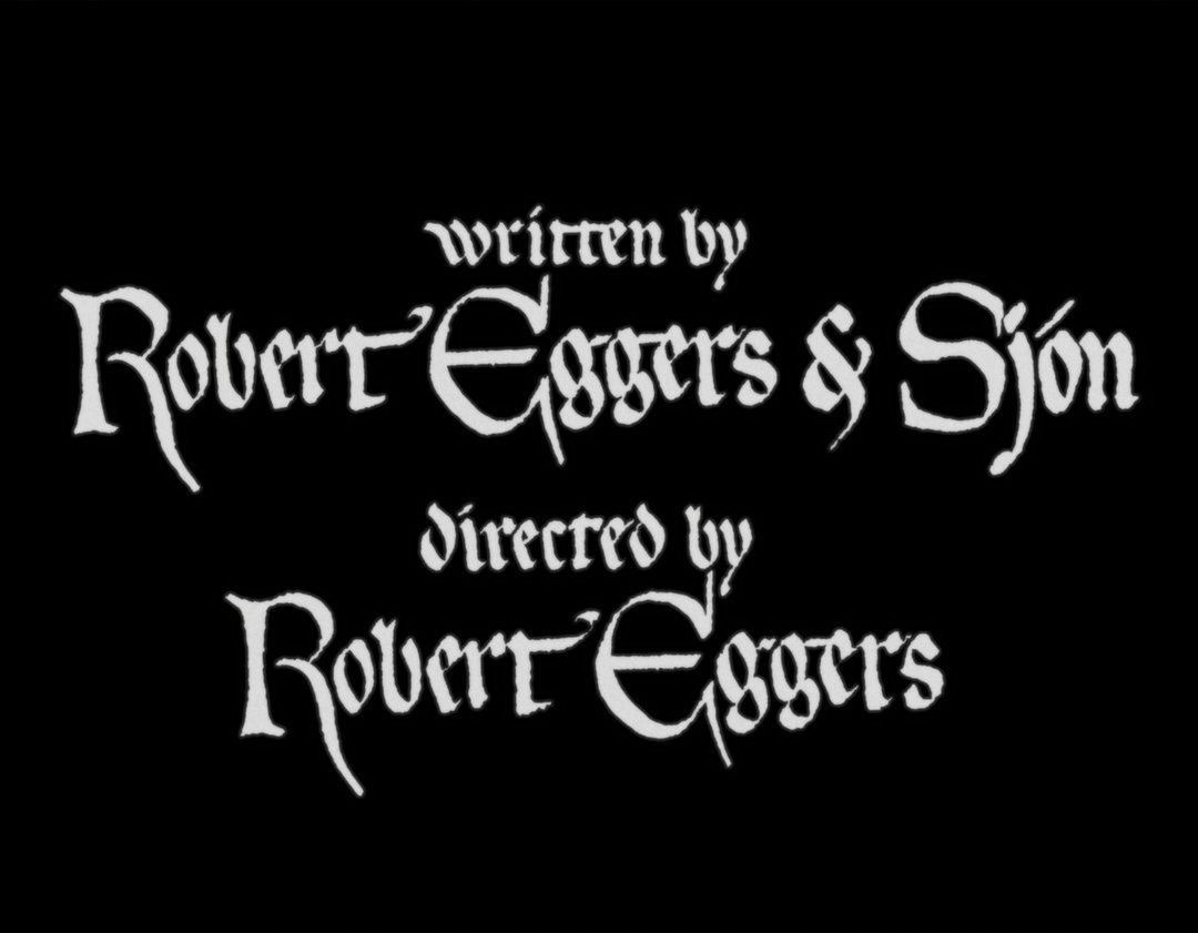
Chips: Werwulf titles (Copyright © Focus Features, Maiden Voyage Pictures, and Working Title Films)
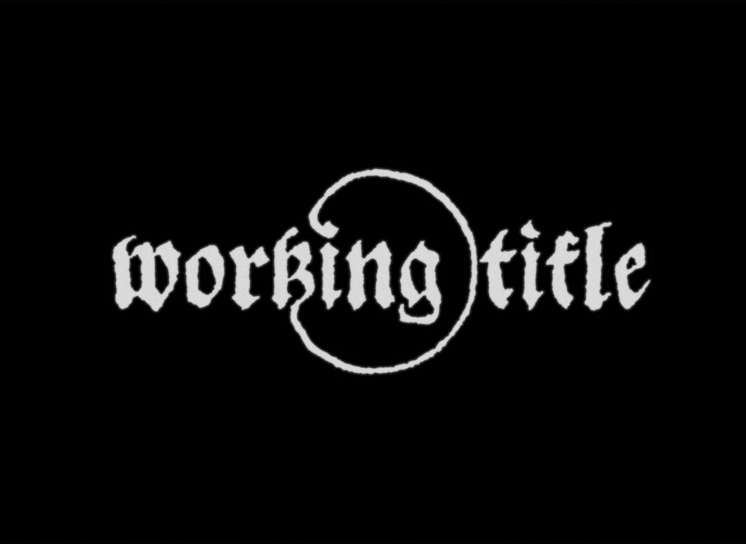
Chips: Werwulf titles (Copyright © Focus Features, Maiden Voyage Pictures, and Working Title Films)
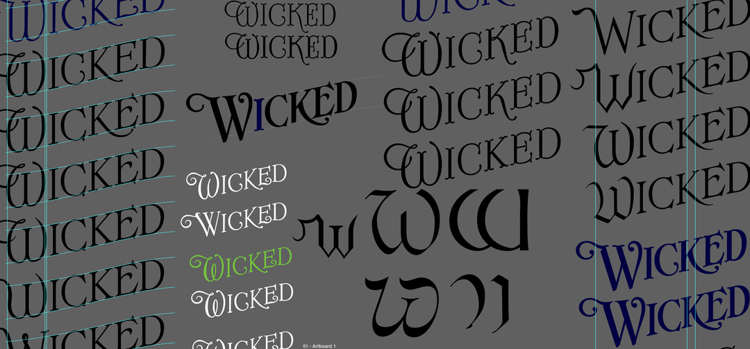
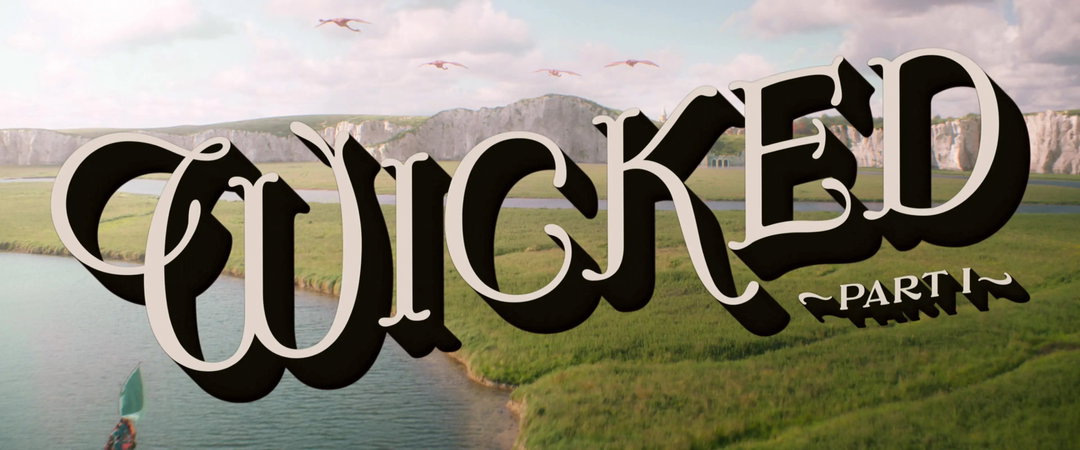
1 of 3
Chips: Wicked: For Good titles (Copyright © Universal Pictures and Marc Platt Productions)
1 of 3
Chips: Wicked: For Good titles (Copyright © Universal Pictures and Marc Platt Productions)
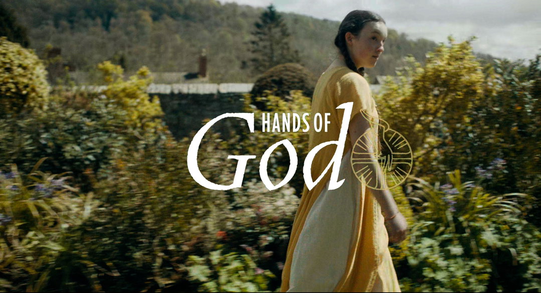
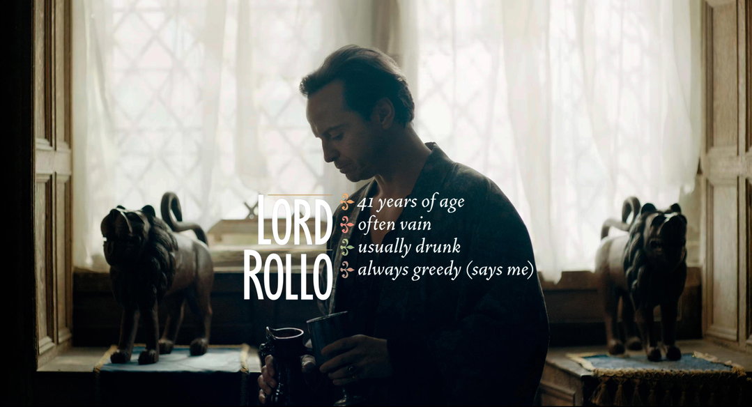
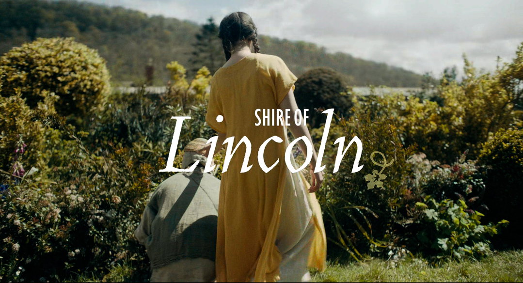
Teddy has played with medieval fonts even in films not directed by Eggers. For David Lowery’s The Green Knight, after the initial design variations, Lowery told him that they had the opportunity to go all out with the titles. “His idea changed the way I think about title design a little bit. He had gone back to my original presentation, where I’d shown him all these different medieval and faux medieval-type styles, and cut six or seven of them rapidly together in the edit. And he said, every time there’s a new title – the film has all these chapter cards delineating each step in the character’s journey – I want a totally different font, totally different design, totally different colour. All playing in the medieval space, but very big, bold and totally new every time.”
“There is that unspoken emotional connection to something real that the story is connected to.”
Teddy Blanks
Until then, Teddy’s approach to title design had been closer to branding, or any other kind of graphic design project where the goal is always a consistent language and voice: not to use too many type sizes, and to ensure that every lower third in the film matches the last one. “The project taught me that movies are just different. What’s most important for a title is how it feels to the audience the moment it comes on screen. Where it’s happening in the film, what’s going on with the music, what’s going on visually behind it, whether it’s over black or over picture; what matters is the impact that it has at that moment – not how it ties into some greater design system.”
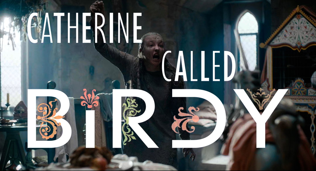
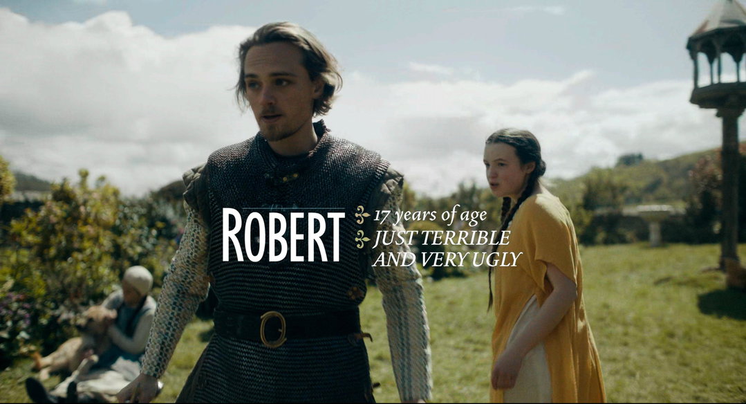
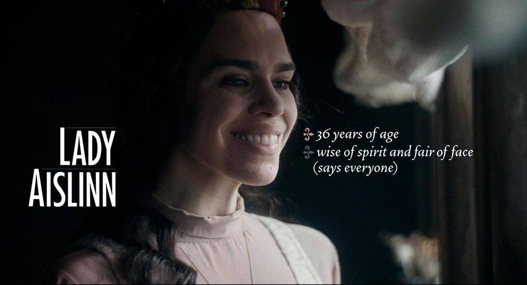
1 of 6
Chips: Catherine Called Birdy titles (Copyright © Amazon Content Services LLC and Working Title Films)
1 of 6
Chips: Catherine Called Birdy titles (Copyright © Amazon Content Services LLC and Working Title Films)
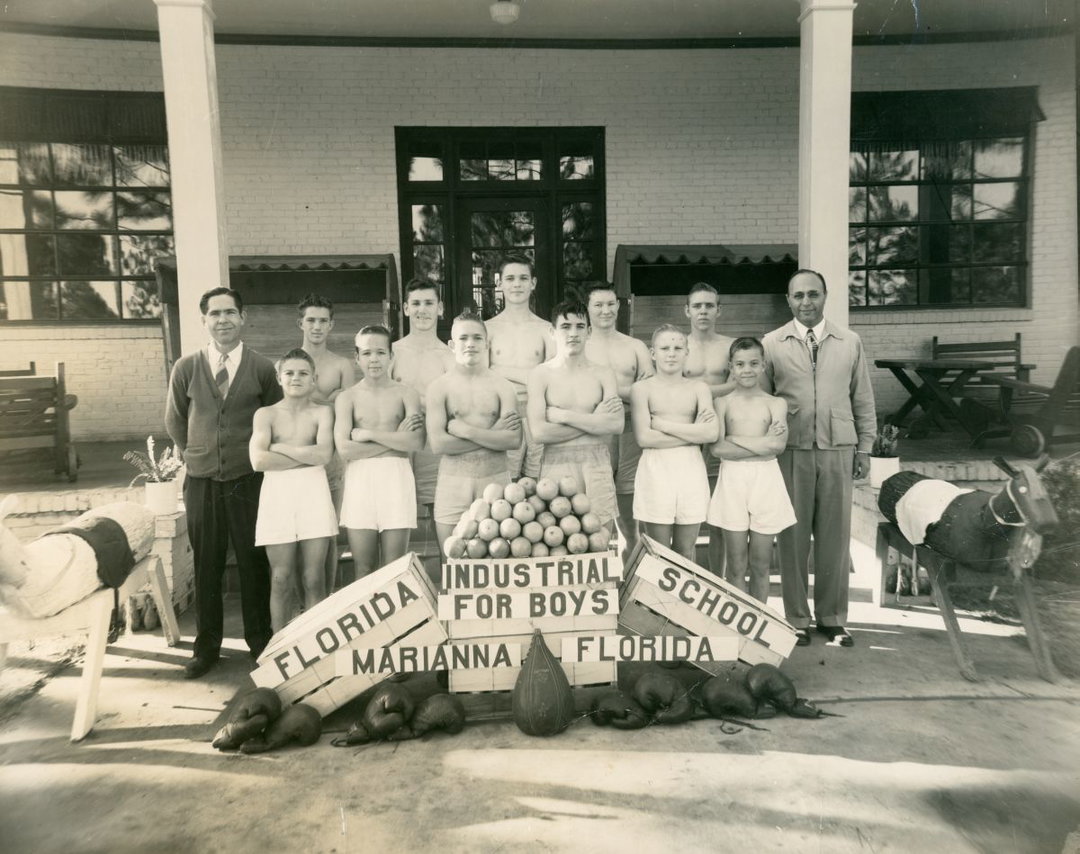
Chips: Nickel Boys titles (Copyright © Orion Pictures and Plan B Entertainment)
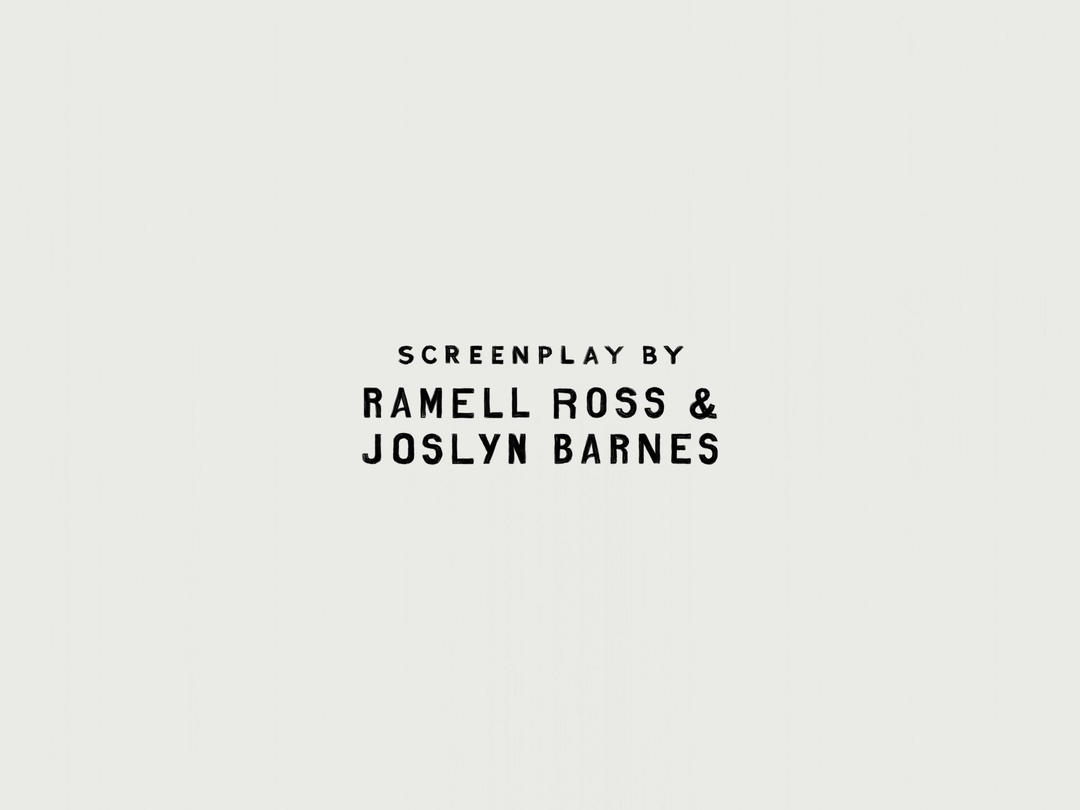
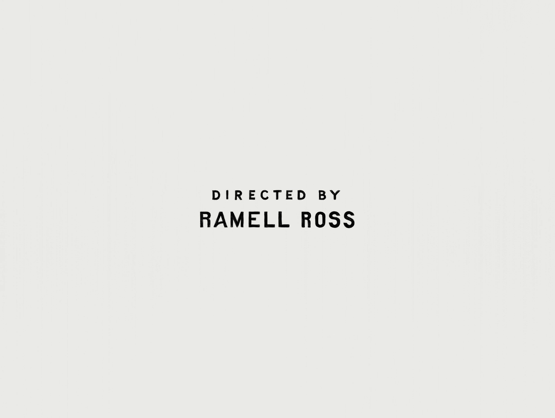
Teddy now understands, all too well, that expecting praise for the layered and nuanced processes behind film title design is a slippery slope. Expecting people to “get it” misses the point. Consider RaMell Ross’ Nickel Boys, adapted from the 2019 novel by Colson Whitehead on the Dozier School for Boys, a segregated Florida reform school where decades of abuse went unpunished and dozens of deaths unrecorded. For the film, Teddy researched the school’s actual hand-painted signs, but they don’t appear in the film at all. “Nobody would be able to see those titles and think, oh, those are the hand-painted signs. It is not even an association that the audience could make. But there is that kind of unspoken emotional connection to something real that the story is connected to. It is maybe the most superstitious thing, but I believe that in some ways it affects your experience.”
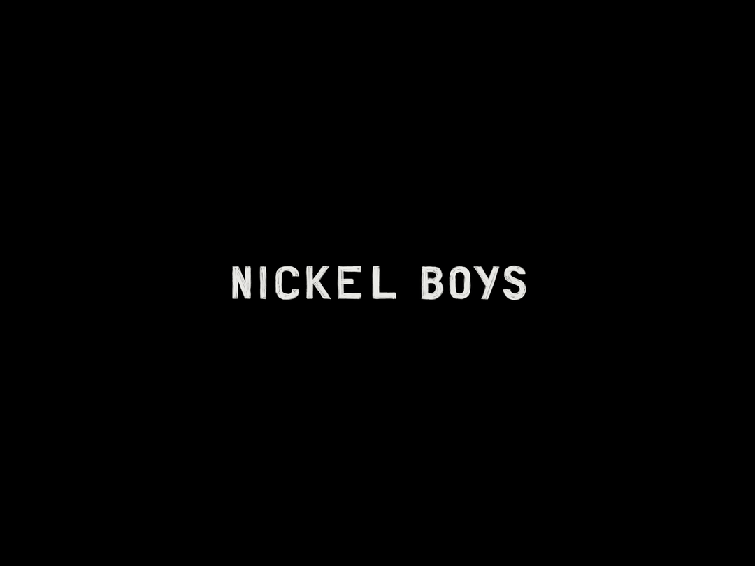
Chips: Nickel Boys titles (Copyright © Orion Pictures and Plan B Entertainment)
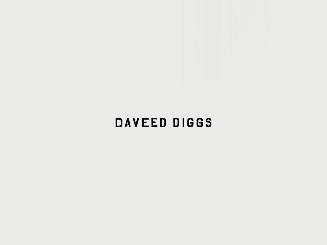
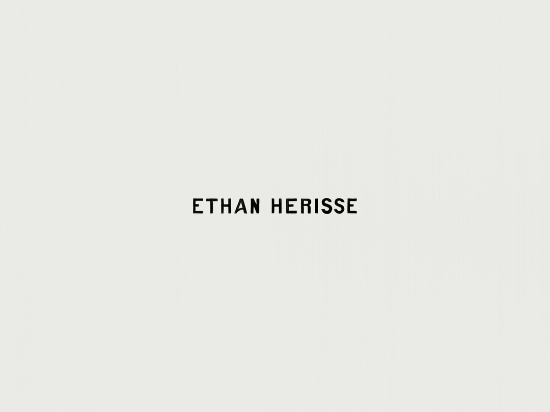
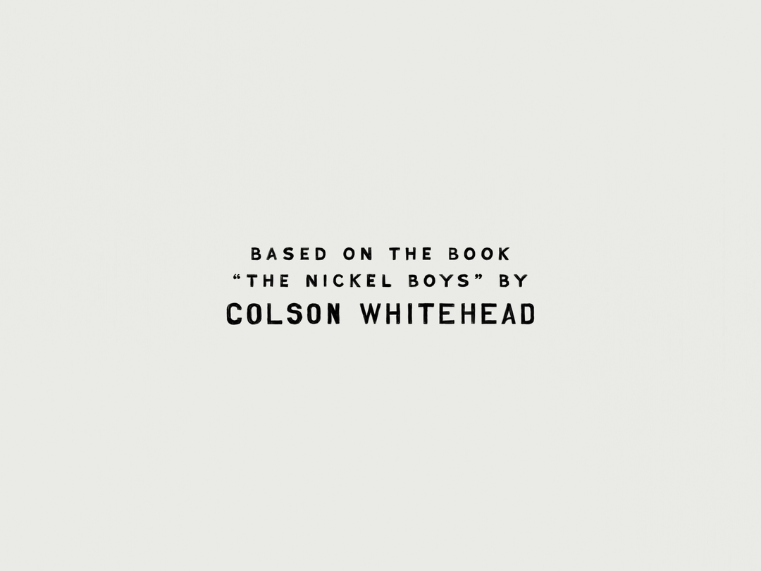
1 of 5
Chips: Nickel Boys titles (Copyright © Orion Pictures and Plan B Entertainment)
1 of 5
Chips: Nickel Boys titles (Copyright © Orion Pictures and Plan B Entertainment)
Hero Header
Chips: Werwulf titles (Copyright © Focus Features, Maiden Voyage Pictures, and Working Title Films)
Share Article
Further Info
About the Author
—
Arman Khan is a writer, editor and educator. Formerly, he was the executive editor at Vogue India. He writes at the intersection of culture and fashion with a sociological lens.