Launch Recite Me assistive technology
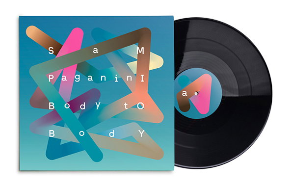
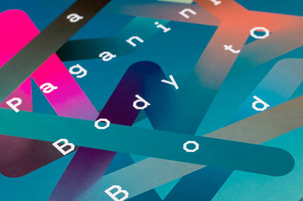
A close-up of a graphic design featuring overlapping colourful strips in shades of blue, pink and purple. White sans-serif text is scattered across the strips, including the words “paganini” and “body”.

Graphic Design: Tip top record sleeve design from German duo Schultzschultz

—
Date
20 March 2014

I read a good Tweet from MagCulture recently bemoaning how often you hear/read the “They say print is dead but…” way of introducing interesting and exciting print projects. The same could be said of the commonplace discussion of record sleeve artwork in the context of the post-iPod vinyl revival. So let’s skirt round that well-trodden cultural turf and content ourselves with celebrating a German studio which seems to have utterly mastered the art.

Marc Schütz and Ole Schulte founded Frankfurt-based agency Schultzschultz in 2007 and their impressive portfolio includes books, posters, identities and the like. But it’s their work for the music industry that really caught my eye, thanks to the unbelievable amount of top-quality record sleeves they have produced.

They say the studio is focussed on “authenticity, materiality and quality of craftsmanship” and that certainly shines through, as does the strength of the pair’s ideas which are explained in illuminating contextual write-offs on the site. And people said the iPod would kill off… yadda yadda yadda.
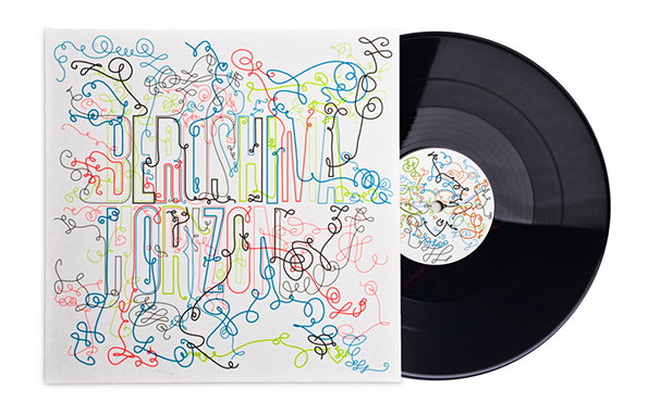
A black vinyl record sits beside its sleeve. The cover features a colourful, tangled web of scribbled lines that form the words “Hiroshima Horizon”.
Above

Schultzschultz: Record Sleeve Design

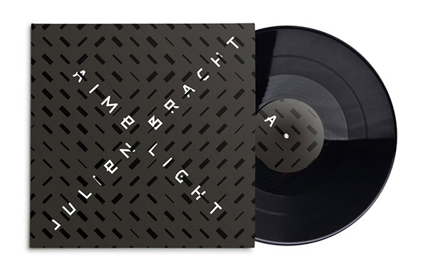
A black vinyl record partially slides out of its sleeve. The cover features a dark grey pattern of small dashes with the names “Aime Bracht” and “Julien Light” printed in white.
Above

Schultzschultz: Record Sleeve Design

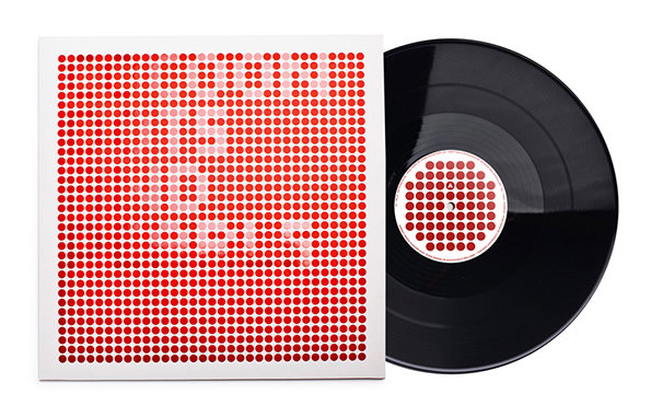
A black vinyl record sits beside its white square sleeve. The cover features a grid of red dots with the words “Brian Eno” appearing in a lighter shade.
Above

Schultzschultz: Record Sleeve Design

A vinyl record and its sleeve. The cover features abstract, overlapping colourful ribbons on a blue gradient background with the text “Sam Paganini Body to Body”.
Above

Schultzschultz: Record Sleeve Design

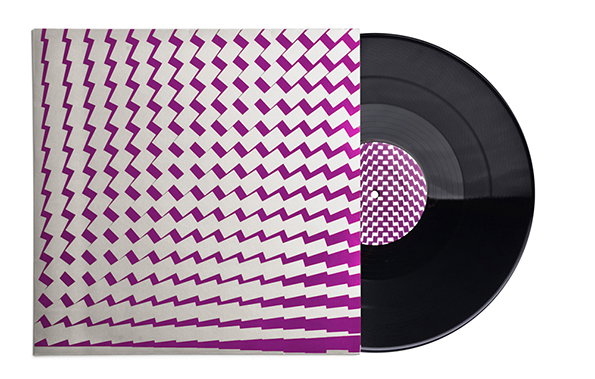
A vinyl record partially slid out of its sleeve. The cover and record label feature a repeating pattern of purple zig-zags on a white background.
Above

Schultzschultz: Record Sleeve Design

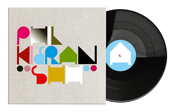
A vinyl record and its sleeve. The cover features bold, colourful geometric shapes that form the words “Phil”, “Kiran” and “Sim”.
Above

Schultzschultz: Record Sleeve Design

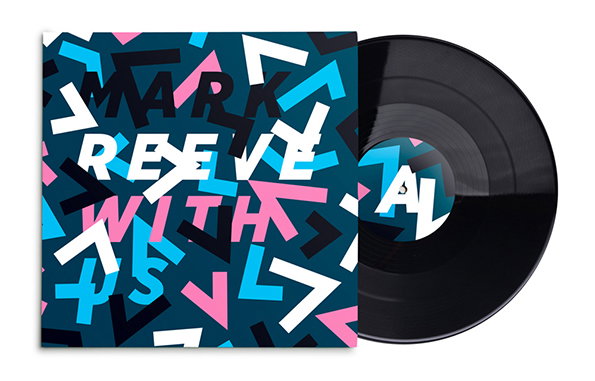
A black vinyl record sits beside its sleeve. The cover features a bold, abstract pattern of blue, pink, white and black geometric shapes with the text “Mark Reeve with” layered across the design.
Above

Schultzschultz: Record Sleeve Design

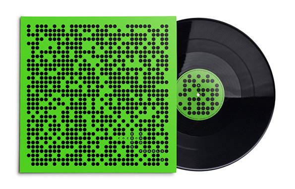
A black vinyl record sits beside its bright green sleeve. Both the cover and the record label feature a dense, abstract pattern of black dots.
Above

Schultzschultz: Record Sleeve Design

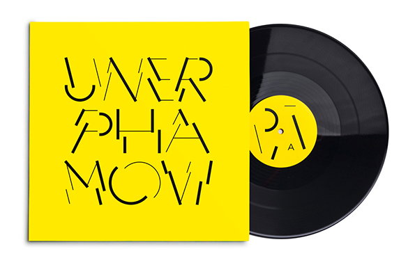
A bright yellow vinyl record sleeve features the words “UNER PHARMA MOVI” in a fragmented, black typographic style. A black vinyl record leans out from behind the cover.
Above

Schultzschultz: Record Sleeve Design

Share Article

About the Author

Rob Alderson

—

Rob Alderson is a freelance writer, editor and strategist. He was previously editor-in-chief of It’s Nice That and WePresent, and editor of Design Week. He publishes the newsletter Undo, which tries to make sense of how AI is changing design work, the design process and the design industry.


It's Nice That Newsletters

Fancy a bit of It's Nice That in your inbox? Sign up to our newsletters and we'll keep you in the loop with everything good going on in the creative world.