




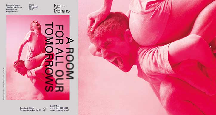
Inside the constantly-probing mind of graphic designer Sebastian Koseda
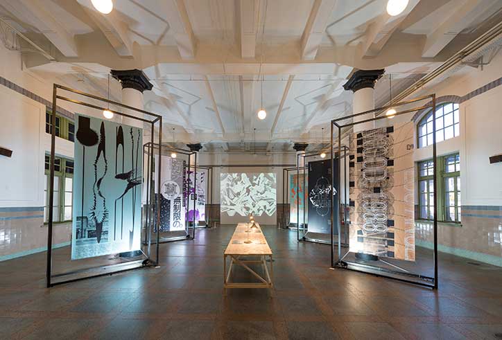
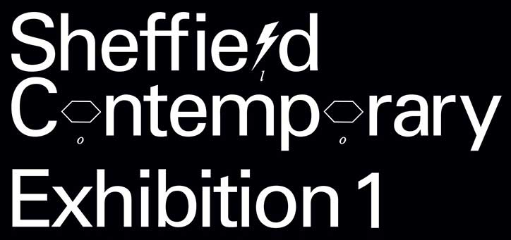
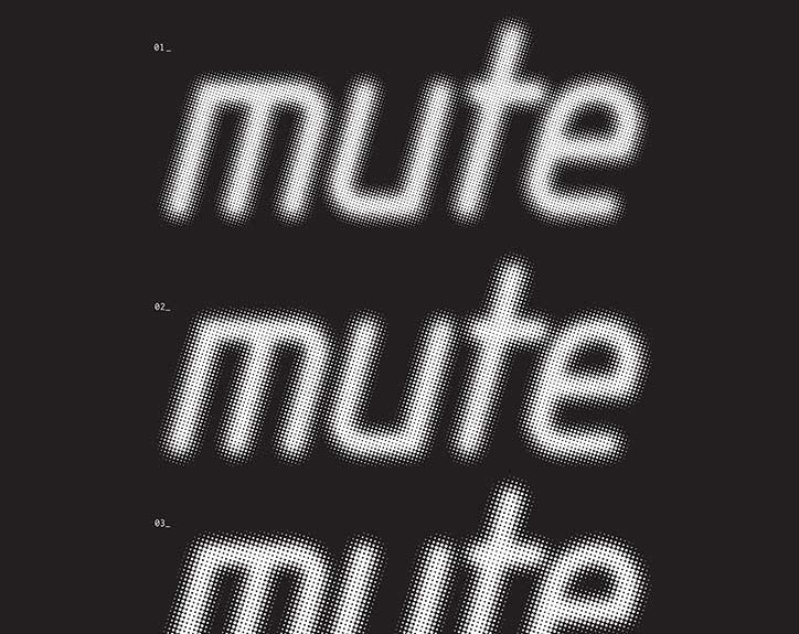
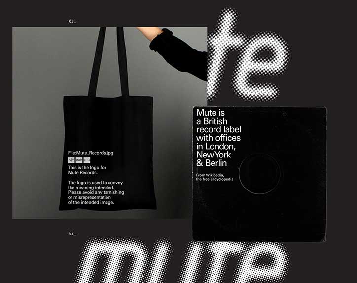
“Graphic design is dead. The kind I was introduced to is anyway,” so says graphic designer Sebastian Koseda. Since we first spoke to him back in 2012 when he had freshly graduated from Middlesex University (with a fistful of awards from CN, ISTD and D&AD), the graphic designer has graphed his way up the career ladder at Clerkenwell-based digital agency Feed London from junior design to creative director via an MA Visual Communication at the RCA. Among recent successes, Sebastian counts a typographic installation piece for Seoul typography biennale Typojanchi Biennale, the transformation of a discarded theatre into a cutting-edge space in Sheffield, the redesign of a record label Mute with Adrian Shaughnessy and saving the Southbank skate spot. We caught up with Sebastian for a closer look at his work.
You’ve gone from junior designer to creative director in five years. How did you get from there to here?
Most creatives by nature are, generally speaking, introverted people; I know I am, along with the people whose ideas I respect the most. This is something I had to condition myself out of by seeing the industry in a different light and realising that regardless of the work itself, this industry is all about the people. It’s all so human. In one day you are expected to put yourself in the mindset of a 40-year-old dog lover and a finance technology specialist and a metropolitan gym bunny. To be able to do this you have to keep your sensitivity sacred: that’s what makes us good at what we do and that’s what lets us have original ideas.
This cannot be compensated for by simply developing a professional veneer. You just get more comfortable with being out of your comfort zone. All you can really do is ask good questions and work very hard.
We are working with real people on projects that they really believe in. We create communication that champions human truth. The hand shaking, networking, relentless battle with your Google calendar is all to facilitate this search for truthiness, what people want, what people need, how people behave.
It’s important to note however, being sensitive/perceptive doesn’t make you special; you have to work extremely hard to get those ideas through. Even then, you can be proud of what you do but, in an agency of 150 brilliant people, you leave your ego at the door or you’ll be picking it up off the floor.
The only payoff is in the knowledge that you are fighting a good fight and the fact that you can pay your rent and occasionally eat in restaurants slightly nicer than Chicken Cottage.
Tell us about your practice…
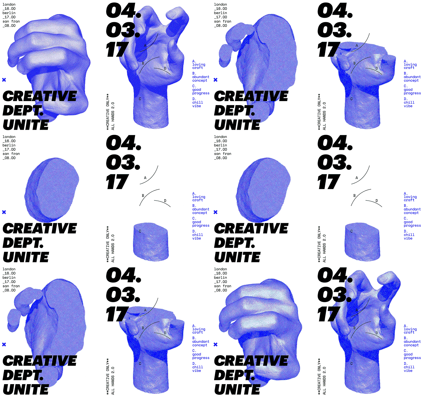
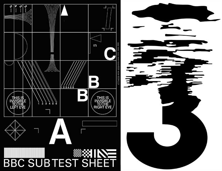
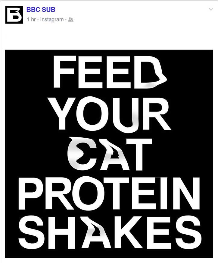
Using graphic design as a framework, my personal practice focuses on themes of ethics, authorship and identity. This way of thinking informs the commercial projects I work on with clients in the cultural sphere. In my practice, I aim to merge conventional graphic design with the satirical interrogation of contemporary culture.
In an age of digital saturation, visual communication has to be outstandingly attractive and, to some degree, follow the rules of attraction; It needs to be visually seductive and impactful to entice people to engage with it, then it has to have a great personality (content) for the right audience. If these are combined then the audience falls in love. This equilibrium is something I continue to strive to achieve in work and maybe why marketing guys love calling projects ‘sexy’ ten times a day.
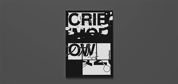
Sebastian Koseda: Barbican
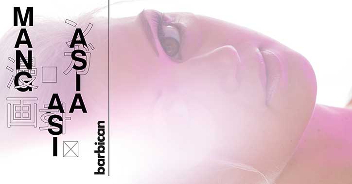
Sebastian Koseda: Barbican
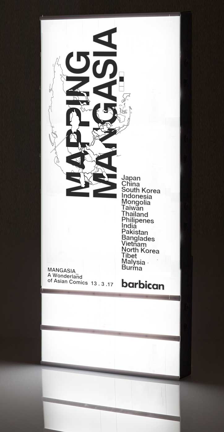
Sebastian Koseda: Barbican
Tell us about your most “sexy” recent project.
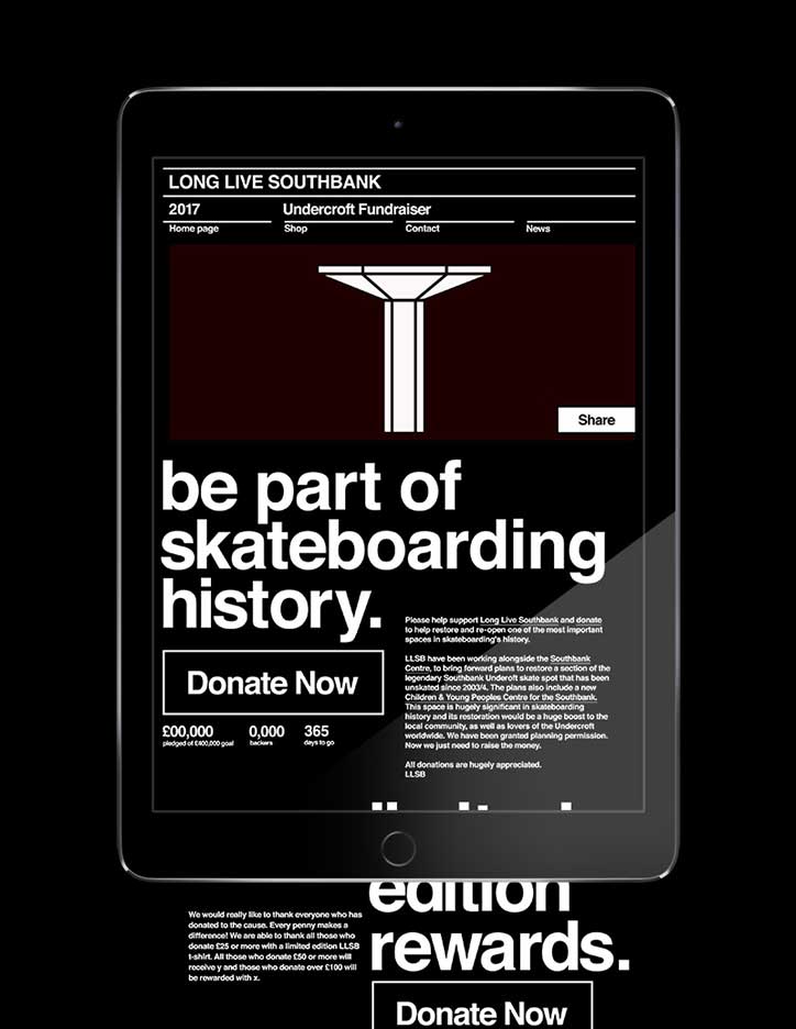
I have been working with the Long Live Southbank project to get their fundraiser campaign up and online. The Southbank undercroft skate spot has been a national skateboarding treasure since 1973 and has been under threat of being completely knocked down and replaced with retail space. The guys who run it, Paul and Louis, are great. They have hearts of gold and are truly community driven, open to ideas and have worked very hard to make this happen. Anyone that knows me knows that this is something close to my heart so that was great to be a part of. You can help raise funds to restore the spot “here”:http://www.llsbdonate.com
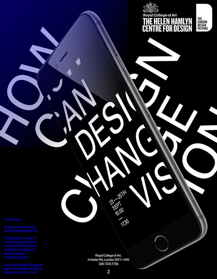
I have also been working with the Helen Hamlyn Centre at the Royal College of Art on a new brand direction for the Centre, which we are really excited about. They should be revealing it in the upcoming months.
What continues to excite you about working in graphic design in 2017?
Graphic design in 2017 is volatile but progressive, a hotbed of uncertainty that facilitates everything from the sublime to the incongruous. In this climate the only consistent is your critical position. The challenge is to evolve with the medium.
Some exciting points to me are…
—Post-automation graphic design will free up brainpower and create an explosion of experimentation. This is the biggest thing to happen to design since desktop publishing.
—How art-based thinking continues to translate digitally, and how graphic design can facilitate this.
—The shift from brands focusing on product to lifestyle to incongruity to attempting to highjack activism. The fact that the audience cannot be undermined by transparent formulas i.e ‘Big brand challenges social norms in new campaign’
—The fact I feel like the people I’m surrounded by are making the most beautiful work in the world right now.
—Non-linear UX innovations, challenging everything we ever thought we knew about optimized communication and completely overthrowing the codex format.
—The constant struggles of cut-through in such an oversaturated hyperculture and how ‘weird’ prevails time and time again, even over data-proven formulas.
—The future of money, the blockchain and what it looks like.
—Politically-charged memes, the fact that the public have always been hilarious but only now have the chance to publish it in a global showcase at 2:34am in their pants.
—Post-post rationalisation in an impact-first world, when mediocre ideas can no longer be validated by seductive David Attenborough style spiel.
—The age of the creative polymath and how “multidisciplinary” needn’t be stated in a studio’s manifesto, it is now expected.
I’m not so excited about…
—When a school becomes a class, seeing how the government deals with art education as being a ‘luxury’ and the repercussion of the ‘art elite’ feeding back into itself creating a potentially sterile mirror culture.
—How will we avoid institutionalised elitism and work around the rejection of working class talent that will never have the money to buy a platform to be heard? A tragedy because they have a lot, if not the most, to say.
Sebastian Koseda
Sebastian Koseda
Sebastian Koseda
Sebastian Koseda
Sebastian Koseda
Sebastian Koseda
Sebastian Koseda
Sebastian Koseda
Sebastian Koseda
Sebastian Koseda

Sebastian Koseda
Sebastian Koseda
Share Article
Further Info
About the Author
—
Bryony joined It's Nice That as Deputy Editor in August 2016, following roles at Mother, Secret Cinema, LAW, Rollacoaster and Wonderland. She later became Acting Editor at It's Nice That, before leaving in late 2018.



