Simon Bent of Australian foundry Metis on taking type to the limits of legibility
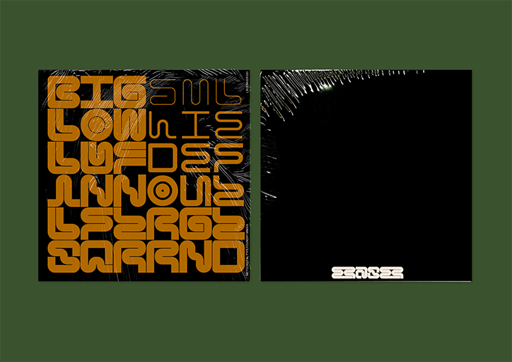
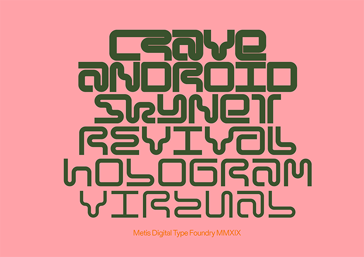
“Our mission is to develop typefaces that push ourselves, and that push boundaries,” says Simon Bent of Melbourne-based type foundry Metis. From the heavy Dot19 to shape-tastic Geometer Regular, Metis’ typefaces blur the lines between creative expression and practicality. “You have to be creative with how you apply some of them in practice because of how far we push the limits of legibility, but that’s something we can live with,” Simon tells It’s Nice That.
Simon and his colleagues at studio io set up the foundry last year after amassing a huge number of complete typefaces after four years in business. “We’d been tossing around the idea of a type foundry for a while, but it wasn’t until we listed out all of the typefaces that we saw how much we already had up our sleeves and were motivated to make better use of it,” says Simon. Metis now serves two purposes: a way to make use of unused or dormant typefaces either from successful projects or those that didn’t make the cut, and as a creative outlet for the studio. “It’s a creative space that’s free from rules and client feedback, where we don’t have to play it safe,” Simon says.
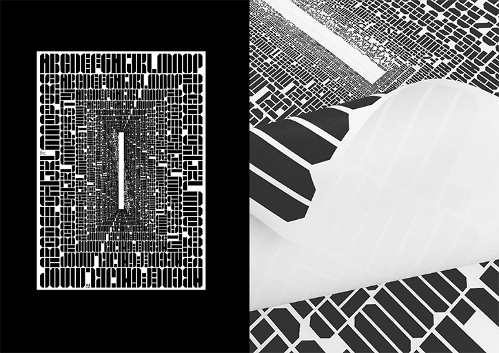
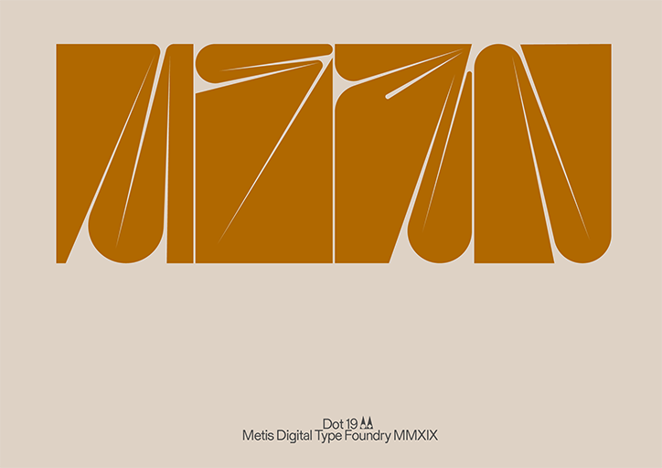
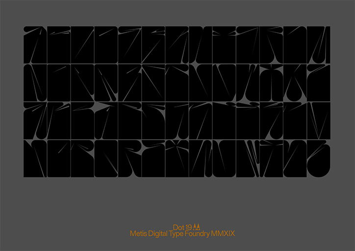
One particularly un-safe typeface is Dot19, a reinterpretation of 70s display typefaces, inspired by the work of psychedelic artists Victor Moscoso, Wes Wilson and Bonnie MacLean. Here each letter was created from a block with the same dimensions, carving away negative space to give a subtle indication of its meaning. “Creation by subtraction,” says Simon. Interestingly, the simpler, symmetrical letters were the hardest to work into the system. “T, H and X were a pain,” says Simon. “The system really relies on twisting forms to the limits and these letterforms were far more easily broken in the experimentation and became completely unrecognisable early on.”
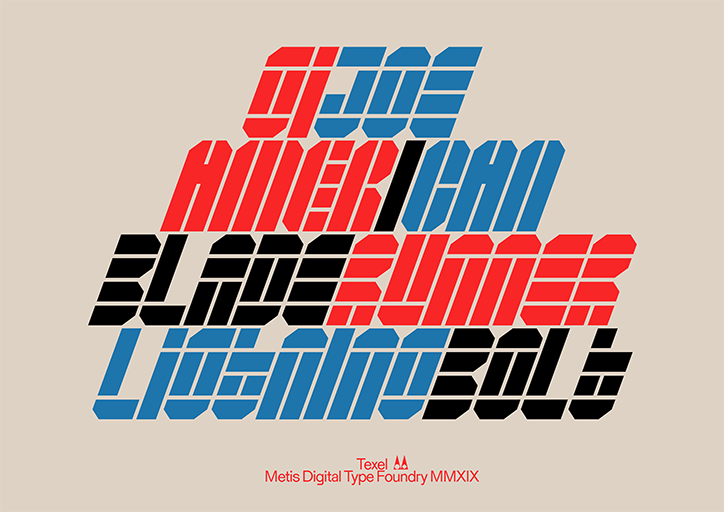
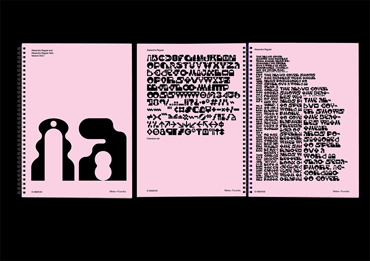
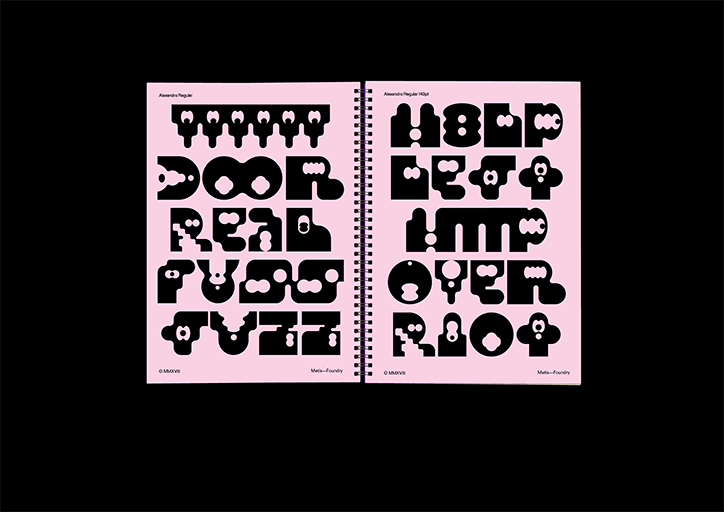
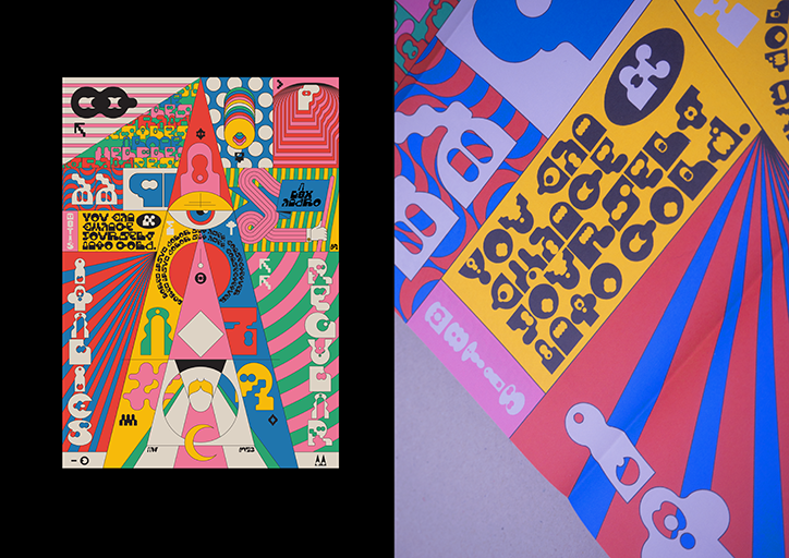
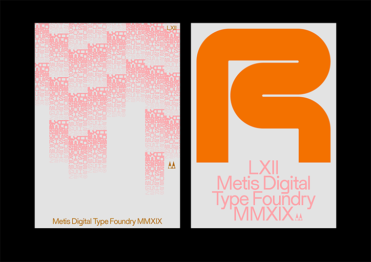
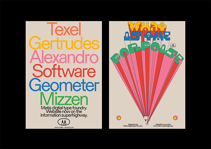
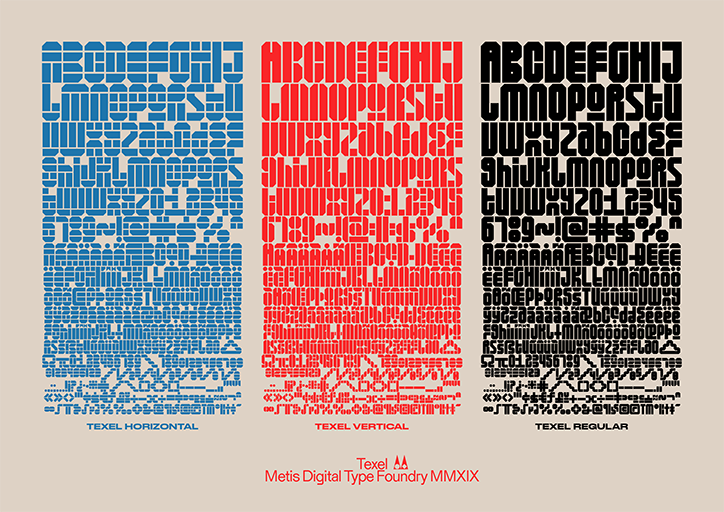
Other recent typefaces include brutalist stencil typeface Texel, grid-based variable typeface LXII and Alexandro, a wiggly Jodorowsky-inspired font that “broke so many rules of traditional typography because of its playful nature”. The latter was used by Wade Jeffree and Leta Sobierajski in their recent A/D/O exhibition. “They blew up some of the letterforms to about 2m tall and coated them in mesmerising patterns – super satisfying.”
Simon himself has long been interested in challenging typefaces, finding inspiration in black metal band logos, complex graffiti and psychedelic posters of the 60s. When quizzed about whether type needs to be legible, he says: “From a creative standpoint, no. A big motivator for this project is to provide an outlet for experimentation. But looking at it practically, then yes, but it really depends on context.”
For Simon, Metis-designed typefaces will often be used in contexts where they only tell part of a story. “Much like a logo only tells part of a brand,” he says. “You can’t hear what a band sounds like from looking at a photograph or understand what a book is about by looking at the cover illustration. Everything from page layout to the words themselves will impact on legibility, but at the end of the day, legibility is down to who is looking. If the reader is motivated enough, they’ll find a way to read it.”
Metis Foundry
Metis Foundry
Metis Foundry
Metis Foundry
Metis Foundry
Metis Foundry
Metis Foundry
Metis Foundry
Metis Foundry
Metis Foundry
Metis Foundry
Share Article
Further Info
About the Author
—
Laura is a London-based arts journalist who has been working for It’s Nice That on a freelance basis since 2016.