Graphic design: Sinem Erkas' jazzy typefaces for F Scott Fitzgerald covers
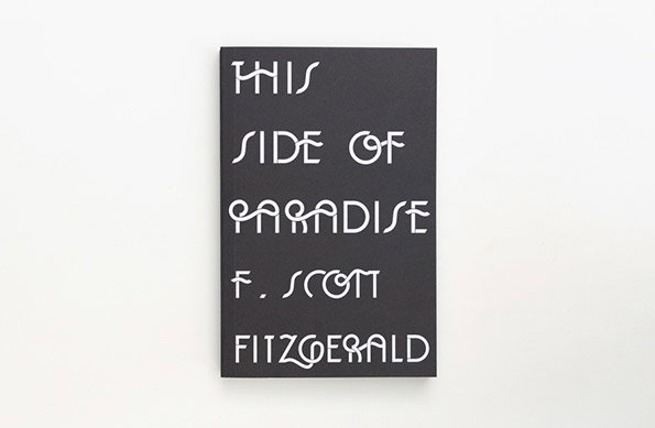
There’s few authors who evoke such fixed aesthetic connotations as F Scott Fitzgerald. The American author (whose prose is so rhythmic that Hunter S Thompson taught himself to write by retyping his novels) is synonymous with a stylish Jazz Age visual vernacular, and graphic designer Sinem Erkas knew to work with this when it came to producing new covers for his books.
She produced six covers in total for publishers Orion, including famous titles like The Great Gatsby and Tender Is The Night, and created a bespoke typeface for each inspired by the particular publication. So the font used on For The Last Tycoon includes various half-formed letters to reflect the fact the novel was unfinished when the author died, while The Beautiful And The Damned’s typeface is informed by “the heavily geometric shapes on the cafe shop fronts and design paraphernalia.”
You can read much more over on the Waterstone’s blog if the fancy takes you, but either way I’m sure you’ll agree the results are superb.
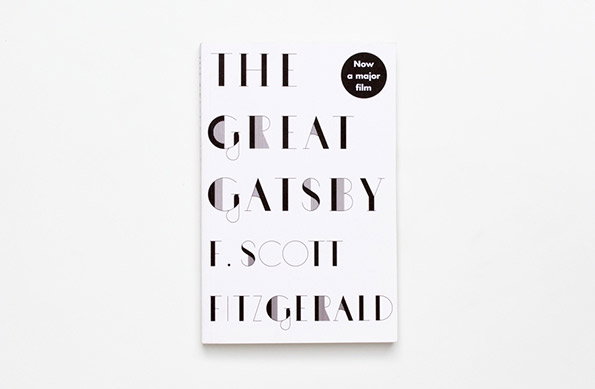
Sinem Erkas: F Scott Fitzgerald for Orion
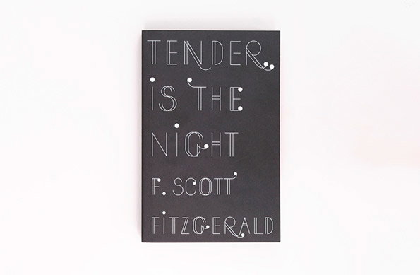
Sinem Erkas: F Scott Fitzgerald for Orion
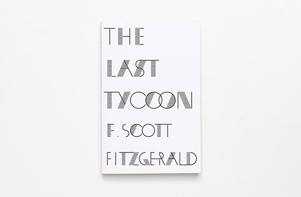
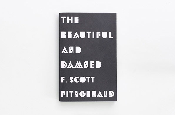
Sinem Erkas: F Scott Fitzgerald for Orion
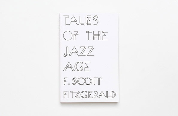
Sinem Erkas: F Scott Fitzgerald for Orion
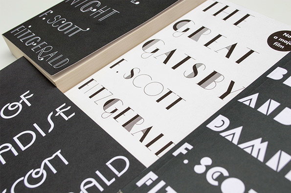
Sinem Erkas: F Scott Fitzgerald for Orion
Share Article
Further Info
About the Author
—
Rob Alderson is a freelance writer, editor and strategist. He was previously editor-in-chief of It’s Nice That and WePresent, and editor of Design Week. He publishes the newsletter Undo, which tries to make sense of how AI is changing design work, the design process and the design industry.