Launch Recite Me assistive technology
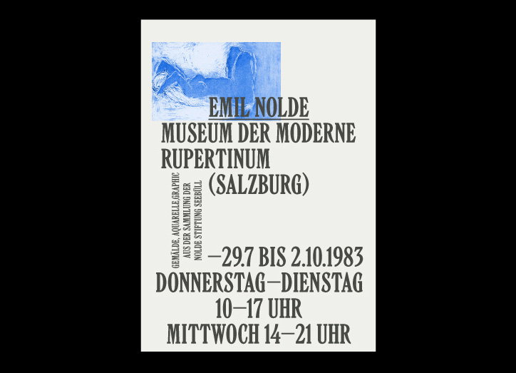
An exhibition poster for Emil Nolde featuring a blue abstract painting at the top. Bold text reads “Emil Nolde Museum der Moderne Rupertinum (Salzburg)” and lists dates from “29.7 bis 2.10.1983”.

Designer Slava Kirilenko breathes character into his type-focused projects

—
Date
11 April 2017

Kazakhstanian designer Slava Kirilenko’s portfolio is littered with typefaces and specimens that showcase his knack for evoking moods and personality through letterforms. Often working with fellow designer Gayaneh Bagdasryan, Slava’s work is minimalist and no frills in its approach, yet the designer attaches character and pizzazz to each of his typefaces, writing short, flamboyant descriptions to sit alongside them.

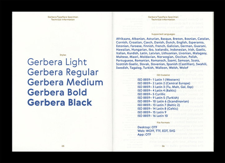
For example, for his typeface Wermut, Slava describes the serif font as “an intoxicating blend of rare flavours” and “bitter and thorny at first glance”. Equally as juicy is Gerbera, which Slava sees as “at once hip and quaint, clear yet idiosyncratic, restrained but sensual”. This passion for type and all its quirks is great to see communicated through a portfolio, and that breathes life into Slava’s projects. The accompanying type specimens are well-considered and detailed, while also sensitively alluding to the traits mentioned in the descriptions.
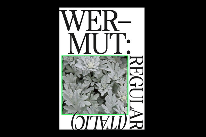
A typographic poster featuring the word “WERMUT:” in a bold serif font. Below the text is a photograph of silvery-grey foliage, flanked by the word “REGULAR” written vertically.
Above

Slava Kirilenko

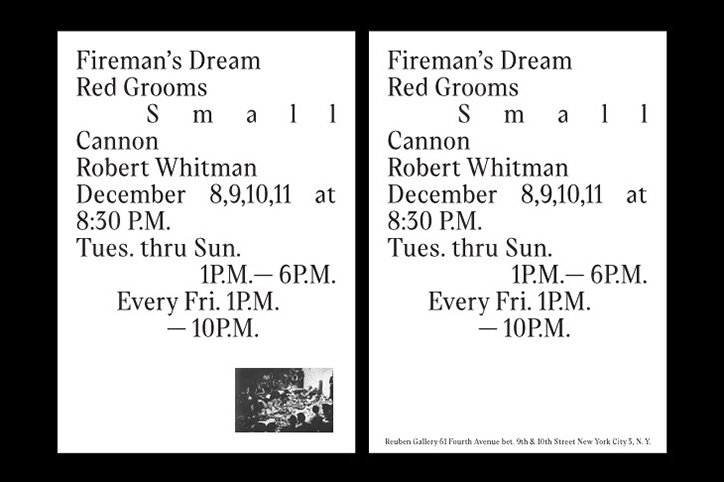
Two identical black and white posters list a series of events. The text reads “Fireman’s Dream”, “Red Grooms”, “Small”, “Cannon” and “Robert Whitman”, with dates in December and opening times.
Above

Slava Kirilenko

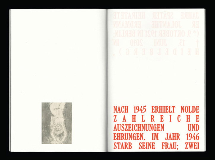
An open book with a small, monochromatic illustration of a figure on the left page. The right page features bold red text that reads “NACH 1945 ERHIELT NOLDE ZAHLREICHE AUSZEICHNUNGEN UND EHRUNGEN. IM JAHR 1946 STARB SEINE FRAU; ZWEI”.
Above

Slava Kirilenko

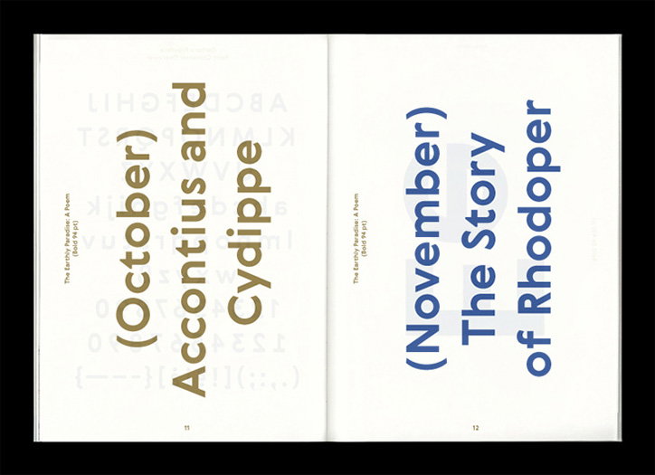
An open book showing two pages of bold, vertical typography. The left page reads “(October) Accontius and Cydippe” in gold, and the right reads “(November) The Story of Rhodoper” in blue.
Above

Slava Kirilenko

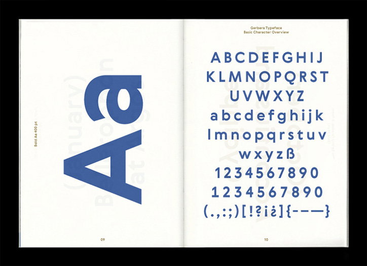
An open specimen book showing the “Gerbera Typeface”. The left page features a large, bold blue “Aa”, while the right page displays the full alphabet, numbers and punctuation.
Above

Slava Kirilenko

An open specimen book for the Gerbera typeface. The left page lists the styles “Gerbera Light”, “Gerbera Regular”, “Gerbera Medium”, “Gerbera Bold” and “Gerbera Black”. The right page lists supported languages and ISO codelist technical information.
Above

Slava Kirilenko

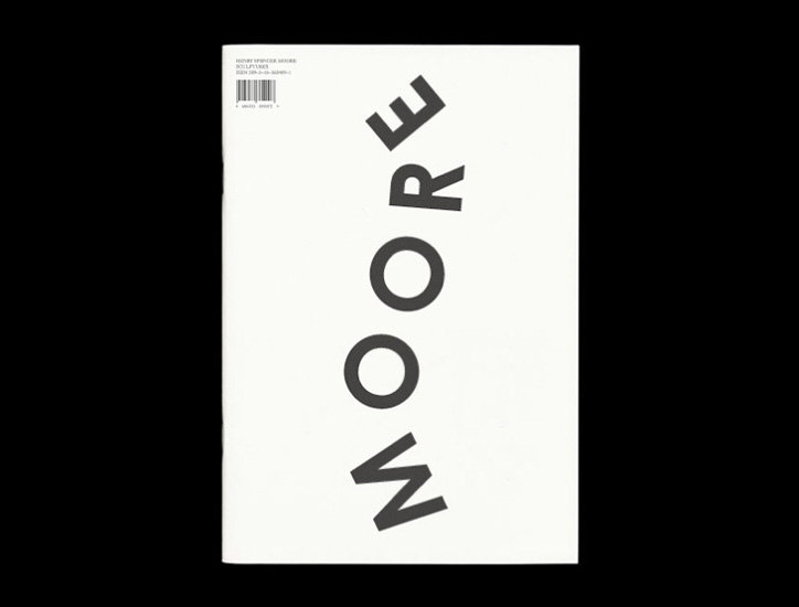
The white cover of a book features the word “MOORE” printed in bold, black capital letters. The text is arranged vertically and curves slightly across the centre of the page.
Above

Slava Kirilenko

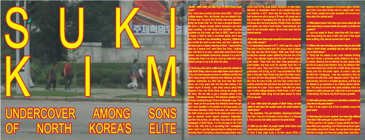
A graphic layout featuring a photograph of people walking along a city street, overlaid with large yellow text that reads “SUKIM”. Below this, a headline reads “UNDERCOVER AMONG SONS OF NORTH KOREA’S ELITE”. The right side of the image is filled with columns of interview text and questions highlighted in yellow.
Above

Slava Kirilenko

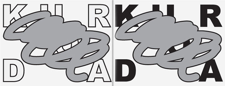
Two versions of a graphic design featuring the words “KUR” and “DA” in a bold sans-serif typeface. A grey, scribbled loop is laid over the text, partially obscuring the letters.
Above

Slava Kirilenko

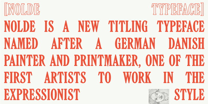
A typographic specimen in red text on a white background. It reads “Nolde Typeface” and explains that the font is named after a German Danish expressionist painter.
Above

Slava Kirilenko

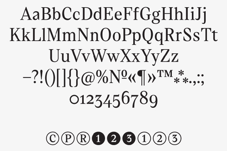
A specimen of a serif typeface showing the full alphabet in upper and lower case. Below the letters are various punctuation marks, numbers from 0 to 9, and a series of circled characters.
Above

Slava Kirilenko

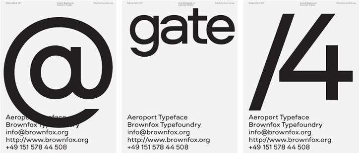
Three minimalist posters in black and white. Each features a large graphic element – an “@” symbol, the word “gate”, and “/4” – above the text “Aeroport Typeface” and contact details for Brownfox Typefoundry.
Above

Slava Kirilenko

Share Article

About the Author

Rebecca Fulleylove

—

Rebecca Fulleylove is a freelance writer and editor specialising in art, design and culture. She is also senior writer at Creative Review, having previously worked at Elephant, Google Arts & Culture, and It’s Nice That.


It's Nice That Newsletters

Fancy a bit of It's Nice That in your inbox? Sign up to our newsletters and we'll keep you in the loop with everything good going on in the creative world.