Launch Recite Me assistive technology
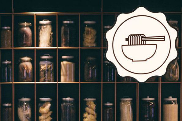
A white, scalloped sign featuring a line drawing of a bowl of noodles hangs in the foreground. Behind it, rows of glass jars containing various preserved ingredients sit on dark shelves.

Warning! You will salivate heavily at identity developed for restaurant brand

—
Date
17 May 2013

You’re probably thinking; “Does graphic design really have the ability to make me drool?” The answer is yes, yes it does. And this is currently due to Somewhere Else, a Singaporean graphic design studio and their rebranding for Foodology; a restaurant made up of nine different food stations so the idea was to create a flexible identity that can morph to fit their multi-faceted personality. Full of simple, effective graphics tied together with a traditional stamp symbol, and finished off with touch of vintage – this is tasty graphic design in its most literal form.
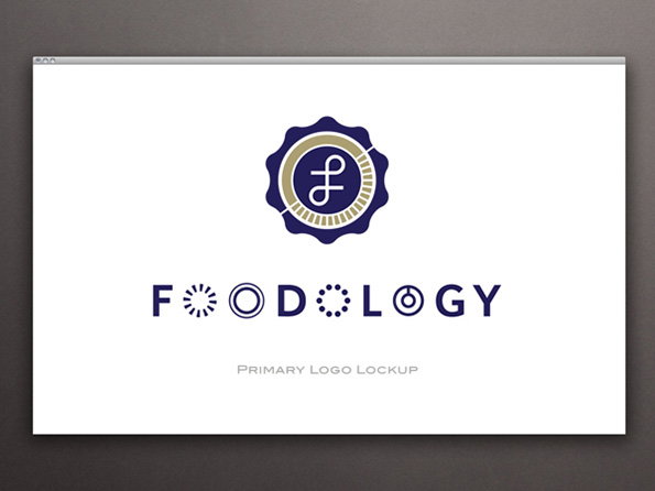
A logo for “Foodology” featuring a dark blue scalloped seal with a gold inner circle and a stylised “F”. Below the seal, the brand name is written in a dark blue sans-serif typeface with geometric shapes replacing some letters.
Above

Somewhere Else: Foodology

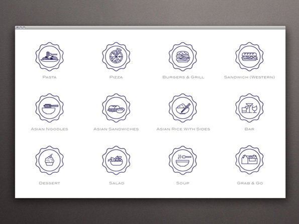
A grid of 12 blue line icons for a food menu, each enclosed in a scalloped circular border. Labels below the icons include “Pasta”, “Pizza”, “Burgers & Grill”, “Asian Noodles” and “Dessert”.
Above

Somewhere Else: Foodology

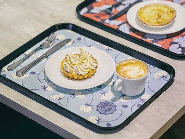
A lemon meringue tart on a white plate sits on a blue floral tray. Beside it is a small white cup of coffee with latte art.
Above

Somewhere Else: Foodology

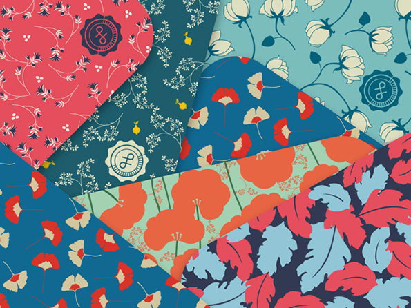
A collage of five floral fabric patterns in various colours. The designs feature stylised blooms and leaves in red, blue, green and cream, each accented with a small circular logo.
Above

Somewhere Else: Foodology

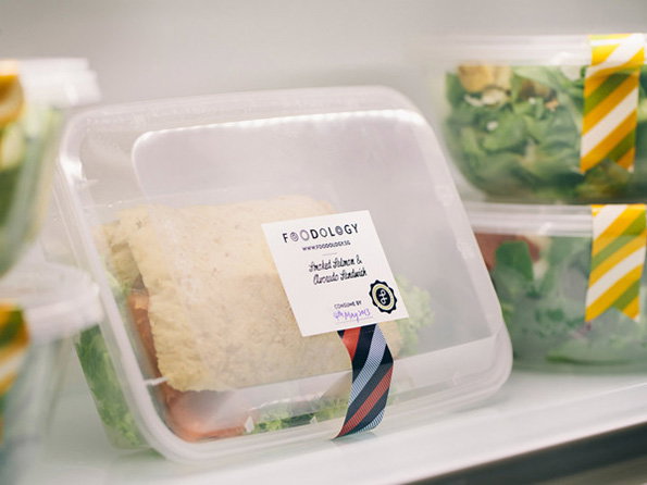
A sandwich in a clear plastic container sits on a white shelf. A white label on the front reads “Foodology” and “Smoked Salmon & Avocado Sandwich”.
Above

Somewhere Else: Foodology

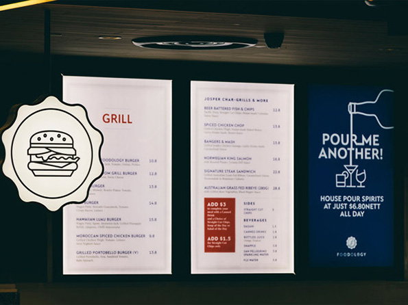
Three menu boards hang against a dark wall. The first two are white with red and black text listing “Grill” and “Josper Char-Grills & More” options, while the third is a blue poster that reads “Pour me another!”.
Above

Somewhere Else: Foodology

Share Article

About the Author

Holly Wilkins

—

It's Nice That Newsletters

Fancy a bit of It's Nice That in your inbox? Sign up to our newsletters and we'll keep you in the loop with everything good going on in the creative world.