“I see it as our duty as designers to educate”: Spin on how it’s working with purposeful clients
Design director and partner at Spin, Jonas Zieher, talks us through two recent projects which demonstrate the studio’s interest in sustainability.
Share
For the last 20 years, Spin has established itself as one of the major mainstays of the London creative design scene. Naturally, its clientele list boasts an impressive wealth of clients that range from arts and entertainment to brand identities, to motion graphics and electronics. But, it’s the studio’s recent endeavours with Smile Plastics and Design Museum that has piqued our interest. Overseen by design director and partner of the studio, Jonas Zieher, these two projects speak to Spin’s evolving commitment to taking on projects that help push forward the conversation about climate change in any way it can.
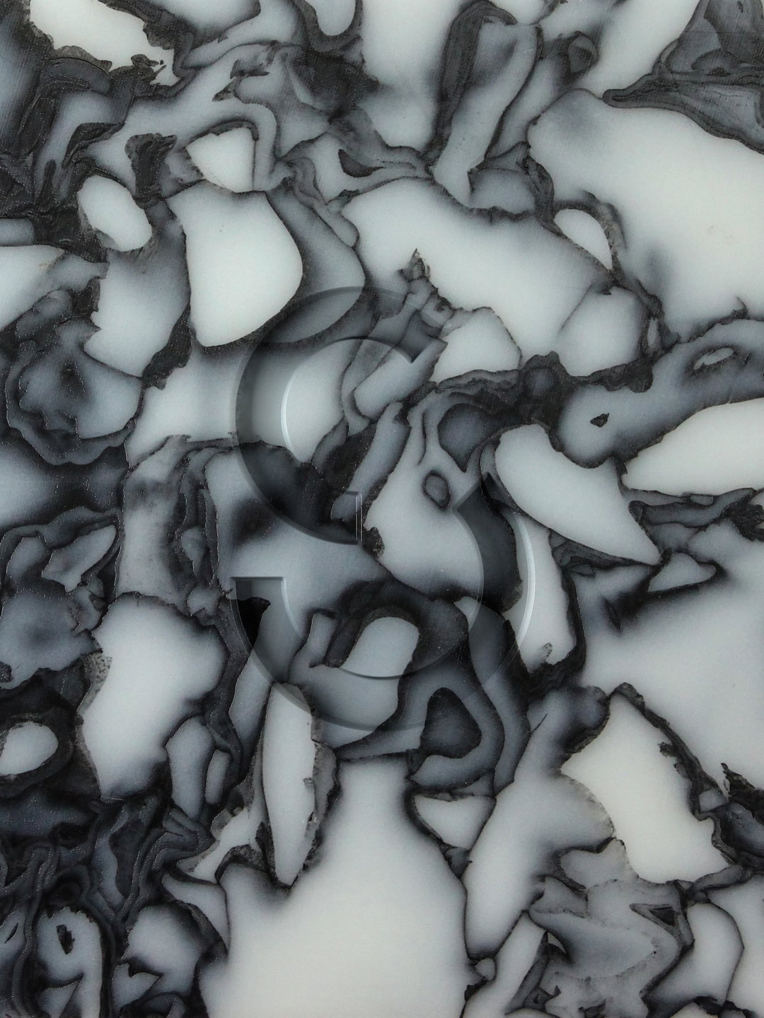
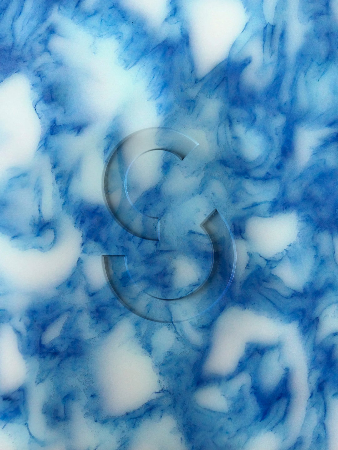
Spin’s work specifically with Smile Plastics is a shining example of creatives being a valuable asset to the material practice of sustainability. Smile Plastics, founded by Rosalie McMillan and Adam Fairweather, is a materials and manufacturing house that takes “waste plastics, and other materials traditionally classed as waste, and transforms them through a unique process into large scale, solid surface panels that are used in interior and product design,” Jonas tells It’s Nice That. “They’ve enjoyed great success with their products and have outgrown their original identity, which was made ad hoc when the company was founded.” The company’s innovative waste usage and positively uplifting commitment to the mission are what attracted Jonas and Spin in the first place. “They have a lovely attitude towards things like sustainability, craftsmanship and an enthusiasm to change the world for the better,” Jonas tells us. “We developed an identity that reflects these ideas.”

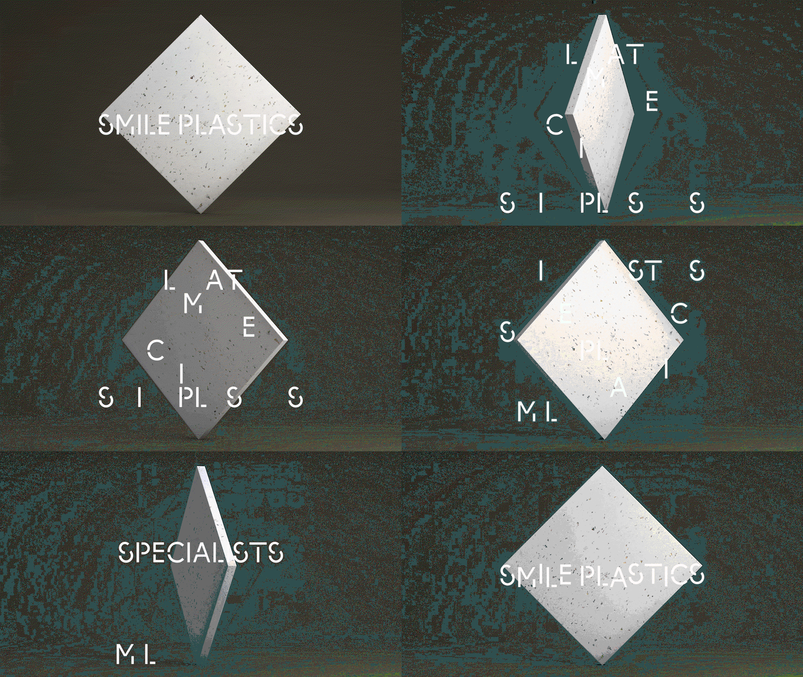
Spin: Smile Plastics (Copyright © Spin, 2021)
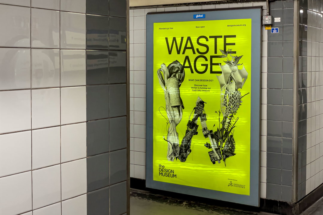
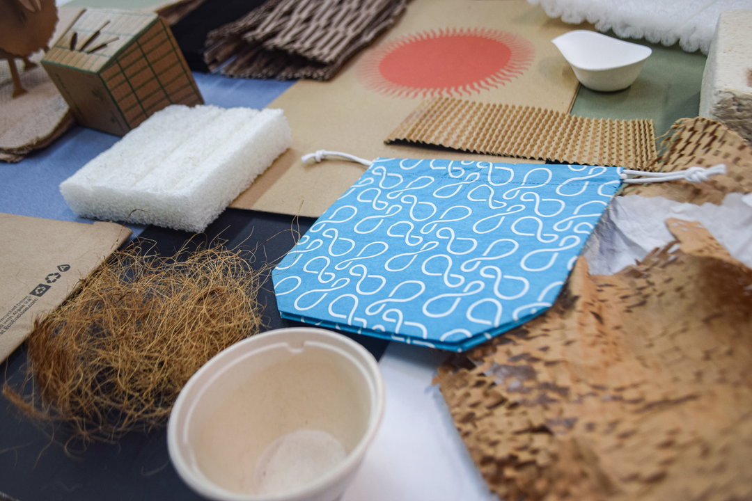
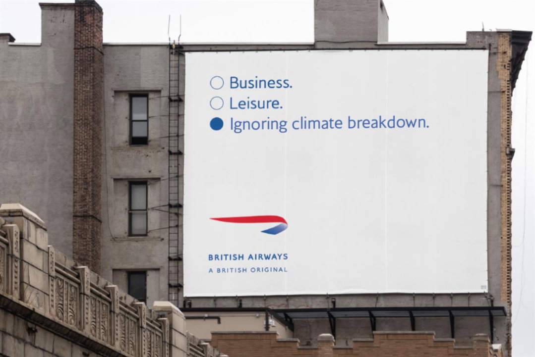
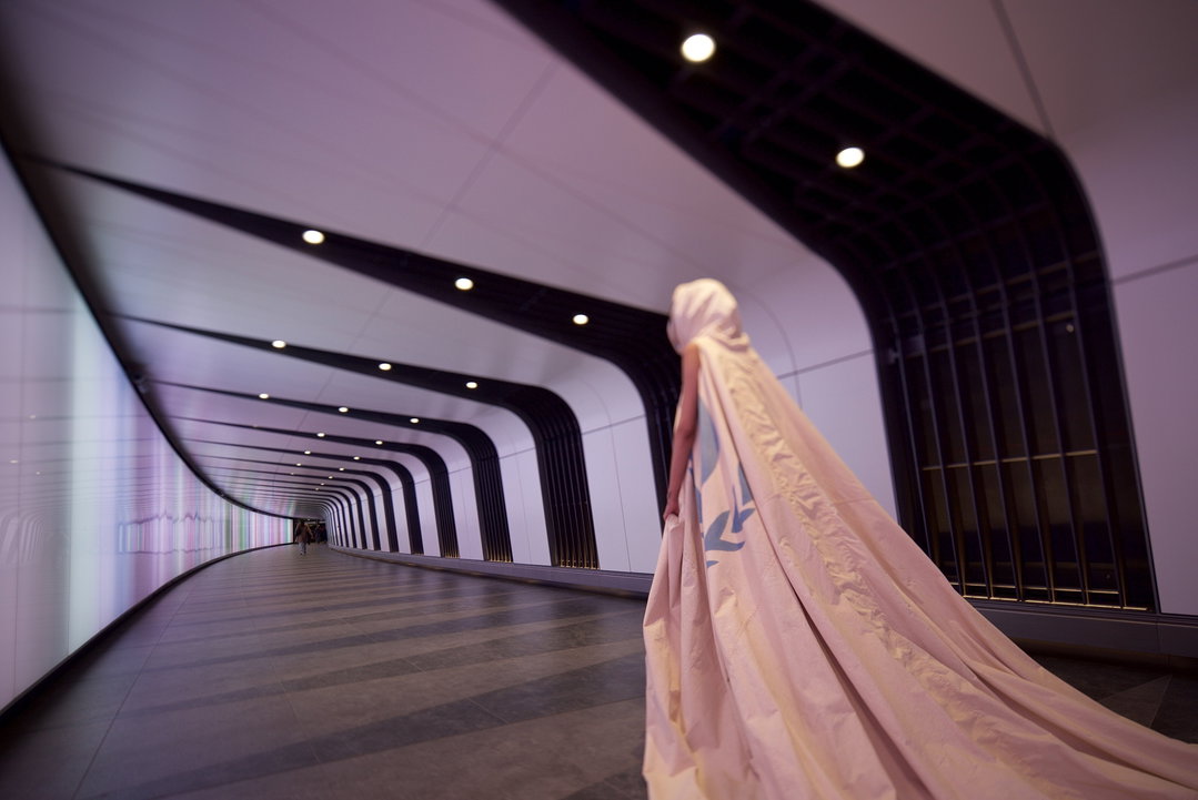
Spin: Waste Age (Copyright © Spin, 2021)
On the brand identity, it’s clear this has worked. It’s succinct, to the point, and still has a bit of character unique to them. “For the cyclical ‘S’ mark we looked at the idea of circularity in a very literal way and started to experiment with circles to create letterforms,” Jonas explains. “We chopped them up, moved them around, tried different configurations and finally found a satisfying configuration that conveys the idea of circularity, but also reads clearly as a letter ‘S’.” From there, Spin made a bespoke typeface that discreetly represents Smile’s ethos. “They focus on single-use plastic packaging and other materials that would usually find their way to landfill, and disrupt unsustainable industrial ecosystems by transforming them to circular economy materials, and the panels are 100 per cent recycled, but also 100 per cent recyclable,” Jonas says, drawing links back to the cyclic nature of the brand identity. “They encourage us to value our resources and waste less and this is an idea that resonates a lot with me, so it was very attractive to be able to support Smile Plastics in that endeavour.”
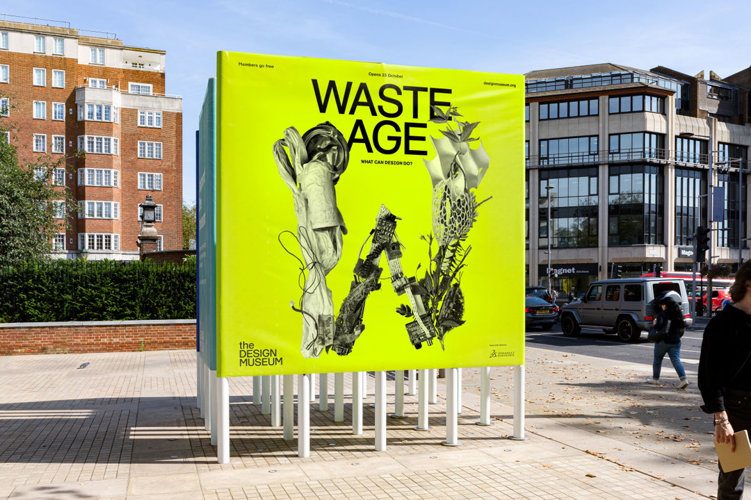
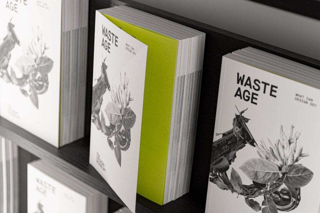
Looking at Spin’s work with the exhibition Waste Age at the Design Museum, we see how Spin utilises a completely different aesthetic and identity package to expand on similar ideas. “If you try to define an age by its predominant material – the Stone Age, the Bronze Age, the Steam Age, etc – then what material most defines the current era? Gemma Curtin, the show’s curator, suggests we are living in the age of waste,” Jonas says. “The desperate situation we find ourselves in is at least in part a design problem, and the exhibition shows beautifully how designers are working on fixing this problem.” Spin created the identity, signage, poster campaign, infographics, and animations for Waste Age, and along the way made sure, as an agency, it was avoiding as much waste as possible. “We selected recycled and recyclable materials, used handheld printers to print the exhibition signage instead of using vinyl lettering, and went for a stripped-back and raw, almost factual design,” Jonas explains. “In the end, it was a very challenging but hugely rewarding project and we’re proud to have contributed to a project that is taking the lead in providing a profound, beautiful and comprehensible road map out of the mess that we are in.”
Jonas, much like other creatives in the design industry right now, still feels like there is more to be done. “Looking at the opening statements for the Cop26 conference a couple of days ago, it strikes me that everyone has understood the urgency of the topic, but there’s still not enough action being taken,” he tells us. “As a designer, I’m faced with how resistant people can be to change on a daily basis, and in a way, I see it as our duty as designers to educate and to be as convincing and persuasive as possible to take our clients and collaborators on that journey.”
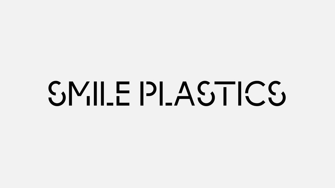
Spin: Smile Plastics (Copyright © Spin, 2021)
Spin: Smile Plastics (Copyright © Spin, 2021)
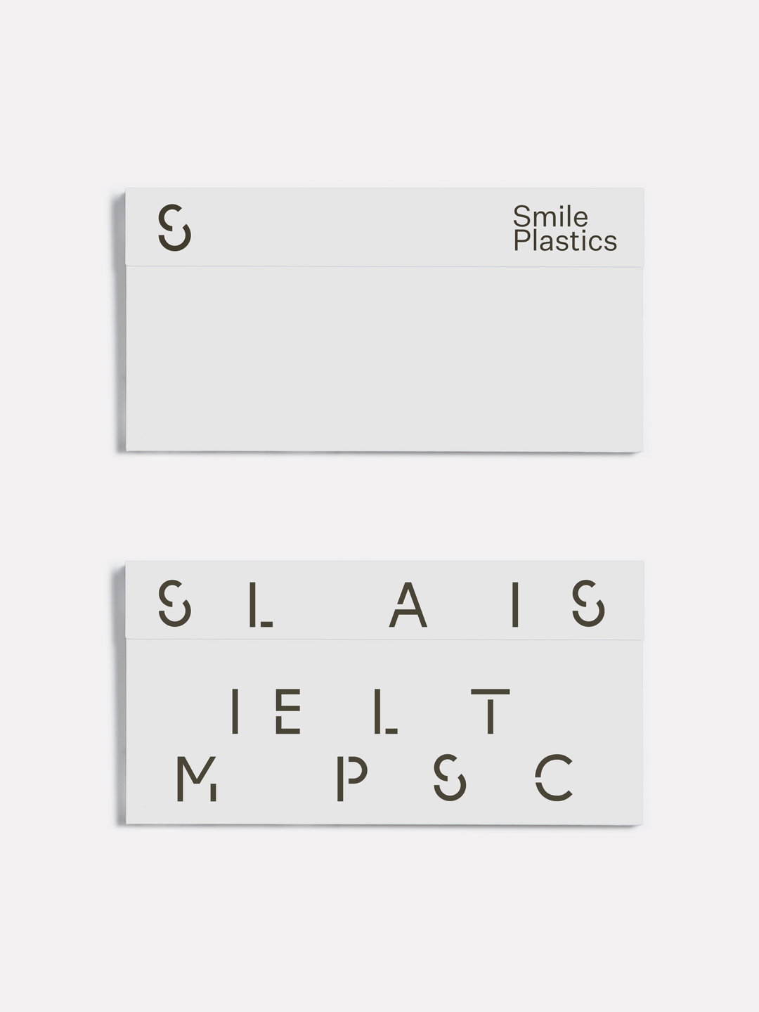
Spin: Smile Plastics (Copyright © Spin, 2021)
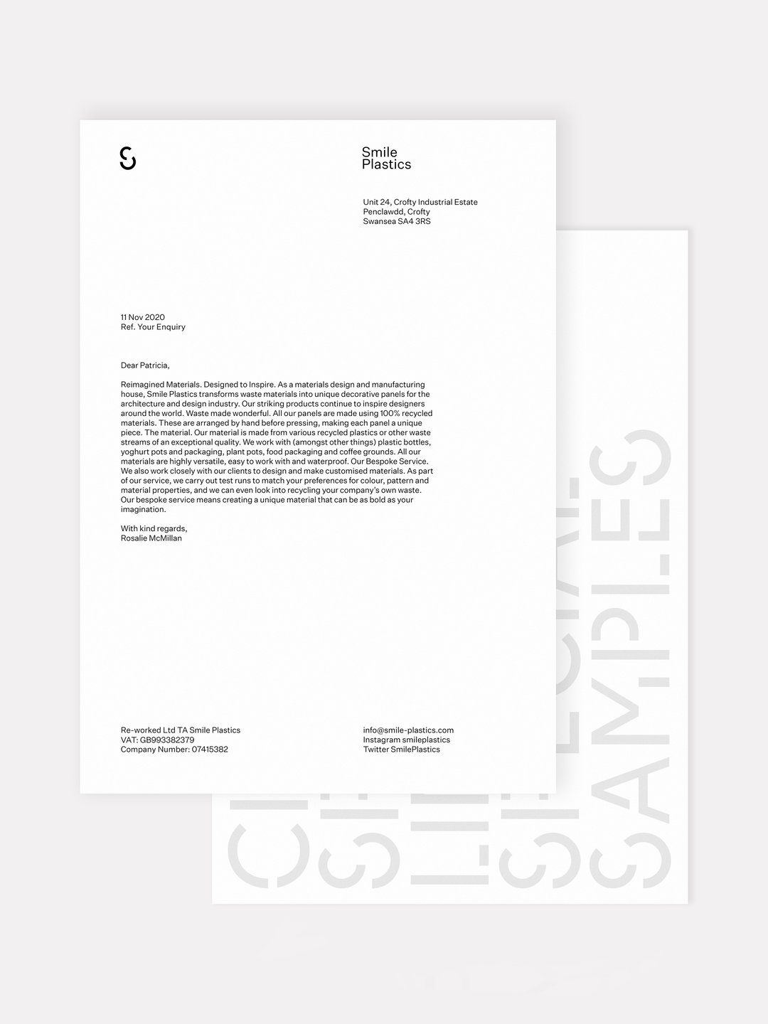
Spin: Smile Plastics (Copyright © Spin, 2021)
Spin: Smile Plastics (Copyright © Spin, 2021)
Spin: Smile Plastics (Copyright © Spin, 2021)
Spin: Smile Plastics (Copyright © Spin, 2021)
Spin: Waste Age (Copyright © Spin, 2021)
Spin: Waste Age (Copyright © Spin, 2021)
Spin: Waste Age (Copyright © Spin, 2021)
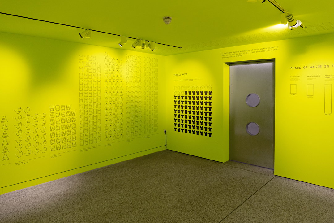
Spin: Waste Age (Copyright © Spin, 2021)
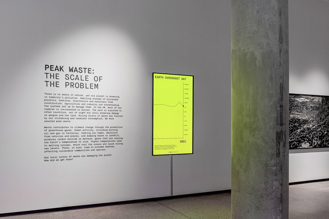
Spin: Waste Age (Copyright © Spin, 2021)

Response & Responsibility – Cop26
During the next two weeks, over 120 world leaders are meeting in Glasgow to agree on the actions needed to pull the earth back from the brink of a climate catastrophe. The most important conference of our lifetime, in response, we are exploring creative responses to the climate crisis throughout the duration of Cop26.
Hero Header
Spin: Smile Plastics (Copyright © Spin, 2021)
Share Article
Further Info
About the Author
—
Joey is a freelance design, arts and culture writer based in London. They were part of the It’s Nice That team as editorial assistant in 2021, after graduating from King’s College, London. Previously, Joey worked as a writer for numerous fashion and art publications, such as HERO Magazine, Dazed, and Candy Transversal.