



Launch Recite Me assistive technology
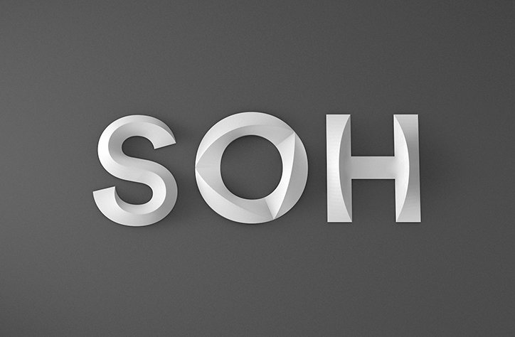
A 3D render of the letters “SOH” in a matte white, sculptural style. The letters are set against a plain dark grey background.

Interbrand Australia’s monochromatic rebrand of the Sydney Opera House

—
Date
25 February 2016

Interbrand Australia’s work with the Sydney Opera House (SOH) started back in 2014, when the institution needed help in attracting an audience. The opera house found people were visiting, but few were actually going inside. After being set the brief to change the perception of the SOH, the Australian agency aimed to created a visual language that lived up to the iconic building.

Interbrand Australia wanted to inspire conversation around culture and art and help the audience to understand that the building is more than just opera. This brand idea was then translated into a “sculptural form language” to give this shift an identity that could be applied to marketing materials. Acknowledging its unique shape, a compact and simple graphic mimics the SOH’s sails to form a neat logo. The typeface, called Utzon, was designed with Studio Laurenz Brunner and reflects the contours of the building itself. Together they make a subtle and elegant identity, by using monochromatic colours inspired by the building’s exterior. However, Stand Apart has made sure it’s adaptable by letting the performances and shows influence imagery and illustrations that also appear on posters and pamphlets.   
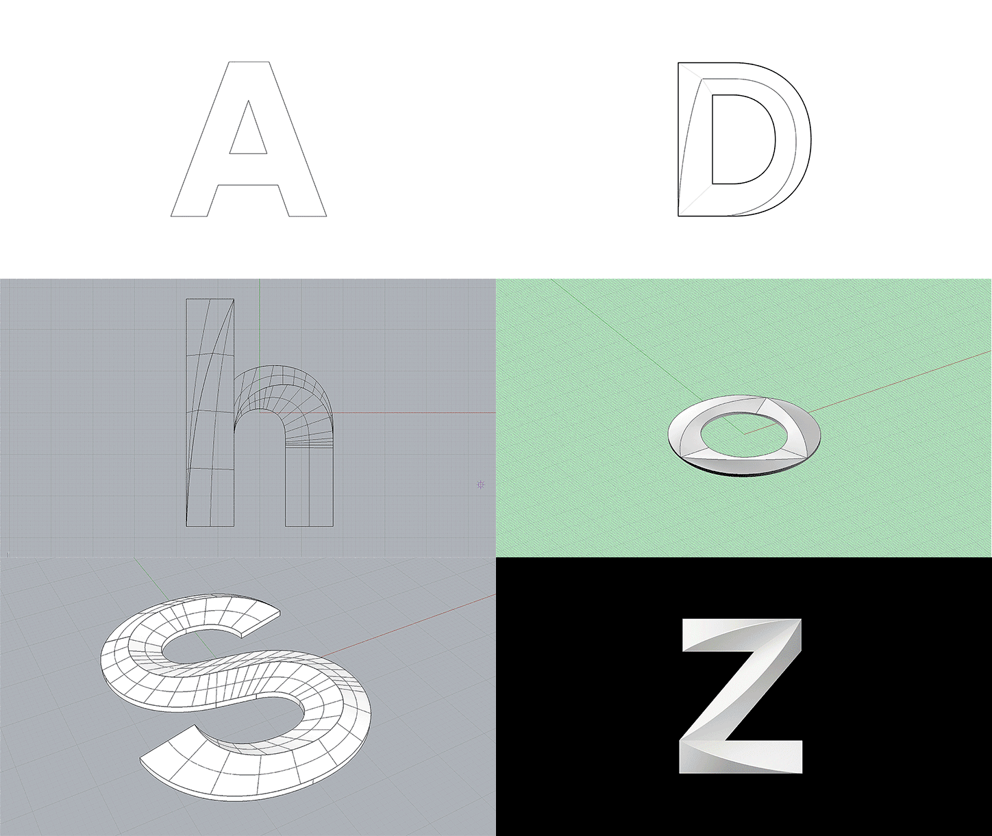
An animation in which a 3D wireframe of a circle morphs through various geometric stages. The shapes evolve into a white, sculpted “W” and then a “Z” against a black background.
Above

Interbrand Australia: Sydney Opera House
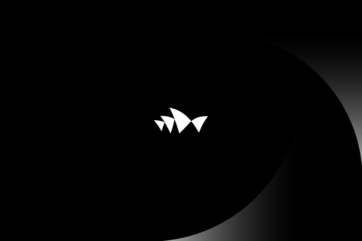
A small, white abstract logo consisting of three jagged, peak-like shapes sits in the centre of a black background. A soft, grey curved gradient arcs across the right side of the frame.
Above

Interbrand Australia: Sydney Opera House
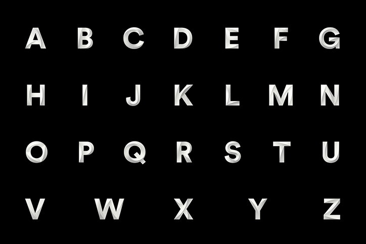
A 3D render of the alphabet from A to Z in a bold, sans-serif typeface. The white letters have a metallic, sculpted appearance and are set against a plain black background.
Above

Interbrand Australia: Sydney Opera House
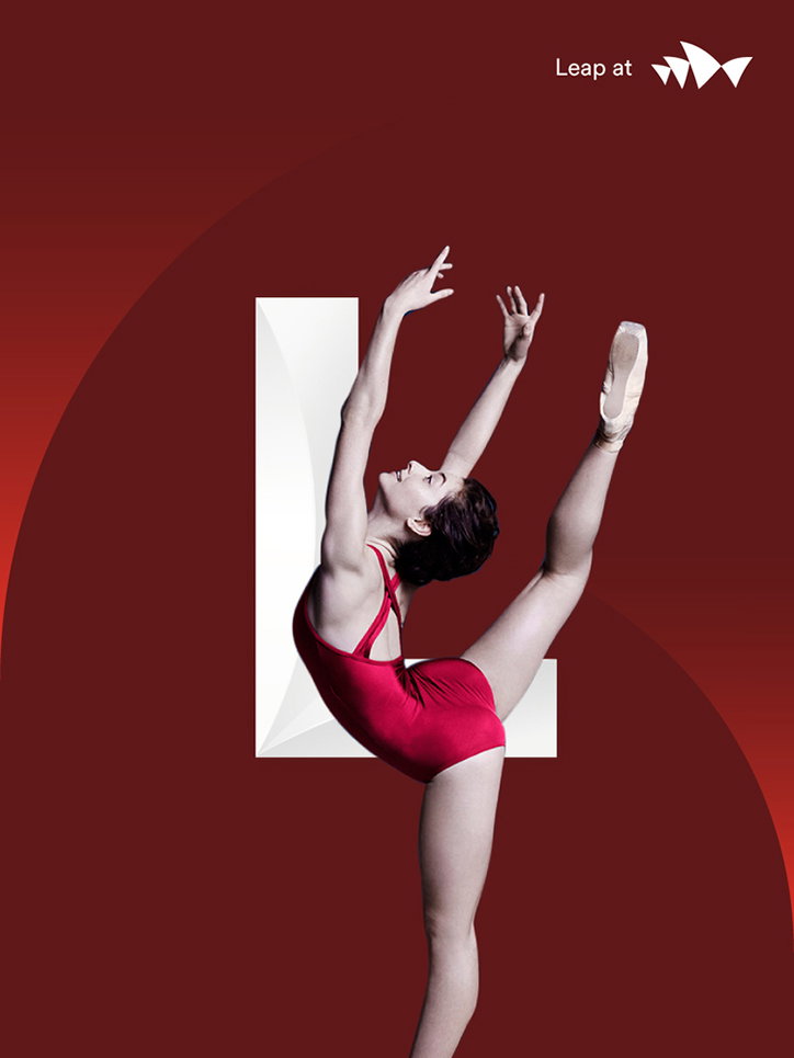
A dancer in a red bodysuit leaps against a deep red background, their body arched back with one leg extended upwards. They are positioned in front of a large, white capital “L”. In the top right corner, the text “Leap at” appears next to a white logo.
Above
Left

Interbrand Australia: Sydney Opera House
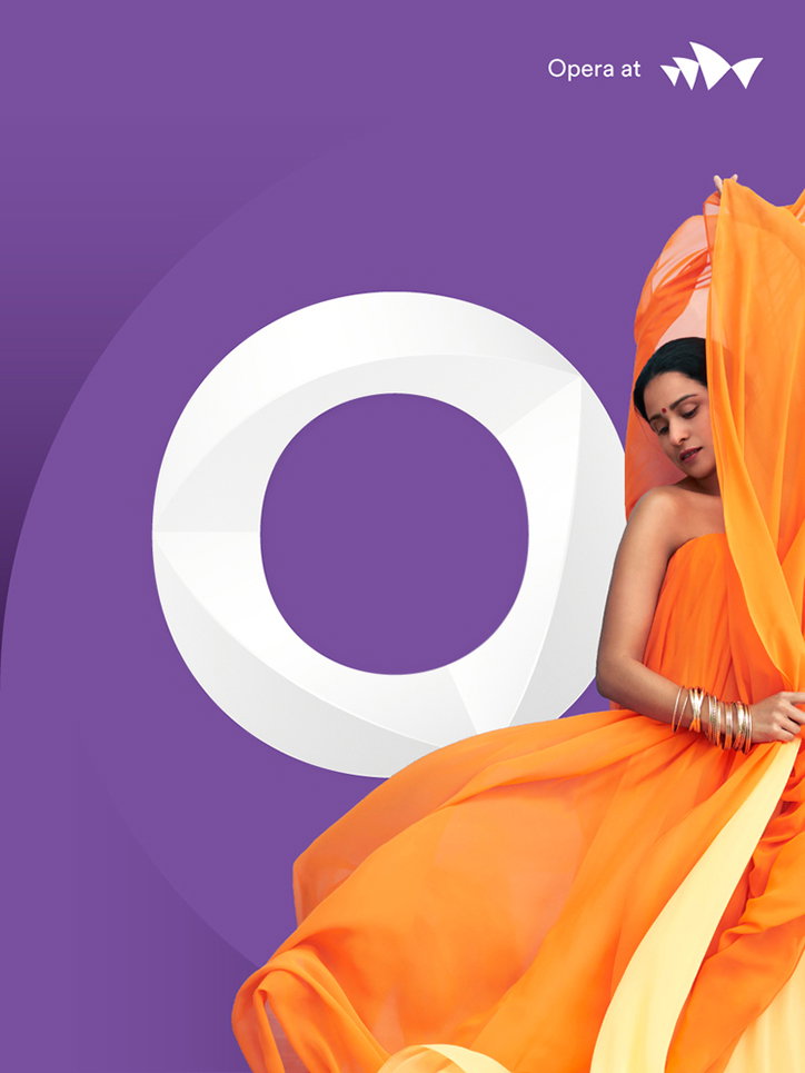
A person draped in flowing orange fabric sits beside a large, white 3D ring. The scene is set against a purple background with the text “Opera at” and a white logo in the top right.
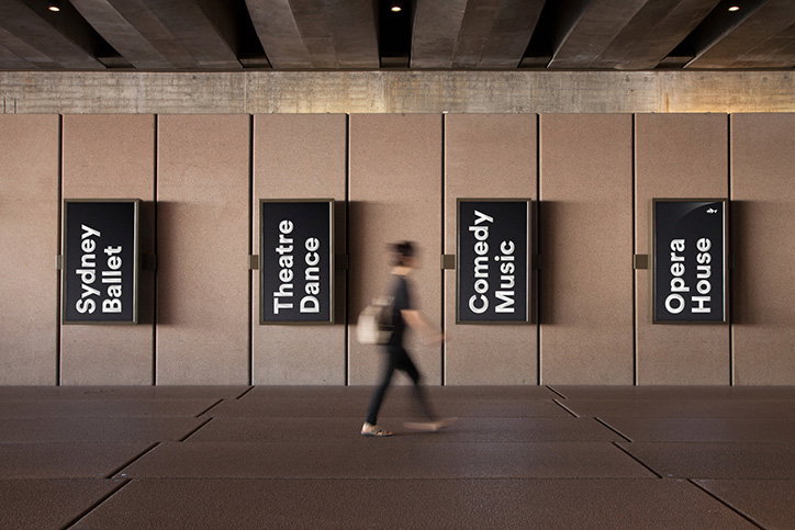
A blurred figure walks past four black directional signs mounted on a concrete wall. The signs read “Sydney Ballet”, “Theatre Dance”, “Comedy Music” and “Opera House”.
Above

Interbrand Australia: Sydney Opera House
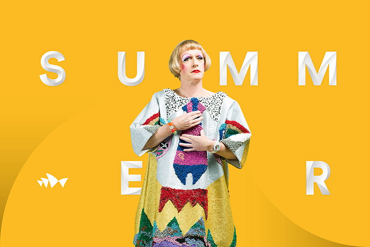
A person with a blonde bob and bold makeup stands against a bright yellow background. They wear a colourful, oversized patterned tunic and hold one hand to their chest. Large, 3D white letters around them spell “SUMMER”.
Above

Interbrand Australia: Sydney Opera House
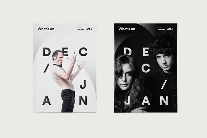
Two magazine covers for “What’s on” are shown side by side. The left cover is white and features a shirtless person in black trousers, while the right cover is black and features two people. Both covers display the words “DEC” and “JAN” split by a diagonal line.
Above

Interbrand Australia: Sydney Opera House
Share Article

About the Author

Rebecca Fulleylove

—

Rebecca Fulleylove is a freelance writer and editor specialising in art, design and culture. She is also senior writer at Creative Review, having previously worked at Elephant, Google Arts & Culture, and It’s Nice That.

It's Nice That Newsletters

Fancy a bit of It's Nice That in your inbox? Sign up to our newsletters and we'll keep you in the loop with everything good going on in the creative world.