Launch Recite Me assistive technology
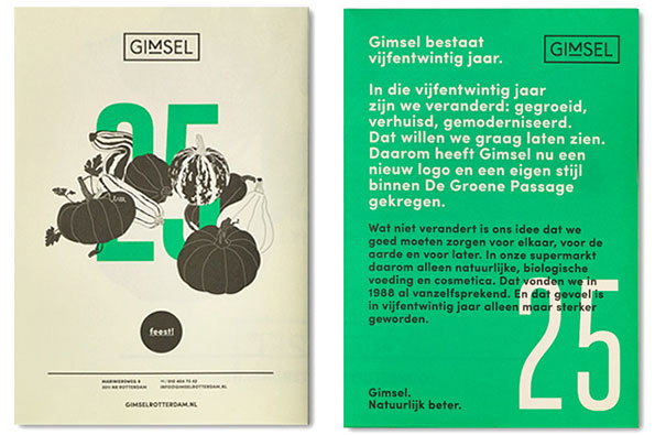
Two posters celebrating the 25th anniversary of Gimsel. The first features a large green “25” layered with illustrations of pumpkins and squashes, while the second is a solid green page with a Dutch text manifesto and a large white “25”.

Graphic Design: Studio Beige put together a super-cool identity for a supermarket

—
Date
14 April 2014

Rotterdam-based design studio Studio Beige might go by a moniker which calls to mind a mindless stretch of nondescript off-white, but their portfolio proves the work they make to be anything but.

They were recently called upon to redesign the identity for Gimsel, a supermarket in Rotterdam which has been selling natural and organic food and cosmetics to a growing crowd for over 25 years. Beige created a new logo, slogan, website and visual identity for the brand, incorporating naturally vibrant and yet muted colours, pared back botanical illustrations and a clean aesthetic. The resulting identity is cohesive and simple, yet undeniably stylish in that inimitable European way. Now can we get these talented brains to overhaul some British supermarkets? Please?
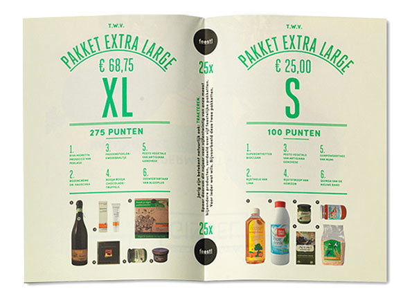
An open brochure showing two different product bundles. The left page features a “Pakket Extra Large” priced at “€ 68,75” for “275 punten”, while the right page shows a smaller bundle for “€ 25,00” and “100 punten”. Both pages list numbered items and show images of the included food and drink products.
Above

Studio Beige: Gimsel

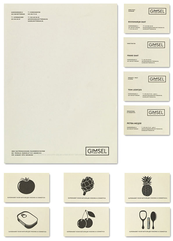
A stationery set for a brand called “Gimsel”, featuring a letterhead and four business cards on cream paper. The minimalist layout uses a clean sans-serif typeface and a simple boxed logo. Below these are six smaller cards, each featuring a black silhouette of a food item or beauty tool. These include a tomato, an artichoke, a pineapple, a bar of soap, cherries and a mirror with a brush.
Above

Studio Beige: Gimsel

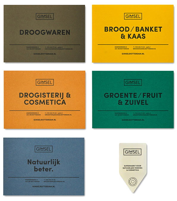
A series of rectangular signs for the brand Gimsel in olive green, yellow, orange, emerald green and blue. Each sign features a category name in bold, such as “Droogwaren” and “Groente/Fruit & Zuivel”, alongside contact details.
Above

Studio Beige: Gimsel

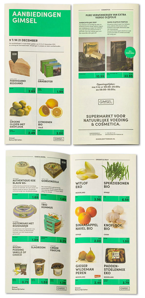
A promotional flyer for the supermarket Gimsel, featuring a grid of food and cosmetic products with prices. The header reads “Aanbiedingen Gimsel” and lists offers valid from 9 to 21 December.
Above

Studio Beige: Gimsel

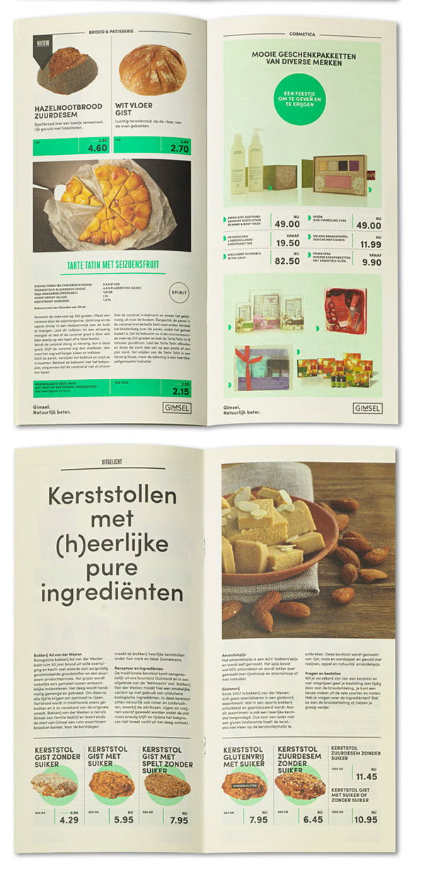
An open brochure showing two spreads from a food and cosmetics catalogue. The left page features bakery items like “Hazelnootbrood Zuurdesem” and a “Tarte Tatin”, while the right page displays various beauty gift sets.
Above

Studio Beige: Gimsel

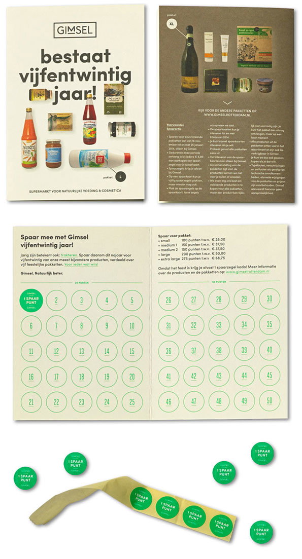
A promotional brochure for the supermarket Gimsel celebrating its 25th anniversary. The cover features a collage of food and cosmetic products under the headline “bestaat vijfentwintig jaar!”. The inside spread contains a loyalty card with numbered circles from 1 to 50. Below the brochure, several green circular stickers read “1 SPAAR PUNT”.
Above

Studio Beige: Gimsel

Share Article

Further Info

About the Author

Maisie Skidmore

—

Maisie joined It’s Nice That fresh out of university in the summer of 2013 as an intern before joining full time as an Assistant Editor. Maisie left It’s Nice That in July 2015.


It's Nice That Newsletters

Fancy a bit of It's Nice That in your inbox? Sign up to our newsletters and we'll keep you in the loop with everything good going on in the creative world.