Studio Cabrio is named after a convertible for its fast and freewheeling spirit
The Stuttgart-based design studio prides itself on a “nerdy” attention to detail and aims to learn something new from each new brief.
Juliane Windbiel, Kahyan Mac and Berenice Gaß met while studying graphic design at the State Academy of Art and Design in Stuttgart and decided to start a studio together over a glass of wine. Quickly becoming close friends, the three designers realised they shared the same vision: “to combine our everyday work with a lot of fun, like driving a cabriolet with three seats in the front row.” And just like that, Studio Cabrio was born.
The studio is run on three essential pillars. First is a deep interest in design, friendship and the will to be their own bosses. In a male-dominated industry, particularly seen in Stuttgart where there are barely any female-led studios (despite the number of female facing students) the three founders wanted to make a statement with Studio Cabrio. Growing steadily alongside the German city’s rising arts scene, the three founders are eager to collaborate with other budding creatives and contribute to the scene. In this way, it founded a shared working space with other creatives last summer. A space to also host exhibitions and workshops, once it is safe to do so.
Relatively new to the creative scene, Juliane, Kahyan and Berenice already have a number of clients under their belt; a vast majority being in the arts sector. For the founders, graphic design is a “melting pot where many different influences such as art, technology, music and much more come together so say something in a contemporary way.” And using this approach, the studio first considers the brief, then experimentally find the right graphic language – whether its typographically or pictorially – to express the concept. With a client base which is as broad as it is long, Studio Cabrio see each new brief as a “huge enrichment” to the work at hand.
Due to the fact Juliane, Kahyan and Berenice all studied together, the three designers proud themselves on a particularly close relationship. “We are very close to each other in terms of our strengths,” says Juliane, “whereby different interests such as typography, web design, illustration or 3D have been developed to varying degrees.” But with such a broad scope of skills, the three see their work as an opportunity to flex different muscles with different aspects of the job. Finding a suitable concept full of sensitivity and refinement when it comes to a new project is the ultimate goal.
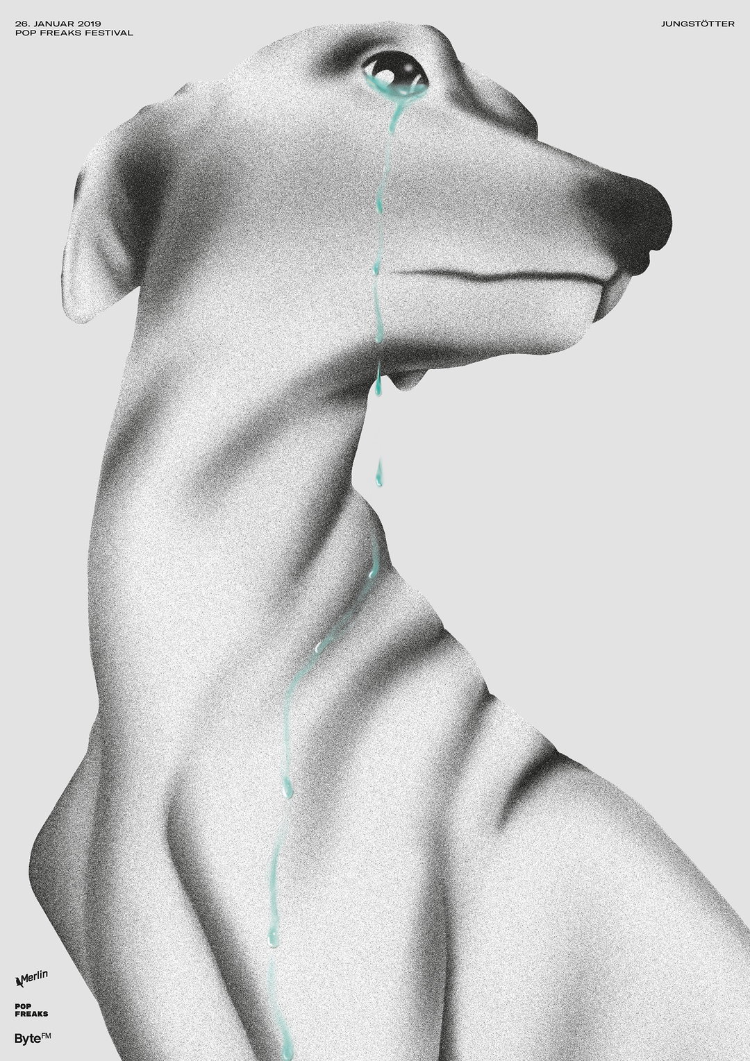
Studio Cabrio: Poster Jungstoetter (Copyright © Studio Cabrio, 2020)
Like many designers, the relationship between client and creative is of utmost importance. It allows for a more effortless feel of a project, adding to the belief that “a design that is integrated into a project is always better than one that is simply imposed on the project.” All in all, whatever the brief, Studio Cabrio is determined to learn from the project in one way or another. Whether it’s a lesson in content, development or technical skill, each project aims to have its own unique visual language.
Juliane, Kahyan and Berenice talk us through a couple of recent projects. The first being a stage design and some animations for an online event where the night mayor of Stuttgart was presented. The concept revolved around showing different aspects of nightlife in a nuanced and abstract way; contrasting light and shadow. On a different point of the design spectrum, Studio Cabrio love to design books and like many graphic designers, are bibliophiles.
“The durability of books in contrast to our increasingly digital surrounding and its infinite design possibilities created by a few sheets bound together fascinates us each and every time,” says Kahyan. The studio have tackled artist books for the likes of David Bopp, as well as a documentary publication for the Lotte project space promoting the young cultural scene in Stuttgart. With an eye for detail focusing on the meticulous typography, print finishing, materiality and physicality of the book, the studio pride itself on a sense of “nerdiness” which, as Berenice points out, “is very important for us too.”
As for the future, the studio named after the fast flowing freedom of a convertible, hopes to charge ahead with its practice. “Driving full speed further on the road of graphic design, sun shining, fresh breeze around our heads, wind in the hair with some nice tunes on.”
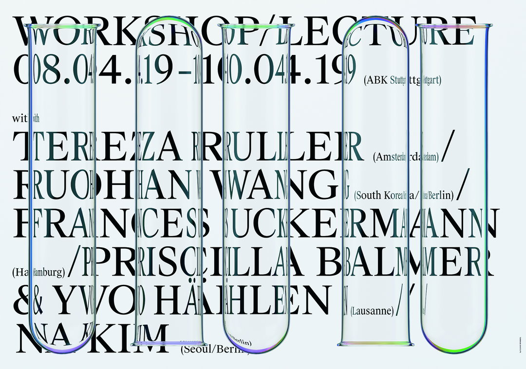
Studio Cabrio: Poster Test Tubes (Copyright © Studio Cabrio, 2020)
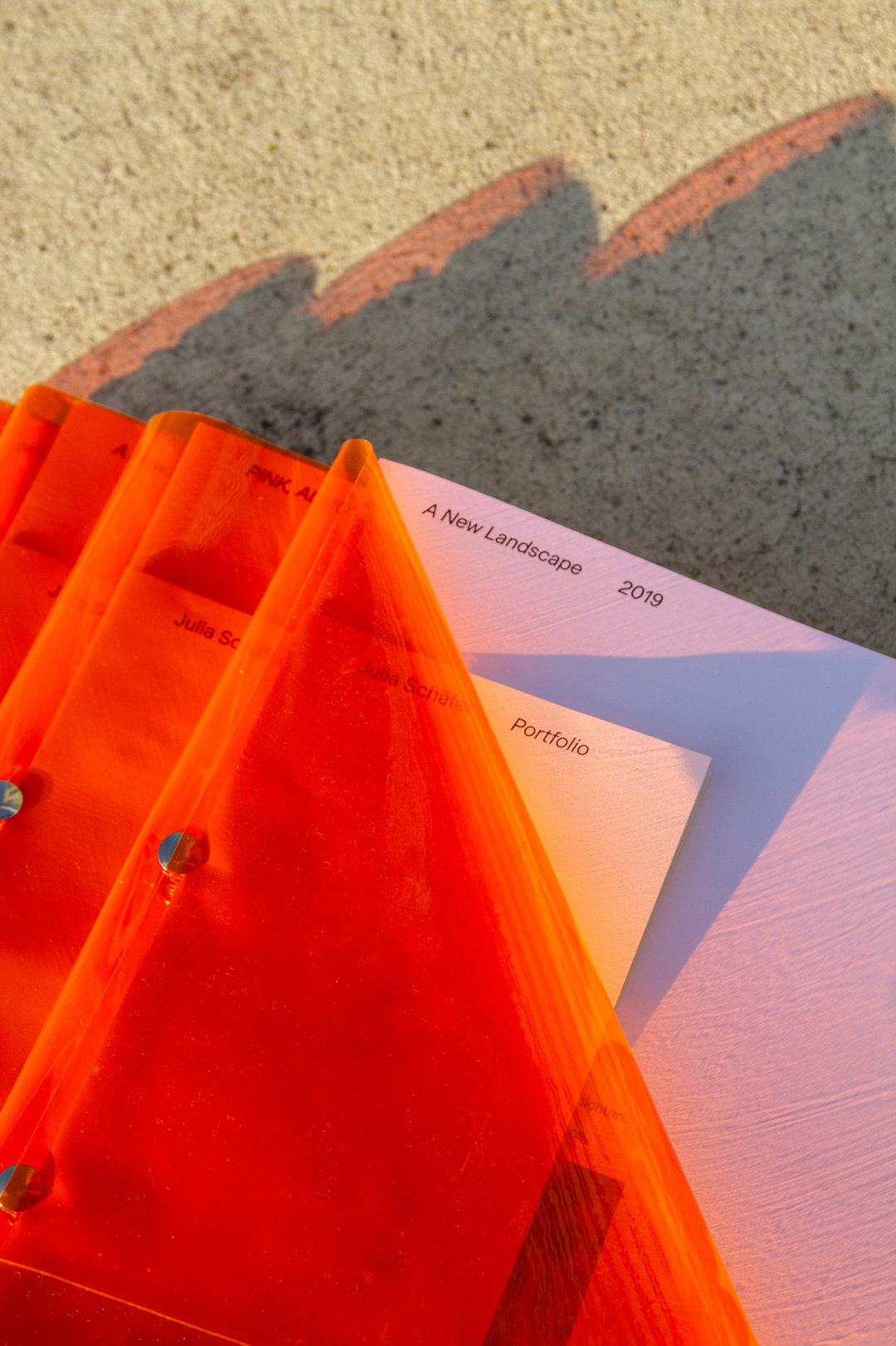
Studio Cabrio: Julia Schaefer Portfolio (Copyright © Studio Cabrio, 2020)
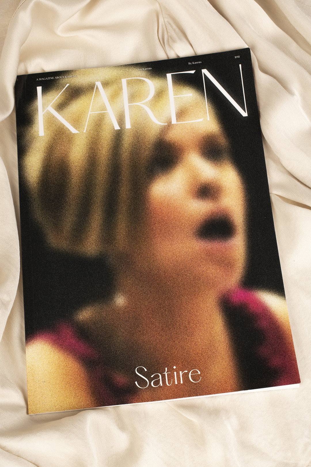
Studio Cabrio: Karen Satire Magazine (Copyright © Studio Cabrio, 2020)
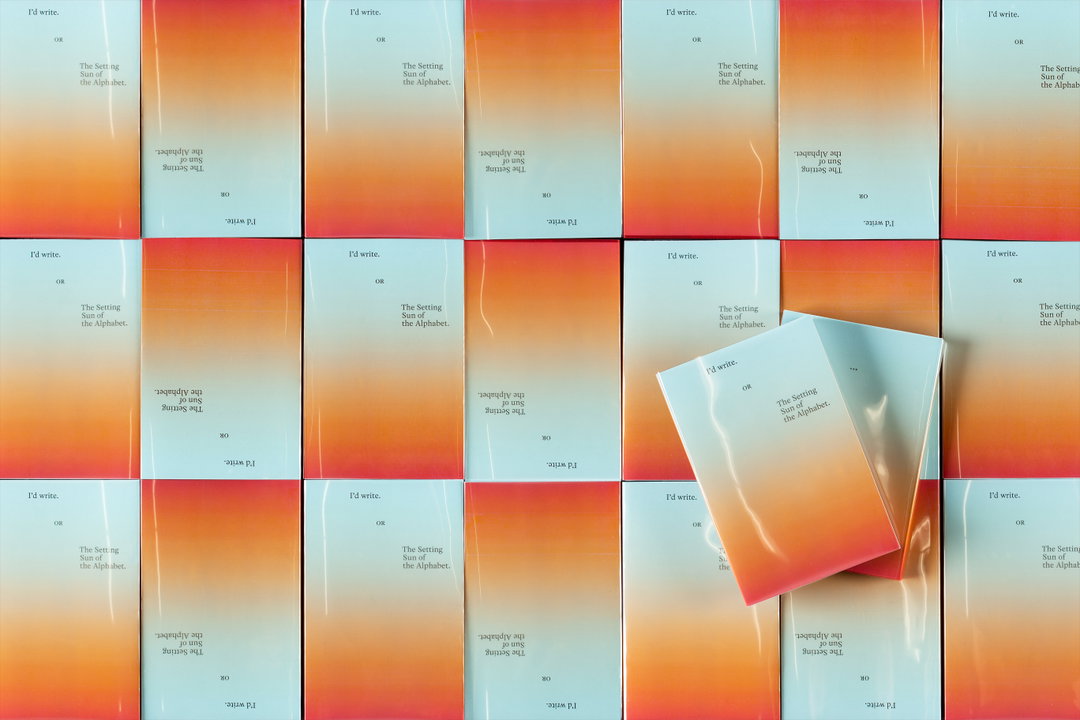
Studio Cabrio: I’d write or the settings sun of the alphabet (Copyright © Studio Cabrio, 2020)
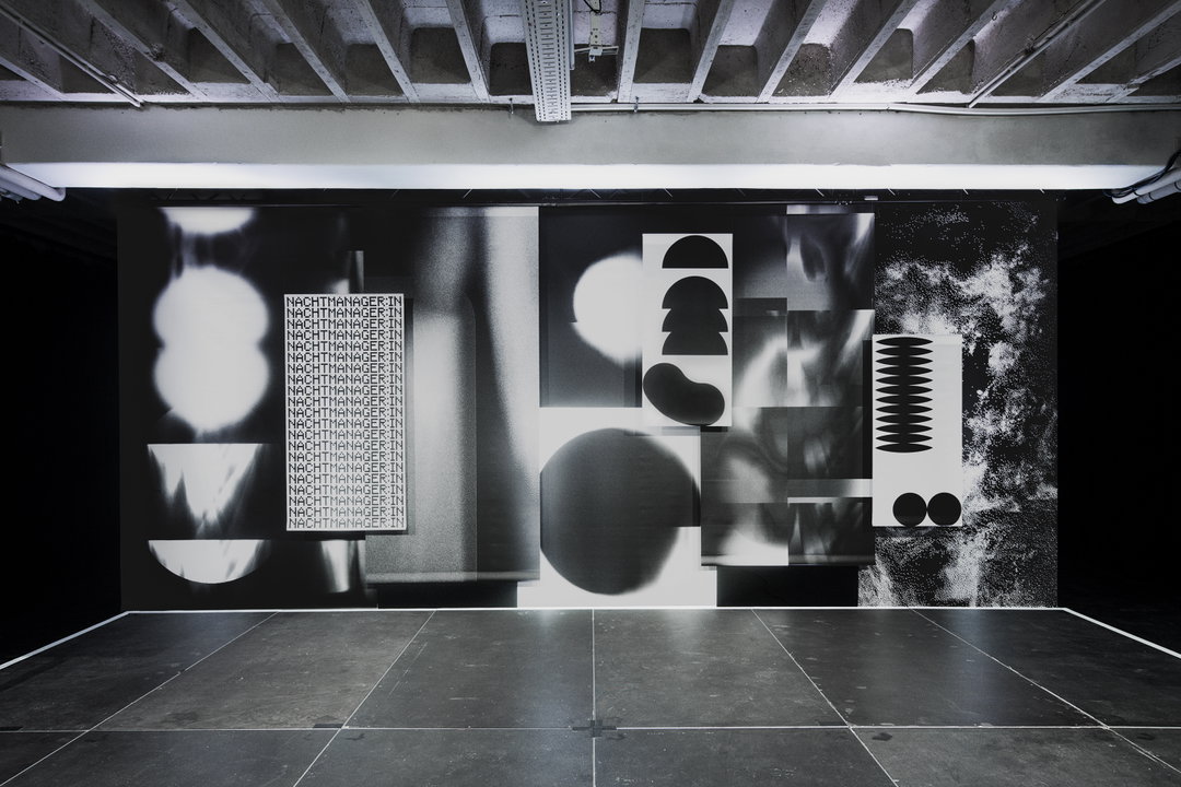
Studio Cabrio: Night mayor, photography by Reiner Pfisterer (Copyright © Studio Cabrio, 2020)
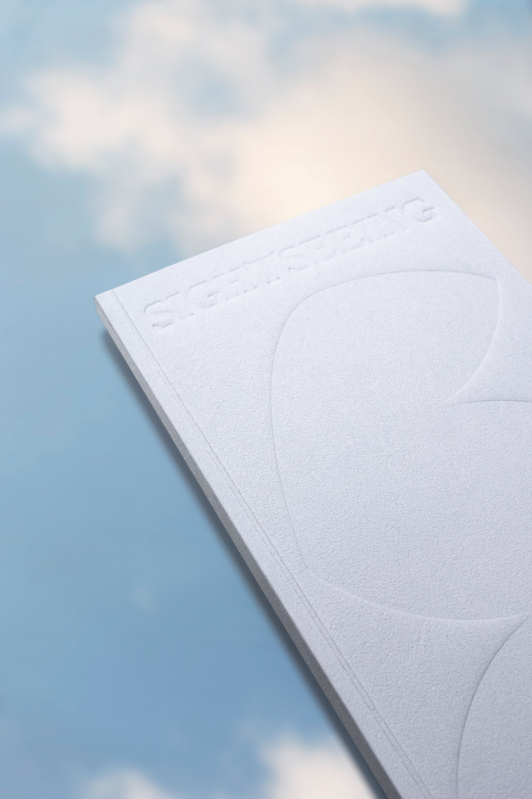
Studio Cabrio: Sightseeing (Copyright © Studio Cabrio, 2020)
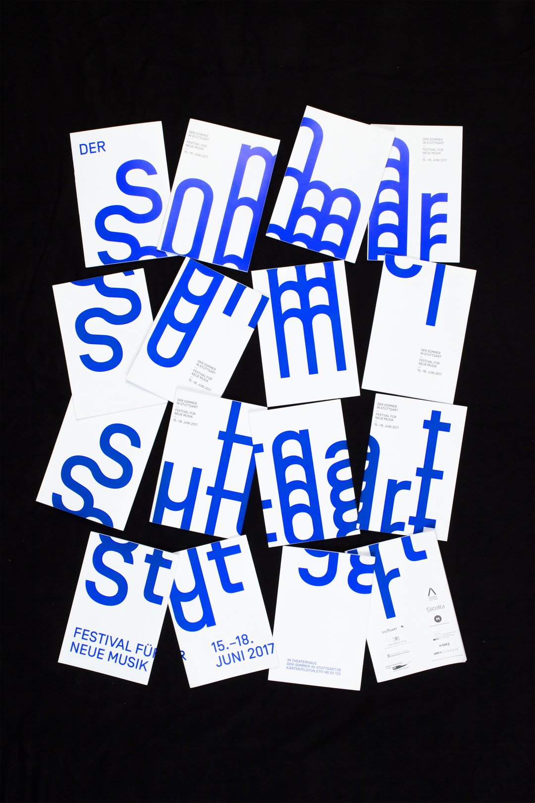
Studio Cabrio: Sommer in Stuttgart Festival in collaboration with Fiona Frahm (Copyright © Studio Cabrio, 2020)
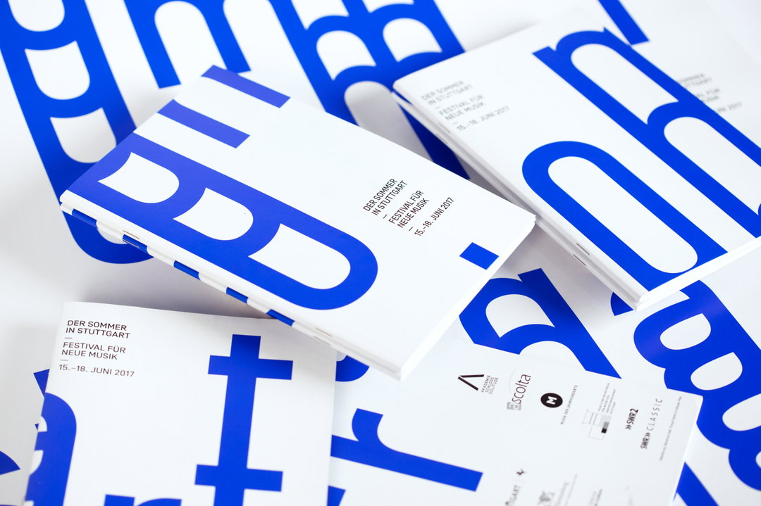
Studio Cabrio: Sommer in Stuttgart Festival in collaboration with Fiona Frahm (Copyright © Studio Cabrio, 2020)
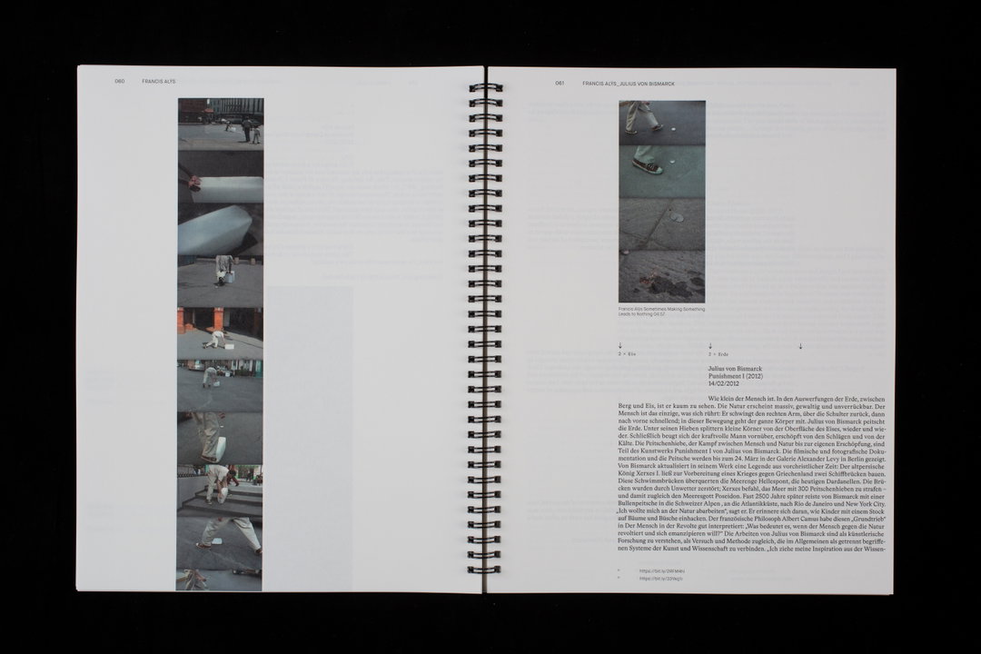
Studio Cabrio: Feuer Wasser Erde Luft – Eine Auseinandersetzung (Copyright © Studio Cabrio, 2020)
Become an Extra Nice Supporter
Unlock an inspiring new way to explore It’s Nice That, get your hands on exclusive perks, and help bring meaningful creative projects to life.
Hero Header
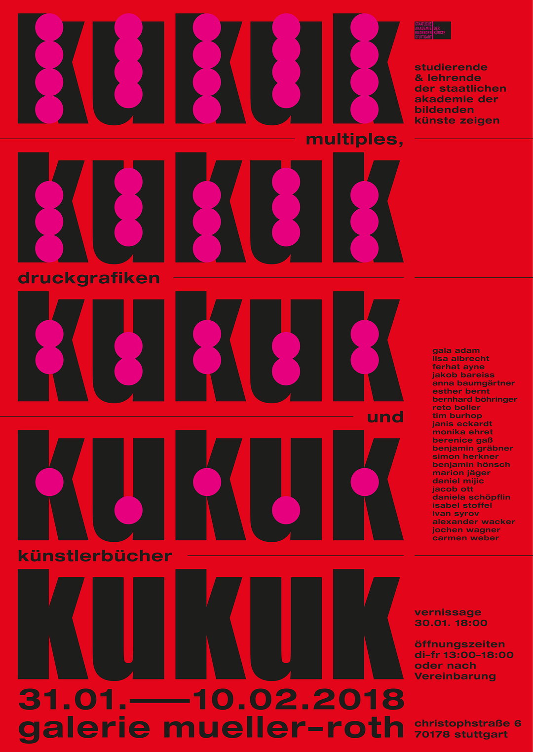
Studio Cabrio: Poster kukuk
Share Article
Further Info
About the Author
—
Jynann joined It’s Nice That as an editorial assistant in August 2018 after graduating from The Glasgow School of Art’s Communication Design degree. In March 2019 she became a staff writer and in June 2021, she was made associate editor. She went freelance in 2022.