Launch Recite Me assistive technology
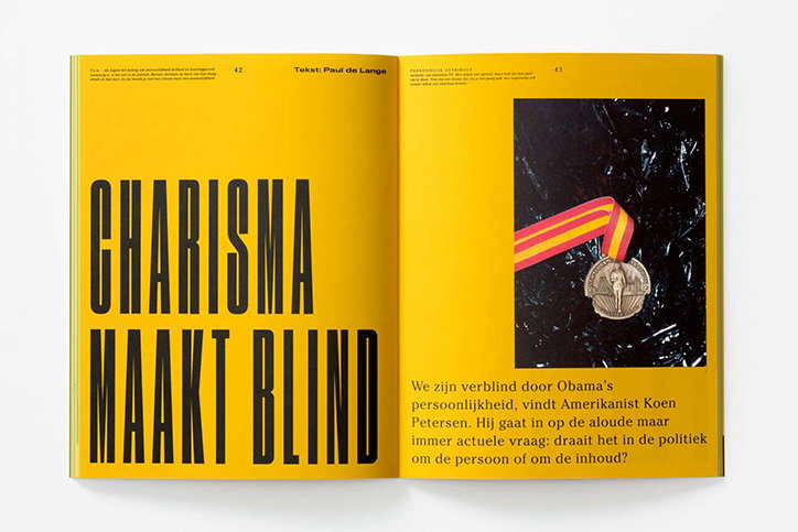
An open magazine spread with bright yellow pages. The left page features bold, black typography that reads “CHARISMA MAAKT BLIND”. The right page shows a photograph of a medal with a red and yellow ribbon against a dark background, accompanied by a short paragraph of Dutch text.

Studio Dumbar’s brightly coloured one-time redesign of Dutch magazine Creatie

—
Date
13 July 2016

Studio Dumbar’s redesign of Dutch quarterly design and advertising magazine Creatie marries content and aesthetic through a confident one-time editorial takeover of creative and artistic direction.

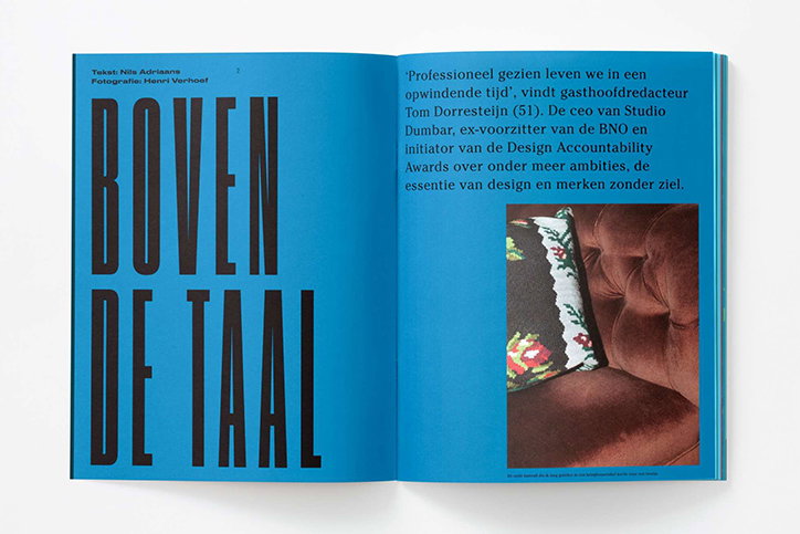
The studio’s creative direction makes the entire publication pop from cover to cover. Intense, bold colours are used throughout from neon oranges to electric blues, robustly framing the images and selection of commanding sans-serif typefaces. Often elongated and spread across the page, negative space is used effectively to make each page feel important.

“The magazine celebrates the variety of ‘voices’ in the creative industries by adopting a new guest editor for each issue. In a first for Creatie [Dumbar CEO Tom] Dorresteijn convinced the publishers to relinquish their design duties, allowing Studio Dumbar to create a complete visual statement that truly reflects the magazine’s central theme,” says the studio.

This edition examines the dichotomous behaviour and attributes between personality brands and professional brands, and the manner in which consumers interact with them. The design follows suit, mimicking this in its colour scheme and content these difference: “the latter behave in a rational, strategic manner (Microsoft, for example), while Personality Brands (like Apple) behave in a more emotive way – brands that are ‘brought to life by design’.”

Studio Dumbar produced the entire suite of content, from the graphic design and art direction through to creative direction of the issue’s editorials. “As well as defining the theme and content, Tom wrote most of the interviews, while our creatives curated regular features such as New Talent.
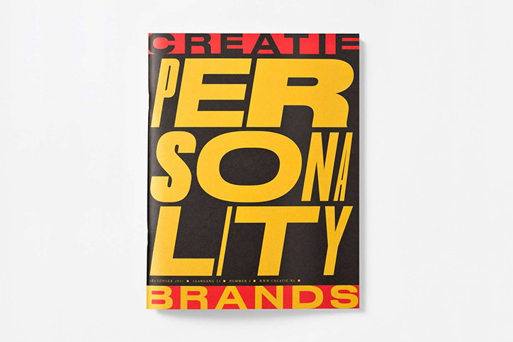
A magazine cover featuring bold, yellow typography on a black background that reads “PERSONALITY”. A red banner at the top reads “CREATIE” and a matching banner at the bottom reads “BRANDS”.
Above

Studio Dumbar for Creatie

An open magazine spread with bright blue pages. The left page features the bold, black title “BOVEN DE TAAL”, while the right page contains a block of Dutch text and a photograph of a brown velvet sofa.
Above

Studio Dumbar for Creatie

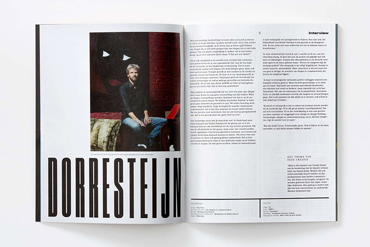
An open magazine spread featuring a portrait of a person sitting in a chair and reading a book. Below the image, the name “Dorresteijn” is printed in a bold, black sans-serif typeface.
Above

Studio Dumbar for Creatie

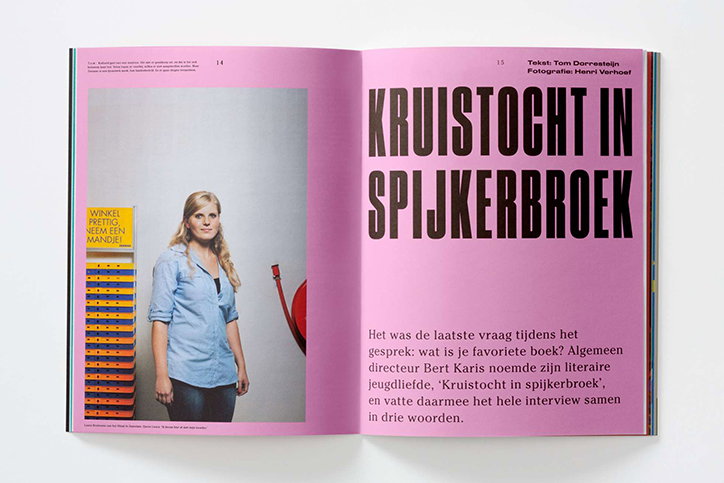
An open magazine spread with a pink right-hand page. The left page shows a person in a blue shirt standing in a shop next to a stack of orange baskets and a yellow sign. The right page features a bold headline that reads “KRUISTOCHT IN SPIJKERBROEK” above a block of Dutch text.
Above

Studio Dumbar for Creatie

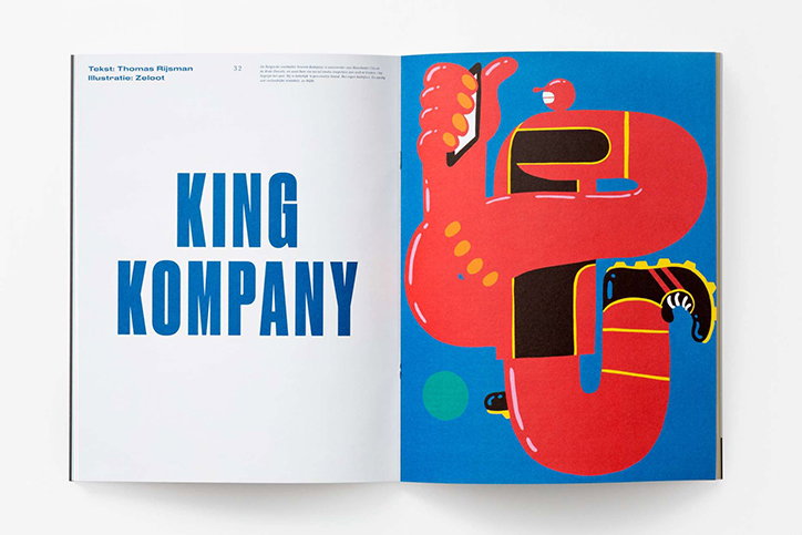
An open magazine spread. The left page features the bold blue title “KING KOMPANY”, while the right page shows a red, abstract illustration of a figure holding a smartphone against a blue background.
Above

Studio Dumbar for Creatie

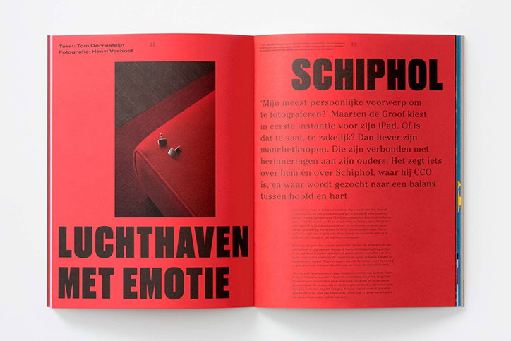
An open magazine spread with bright red pages. The left page features a photo of cufflinks on a red surface and the bold text “LUCHTHAVEN MET EMOTIE”. The right page is titled “SCHIPHOL” and contains a column of Dutch text.
Above

Studio Dumbar for Creatie

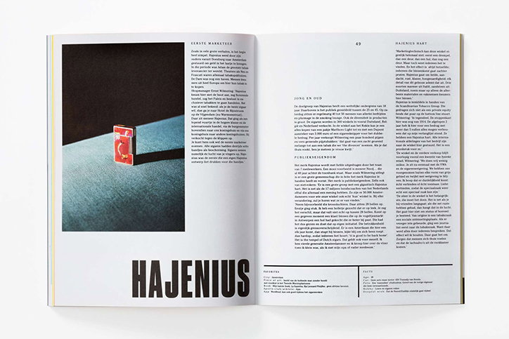
An open magazine spread featuring a layout of Dutch text and a photograph. A large black banner across the bottom of both pages reads “HAJENIUS” in bold white capitals.
Above

Studio Dumbar for Creatie

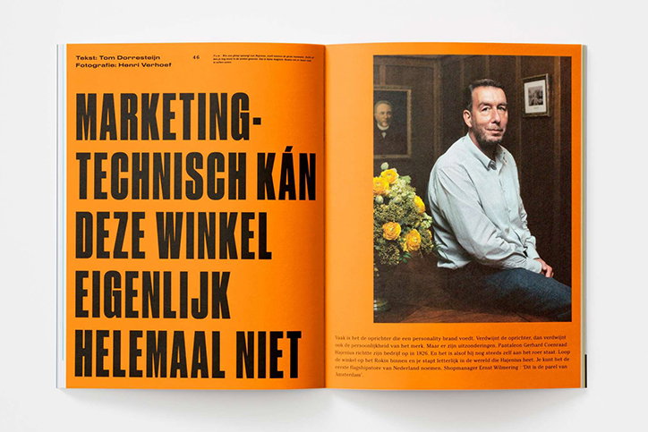
An open magazine spread with a bright orange background. The left page features bold, black typography that reads “MARKETING-TECHNISCH KÁN DEZE WINKEL EIGENLIJK HELEMAAL NIET”. The right page shows a portrait of a person in a light blue shirt sitting beside a vase of yellow flowers.
Above

Studio Dumbar for Creatie

Share Article

About the Author

Jamie Green

—

Jamie joined It’s Nice That back in May 2016 as an editorial assistant. And, after a seven-year sojourn away planning advertising campaigns for the likes of The LEGO Group and Converse, he came back to look after New Business & Partnerships here at It’s Nice That until September 2024.


It's Nice That Newsletters

Fancy a bit of It's Nice That in your inbox? Sign up to our newsletters and we'll keep you in the loop with everything good going on in the creative world.