Launch Recite Me assistive technology
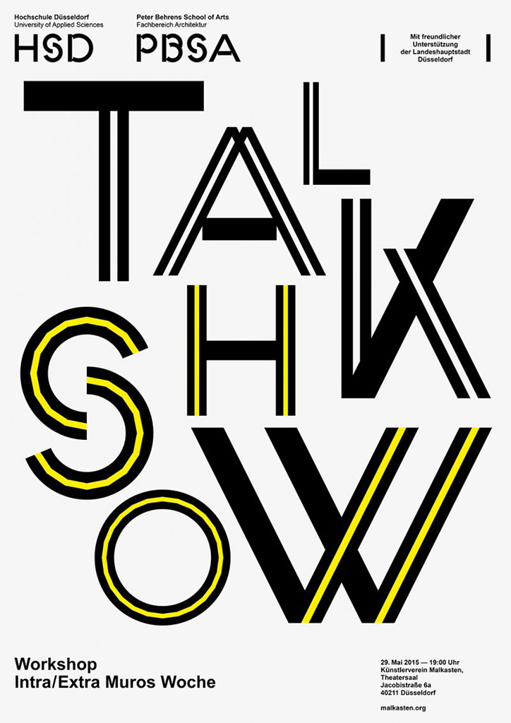
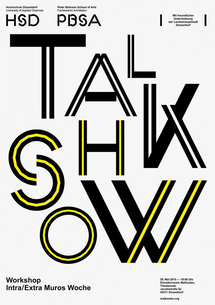
A bold typographic poster in black and yellow reads “TALK SHOW”. The letters are fragmented and layered, with yellow stripes running through the characters. Smaller text at the bottom announces a “Workshop Intra/Extra Muros Woche” and lists the date, time and a Düsseldorf address.

Studio Laucke Siebein’s adaptable identity for a Düsselfdorf university

—
Date
10 December 2015

Earlier this year Studio Laucke Siebein (aka Dirk Laucke and Johanna Siebein) created a new corporate design for the University of Applied Sciences Düsselfdorf. The Dutch duo custom made a typeface to be the voice of the institution, creating something that’s both expressive and playful. Applied across the university, this series of posters demonstrates the flexibility of the typeface and overarching identity.

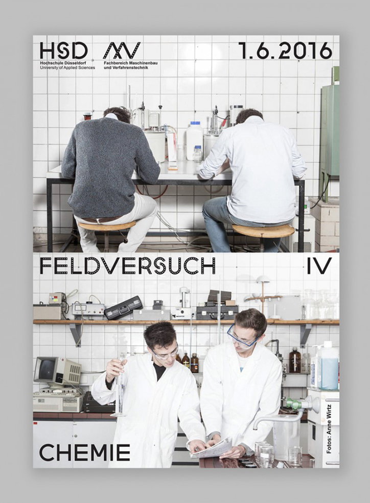
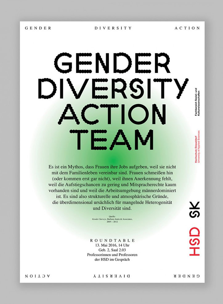
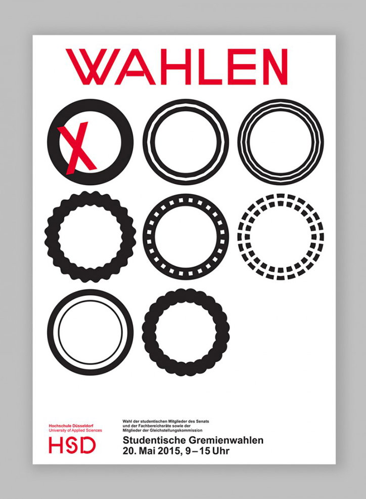
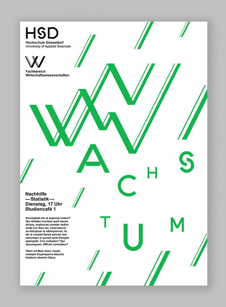
We featured the studio’s work back in 2014 for it’s modern approach to design and this project emulates the same fresh thinking. “There are modified unique styles for the seven faculties to suit their needs of communication,” the studio explains. “In addition the system describes the brand architecture between family and faculty brands.” Simple but with some lovely nuances, HSD Sans Regular acts as the base for the different department styles and lines, wiggly shapes and cutouts are then applied to the existing letterforms. Diverse in the courses and activities it offers, the university posters promote internal workshops, events and teams. Each department has adapted the typeface in its own way, but with Studio Laucke Siebein’s comprehensive identity, the posters remain cohesive and unified.
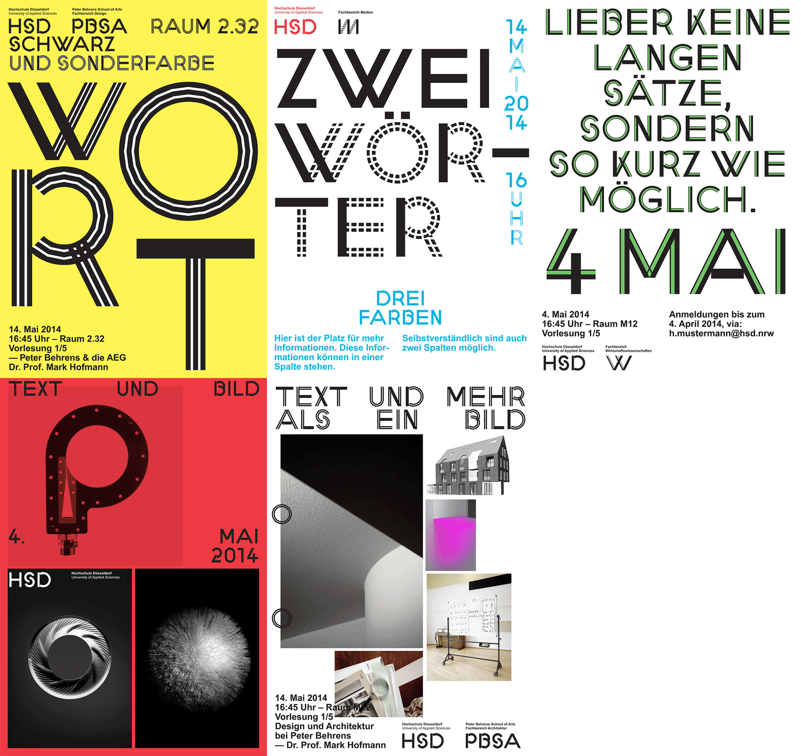
An animation of a series of graphic posters for Hochschule Düsseldorf. The designs shift through bold colours and typographic styles, featuring text such as “WORT”, “ZWEI WÖRTER”, and “TEXT UND BILD”.
Above
Left

Studio Laucke Siebein: University of Applied Sciences Düsselfdorf
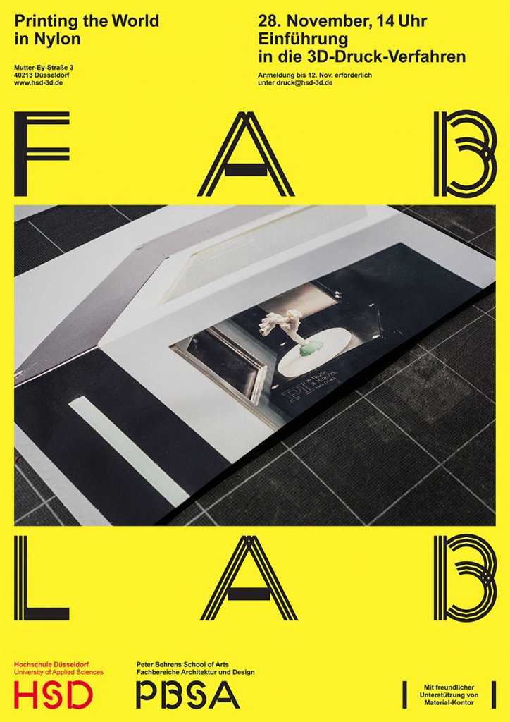
A yellow poster for a 3D printing event reads “Printing the World in Nylon”. A central photograph shows a 3D-printed white object inside a printer. Large black text reads “FAB LAB” across the top and bottom. Details include the date “28. November, 14 Uhr” and the logos for “HSD” and “PBSA”.
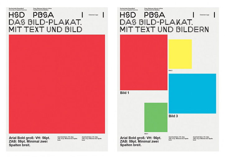
Two graphic design posters demonstrating layout principles. The first features a large red rectangle under the headline “DAS BILD-PLAKAT. MIT TEXT UND BILD”. The second shows a similar layout but with multiple coloured rectangles in red, yellow, blue and green, labelled “Bild 1” through “Bild 4”.
Above

Studio Laucke Siebein: University of Applied Sciences Düsselfdorf
A layout featuring two photographs of people working in a laboratory. The top image shows two people from behind, seated at a workbench, while the bottom image shows two people in white lab coats looking at a document. Text across the top reads “HSD”, “1.6.2016” and “Feldversuch IV”, with the word “Chemie” at the bottom.
Above
Left

Studio Laucke Siebein: University of Applied Sciences Düsselfdorf
A typographic poster with a soft green glow in the centre reads “GENDER DIVERSITY ACTION TEAM” in bold, black lettering. German text below discusses the structural reasons why women leave the workforce, followed by details for a roundtable on 13 May 2016.
A graphic poster with the word “WAHLEN” in bold red capitals at the top. Below, nine circles of varying line weights and styles are arranged in a grid, with a red cross marking the first one. At the bottom, the Hsd logo appears next to the text “Studentische Gremienwahlen” and the date “20. Mai 2015, 9–15 Uhr”.
Above
Left

Studio Laucke Siebein: University of Applied Sciences Düsselfdorf
A graphic poster for Hochschule Düsseldorf featuring the word “wachstum” in a bold, green sans-serif typeface. The letters are stylised as 3D architectural forms that create a zig-zagging pattern across the page. Text in the top left reads “HSD” and “University of Applied Sciences”. Further text lists a statistics tutoring session on “Dienstag, 17 Uhr” at “Studiencafé 1”, followed by several paragraphs of placeholder text.
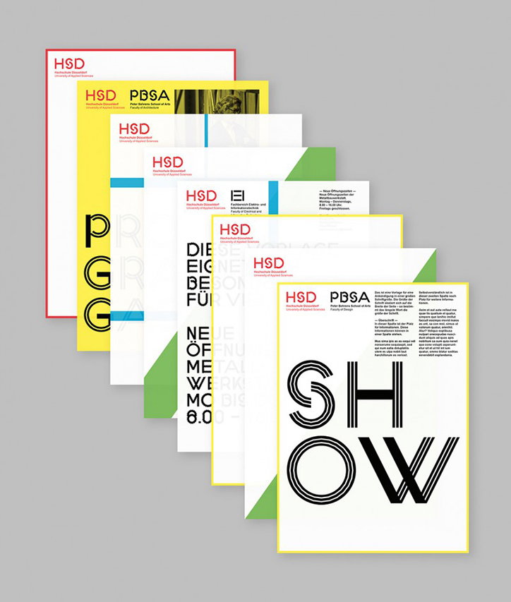
A series of printed brochures and posters for the Hochschule Düsseldorf and the Peter Behrens School of Arts. The designs use a minimalist layout with bold typography and a palette of red, yellow and green. The frontmost poster features the word “SHOW” in a large, striped black typeface.
Above

Studio Laucke Siebein: University of Applied Sciences Düsselfdorf
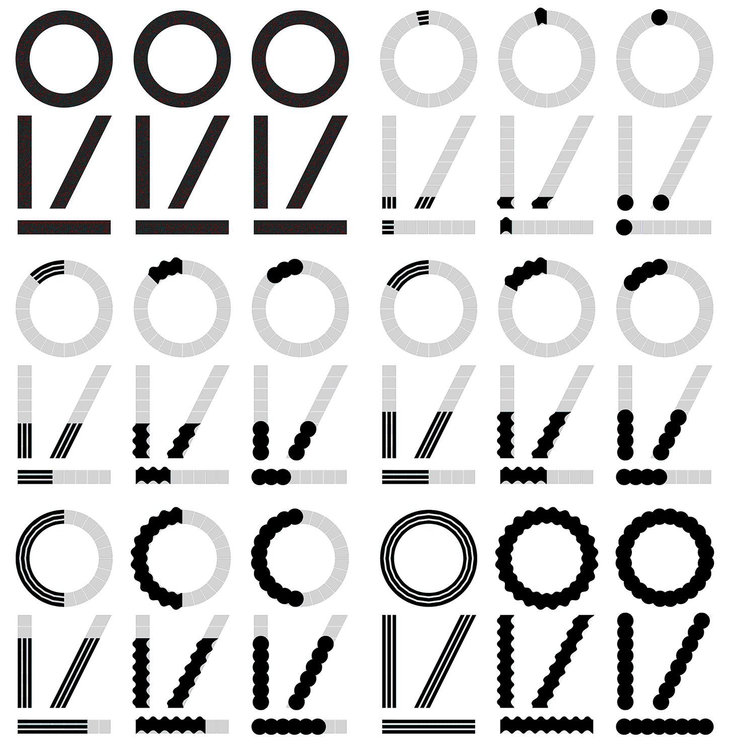
An animation in which three sets of black geometric shapes morph from solid forms into different textures. Each set consists of a circle, a vertical line, a diagonal line and a horizontal base. The shapes transition into striped, wavy and beaded patterns.
Above

Studio Laucke Siebein: HSD Sans variations, University of Applied Sciences Düsselfdorf
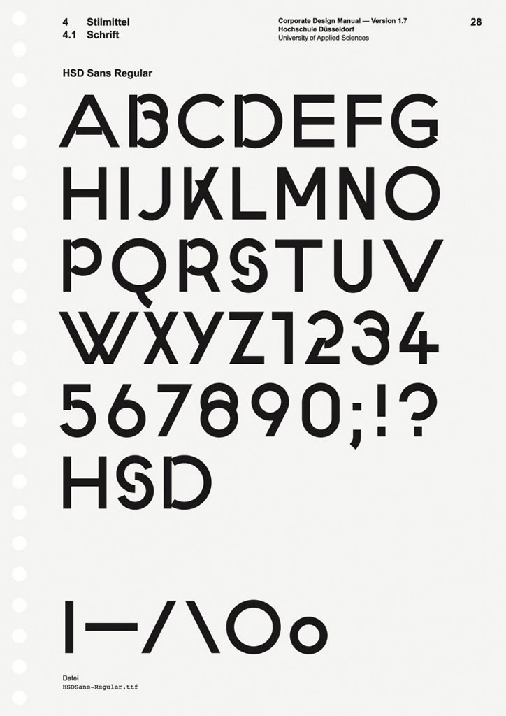
A typography specimen page for “HSD Sans Regular”. The page displays the full uppercase alphabet, numerals and punctuation in a bold, geometric sans-serif typeface.
Above

Studio Laucke Siebein: HSD Sans Regular, University of Applied Sciences Düsselfdorf
Share Article

About the Author

Rebecca Fulleylove

—

Rebecca Fulleylove is a freelance writer and editor specialising in art, design and culture. She is also senior writer at Creative Review, having previously worked at Elephant, Google Arts & Culture, and It’s Nice That.


It's Nice That Newsletters

Fancy a bit of It's Nice That in your inbox? Sign up to our newsletters and we'll keep you in the loop with everything good going on in the creative world.