Launch Recite Me assistive technology
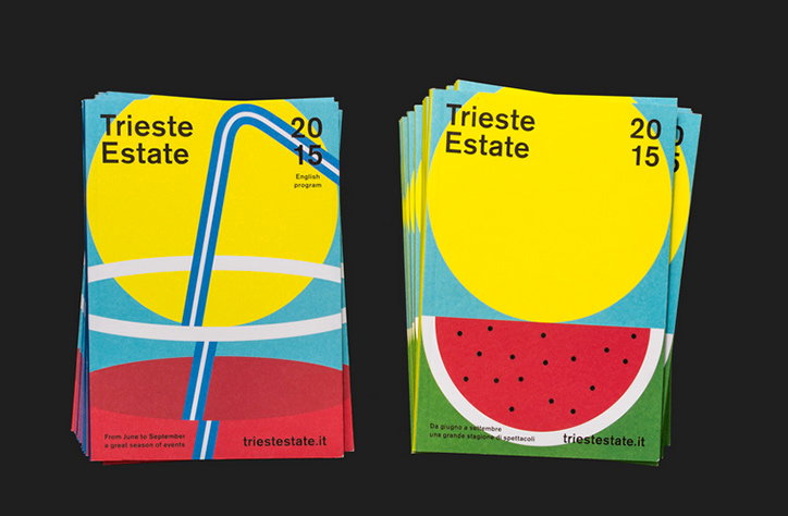
Two stacks of colourful brochures for “Trieste Estate 2015”. The covers feature bold geometric shapes in yellow, blue and red, suggesting a sun and a slice of watermelon.

Bright, bold designs for an arts festival from Italian agency Studio Mut

—
Date
11 September 2015

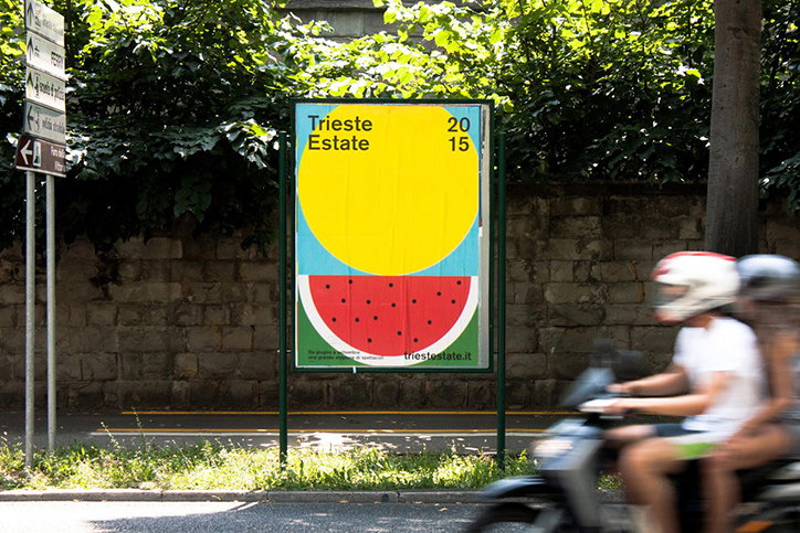
It’s fairly hard to resist making dog puns when writing about an agency called Studio Mut at the end of a long day, so we’ll just get it all out the way and mention its designers’ excellent pedigree, having worked alongside Fons Hickmann m23 in Berlin on a number of projects over the years. Based in Italy, the agency specialises in bright, bold, simple graphics; shown off to gloriously summery effect in its series of printed materials for the Trieste Summer Festival. It’s all about holiday and tropical iconography, abstracted to just the right level and in a colour palette dialled up to 11. Elsewhere in the Studio Mut portfolio we see a fantastic array of posters for events ranging from busking to marriages. Not a dog’s dinner in sight.
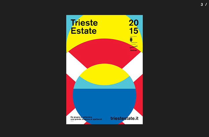
A bold graphic poster in yellow, red, blue and white reads “Trieste Estate 2015”. The design features a series of overlapping semi-circles and a central yellow sun over a blue sea.
Above

Studio Mut: Trieste

A bright yellow and red poster stands on a city street against a backdrop of green foliage. It reads “Trieste Estate 2015” and features a large yellow circle above a slice of watermelon.
Above

Studio Mut: Trieste

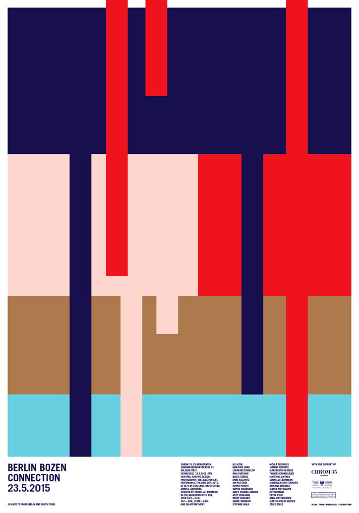
An abstract poster featuring a composition of bold, vertical rectangular blocks in navy, red, pale pink, brown and light blue. At the bottom left, text reads “Berlin Bozen Connection 23.5.2015” and “30 artists from Berlin and South Tyrol”.
Above
Left

Studio Mut: Berlin Bozen Connection Poster

Right

Studio Mut: Busker Poster

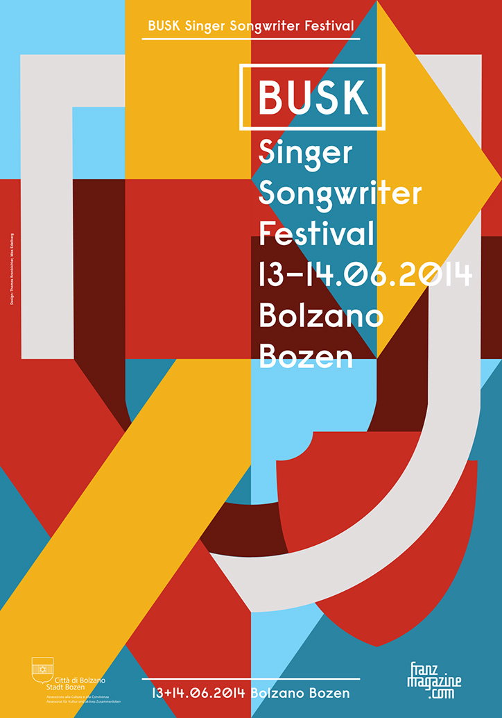
A geometric poster for the “Busk Singer Songwriter Festival” featuring bold blocks of red, yellow, blue and grey. The central text reads “Busk Singer Songwriter Festival 13–14.06.2014 Bolzano Bozen”.
Above

Studio Mut: Busker Poster

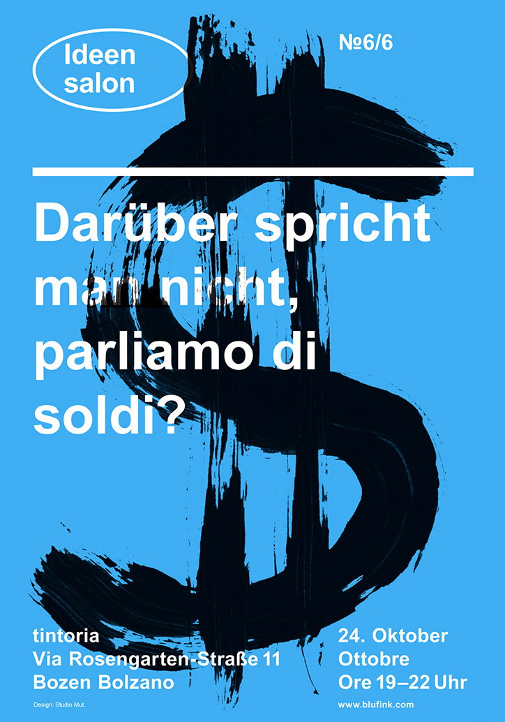
A blue poster featuring a large, black brushstroke of a dollar sign. White text across the centre reads “Darüber spricht man nicht, parliamo di soldi?”. Additional text in the corners includes “Ideen salon” and “№6/6”. Details at the bottom list the venue “tintoria” in Bozen Bolzano and the date “24. Oktober Ottobre”.
Above
Left

Studio Mut: Ideensalon Poster

Right

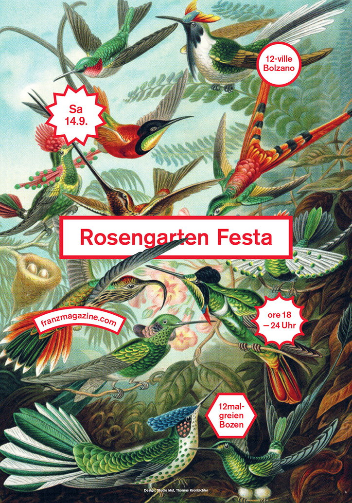
Studio Mut: Rosengarten Fester Poster
An illustration of various colourful birds and hummingbirds amidst tropical foliage. A central white banner reads “Rosengarten Festa”, surrounded by red circular and star-shaped badges containing dates and times.
Above

Studio Mut: Rosengarten Fester Poster

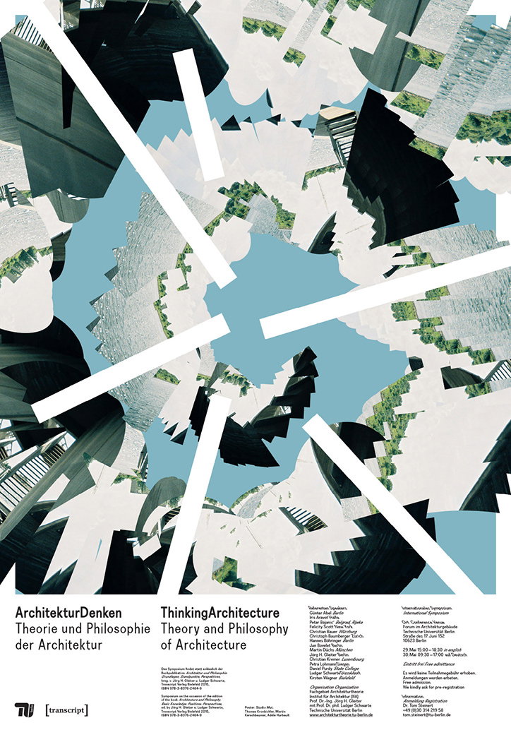
A digital collage of fragmented buildings and architectural elements, tilted and layered against a bright blue sky. Below the image, a poster reads “ArchitekturDenken Theorie und Philosophie der Architektur” and “ThinkingArchitecture Theory and Philosophy of Architecture”. Smaller text provides event details for an international symposium in Berlin.
Above
Left

Studio Mut: Architektur Denken Poster
Right

Studio Mut: Architektur Denken Poster

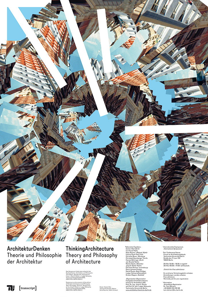
A collage of fragmented architectural photographs and green landscapes, sliced into sharp, geometric shards. White diagonal bars cut across the composition, creating a sense of depth and movement. Below the image, bold text reads “ArchitekturDenken Theorie und Philosophie der Architektur” and “ThinkingArchitecture Theory and Philosophy of Architecture”. Smaller text lists event details, speakers and the venue, the Technische Universität Berlin.
Above

Studio Mut: Architektur Denken Poster

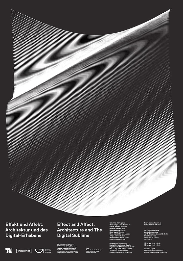
A black and white poster featuring a large, distorted 3D render of a warped, shimmering surface made of fine lines. Below the image, bold text reads “Effekt und Affekt. Architektur und das Digital-Erhabene” and “Effect and Affect. Architecture and The Digital Sublime”. Smaller text lists the event as an “Internationale Konferenz” with dates, a Berlin venue, and a list of participants.
Above
Left

Studio Mut: Effekt und Affekt poster

Right

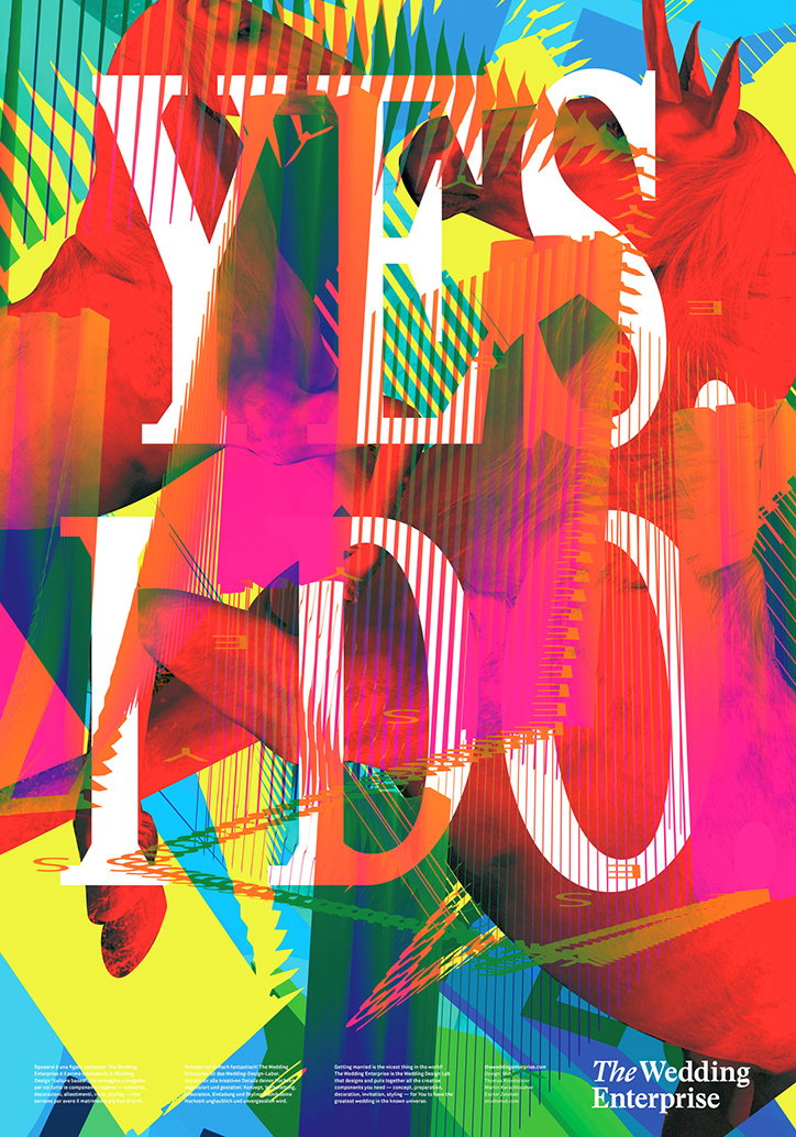
Studio Mut: Wedding poster

A vibrant, multi-layered collage featuring bold white typography that reads “YES I DO”. The text is overlaid on a chaotic mix of bright red, yellow, and blue shapes, including fragmented images of roosters. A small logo in the bottom right corner reads “The Wedding Enterprise”.
Above

Studio Mut: Wedding poster

Share Article

Further Info

About the Author

Emily Gosling

—

Emily joined It’s Nice That as Online Editor in the summer of 2014 after four years at Design Week. She is particularly interested in graphic design, branding and music. After working It's Nice That as both Online Editor and Deputy Editor, Emily left the company in 2016.


It's Nice That Newsletters

Fancy a bit of It's Nice That in your inbox? Sign up to our newsletters and we'll keep you in the loop with everything good going on in the creative world.