Launch Recite Me assistive technology
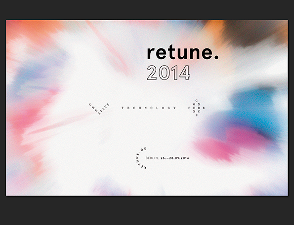
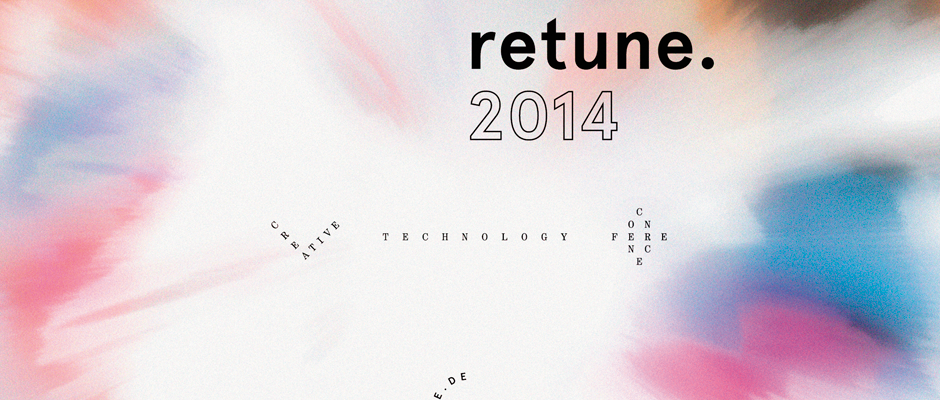
A graphic for a “retune. 2014” event, featuring bold black text and an outlined date. The words “creative technology conference” are spaced widely across the centre over a soft, blurred background of pink, blue and orange hues.

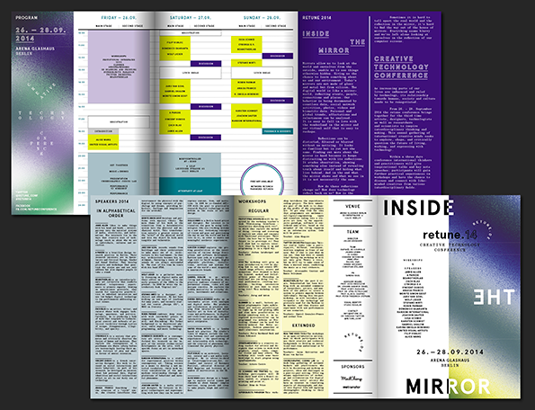
Studio Regular show that it's more than possible to make a timetable look great

—
Date
23 October 2014

Creating a cohesive identity for a design conference might not seem like such a tall order, but the reality of producing flyers, bags, programmes and that all-important logo mark for an international event isn’t as simple as you might think. For starters there’s an abundance of conferences out there, each with it’s own unique look and feel, so creating visuals that present a point of difference will always pose a challenge; secondly how on earth do you make a talks timetable look exciting?

Berlin-based Studio Regular have risen to the challenge admirably, creating an iridescent identity for Retune’s Inside The Mirror creative technology conference. The look and feel of it mirrors the theme perfectly, and we’ll be damned if they haven’t managed to pull off a beautifully engaging programme too.
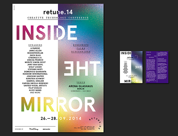
A poster for the “retune.14 creative technology conference” featuring a mirrored layout. The words “INSIDE” and “MIRROR” appear in bold, colourful type, with a list of speakers and the venue “Arena Glashaus Berlin” printed between them.
Above

Studio Regular: Retune Identity

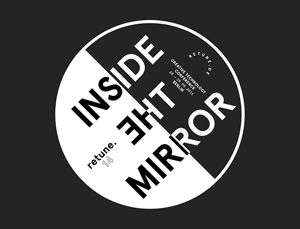
A black and white typographic graphic inside a circle. The bold text reads “INSIDE THE MIRROR”, with the word “THE” mirrored and inverted. Smaller text includes “retune. 14” and details for a “Creative Technology Conference” in Berlin.
Above

Studio Regular: Retune Identity

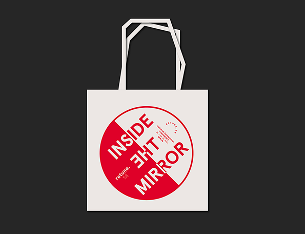
A white shopping bag features a large red and white circular graphic. The bold text reads “INSIDE THE MIRROR”, with the word “THE” mirrored and reversed.
Above

Studio Regular: Retune Identity

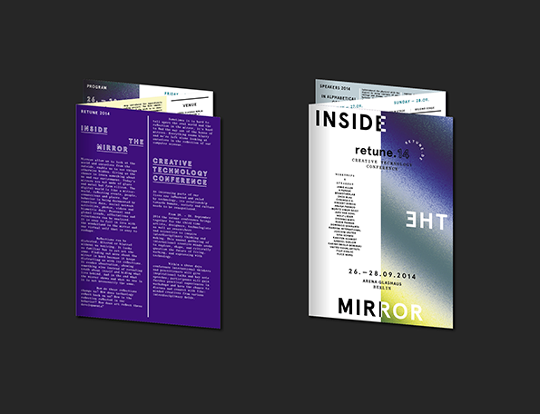
Two brochures for the “retune.14 creative technology conference” are displayed against a dark background. One shows a purple page with the title “Inside the Mirror”, while the other is white with the words “Inside Mirror” and the dates “26.–28.09.2014”.
Above

Studio Regular: Retune Identity

A layout of a multi-page brochure for the “retune.14 creative technology conference”. The design uses a gradient of purple, blue and green with a structured grid of schedules and speaker lists.
Above

Studio Regular: Retune Identity

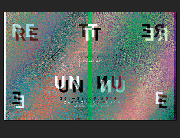
A digital graphic with a grainy, multi-coloured gradient background. Distorted typographic elements are scattered across the frame, including the words “TECHNOLOGY TECHNOLOGY” and the date “26 – 28.09.2014”.
Above

Studio Regular: Retune Identity

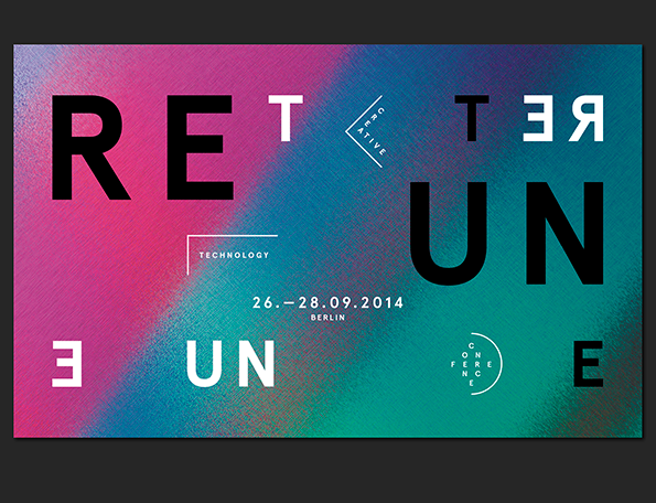
A typographic poster with a gradient background of pink, blue and green. Bold black text reads “RETURN” in a mirrored arrangement, with the words “TECHNOLOGY”, “CREATIVE” and “CONFERENCE” placed around the centre. Smaller text in the middle reads “26.–28.09.2014 BERLIN”.
Above

Studio Regular: Retune Identity

A graphic for a conference featuring a blurred, colourful background of pink, blue and orange. Bold text reads “retune. 2014”, with smaller text below stating “creative technology conference” and the date “Berlin. 26.–28.09.2014”.
Above

Studio Regular: Retune Identity

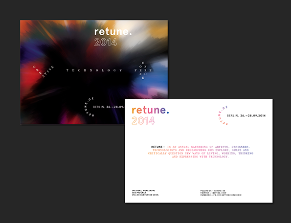
Two promotional cards for the “retune. 2014” conference in Berlin. One card features a blurred, colourful abstract background, while the other is white with a short descriptive text about the event.
Above

Studio Regular: Retune Identity

Share Article

About the Author

James Cartwright

—

James started out as an intern in 2011 and came back in summer of 2012 to work online and latterly as Print Editor, before leaving in May 2015.


It's Nice That Newsletters

Fancy a bit of It's Nice That in your inbox? Sign up to our newsletters and we'll keep you in the loop with everything good going on in the creative world.