Launch Recite Me assistive technology
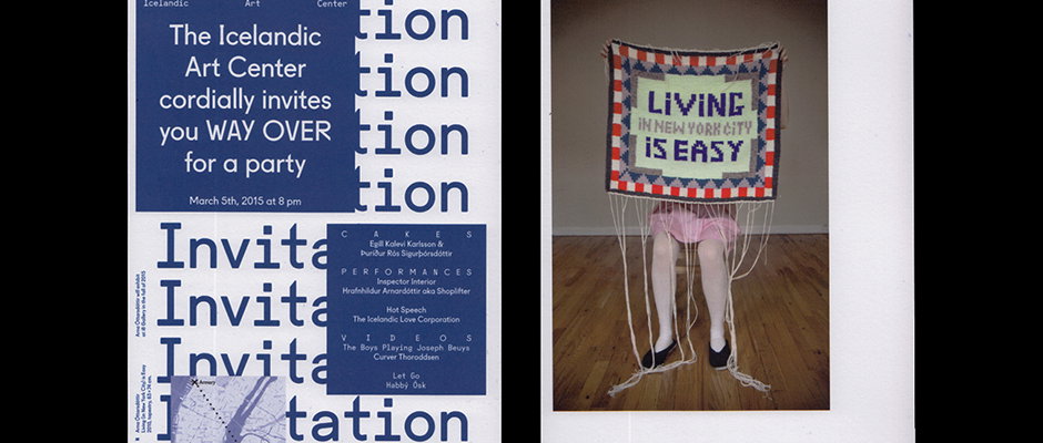
Two images side by side. The first is a blue and white invitation for The Icelandic Art Center, featuring the word “Invitation” repeated in a bold typeface. The second is a photograph of a person wearing a skirt and black shoes, partially hidden behind a crocheted wall hanging that reads “LIVING IN NEW YORK CITY IS EASY”.

Iceland's Studio Studio: so good they named it twice

—
Date
22 June 2015

I don’t know a lot about Icelandic literature, but I know what I like. Well I don’t, but I know when I like the covers, and boy do I like the covers that Studio Studio creates. The Reykjavík-based studio is made up of Arnar Freyr Guðmundsson and Birna Geirfinnsdóttir, and works a lot in the cultural sector designing books, brochures, identities, catalogues, signage, websites and typography. The work is clean, bright and intelligent, with poster designs as crisp and sophisticated as covers for complex literary works. As well as their editorial design prowess, the studio also boasts some brilliant identity design projects, including that for the Icelandic Art Center, which uses a simple blue and white template from which the identity can be expanded in multiple formats and looks using an expressive brushstroke device. Twice the name, and twice as nice.
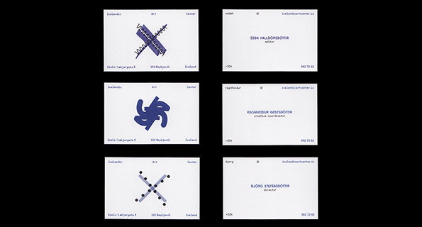
Three pairs of business cards for the Icelandic Art Center. Each pair features a white card with a blue abstract graphic and a corresponding card with a person’s name and job title.
Above

Studio Studio: Icelandic Art Center identity
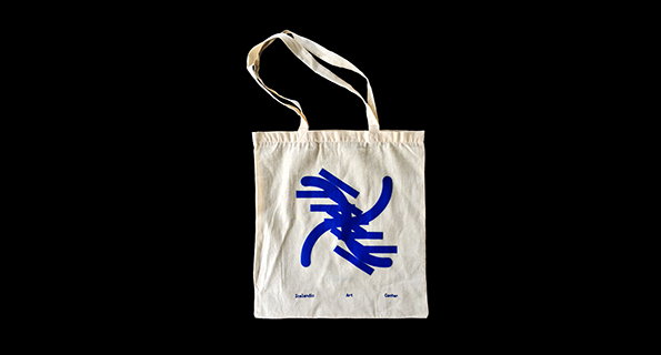
A cream canvas tote bag features a bold, abstract blue graphic of intersecting curved lines. Small blue text at the bottom reads “Icelandic Art Center”.
Above

Studio Studio: Icelandic Art Center identity
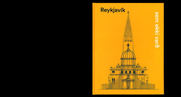
A bright yellow book cover featuring a black line drawing of an ornate building with a tall, pointed spire. Text in the top left reads “Reykjavík” and vertical text on the right reads “sem ekki varð”.
Above

Studio Studio: Reykjavík sem ekki varð, 2014
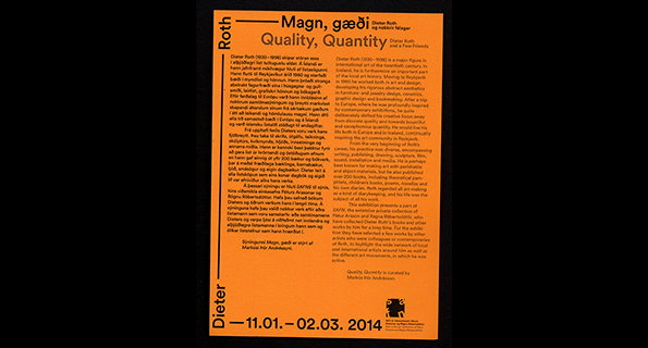
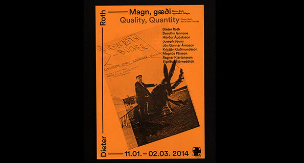
A black and orange exhibition poster for Dieter Roth. The title reads “Magn, gæði / Quality, Quantity” above two columns of text and the dates “11.01. – 02.03. 2014”.
Above

Studio Studio: Safn Identity

An orange and black poster for an exhibition titled “Magn, gæði” and “Quality, Quantity”. It features a black and white photograph of a person sitting on a horse in front of a building. A list of artists is printed to the right, including Dieter Roth and Joseph Beuys.
Above

Studio Studio: Safn Identity

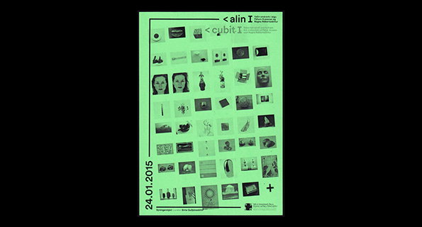
A green poster featuring a grid of small, dark images and photographs. Text at the top reads “< alin I” and “< cubit I”, with the date “24.01.2015” running vertically along the left edge.
Above

Studio Studio: Safn Identity

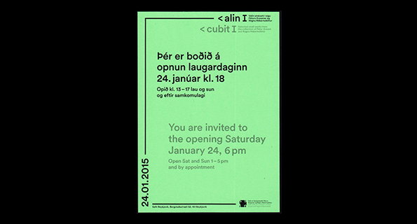
A mint green poster featuring black text in both Icelandic and English. It reads “You are invited to the opening Saturday January 24, 6 pm” and lists opening hours.
Above

Studio Studio: Safn Identity

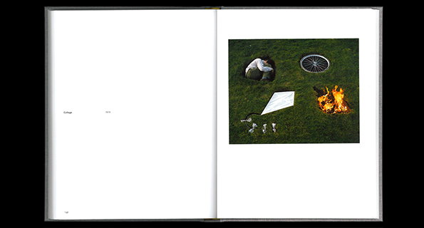
An open book shows a photograph on the right page. The image is a top-down view of a person sitting in a hole in the grass, surrounded by a bicycle wheel, a white cloth and a small fire.
Above

Studio Studio: Sigurður Guðmundsson, 2014
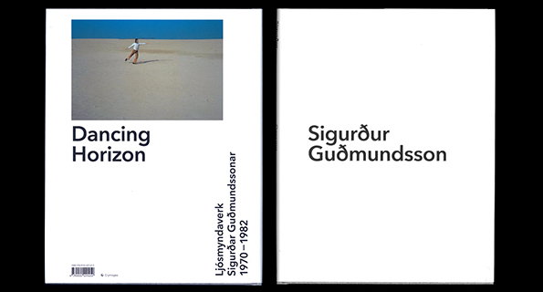
The front and back covers of a book. The front cover features a photo of a person dancing on a beach under a blue sky, with the title “Dancing Horizon” and the text “Ljósmyndaverk Sigurður Guðmundssonar 1970–1982”. The back cover is plain white with the name “Sigurður Guðmundsson”.
Above

Studio Studio: Sigurður Guðmundsson, 2014
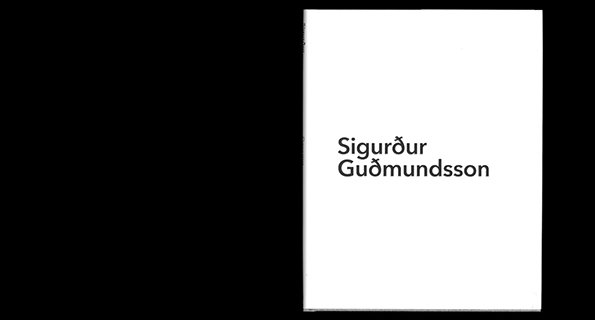
A white book cover with the name “Sigurður Guðmundsson” printed in a simple black sans-serif typeface. The text is positioned in the centre of the page.
Above

Studio Studio: Sigurður Guðmundsson, 2014
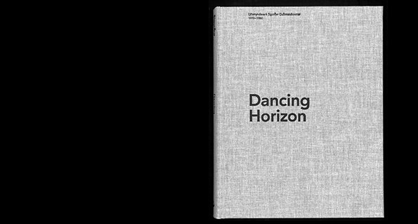
A grey linen-textured book cover with the title “Dancing Horizon” printed in a bold, black sans-serif font. Smaller text at the top reads “Gunterywork Spoor Gultmadonner 1970–1982”.
Above

Studio Studio: Sigurður Guðmundsson, 2014

Share Article

About the Author

Emily Gosling

—

Emily joined It’s Nice That as Online Editor in the summer of 2014 after four years at Design Week. She is particularly interested in graphic design, branding and music. After working It's Nice That as both Online Editor and Deputy Editor, Emily left the company in 2016.


It's Nice That Newsletters

Fancy a bit of It's Nice That in your inbox? Sign up to our newsletters and we'll keep you in the loop with everything good going on in the creative world.