Launch Recite Me assistive technology
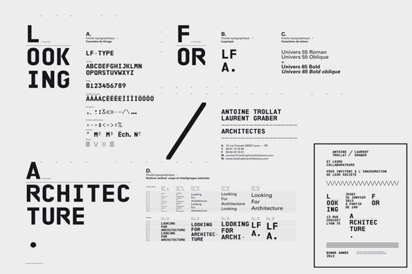
A black and white typographic style guide for an architecture firm. It features the brand name “Looking For Architecture” alongside font samples, character sets and a formal invitation card.

Typophiles Superscript² show us how it's done the other side of the Channel

—
Date
25 April 2012

I like to see words put together nicely – it’s the liquidity of some words on a page or the dynamism of others that just gets me really excited. So it’s always welcome when a studio such as Lyon based Superscript² are so evidently into typography and careful layout it makes me say “oooh.” Everything about their work is thoughtful, clean and fits together extremely well. Their sharp design is often monochromatic too, giving not only the people they design for, but the studio, a strong visual identity. It’s the stacks of fonts they’ve designed collated on their website I enjoy looking through most though, as it’s clear this is where their true passion lies.
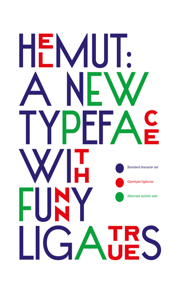
A typographic poster reads “HEMUT: A NEW TYPEFACE WITH FUNNY LIGATURES”. The text uses a mix of blue, red and green letters to highlight different character sets.
Above

Superscript²: Helmut typography

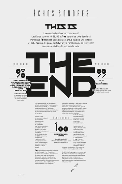
A black and white typographic poster reads “ECHOS SONORES” at the top, followed by “THIS IS THE END” in large, bold lettering. The layout includes detailed French text and lists of names across three columns, marking the final editions of a series.
Above

Superscript²: Echo Sonores- The End poster
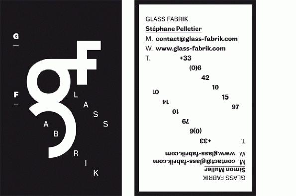
Two business card designs for Glass Fabrik. One features a bold white “gf” logo on a black background, with the words “glass fabrik” scattered around the letters. The other is white with black text, listing contact details for Stéphane Pelletier and Simon Muller, with the text mirrored and rotated in a circle.
Above

Superscript²: Glass Fabrik visual identity
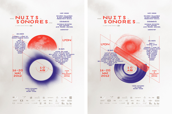
Two versions of a poster for the “Nuits Sonores” electronic music festival in Lyon. A large, blurred red and blue circle sits centrally over a list of artists and the dates “16–20 Mai 2012”.
Above

Superscript²: Nuits Sonores Festival 2012 poster
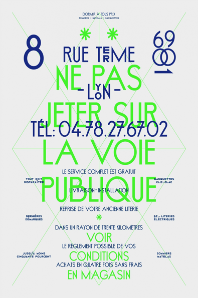
A typographic poster featuring a mix of blue and bright green text on a pale background. Large green letters read “NE PAS JETER SUR LA VOIE PUBLIQUE”, layered over blue text including the address “8 RUE TERME” and a telephone number.
Above

Superscript²: Beautiful Banal poster/typography
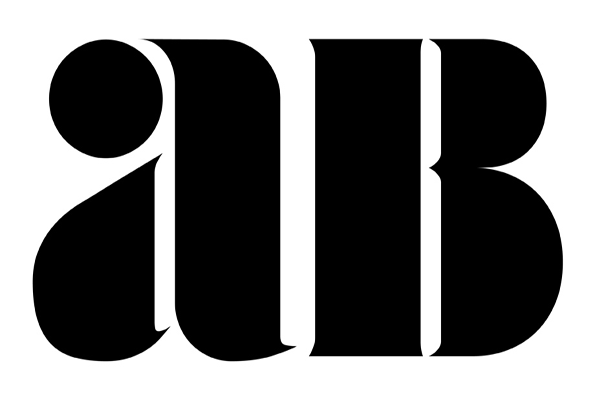
A bold black typographic logo on a white background reads “ab”. The letters are rendered in a heavy, high-contrast serif typeface.
Above

Superscript²: AZL3 typography

Share Article

About the Author

Rebecca Fulleylove

—

Rebecca Fulleylove is a freelance writer and editor specialising in art, design and culture. She is also senior writer at Creative Review, having previously worked at Elephant, Google Arts & Culture, and It’s Nice That.


It's Nice That Newsletters

Fancy a bit of It's Nice That in your inbox? Sign up to our newsletters and we'll keep you in the loop with everything good going on in the creative world.