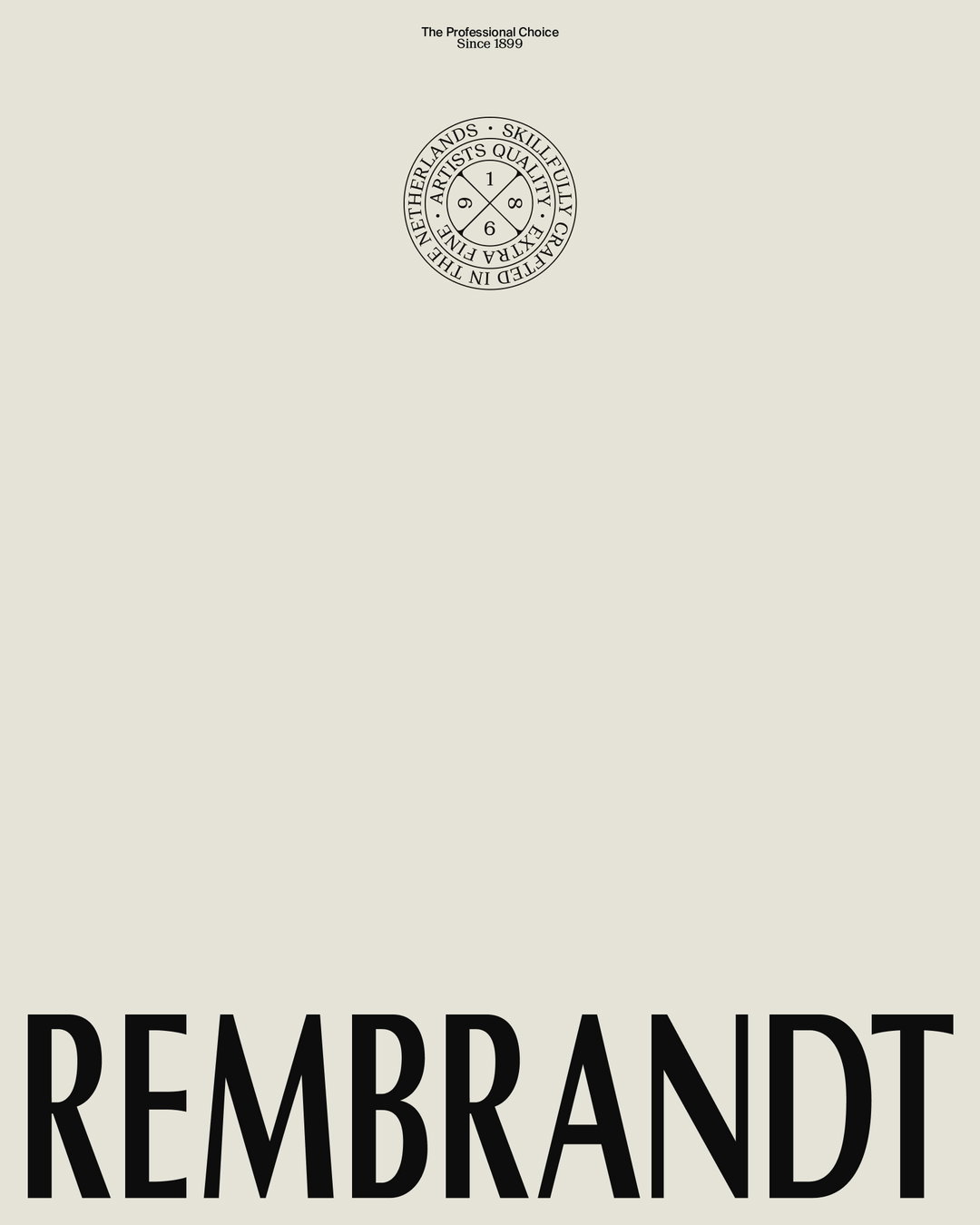
Sylvan Hillebrand gives a 125-year-old oil paint company a contemporary refresh
Rembrandt wanted to move away from a “traditional, slightly dusty expression of craftsmanship” to an identity that feels more relevant to a younger generation of serious artists.
For over 125 years, Dutch company Rembrandt has produced oil paints prized by professionals for their transparency and glow. Each colour follows a unique recipe, with every new batch undergoing quality control in the company’s own laboratory. Today, its materials are used by thousands of artists across more than 100 countries.
“The brief was not to reinvent Rembrandt, but to sharpen its identity,” says Dutch designer Sylvan Hillebrand, who was tasked with updating the company’s visual identity. The client wanted to move away from its “overly traditional, slightly dusty expression of craftsmanship” to something more relevant to a younger generation of serious artists who value high-quality materials.
This posed a challenge. Because the brand exists across retail and online, with hundreds of colours across multiple products like oil paint, pastels and watercolours, a new identity had to be introduced gradually. Retailers also hold varying amounts of existing stock, so it can take years for every product to be updated. For that reason, the rebrand had to work alongside the existing identity during this transition.
Gallery(Copyright © Sylvan Hillebrand, 2026)
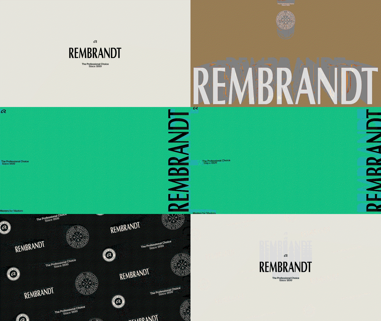
To fully focus on the project, Sylvan moved to Bologna for a month. “I needed some distance from the Netherlands to look at Rembrandt and its Dutch origins from both an inside and an outside perspective,” he explains. In that time he developed a fresh identity that would introduce a new type system, an expanded colour palette, a reworked heritage badge and fresh brand imagery.
He kept the logotype because it had to be immediately recognisable, but he redrew, kerned and tested it without making the change too noticeable for the average consumer. For the typeface, he introduced Suisse International to carry the contemporary, functional side, along with Suisse Neu for a more expressive, heritage-led counterpoint. This pairing allows the identity to move between the two expressions, as well as nodding to Swiss type history as a long-standing influence on Dutch graphic design.
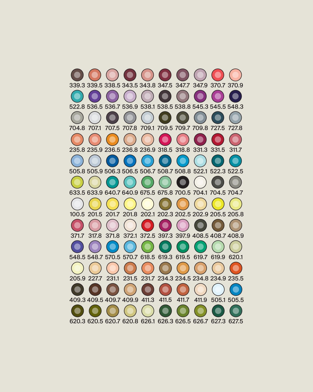
Sylvan decided to keep the brand’s original black, gold and off-white colour palette, but with added burgundy, green and a warm grey. “Together, they broadened the palette without making it feel too bright or trend-led and it allowed us to dial the identity up or down depending on the application,” he explained. The graphic language also nods to the brand’s namesake, the Dutch Golden Age painter Rembrandt Harmenszoon van Rijn. This plays out through bold colour contrasts, and layouts that shift between oversized typography and finely detailed information.
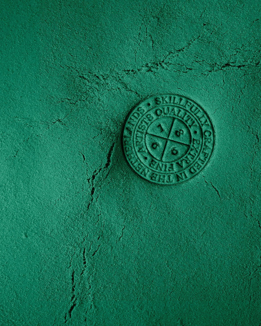
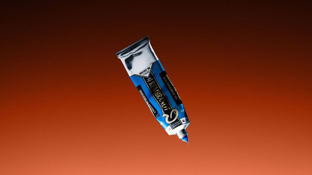
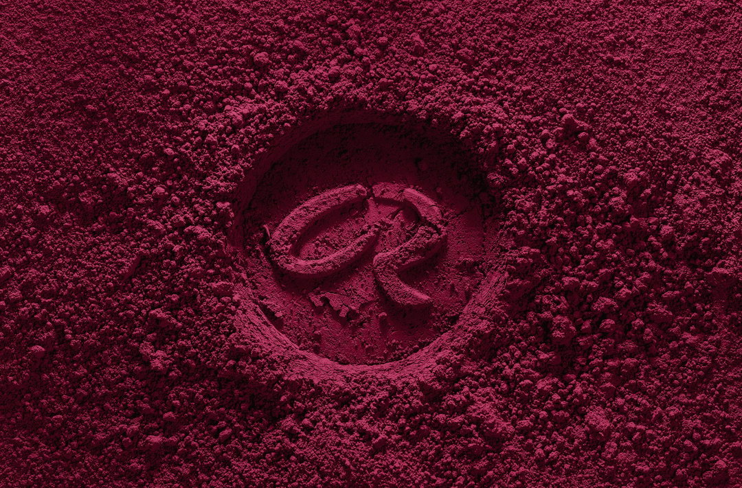
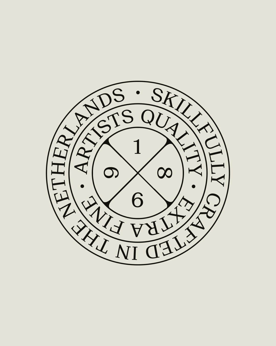
Next, Sylvan updated the heritage badge. Taking inspiration from a circular mark found in one of Rembrandt’s etchings, he created a quality stamp to signal authenticity and craftsmanship. Finally, for product shots, he worked with photographer Corey Martin to shoot the products against gradient backgrounds, and stamping the logo and heritage badge into actual paint pigments.
The project is an example of how strict restraints can create more creative possibilities. In the end, Sylvan found the perfect balance between preserving a heritage brand giving it a contemporary makeover: “It still feels recognisably Rembrandt, but has much more range than before,” he ends.
Gallery(Copyright © Sylvan Hillebrand, 2026)


Hero Header
(Copyright © Sylvan Hillebrand, 2026)
Share Article
Further Info
About the Author
—
Marigold Warner is a British-Japanese writer and editor based in Tokyo. She covers art and culture, and is particularly interested in Japanese photography and design.