




Tata & Friends creates colourful plural identity for Medialab Prado
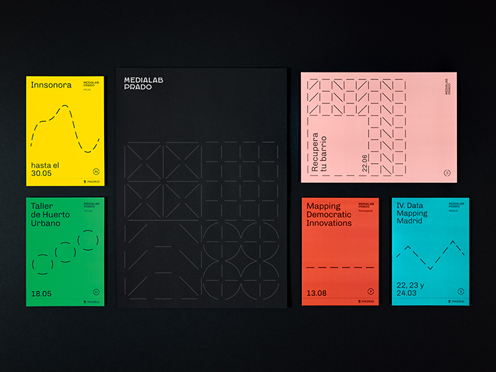
Madrid-based studio Tata&Friends has worked with Medialab Prado on its new identity. Medialab Prado is an I+D department for the citizenship. It’s a public entity that does research and builds solutions to improve communities through human-centred design and open source technologies. The organisation is structured as laboratories, each one dedicated to a topic of research including audio and video, biotechnology and democratic participation among others.
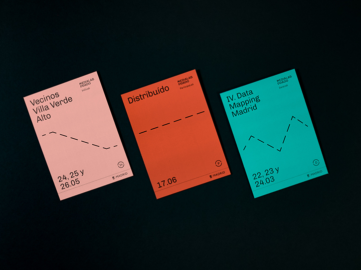
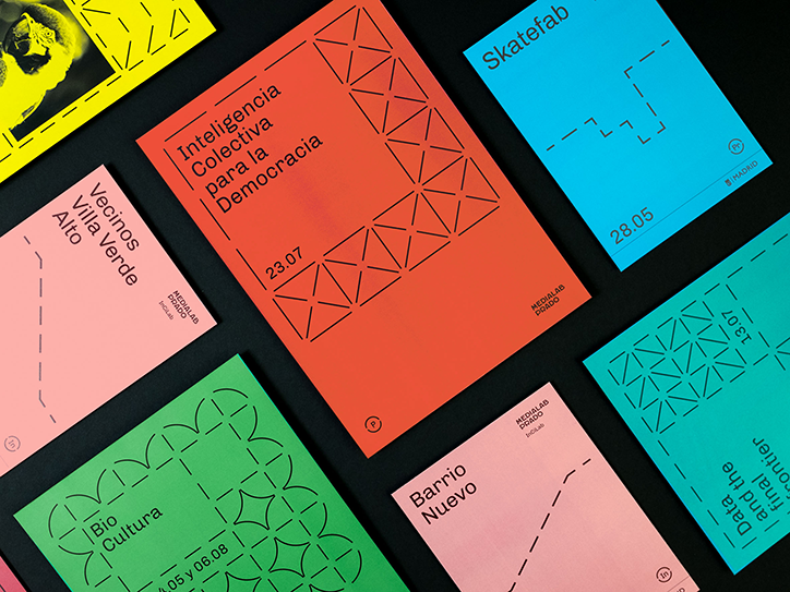
Tata&Friends’ initial brief was to create six different identities for each lab. “But after the initial interviews, we understood the real need was to simplify its communications and outputs, having too many identities would just dilute and weaken its message,” explains the studio. “What we proposed was to build a system that unifies all of Medialab’s communications and to build a scalable system that allows each lab to be unique but speaking the same visual language.”
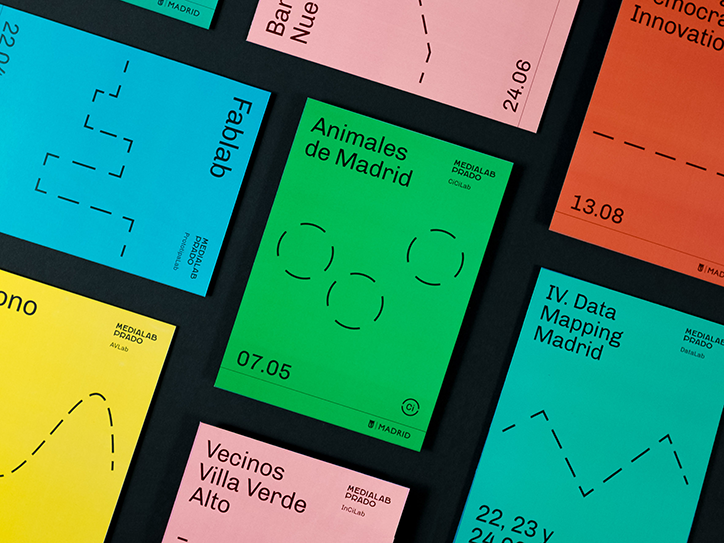
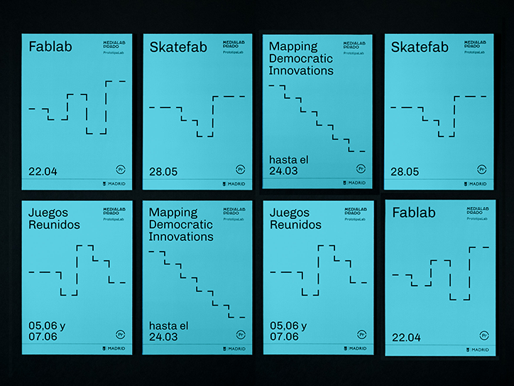
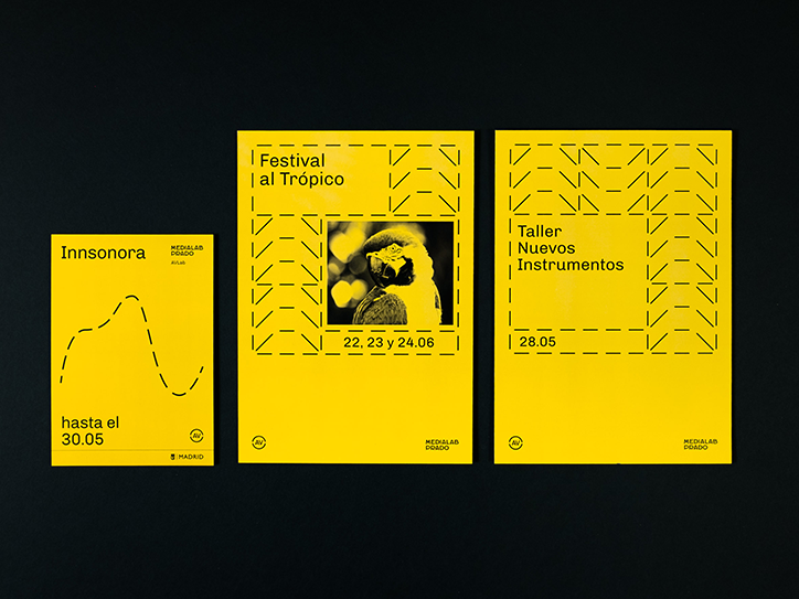
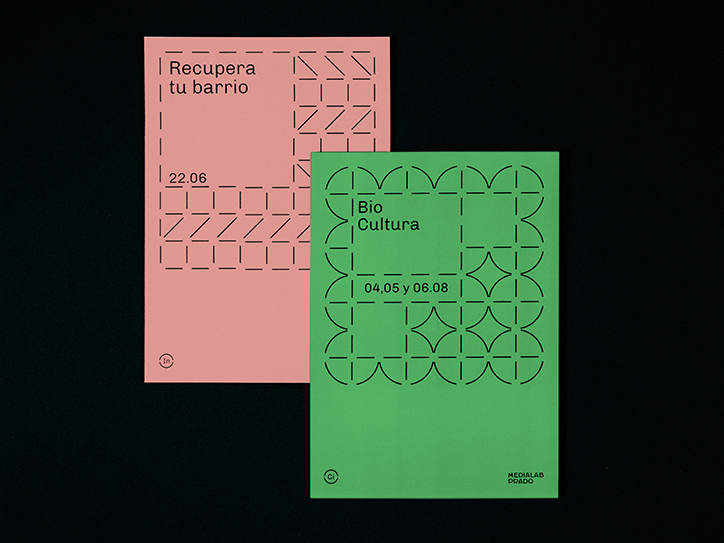
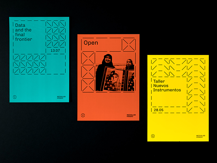
The scalable system was used for naming, icons, colouring and creating patterns for the existing laboratories as well as future ones. “One of the main values is inclusivity, so we decided the design has to be as simple as possible and easy to update and create new events. Following their principles, anyone should be able to do it,” says Tata&Friends. The result is a plural identity that not only distinguishes each lab, also unifies the organisation as a whole.
Each lab has its own bright colour and the typography is an open font. “We did extensive research about open fonts and one of the challenges was to find one that transmits this modern approach, and also technically very well structured. We found that the font Chivo by Omnibus-Type, which was amazing to represent these values – it’s a sans with a technological touch that fits perfect for the voice of the centre,” says Tata&Friends. The simply geometric patterns applied to the identity acts as a symbol for community and collaboration. “A dotted grid was the base for all patterns, we played to create a pattern for each lab, and manages to set the rules for new ones,” the studio explains.
The identity relates to the work of Tata&Friends as a whole, where for every project it aims to “transmit the essence as simple as possible” avoiding anything overly decorative, working hard instead to be legible and honest with a solid concept. “We try to achieve a balance between function and emotions,” says Tata&Friends.
Tata&Friends: Medialab Prado
Tata&Friends: Medialab Prado
Tata&Friends: Medialab Prado
Tata&Friends: Medialab Prado
Tata&Friends: Medialab Prado
Tata&Friends: Medialab Prado
Tata&Friends: Medialab Prado
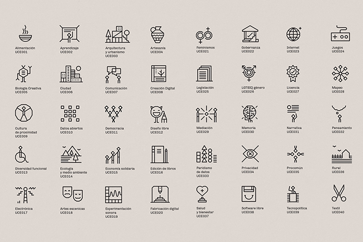
Tata&Friends: Medialab Prado
Share Article
Further Info
About the Author
—
Rebecca Fulleylove is a freelance writer and editor specialising in art, design and culture. She is also senior writer at Creative Review, having previously worked at Elephant, Google Arts & Culture, and It’s Nice That.



