




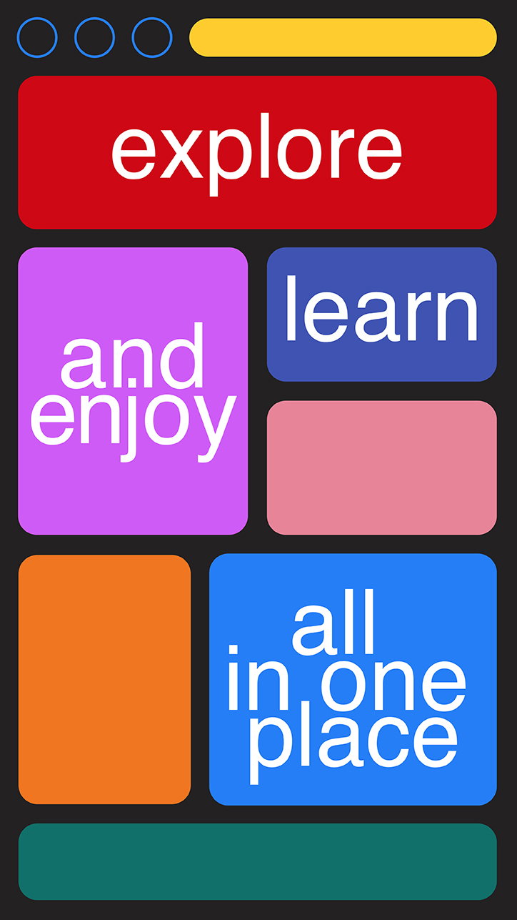
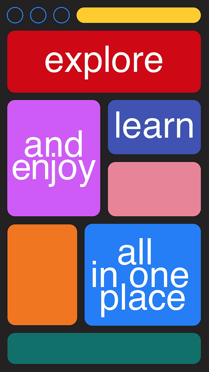
Graphic designer Tatiana Egoshina uses “plain forms, bright colours and clear metaphors”
When we stumbled upon the portfolio site of graphic designer Tatiana Egoshina, it’s safe to say her bold colours, geometric shapes and playful typography caught our eye. Originally from a small republic in Russia called Mari El, but now based in Moscow, Tatiana’s combination of techniques sees her portfolio sitting somewhere between motion design, illustration and graphic design.
For someone clearly so graphically-minded, Tatiana’s creative career actually began in the world of classical art which she studied in school. “But,” she tells It’s Nice That, “then I chose a graphic design institute to study in, because I like to explore unfamiliar things and it looked more modern, so that’s how it all began!”
Currently a designer at Readymag – a “web-tool for designing websites, presentations, portfolios and all kinds of digital publications” – at the heart of everything Tatiana makes is simplicity; a clarity of communication. It’s these ideas which initially drew her away from art and towards graphic design, in fact, as it’s a medium which encompasses a “very simple visual language, but I always have to think a lot to make it that simple and understandable,” she adds. In turn, her work features “simple decisions, plain forms, bright colours and clear metaphors” which are directly dictated by the project at hand.
A particularly intriguing project of Tatiana’s is her ongoing work for Bar Strelka which sees her designing weekly posters for its parties. With no restraint shown in terms of colour, Tatiana contributes to what has become a signature visual language for the institute, one very much defined by the likes of Anna Kulachek. “I’ve done a hundred of them already and don’t plan to stop,” Tatiana explains. “I like it because it’s always a tricky task to make a fresh image but stay in one visual language.”
Whatever the project – and whatever the medium, be it web design, editorial or typography – there’s an inherent playfulness to Tatiana’s portfolio. Her amalgamation of shape, colour and type demonstrates experimentation in an unencumbered manner but with a sense to know when it’s time to strip things back – when less is more.

Tatiana Egoshina: Readymag
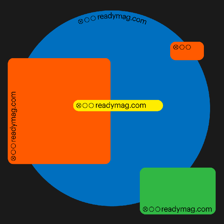
Tatiana Egoshina: Readymag
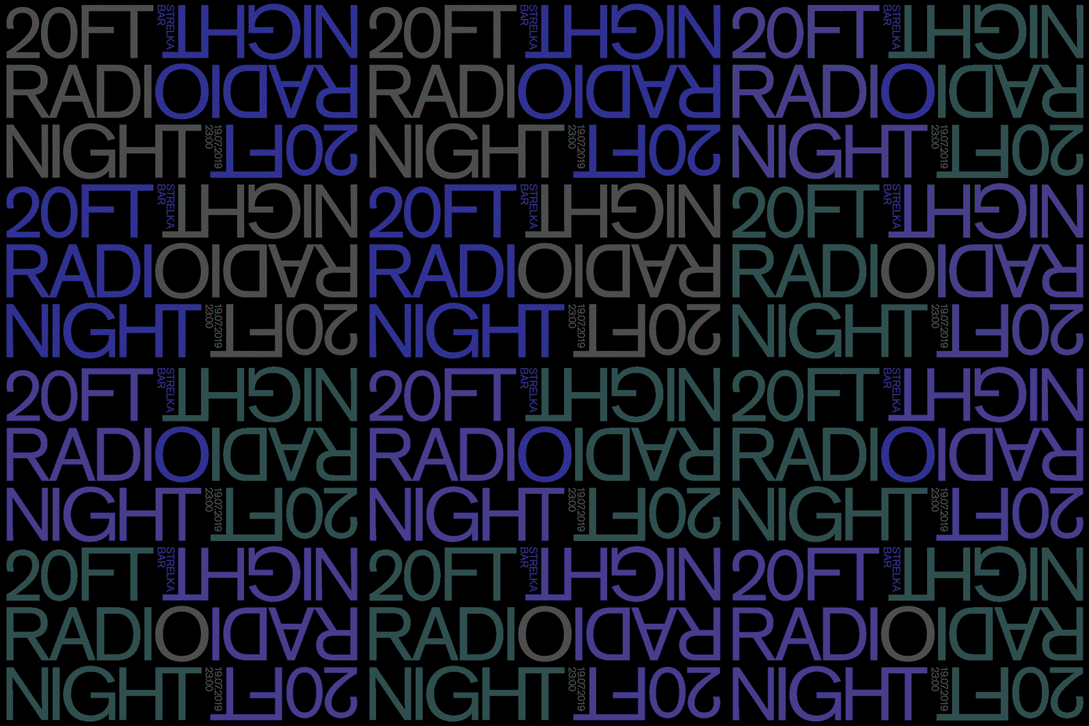
Tatiana Egoshina: Bar Strelka
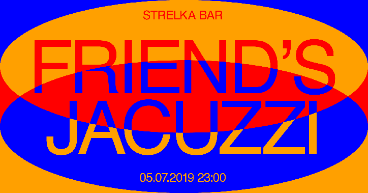
Tatiana Egoshina: Bar Strelka
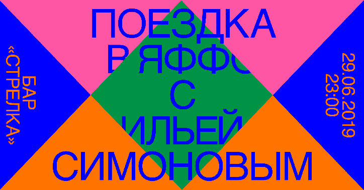
Tatiana Egoshina: Bar Strelka
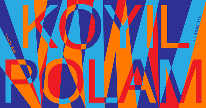
Tatiana Egoshina: Bar Strelka
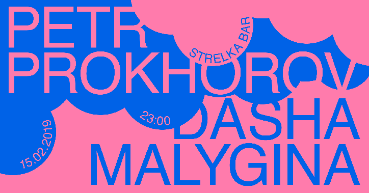
Tatiana Egoshina: Bar Strelka
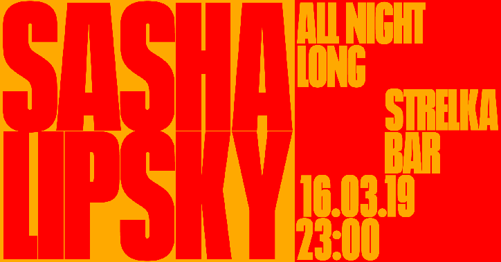
Tatiana Egoshina: Bar Strelka
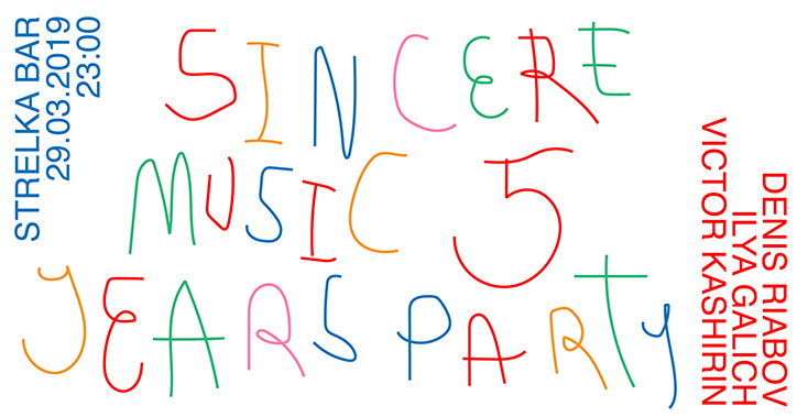
Tatiana Egoshina: Bar Strelka
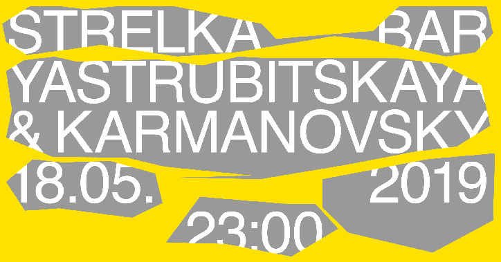
Tatiana Egoshina: Bar Strelka
Share Article
Further Info
About the Author
—
Ruby is Senior Creative at It's Nice That, overseeing our visual output across platforms and projects. Before that, she was associate editor on the editorial team, after joining in September 2017 following graduation from Central Saint Martins.