The View From Cairo: how Helmi Eltouni’s al-Hilal book covers carved a modern Arab aesthetic
In his first column, Moe Elhossieny charts how the iconic Egyptian graphic designer, artist and calligrapher challenged Western-centric design ideals and created a visual legacy still influential today.
Share
The View From... is a new column on It’s Nice That written by a team of international correspondents in major creative cities around the world. Every two weeks we’ll report on the design scene in these cities, exploring the topics that are making an impact on the local creative community there. This week, Moe Elhossieny is reporting from Cairo.
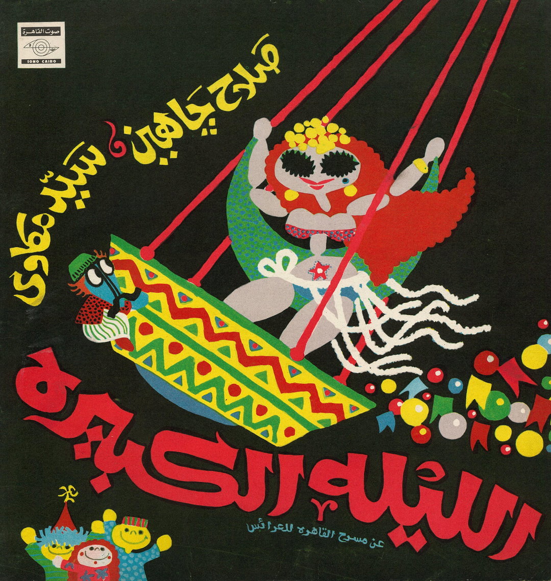
Helmi Eltouni: vinyl record cover he designed and illustrated, 1972 (Courtesy of Egyptian 45 RPM record cover archive)
In the heart of Egypt’s design scene stands an unyielding figure, Helmi Eltouni, whose legacy as a modernist artist and designer transcends time. Arab scholars such as Yasmine Nachabe Taan, Haytham Nawar, Bahia Shehab and Zeina Maasri have noted that Eltouni designed and illustrated thousands of books throughout his career. So, for this piece (the first The View From column to come out of Cairo), I’ve chosen one project that I believe is emblematic of how Eltouni, by immersing himself in the rich local and regional heritage, articulates an authentic and modern Arab graphic practice.
Born in 1934, Eltouni has profoundly influenced and continues to influence generations of Arab designers and illustrators alike. His mastery in melding various artistic styles with culturally resonant design garnered him a reputation that opened doors to collaborations with major Egyptian and regional publishing and cultural institutions. He belongs to a generation of Egyptian graphic artists that attempted to articulate Arab-modernist aesthetics during the second half of the 20th century. This was a time marked by an Arab anti-colonial artistic and intellectual fervour to resist the Euro-American aesthetic and cultural hegemony which was proliferating in the Arab world through mass-printed media. The rising threat of a Euro-American cultural imperial project set in motion a generational debate on cultural authenticity and modernity that still echoes to this day.
Eltouni’s position sought to redefine the relationship between cultural authenticity and modernity in Arab design, challenging the conventional dichotomy that often positions them in opposition. Instead, he advocated for a framework that embraced the coexistence of both principles without sacrificing one for the other.
Al-Hilal fiction books
The project I will unpack in this piece is a series of book covers designed for al-Hilal, a Cairo-based publishing house established in 1892, namely a sub-series titled al-Hilal fictions.
Following a political exile in Beirut (1974–83), Eltouni returned to Cairo and resumed his role as art director at al-Hilal with a sharper sense of Arab identity and honed graphic skills. Eltouni slowly started to transform the art direction of al-Hilal fiction books by fusing extensive historical knowledge from folklore art, Islamic and Coptic manuscript traditions, Pharaonic symbols, miniature manuscript drawings, as well as Arabic calligraphy.
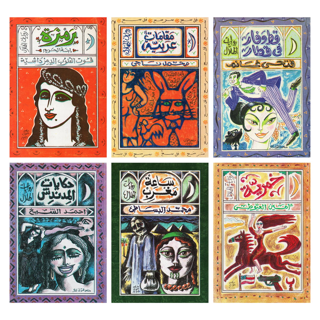
Helmi Eltouni: various book cover designs for al-Hilal fiction books, various dates. (Collection of the Arabic Design Archive and the author)
The Quest for Cultural Identity
Throughout the years, Eltouni’s work exhibited a clear interest in, and understanding of, Islamic art. Al-Hilal book covers were no exception. This recurring theme represents the evolution of a particular design approach across his work. His interest in Islamic art was part of a broader movement to assert the positioning of Islamic art as a precursor to European abstraction. This positioning challenged Western-centric narratives of originality and creative genesis while underscoring the interconnectedness of global art movements.
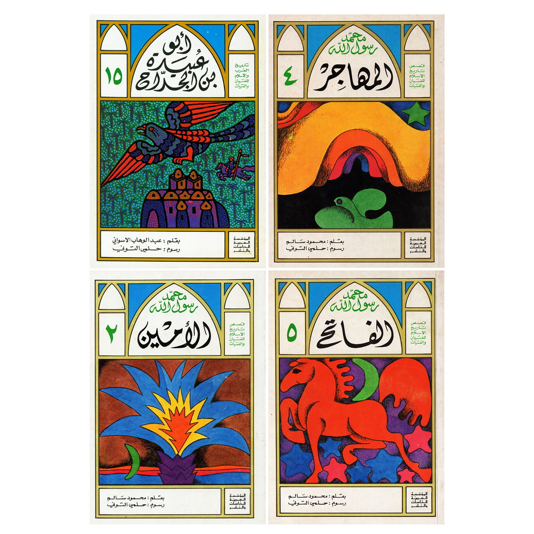
Helmi Eltouni: designs for Stories from the History of Islam for the Youth book series, 1977 (Collection of the author)
The book series published by the Arab Institute for Research & Publishing, Beirut, 1978 titled “Stories from the History of Islam for the Youth”, exemplifies this early preoccupation with Islamic art, namely how he took inspiration from manuscript practices. When viewed chronologically, this series can be considered an earlier iteration of al-Hilal book covers.
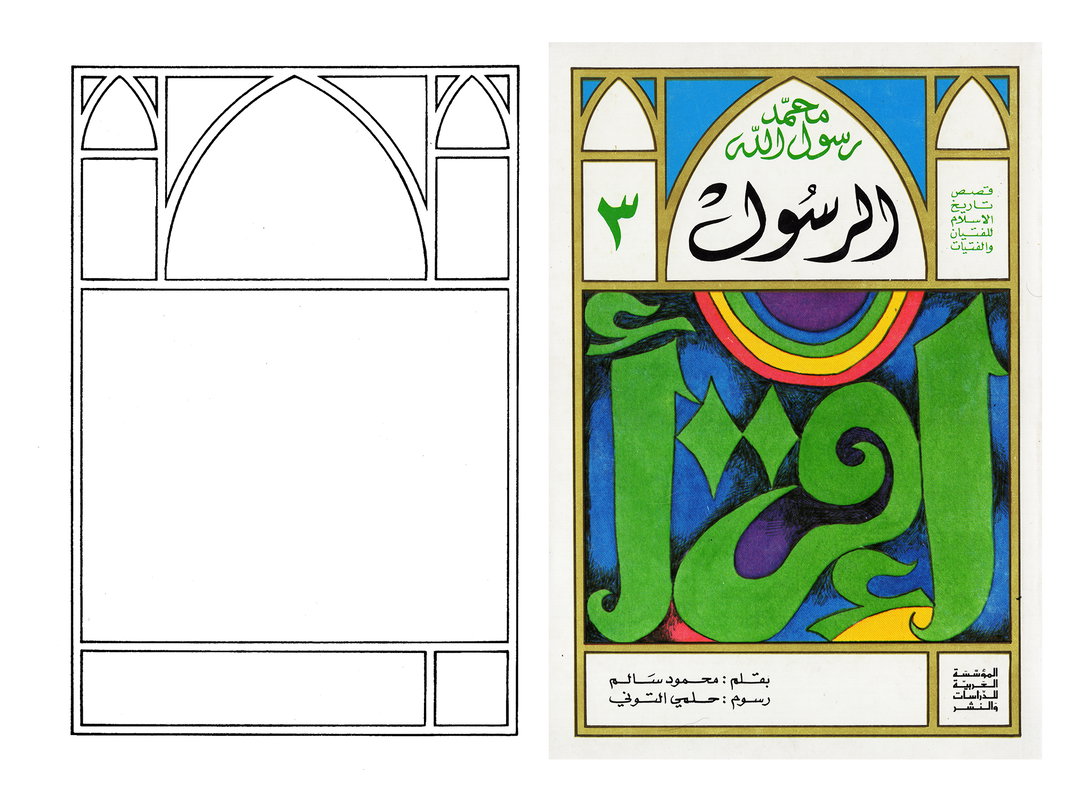
Helmi Eltouni: designs for Mohamed the Prophet book cover, part of Stories from the History of Islam for the Youth book series, 1977 (Collection of the author)
Layout
The early manuscript calligraphers and bookmakers were inspired by architecture and approached book design as a spatial challenge. They used a particular kind of grid based on modular units to compartmentalise and compose the book content and design. They did not shy away from showing this grid structure, so it became in and of itself a design element, simultaneously helping structure the rest of the elements and used for decorative purposes.
Eltouni made playful use of this grid conception, fully embracing its visibility and utilised it to compose beautiful modular compartments with borders, arches, and cartouches tailored to his specific design needs. While this modular-based, compartments-like grid may seem restrictive, Eltouni found it liberating because it allowed him to concentrate on his favoured mediums: calligraphy and illustration. Leaning into this conception of the grid represented a departure from the invisible grid championed by the Swiss design style, aligning with his rejection to the dominant Euro-American “universal” design principles.
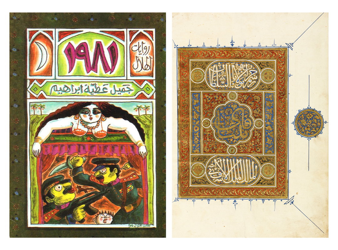
Left: Helmi Eltouni, 1981 book cover design for al-Hilal fiction book series, 1994 (Collection of the author)
Right: Mamluk illuminated frontispiece, 15th century (Courtesy of Chester Beatty, Dublin)
Eltouni’s use of grids is reminiscent of, and most likely inspired by, a tradition in manuscript practices called the frontispiece or title piece – a highly decorative and calligraphic page at the beginning of illuminated manuscripts containing information about the book. These illuminated manuscripts were associated with the elite as they were often commissioned by wealthy patrons. As a self-pronounced populist artist who rejected the association of art with a specific social class, it’s safe to infer that Eltouni approached this meticulously crafted tradition with scepticism, and his interpretation of the frontispiece was more intuitive and fluid. This was marked by him leaning into the more humble stylistic approach of the folk artist who worked on reverse glass paintings, which Eltouni stated he was particularly inspired from on a number of occasions. The dynamic merging of these two seemingly polar traditions of manuscript practices and folk aesthetic treatment, gave his work in these covers and other graphic productions a mesmerising effect.
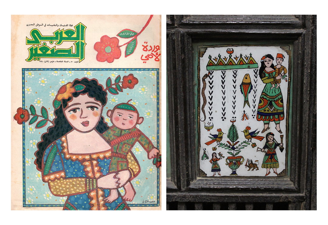
Left: Cover of al-Arabi Magazine by Helmi Eltouni, 1990 (Courtesy of Barq House)
Right: A street tattoo board (Courtesy of the Ethnographic Museum, Cairo)
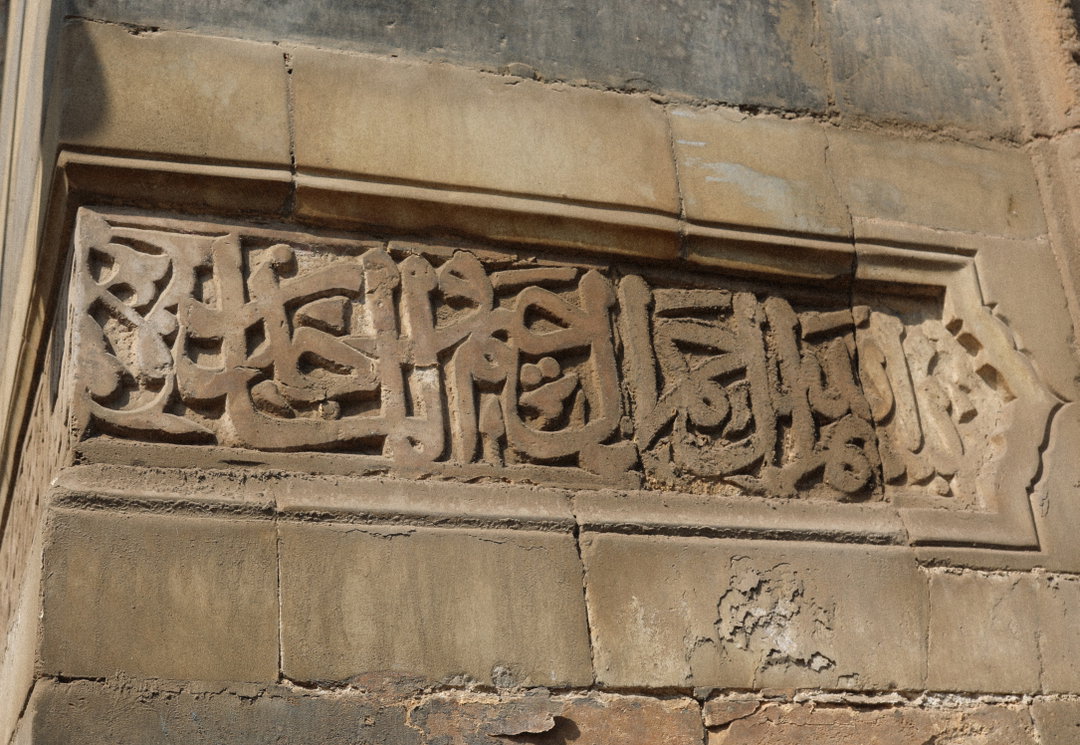
Mamluk mosque inscription (Photograph by the author, 2023)
Layout (calligraphy)
Eltouni’s experimentation with calligraphy spanned his lifetime. In al-Hilal covers and his broader body of work, he favoured to base his calligraphy on the Mamluki Thuluth (a Thuluth script simplified by the Mamluks for use on architecture). His iteration of it imbued the same humble and fluid folk artist signature. Modern type foundries such as Hehe type were particularly inspired by Eltouni’s signature Mamluki Thuluth style and reproduced it into a font called Dobb.
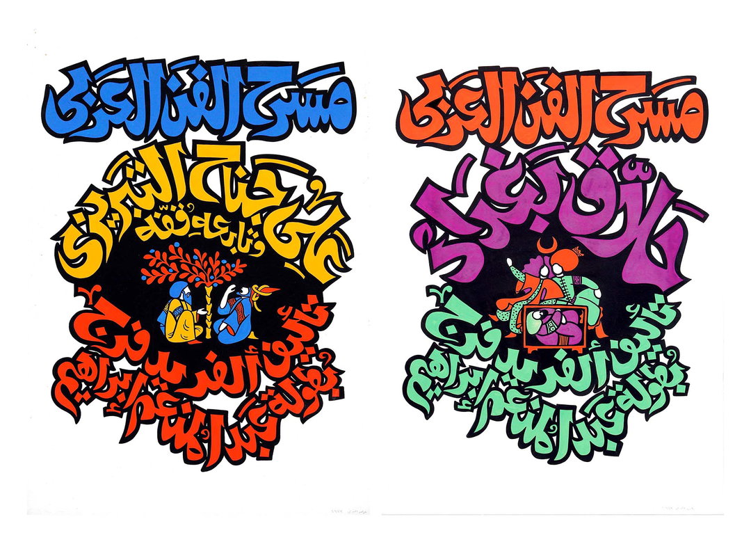
Helmi Eltouni: theatre posters designs, 1973 (Courtesy of A History of Arab Graphic Design)
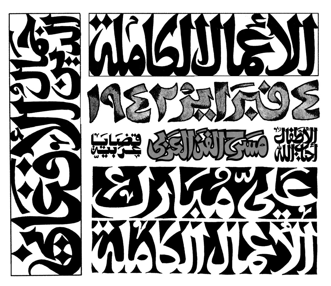
Helmi Eltouni: Thuluth Mamluki calligraphy (Collage by the author)
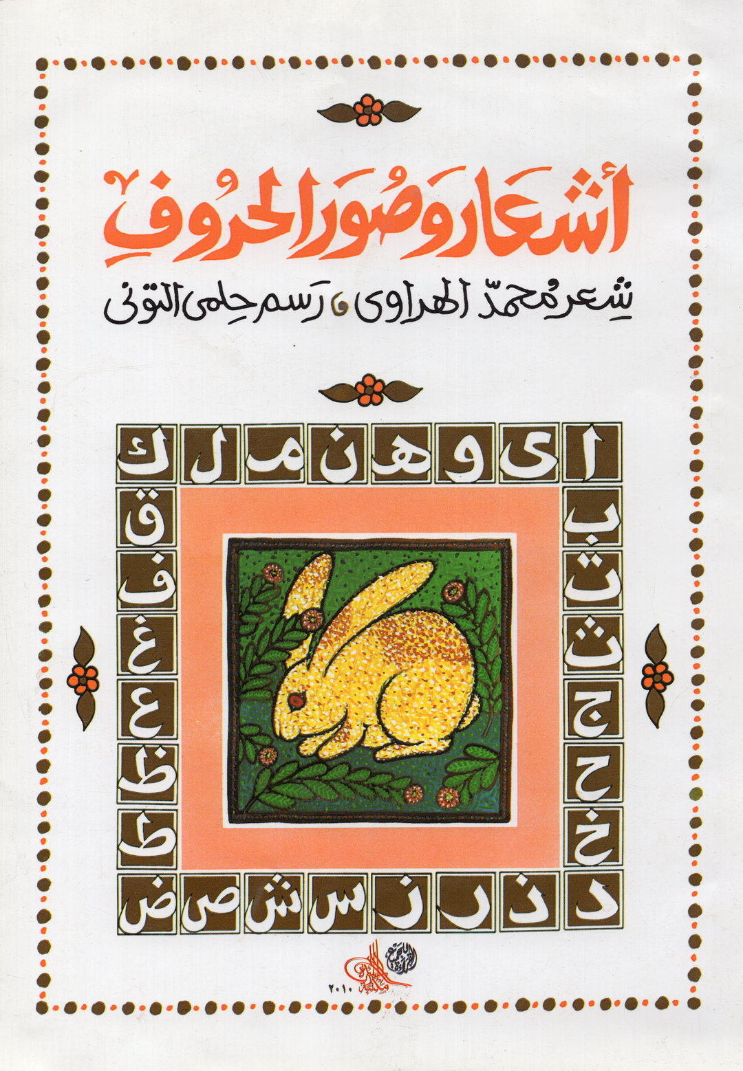
Helmi Eltouni: Poems and the Images of Letters book cover, 1992 (Collection of the author)
Helmi Eltouni: Poster for the Arabic Book Fair, 1979. (Courtesy of Cosmopolitan Radicalism.)
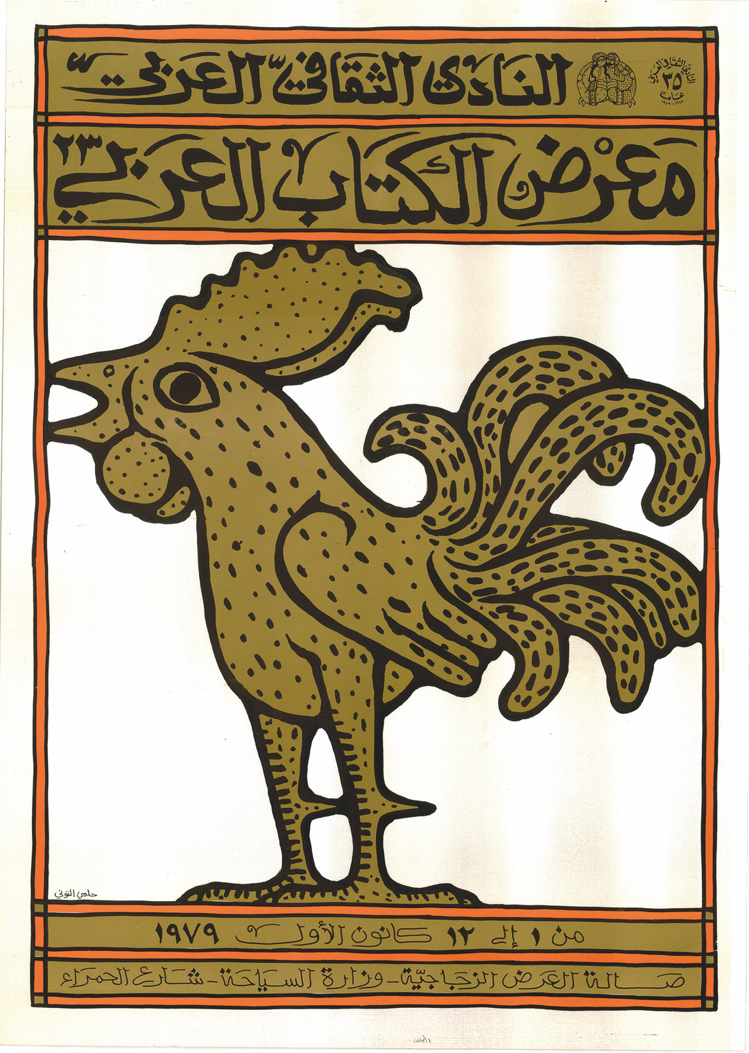
Helmi Eltouni: Poster for the Arabic Book Fair, 1979. (Courtesy of Cosmopolitan Radicalism.)
Illustrations
Eltouni’s illustrations can hardly be categorised under any one specific style because of how diverse and versatile they are. Throughout his career, Eltouni honed a multitude of styles that he was able to summon at will in his designs depending on his interpretation of the work’s content.
In al-Hilal fiction books, this knowledge and skill converged into what seems to be the pinnacle of this approach for Eltouni; in other words, they give us a glimpse into what Eltouni believed to be a modern Arab graphic design aesthetic.
Eltouni’s contribution to Arab design will always inspire us to investigate and learn from our rich history as well as critically engage with global design. To Helmi Eltouni, I dedicate this piece and say thank you for inspiring us.
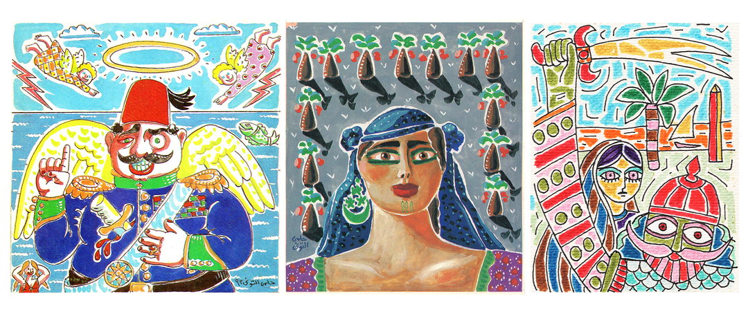
Helmi Eltouni: various illustrations (Collection of the author)
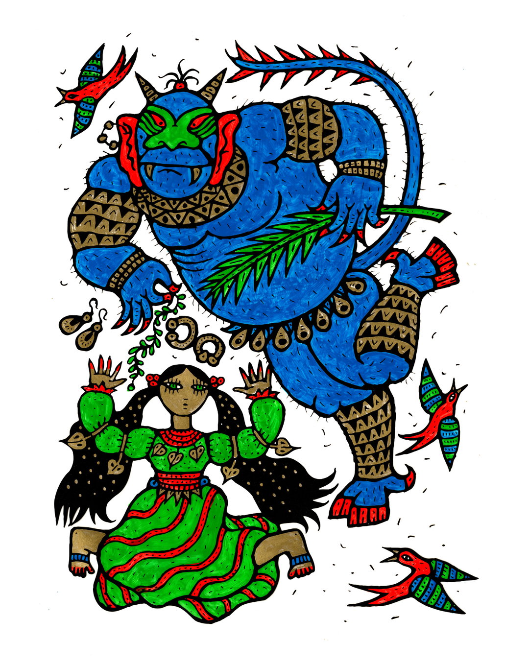
Helmi Eltouni: various illustrations (Collection of the author)
Helmi Eltouni: various illustrations (Collection of the author)
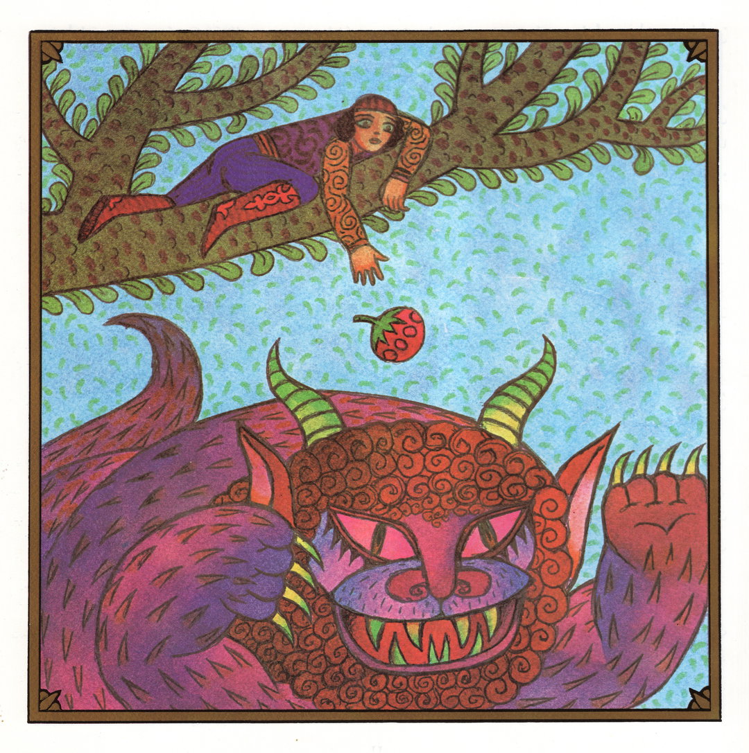
Helmi Eltouni: various illustrations (Collection of the author)
If you want to find out more about Helmi Eltouni and his impact on contemporary Egyptian design, Moe has picked out some local Cairo recommendations including a creative to follow, a typeface to check out, a book to read, and a store to visit.
- Creative to follow: Amira Khalid is a Cairo-based designer who fuses Islamic influences with modern design.
- Check out: the aforementioned Dobb Typeface by Hehe type, inspired by Eltouni’s signature Mamluki Thuluth style.
- Things to buy: Pheel is an artisanal design studio in Cairo, founded by Nour ElSherif and Marwan Fayed, which recently relaunched, making limited edition, beautiful handmade products.
Share Article
Further Info
About the Author
—
Mahmoud Elhossieny is a Cairo-based designer, writer, and researcher. He is the founder of the Arabic Design Archive and Design Repository. His work utilises design and writing to decolonise, contextualise, and facilitate access to Arab design. He is It’s Nice That’s Cairo correspondent.