The Weekender: Throw your arms around your co-worker, it's the Weekender!
Or, y’know, don’t; it is Friday, after all – you might have had a long, hard week, or gotten a bit too over-enthusiastic with the thermal undies, or spit your lunch all down yourself when watching something really funny, or just not quite have had time to get in the shower this morning. There won’t be any arm-throwing here, in any case. Gross. For hugging and non-hugging co-workers alike, it’s Friday night! Get away from your desks!
6. Architectural drawings to blow your mind into next week
Yes they’re by Thibaud Hérem, and yes we gush about him too much. But his new book is too good not to!
5. We interviewed Paul Smith in his office!
What a truly lovely man. Watch the film by James Aiken over here.
4. Furniture that looks like sweets? Yes please. Two.
Too good to eat? More like too good to sit on.
3. A really great bookshelf from one of our fave illustrators
We love Kyle Platts, and his predictably interesting bookshelf.
2. Tourists have never looked so cute
Ah Jan Buchczik. You and your complicated name and beautiful drawings.
1. And finally, a Christmas campaign with a pinch of salt
Just how we like it. Thank you Harvey Nichols for your genuinely quite funny series of rubbish gifts.
After handing over our Friday Mixtape to the guys at NTS Radio last week we decided to treat you to our own studio’s taste once more. Look, no one said we were really cool and into trendy music, we’re into art and shit, yeah? Deal with it. This week we’ve got Jon Grant who got the top spot on the Rough Trade albums of 2013 list some Black Sabbath and some Tom Waits. What more could you ask for?! It’s Friday afternoon, crank. It. Up.
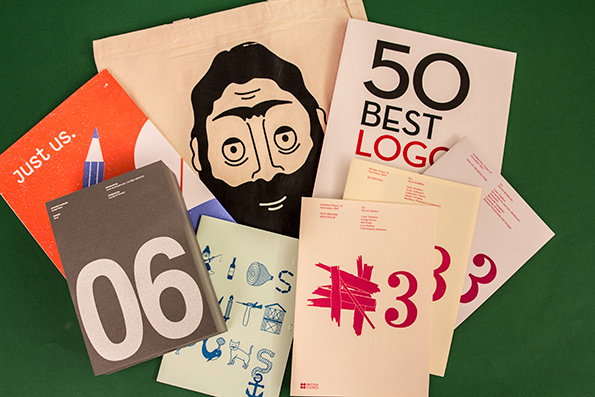
This week featuring pop-up architecture, beardy bags, plenty of logos, a call to arms for arty undergraduates and an oddly recurrent theme of eggs. Prize goes to the first one to spot all of the eggs! Hint: The prize is a funny joke, which is also concealed in Things. We are the gift that just keeps on giving, aren’t we?
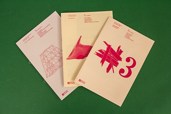
The British Council: ADF Papers, Series #3
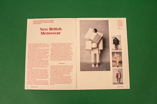
The British Council: ADF Papers, Series #3
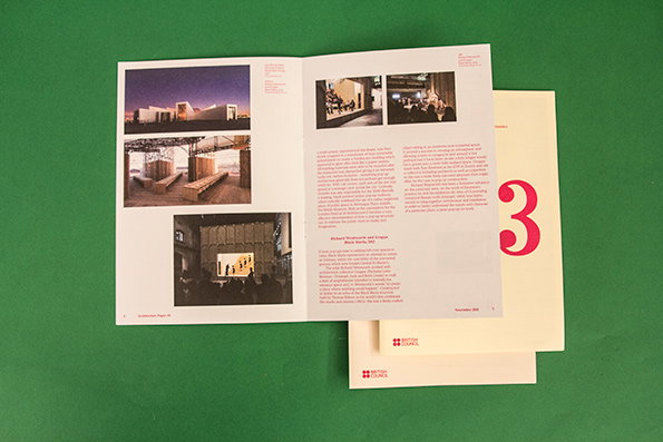
The British Council: ADF Papers, Series #3
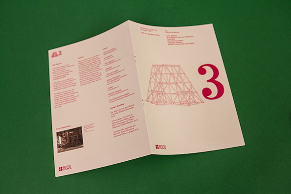
The British Council: ADF Papers, Series #3
The British Council: ADF Papers, Series #3
ADF stands for Architecture, Design and Fashion, the three areas that the British Council is looking to publicise with this collection of essays. Each includes an introduction, case studies and examples of recent projects. This series explores the recent high that British menswear is riding, 3D printing and pop-up architecture, and each issue is expertly written, beautifully designed and carefully curated in its presentation of fairly niche and yet super interesting content. Really excellent.
www.backoftheenvelope.britishcouncil.org
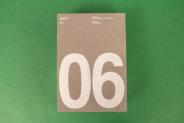
Accept & Proceed: Material Board for Nirvana, Sample No. 6
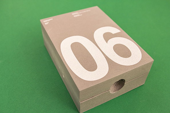
Accept & Proceed: Material Board for Nirvana, Sample No. 6
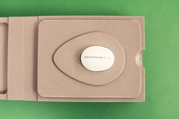
Accept & Proceed: Material Board for Nirvana, Sample No. 6
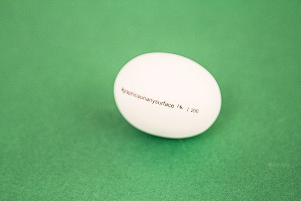
Accept & Proceed: Material Board for Nirvana, Sample No. 6
Accept & Proceed: Material Board for Nirvana, Sample No. 6
Not enough people send us hollow limited edition egg shells encased in foam so it was a relief that FINALLY it happened this week. Nirvana Creative Production House produce a Material Board twice a year where they challenge someone in the industry to rethink a certain material. This time they asked Accept & Proceed studio to work with foam, and to showcase its protective qualities A&P decided to send out the most delicate thing they could think of; enter the hollow egg shell. Thought-provoking, weird and terrifically on brief; and we can confirm it arrived in one piece!
www.nirvanacph.com
Just Us Collective: Poster
Just Us Collective: Poster
Just Us Collective: Poster
Just Us Collective: Poster
Just Us Collective: Poster
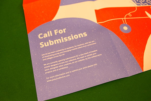
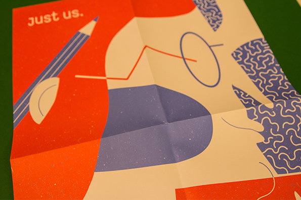
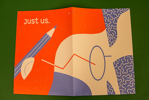
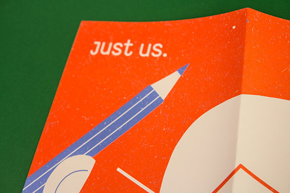
Just Us is a collective of artists, illustrators and designers who promote the work of undergraduates. They sent us this bloody lovely two colour litho printed poster by Evgenia Barinova (a previous member of the collective) to announce their call for submissions 2013/14, as they’re looking for 50 new students to join their ranks. For more information check them out at the address below!
www.justusdesigncollective.com
Kids With Puns: Issue #2 & Two-Faced Tote Bags
Kids With Puns: Issue #2 & Two-Faced Tote Bags
Kids With Puns: Issue #2 & Two-Faced Tote Bags
Kids With Puns: Issue #2 & Two-Faced Tote Bags
Kids With Puns: Issue #2 & Two-Faced Tote Bags
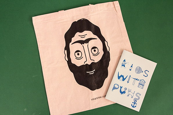
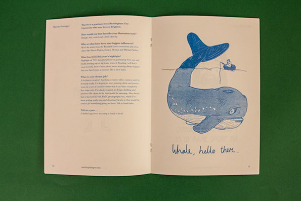
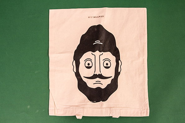
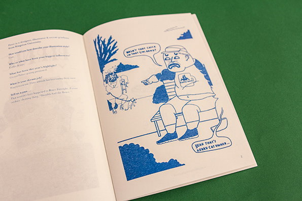
Kids With Puns is a zine dedicated to the work of new and exciting grads. Issue #2 is chockablock with interviews and pun from recent graduates, including “A boiled egg every morning is hard to beat!” and “two television aerials had a wedding. The bride said that the ceremony was terrible, but the reception was great!” to name but a few. They also created this (equally pun-tastic) two-faced tote, which features a face whichever way you look at it. This is exactly the childish humour we love to revel in.
www.kidswithpuns.co.uk
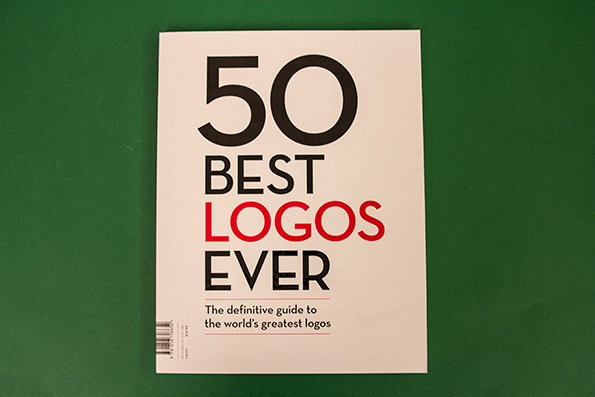
Creative Bloq: 50 Best Logos Ever
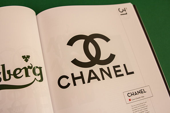
Creative Bloq: 50 Best Logos Ever
Creative Bloq: 50 Best Logos Ever
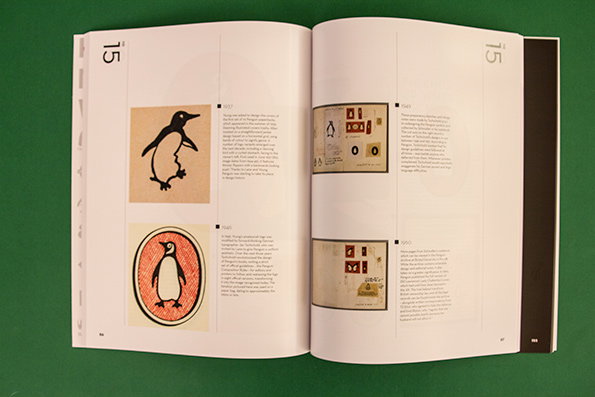
Creative Bloq: 50 Best Logos Ever
Creative Bloq: 50 Best Logos Ever
Logos are great, aren’t they? If you happen to work in advertising, or just be a fan, you’ll thoroughly enjoy this book. Put together by a panel of branding and identity design experts, it compiles (you guessed it) 50 of them together with a bunch of information and some old skool designs on all of its glossy pages. The cover is a special treat. Not to be missed if you’re after encyclopaedic knowledge of the key players in the advertising world.
www.creativebloq.com
Mad taxi website of the week
There’s not an emoticon or a flashy effect out there that Ling of Ling’s Cars doesn’t know about.
Utterly insane video of the the Black Friday scrums of the week
Avert your ideas if you’re feeling wobbly; this shit ain’t for the weak of heart. Those Americans go wild for a bargain.
Wrecking Ball remake of the week
The Chat Roulette version! Take one hairy man, a yoga ball and a pair of white Y-fronts and give him a wifi connection, then watch the hilarity ensue.
Hilarious post-party text conversation of the week
This is the kind of stuff that goes down if you let Rickey Diggs chug seven wine coolers.
Thanksgiving-themed episode of Charlie Brown of the week
Because we might be British but we can’t say no to an excuse to watch the original Snoop dog in action.
Rude website design of the week
Simple, foul-mouthed and straight to the point. Trendy web designers the world over; take note.
Laterz alligators!
Share Article
Further Info
About the Author
—
This article was written by the It’s Nice That team. To find our editors and writers, please head over to our Contact page.