The Weekender: Clap your hands and spin around it's the weekly nonsense update!
I’m doing a dance but you can’t see it so you’ll need to imagine it. It’s a special friday Weekender celebratory dance. Imagine a cross between a dirty Tango and a stadium-tour-choreographed pop medley. That’s the one! It’s fun, no? So why not join in with your own little fandango, and believe (TESTIFY!) that we are so ruddy ready for a Friday. Let’s do this.
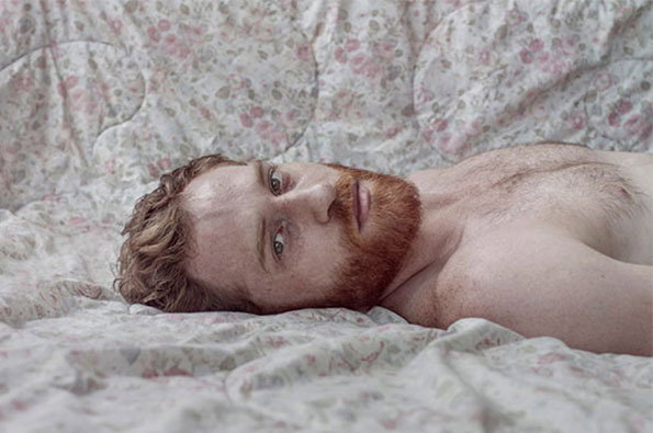
Nir Arieli: Men
6. Fire fire the fair’s on fire!
Canadian painter Caroline Larsen creates mindboggling pictures which look like tapestries and depict burning vehicles. We don’t know why either but we blooming love them.
5. Top Doig returns to his homeland
The Peter Doig show in Edinburgh is a real visual treat which left our reviewer fairly bowled over by its brilliance. Read why here.
4. The types they are a’changing
Interesting to see the redesign of Wallpaper* magazine overseen by new creative director Sarah Douglas, complete with two brand new typefaces.
3. Guess who’s Pat, Pat again?
That’s right, it’s former It’s Nice That Graduate Pat Bradbury who is tickling our funny bones with a host of ace new updates.
2. We go together like rama lama lama, ke ding a de ding a a dong
Charles Schulz’ Peanuts + Smiths lyrics? It’ll never work. Ha take THIS naysayers!
1. Come swoon with us, come swoon, we’ll swoon away
Nir Arieli’s photographs are an absolute treat and, for a refreshing change, this time it’s all about the boys…
This weeks Things
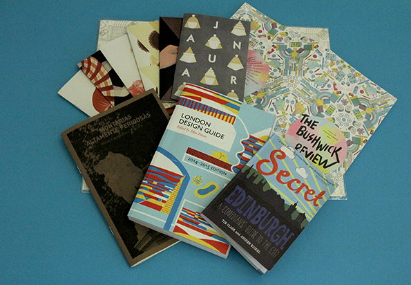
Public displays of bucking bronco-ing, a year in the life of a zine, swanky London design spots, back-pocket sized books of New York writing and a what’s hot guide to the Edinburgh Festival. Sound like a rather tasty week of post? We think so. Tuck into this week’s Things.
Eleni Kalorkoti: Zine Project
Eleni Kalorkoti: Zine Project
Eleni Kalorkoti: Zine Project
Eleni Kalorkoti: Zine Project
Eleni Kalorkoti: Zine Project
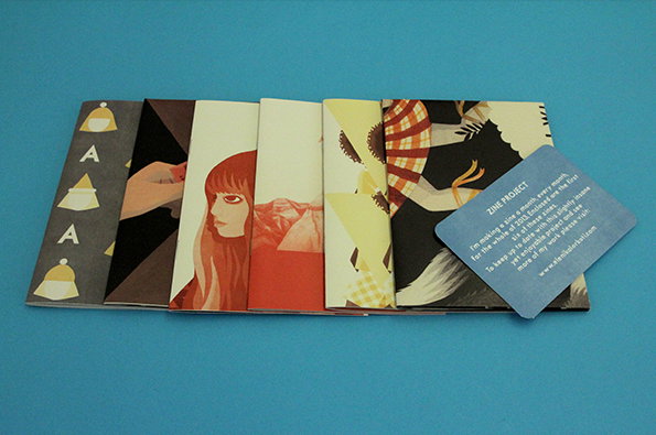
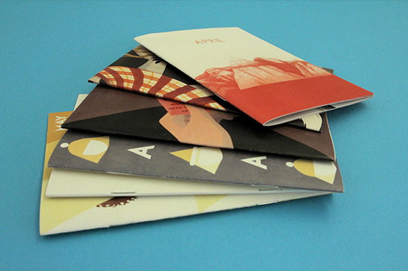
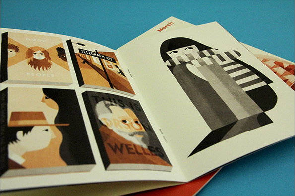
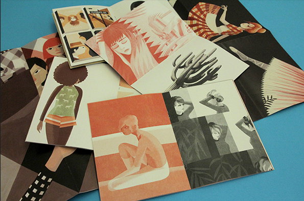
Illustrator Eleni Kalorkoti has set out on an ambitious project to create a zine a month, every month for the whole of 2013. Only January to June arrived so far but we are already sold. Beautiful screen printed images of people in cities, cars, train stations and theatres; a sense of travelling and we are more than willing to join the ride.
www.elenikalokoti.com
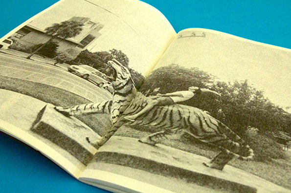
SOMETIMES ALWAYS: MONTARIAS ALTAMENTE PERIGOSAS – HIGHLY DANGEROUS RIDES
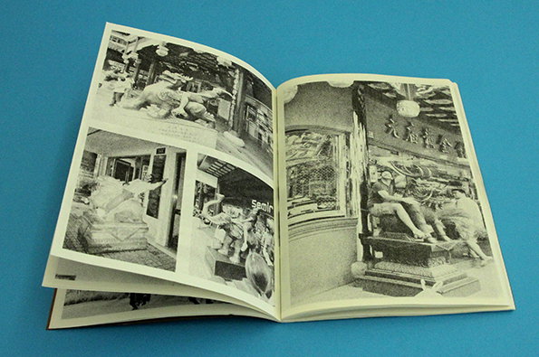
SOMETIMES ALWAYS: MONTARIAS ALTAMENTE PERIGOSAS – HIGHLY DANGEROUS RIDES
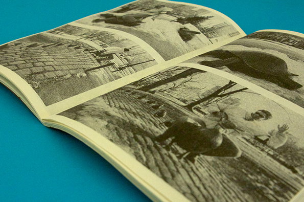
SOMETIMES ALWAYS: MONTARIAS ALTAMENTE PERIGOSAS – HIGHLY DANGEROUS RIDES
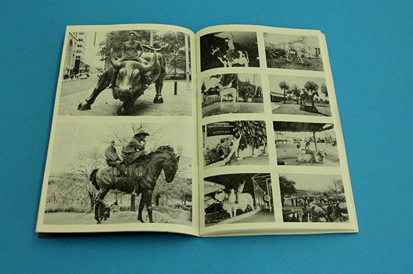
SOMETIMES ALWAYS: MONTARIAS ALTAMENTE PERIGOSAS – HIGHLY DANGEROUS RIDES
SOMETIMES ALWAYS: MONTARIAS ALTAMENTE PERIGOSAS – HIGHLY DANGEROUS RIDES
Ever thought a llama would make a good cowboy ride? How about a bull, a sheep or even a moose? Non? Nor did we until this rather wonderful publication from Sometimes Always appeared on our doorstep stuffed cover to cover with hilarious images of men riding animal monuments, public fountains and even garden features – all animal shaped – and the majority equipped with novelty hat or a jazzy tourist tee, so now we are thinking we might have to rethink the whole thing.
www.sometimes-always.com
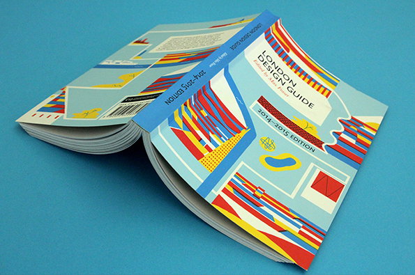
Max Fraser: London Design Guide 2014-2015
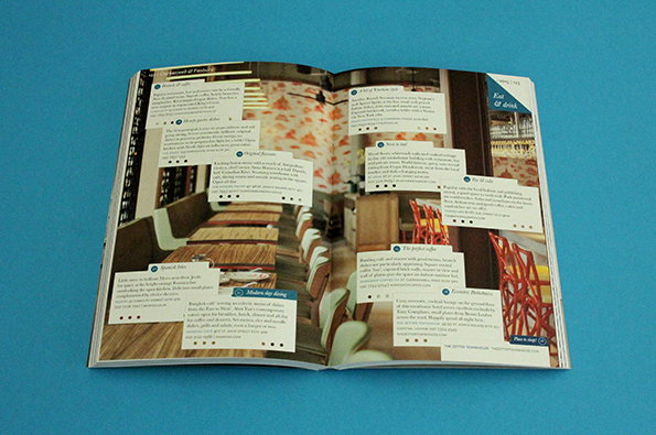
Max Fraser: London Design Guide 2014-2015
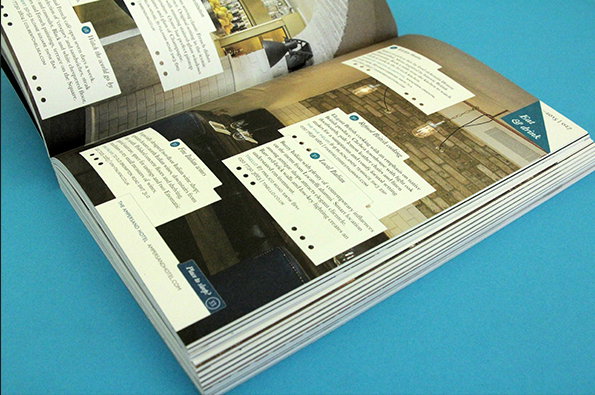
Max Fraser: London Design Guide 2014-2015
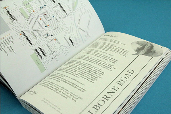
Max Fraser: London Design Guide 2014-2015
Max Fraser: London Design Guide 2014-2015
Ah that delicious smell of print paper hot of the press as it falls from the pages of the new, third and totally updated edition of the London Design Guide 2014-2015. And you get it all – maps, interviews and shops covering everything from furniture to ceramics to lighting to tableware. Though only halfway through 2013, it is fair to say this guide proves that the city will be looking pretty fine over next couple of years.
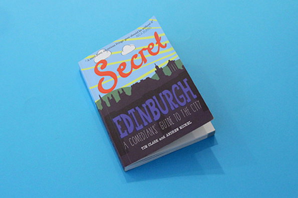
Tim Clark and Andrew Mickel: Secret Edinburgh
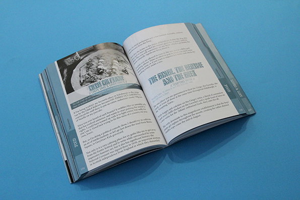
Tim Clark and Andrew Mickel: Secret Edinburgh
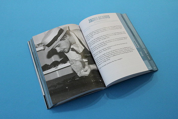
Tim Clark and Andrew Mickel: Secret Edinburgh
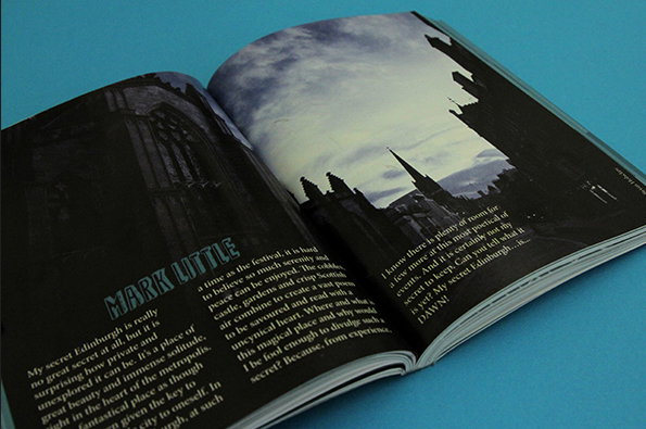
Tim Clark and Andrew Mickel: Secret Edinburgh
Tim Clark and Andrew Mickel: Secret Edinburgh
The Edinburgh Fringe Festival has a habit of being simultaneously quite brilliant and utterly baffling. The problem comes in knowing where to start, but the guys behind comedy website Such Small Portions have gone to the very people who should know – the comics who traipse up to the Scottish capital every summer to make merry. From cafes to kebabs, scenic spots to nightspots this is an invaluable and very readable guide to the city relevant all year round, and it’s a smart looking thing to boot.
www.suchsmallportions.com
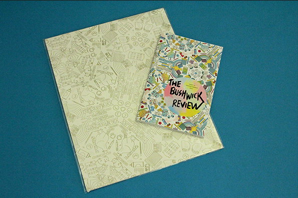
Kristen Felicetti: The Bushwick Review
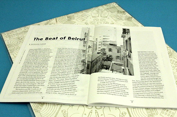
Kristen Felicetti: The Bushwick Review
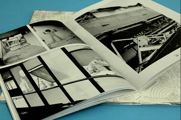
Kristen Felicetti: The Bushwick Review
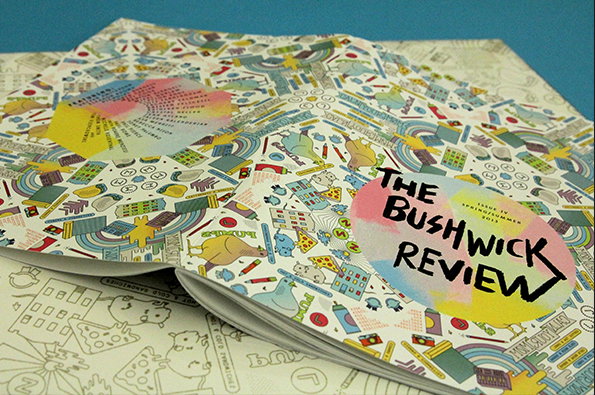
Kristen Felicetti: The Bushwick Review
Kristen Felicetti: The Bushwick Review
What other literary art publication arrives with its own wall adornment/absorbency placemat? None spring to mind. Designed to fit in the back pocket, this snappy publication sent straight from the heart of Bushwick, New York brings together a whole heap of brilliant writers, printers, photographers and illustrators’ curious thinkings. There’s some pretty great experimental writing and to top it all off, a wicked piece about tongues. What more could you want?
www.thebushwickreview
Tweet of the Week
If a pint glass smashes in a forest and no-one is around to hear it, do the forest animals all step in and shout 'Whoooaaaay!!!'?
— cluedont (@cluedont) August 14, 2013
Video of the YEAR
You’ve all seen it, you’ve all shared it, you’ve all impersonated it on an answering phone at 2am, so let’s watch it again.
50 Stars Without make-up of the week
Not what you think, this is just a really, really great poem that you’ve got to read.
Zelda Ocarina of Time completed in 22 minutes of the week
He kind of cheats, but it’s worth watching even if it’s just for soaking up the atmosphere in that room.
Tearjerker of the week
“Two women, who have been pen pals for 74 years, meet for the first time at the Corpus Christi International Airport in Texas.” I WASN’T READY FOR THIS LEVEL OF EMOTION ON A FRIDAY.
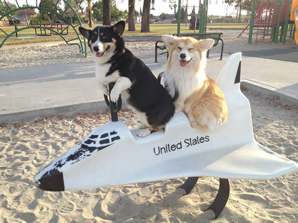
Happy dogs of the week
And they’re off to outer space together. How lovely.
Share Article
Further Info
About the Author
—
This article was written by the It’s Nice That team. To find our editors and writers, please head over to our Contact page.