Launch Recite Me assistive technology
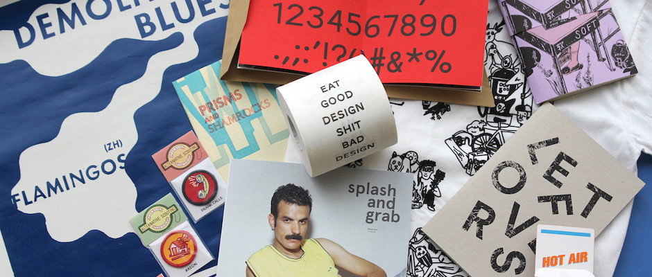
A collection of graphic design ephemera and merchandise laid out on a blue surface. Items include a roll of tape reading “EAT GOOD DESIGN SHIT BAD DESIGN”, a zine titled “PRISMS AND SHAMROCKS”, and a print of a person with a moustache.

Things things things! The best things sent to us by good old fashioned post

—
Date
10 June 2015

The area around our desk has all but been taken over by all the great stuff everyone sends us. It’s been really tough picking out the best bits and pieces but the situation was fast becoming something of a health and safety hazard and imminent danger has a way of making everything much clearer. This month there’s everything from a card game to a photography magazine to a loo roll of design criticism (what?). Here’s Things!
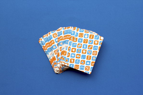
A fan of playing cards with orange and white patterned backs. The cards feature a grid of small, white graphic icons on an orange background, set against a plain blue surface.
Above

Henry Thomas Lloyd: Hot Air

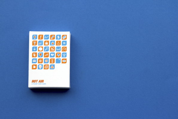
A white card box sits on a plain blue background. The cover features a grid of orange and blue icons and the text “Hot Air: A trump card game”.
Above

Henry Thomas Lloyd: Hot Air

A narrow white card with orange text and icons set against a blue background. It is titled “HOT AIR” and lists corporate clichés including “I JUST NEED TO SHOW IT TO MY TEAM”, “LET’S PARK THAT IDEA” and “CAN WE MAKE IT MORE VISUAL?”.
Above

Henry Thomas Lloyd: Hot Air

Henry Thomas Lloyd: Hot Air
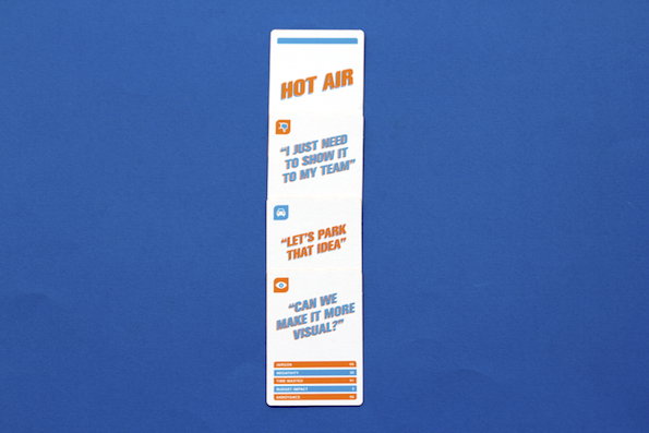
Chelsea grad Henry Thomas Lloyd has found a way to turn cliched design chat into a great trump card game. For Hot Air he asked an impressive roster of creatives (including It’s Nice That’s own Alistair Hanson) “What’s the most annoying phrase in the industry?” It’s all very tongue-in-cheek and you can wrack up points in Jargon, Insult, Time Wasted, Budget Impact and Annoyance whilst vying to out-bullshit your opponent. Nice work.
www.henrythomaslloyd.co.uk
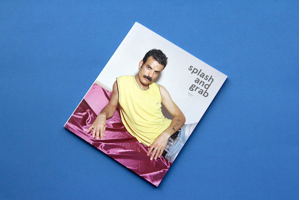
A magazine cover featuring a person with a moustache wearing a yellow tank top and blue jeans. They lean against a draped piece of magenta fabric, with the title “splash and grab” printed in lowercase.
Above

Splash and Grab: Issue 2

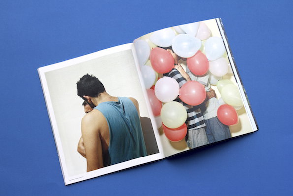
An open book displays two photographs against a blue background. The left page shows a person in a blue tank top from behind, while the right page shows a person partially obscured by a cluster of red and white balloons.
Above

Splash and Grab: Issue 2

An open book on a blue background shows two photographs. The left page features a close-up of a person in a white garment with their arm raised. The right page shows a person lying on a bed, partially covered by a grey blanket.
Above

Splash and Grab: Issue 2

Splash and Grab: Issue 2
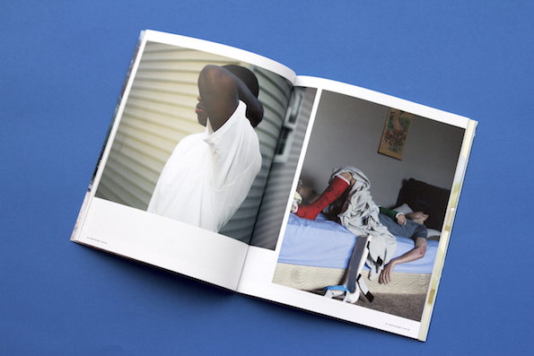
Photography mag Splash & Grab is back with their second issue. Put together by photography and graphic design graduates Max, Sydney, Dan and Finbar, this nice little biannual champions young and emerging talent . There’s some really impressive and weighty stuff inside, like the series taken at an American juvenile detention centre and the one of gay Iranian refugees from which the amazing cover is taken.
www.splashandgrab.co.uk
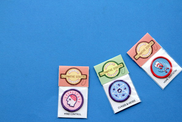
Three embroidered patches from “Alternative Scouting” are displayed on a blue background. The patches are labelled “Mind Control”, “Curses & Hexes” and “Home Dentistry”.
Above

Luke Drozd: Alternative Scouting for Girls & Boys Merit Badges
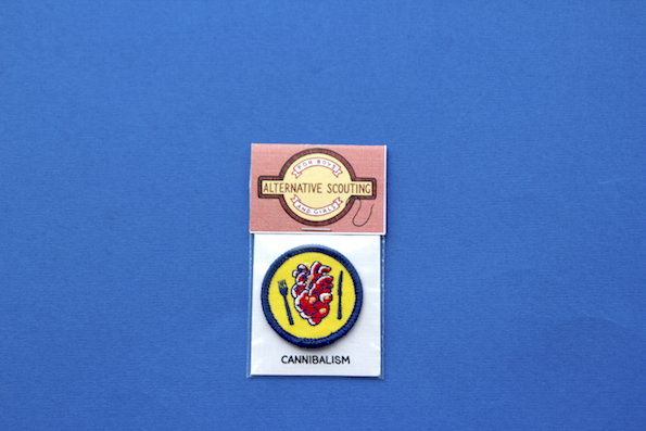
An embroidered patch on a yellow background shows a red heart flanked by a fork and knife. A label below reads “CANNIBALISM”. Above it, a pink card reads “ALTERNATIVE SCOUTING”.
Above

Luke Drozd: Alternative Scouting for Girls & Boys Merit Badges

A circular embroidered patch shows a red building on fire against a yellow background. It is tucked into a green and white sleeve that reads “Alternative Scouting” and “Arson”.
Above

Luke Drozd: Alternative Scouting for Girls & Boys Merit Badges

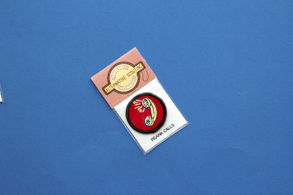
An embroidered patch featuring a yellow telephone receiver on a red background. It is held in a plastic sleeve with a label that reads “PRANK CALLS” and a card reading “ALTERNATIVE SCOUTING”.
Above

Luke Drozd: Alternative Scouting for Girls & Boys Merit Badges

Luke Drozd: Alternative Scouting for Girls & Boys Merit Badges
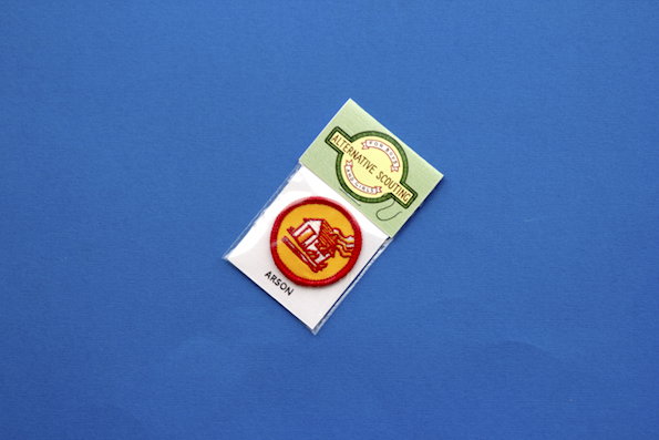
London-based illustrator Luke Drozd sent us these brilliant prankster scouting badges that range from mischievous to imprisonable. They’re a fun take on a nostalgia and Luke sounds like an upstanding guy. When I got in touch to say thank you he was quick to answer, “Please ensure they are given to people only after proving they have successfully completed the relevant task.” I can’t say I’ll be robbing any graves in the near future but we’ll hold on to them just in case.
www.lukedrozd.com
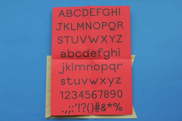
A red card displays a full alphabet in black, sans-serif type. It shows uppercase and lowercase letters, numbers 0–9 and a row of punctuation marks.
Above

Nick Pearce: Carrier Typeface

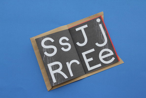
An open booklet on a blue background shows bold white letters on a dark grey background. The pages display the letters “Ss”, “Rr”, “Jj” and “Ee”.
Above

Nick Pearce: Carrier Typeface

A white card rests inside a brown kraft envelope against a bright blue background. The card features a red edge and text that begins “Carrier is the first typeface designed by Nick Pearce.”
Above

Nick Pearce: Carrier Typeface

Nick Pearce: Carrier Typeface
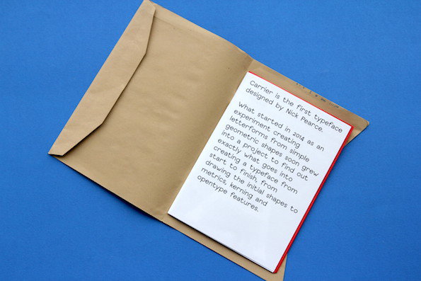
Nick Pearce seems like a bit of a print freak so we already like him. We got a really nice bundle from his Riso printing studio Note Well Press in Norwich, including his typeface Carrier. He also sent a great series of red and blue postcards he has made with 14 illustrators and designers but it was Carrier that stood out; it’s clean and simple and it’s used for his fledgling studio’s very own identity.
www.notewellpress.co.uk
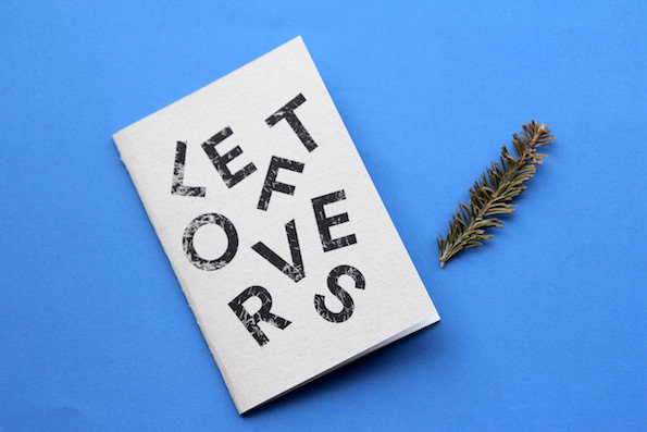
A white booklet lies on a bright blue background next to a small evergreen sprig. Bold, textured black lettering on the cover reads “LEFTOVERS”.
Above

Kim Walker: Leftovers

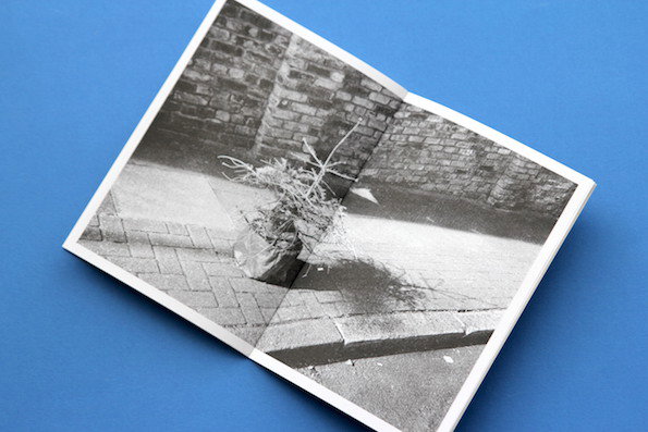
An open booklet on a blue background shows a black and white photograph. The image depicts a small, withered plant in a pot sitting on a paved street against a brick wall.
Above

Kim Walker: Leftovers

A black and white photograph of a frost-covered pine branch lies on a blue surface. Beside it sits a real, dried pine sprig.
Above

Kim Walker: Leftovers

Kim Walker: Leftovers
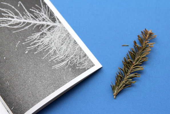
Christmas is a long way off but Leftovers is Kim Walker’s little photo zine documenting the abandoned Christmas trees of London. His iPhone snaps of the forlorn and abandoned evergreens left scattered around the city were taken earlier this year between January and March and are Riso printed for a nice DIY effect. And to make it better he included a little piece of these Christmas trees with each copy.
www.walker.kim
www.theleftovers.co
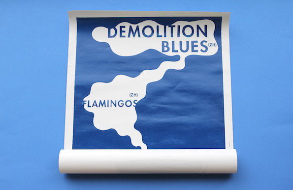
A blue and white poster rolled at the bottom. It features two organic white shapes containing the text “DEMOLITION BLUES(ZH)” and “FLAMINGOS (ZH)”.
Above

Tor Weibull: Demolition Blues

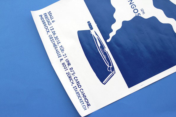
A blue and white poster featuring a stylised illustration of a folding chair. Text on the left reads “STALL 6”, “FREITAG 12.06.2015” and lists a Zurich address and the website “STARTICKET.CH”.
Above

Tor Weibull: Demolition Blues

A blue and white poster for a musical event. Bold text inside white organic shapes reads “Demolition Blues (ZH)” and “Flamingos (ZH)”. Vertical text on the left lists the venue “Stall 6” and the date “Freitag 12.06.2015”.
Above

Tor Weibull: Demolition Blues

Tor Weibull: Demolition Blues
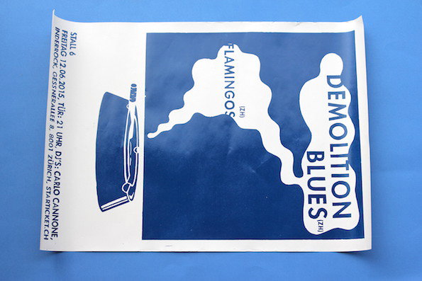
Zurich-based designer and illustrator Tor Weibull sent in this linoleum printed poster for a concert which has a really nice vintage feel. It’s sort of brooding and although Tor is Swedish it makes me think of a 1930s German speakeasy straight out of Christopher Isherwood’s classic Goodbye to Berlin. Sold.
www.torweibull.tumblr.com
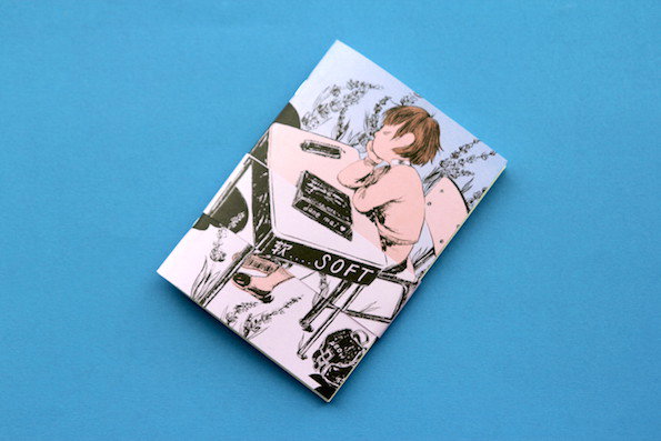
An illustration on a folded booklet shows a person sitting at a desk, resting their chin on their hand. The figure is drawn in a manga style and the image includes the word “SOFT”.
Above

Jane Mai: Soft

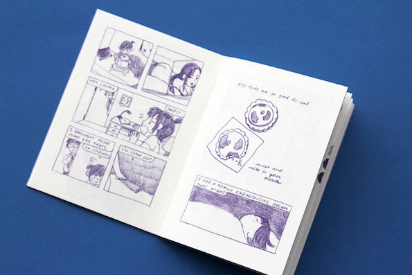
An open zine featuring purple ink illustrations and handwritten text on white paper. The left page contains a comic strip of two people talking, while the right page shows drawings of tarts and a person sleeping.
Above

Jane Mai: Soft

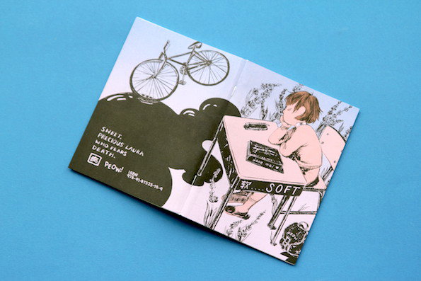
An illustration across a folded booklet. On the right, a person sits at a desk with their chin in their hand, while a bicycle floats above a dark shape on the left. Text on the left reads “SWEET, PRECIOUS LAURA WHO FEARS DEATH.”
Above

Jane Mai: Soft

Jane Mai: Soft

This comic from New York comic artist Jane Mai is absolutely mad. It’s a teenage lesbian vampire romance set in Hong Kong as a wave of mysterious teenage deaths sweep the city. “Sweet, precious Laura who fears death,” reads the back cover. Jane’s off-kilter mix of sad girl humour is all her own and we’re loving it.
www.janemai.co
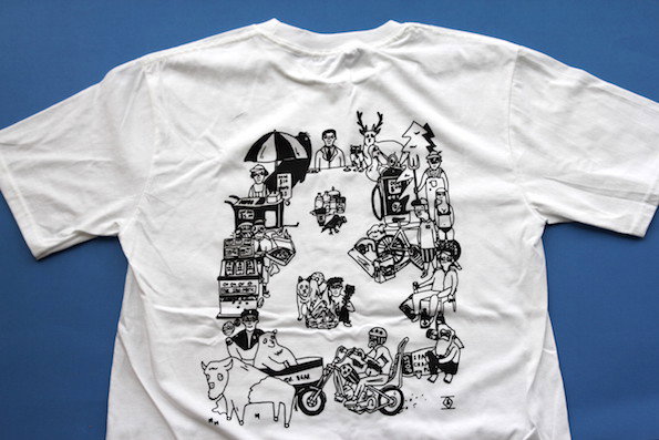
A white T-shirt featuring a black line illustration on the back. The drawing consists of a dense, circular arrangement of various people, animals and objects.
Above

Merrick & Mackay: NV/AZ/CA

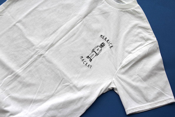
A white T-shirt features a small, simple line drawing of a person on the chest. The figure is framed by the words “Merrick” and “Mackay” written in a hand-drawn style.
Above

Merrick & Mackay: NV/AZ/CA

A close-up of the corner of a white T-shirt against a blue background. A small cream label is sewn into the seam, reading “Merrick Mackay”.
Above

Merrick & Mackay: NV/AZ/CA

Merrick & Mackay: NV/AZ/CA
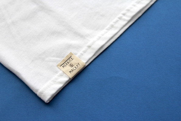
This jazzy T-Shirt from Merrick & Mackay illustrates a collection of people and things the creative duo Robert Hill and Andrew Baird saw on what looks like an incredible trip through Nevada, Arizona and California. There are buffalo and old men on Choppers on the back but the pièce de résistance is the Hulk Hogan lookalike over the breast. Nice.
www.merrickandmackay.co.uk
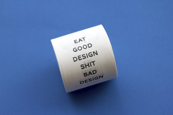
A roll of white adhesive tape sits against a plain blue background. Black text on the tape reads “EAT GOOD DESIGN SHIT BAD DESIGN”.
Above

Pete Rossi: Eat Good Design. Shit Bad Design
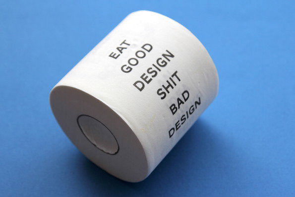
A white cylindrical object rests on a blue background. Black text printed on the side reads “EAT GOOD DESIGN SHIT BAD DESIGN”.
Above

Pete Rossi: Eat Good Design. Shit Bad Design
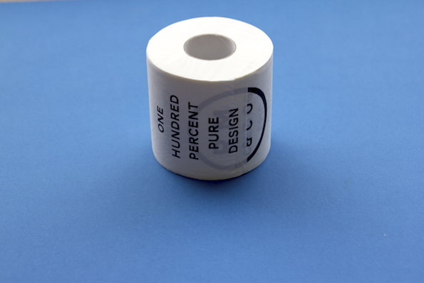
A roll of white adhesive tape sits against a plain blue background. Black text on the side reads “ONE HUNDRED PERCENT PURE DESIGN”.
Above

Pete Rossi: Eat Good Design. Shit Bad Design

RM&CO: Eat Good Design Shit Bad Design

A roll of toilet paper professing design wisdom sends a slightly mixed message, but Pete Rossi did it anyway. It’s part of the art direction for the studio he runs with Alfio Mazzei between the UK and Switzerland, RM&CO and is sure to ruffle a few feathers.
www.rossimazzei.com
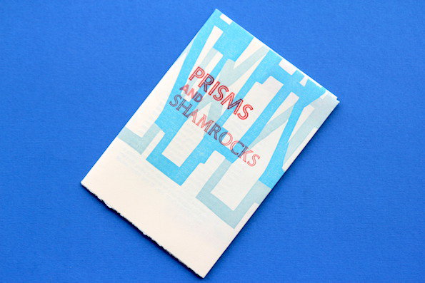
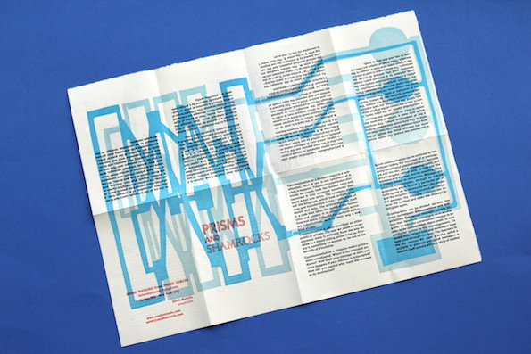
A folded pamphlet lies diagonally on a bright blue background. It features a light blue geometric pattern and the words “PRISMS AND SHAMROCKS” in red.
Above

Sarah Nicholls: Prisms and Shamrocks

A folded white brochure featuring light blue geometric lines and shapes that weave through columns of text. A central title reads “Prisms and Shamrocks”.
Above

Sarah Nicholls: Prisms and Shamrocks

An unfolded white brochure on a blue background features three yellow circles containing green and orange illustrations. The graphics include a circular dial, a complex grid of lines and circles, and a collection of keys. Below the images, three columns of small black text explain the history of secret communication.
Above

Sarah Nicholls: Prisms and Shamrocks

Sarah Nicholls: Prisms and Shamrocks
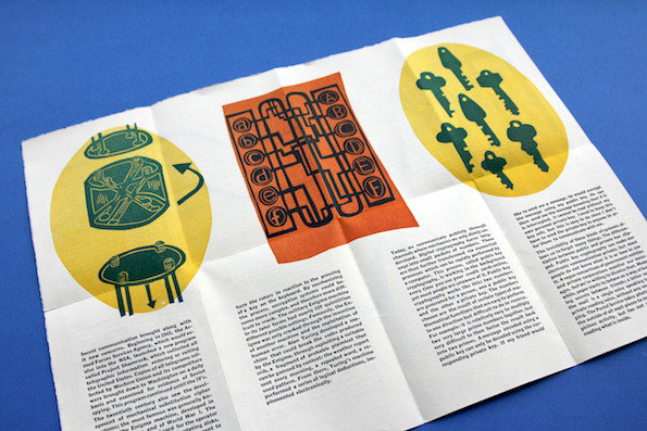
The word pamphleteer just rolls off the tongue. That’s what Sarah Nicholls calls herself, and her conspiratorial little pamphlet looks at the history of cryptography and secret communication. Prisms and Shamrocks is part of her bigger series Brain Washing From Phone Towers Informational Pamphlets. It’s cool and a little weird, but above all it’s just really well designed.
www.sarahnicholls.com

Share Article

Further Info

About the Author

It's Nice That

—

This article was written by the It’s Nice That team. To find our editors and writers, please head over to our Contact page.


It's Nice That Newsletters

Fancy a bit of It's Nice That in your inbox? Sign up to our newsletters and we'll keep you in the loop with everything good going on in the creative world.