




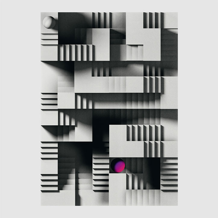
Timo Lenzen dabbles in monochrome shadows and animation for his latest graphics
Building on his knack for pleasing gradients and textures, German graphic designer Timo Lenzen has been experimenting further with black and white palettes in his latest work. In a recent editorial commission for Wired UK, flawless, hyperreal 3D shapes are rendered in greyscale making the shadows far more dramatic. And in a minimalist poster for Swiss graphic design exhibition Soirée Graphique, titled Down the Rabbit Hole, a single shoe lays mysteriously next to a hole in the floor – made all the more alluring by its monochrome shadow and theatrical fall to nothingness.
“I’m still using a lot of colours, but more often I want the atmosphere and heaviness of the classic black and white combination,” Timo says. “Especially when I use architectural elements in my images. I have a thing for the shadow play when light casts against those elements. Just compare an old black and white photo with a high resolution photo from today. The older one may not be sharp, but these are the side effects I’m looking for. Shades of grey create a nebulous story or scenario. I want to play up the curiosity and expectation, so the viewer completes the story by themselves.” The use of shadow and contrast becomes even more complicated in his Escher-like staircases for Werken magazine, which was printed A0 size and conceived to fold up and focus on different sections of the image.
Another side to Timo’s practice that has evolved since we last featured him is animation. Joining the increasingly prevalent discipline of moving posters, Timo has been bringing his graphic designs to life in simple but hypnotic ways. His posters for fellow Frankfurt designers Bureau Mitte feature flat numbers that bend and twist into varying forms. His aforementioned shapes for Wired bounce, spin and topple. His poster for Seoul nightclub Mystik works as both a printed item, and animated spinning graphic for use on the club’s social media.
“At the beginning of every design process, I’m thinking about whether my idea is able to move, and if so, is it good for the design? It makes things more complicated but gives you the opportunity to see your personal Pinocchio start to move and become real.”
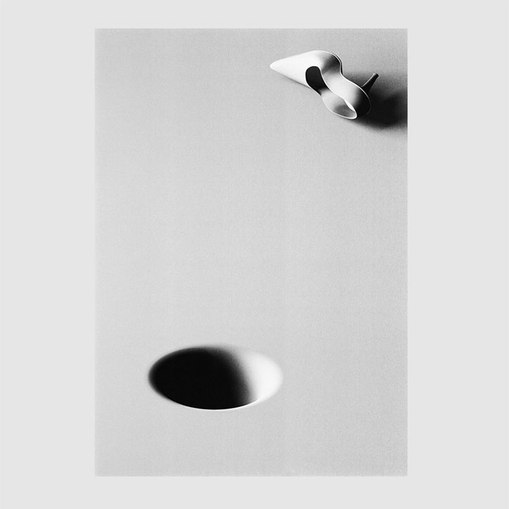
Timo Lenzen: Down the Rabbit Hole
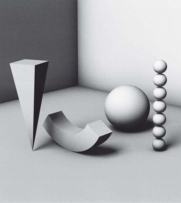
Timo Lenzen: Wired
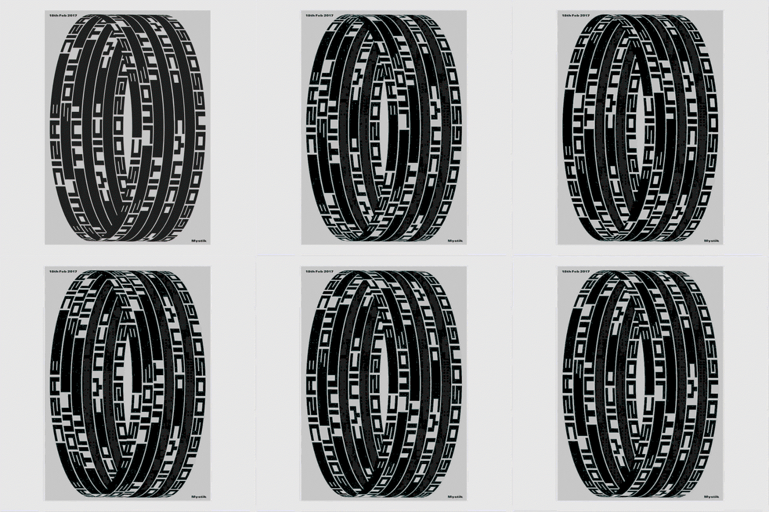
Timo Lenzen: Mystik
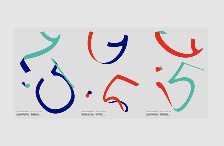
Timo Lenzen: Timo Lenzen: Bureau Mitte
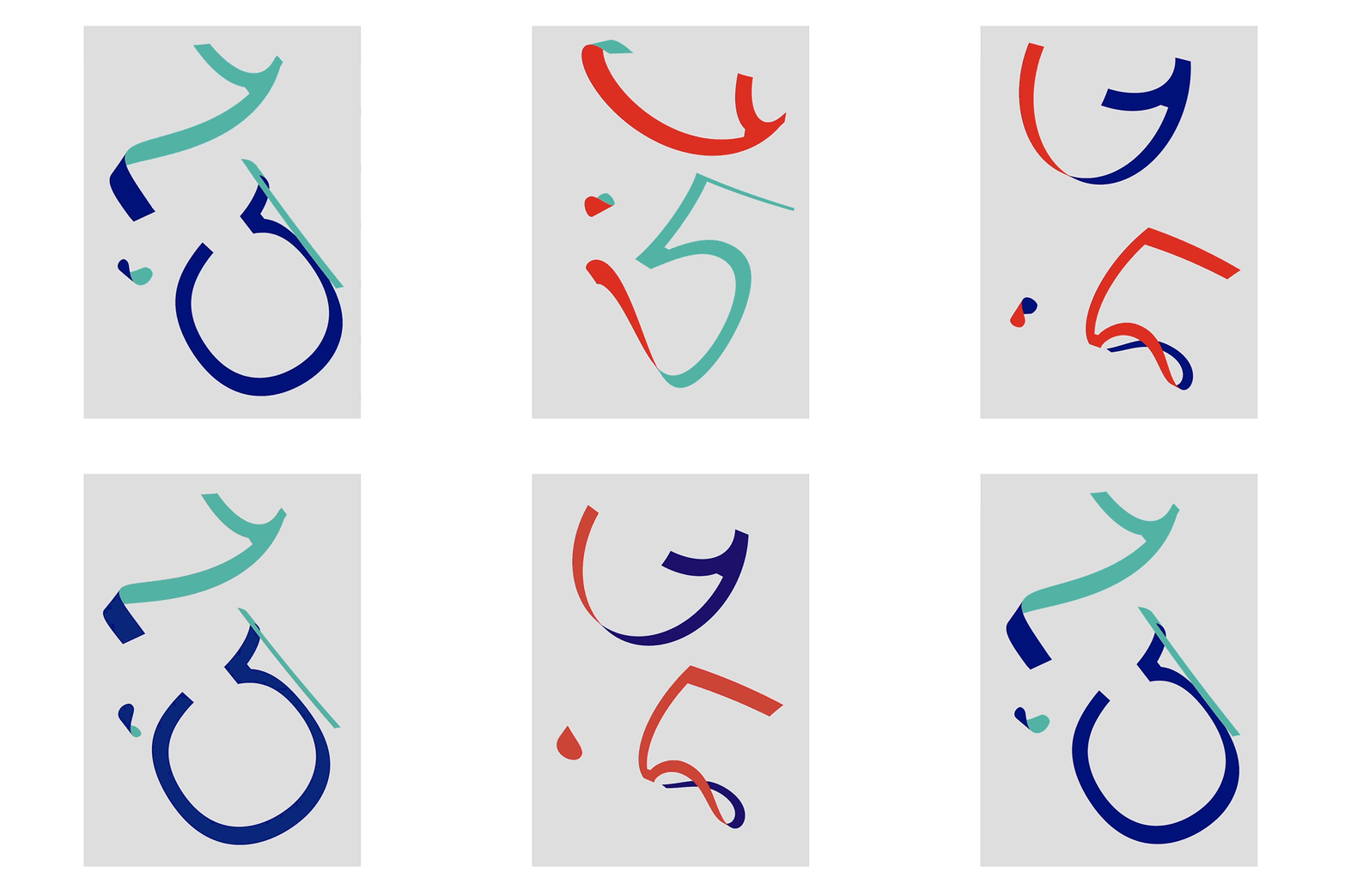
Timo Lenzen: Bureau Mitte
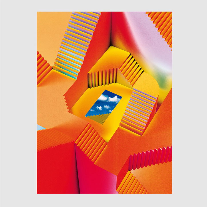
Timo Lenzen: Refinery 29
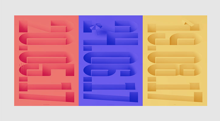
Timo Lenzen: Pool
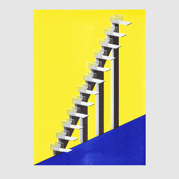
Timo Lenzen: 12 Problems
Share Article
Further Info
About the Author
—
Jenny oversees editorial output across It’s Nice That. Get in touch with writing pitches for features or opinion pieces, big creative story tips, or questions about all things editorial. jb@itsnicethat.com
To submit your work to be featured on the site, please see our Submissions Guide.

