Biceps Grotesk flexes its modular muscles
Together With You’s latest typeface is as unpredictable as it is functional, with a playful launch video to match.
In case you weren’t aware, biceps are back. Earlier this year we discovered the muscly characters of Giorgia Rachel Donnan’s work, and in April, Studio Yukiko premiered its 290 book on postmodernism with a flexing body builder. Now comes something for the type-lovers: Together With You’s Biceps Grotesk.
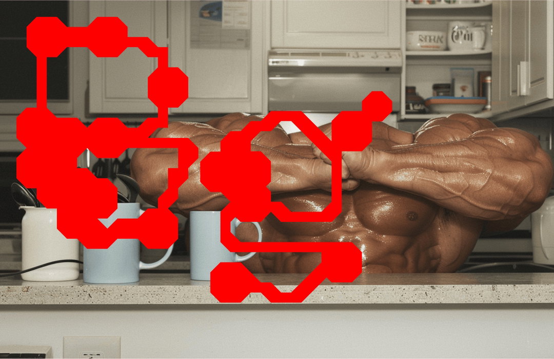
A gathering of topless men flaunt their absurdly large muscles in a bland office setting. Cloaked in the eerie sheen of AI imagery, this is not in fact a protein powder ad gone wrong, but a teaser video for Biceps Grotesk. As the font flashes on-screen to comical grunts, in the next shot it seems that one man has flexed so hard that his head has got lost in his own sinewy lumps.
Rendered by AI artist Bengt Tibert, the video is a playful nod to the meme “buff guys typing on laptops”, and echoes the story of how the font came to be. The idea began “rather randomly”, during a commercial brand identity project, say its co-creator Artem Tarasov. “We stumbled upon a dumbbell shape made from square and triangle modules,” Artem recalls. “We thought it was cool, just because it was so weird. Logically, we added hands to hold the dumbbells and then well, we lost control.”
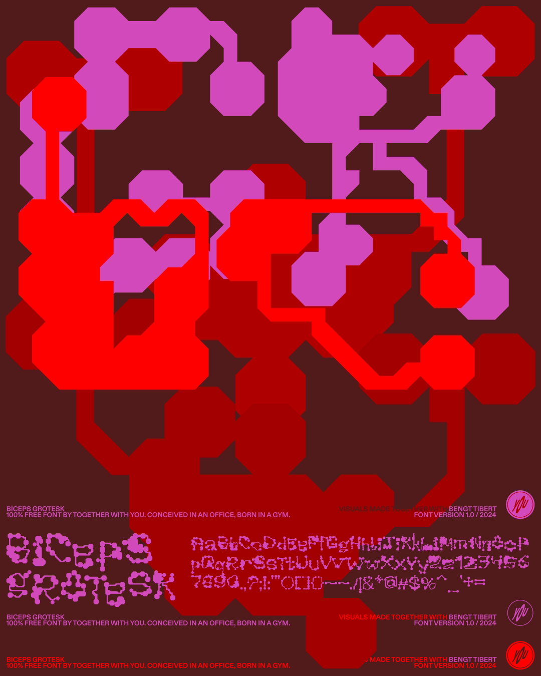
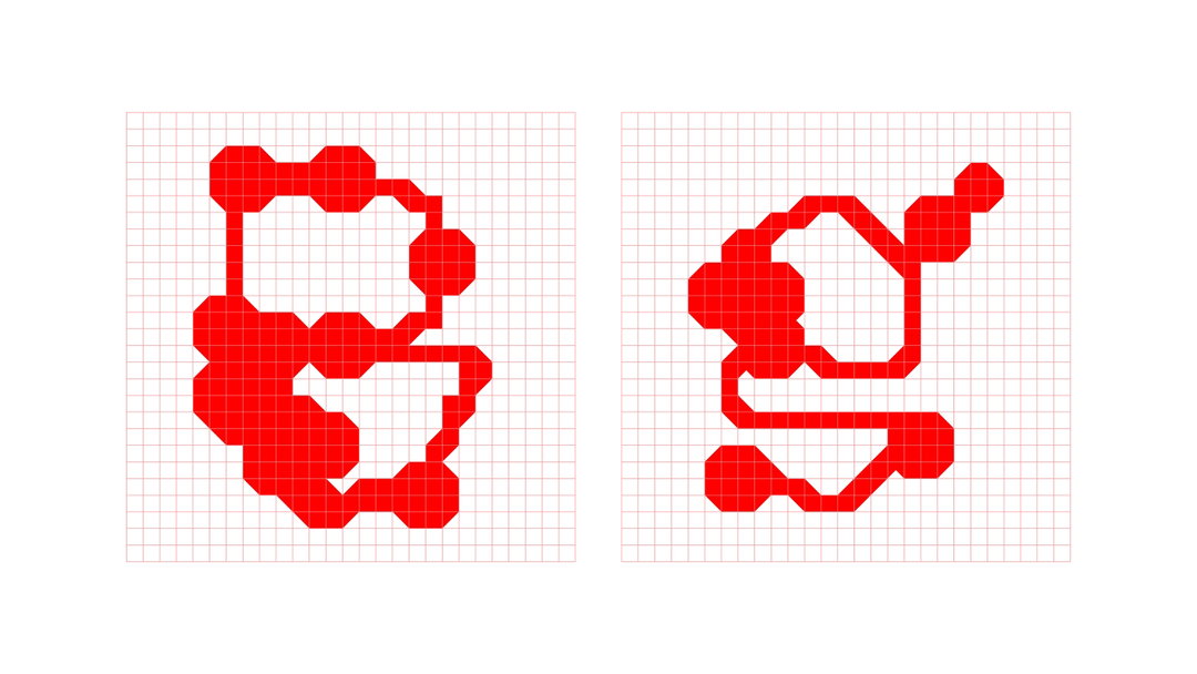
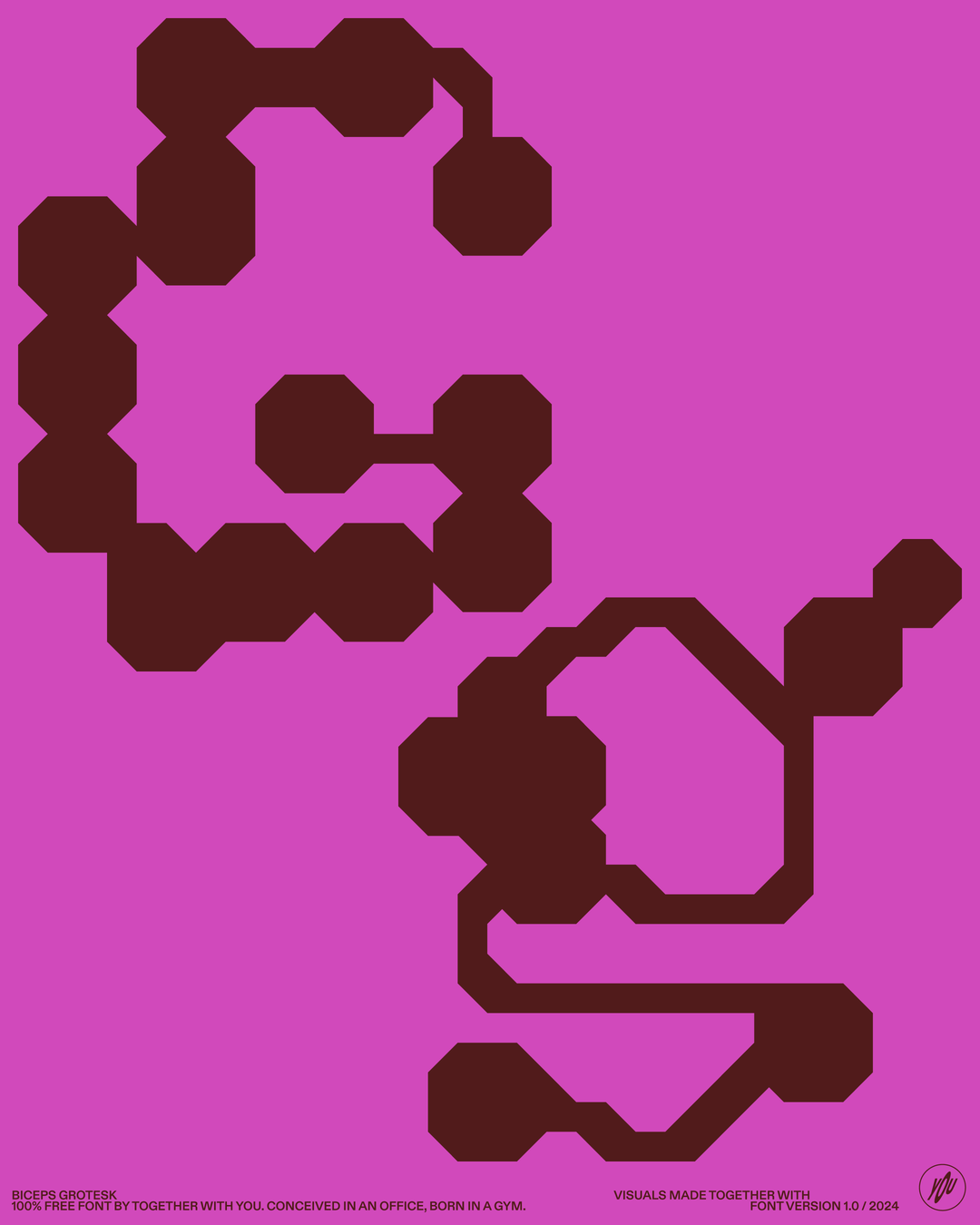
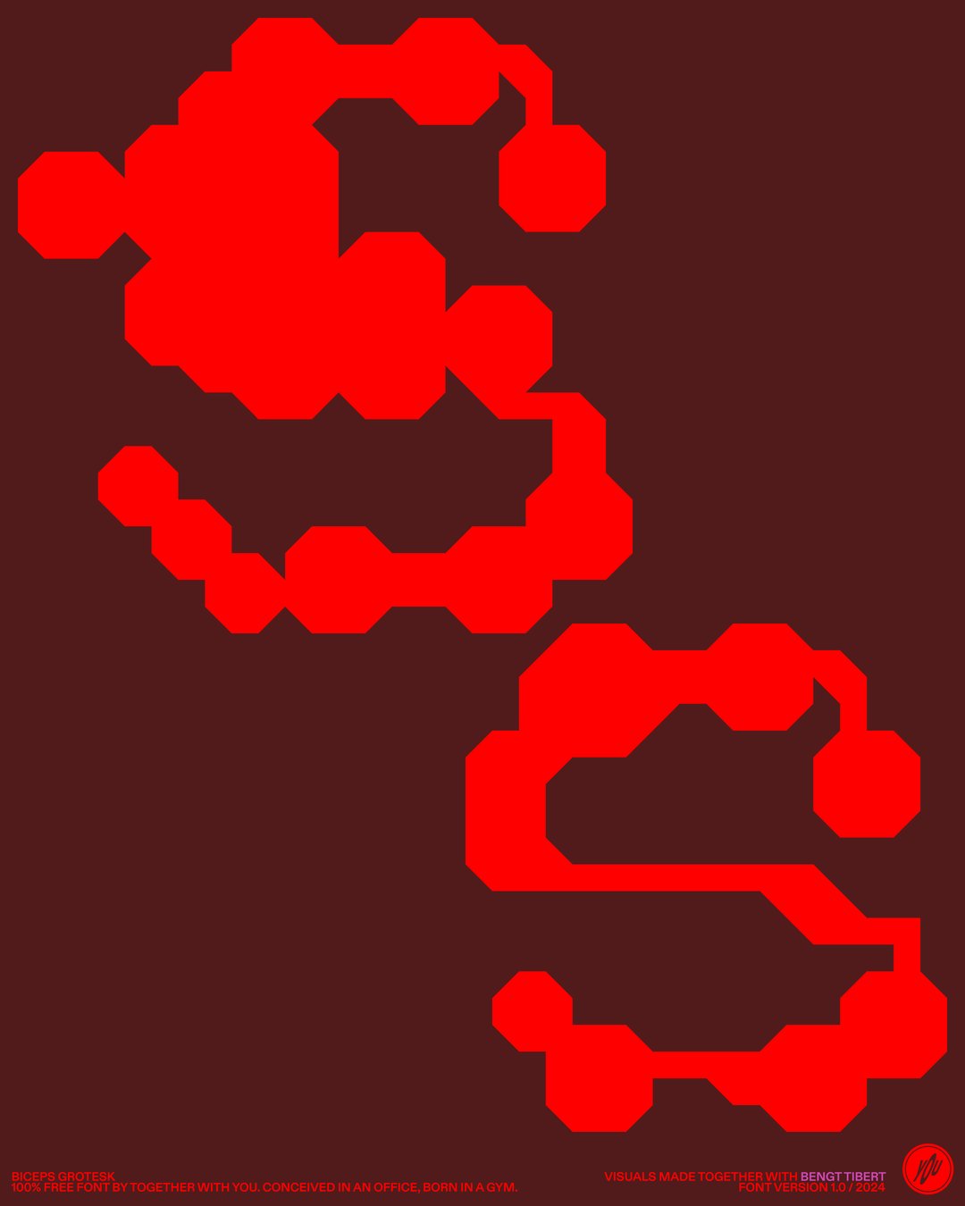
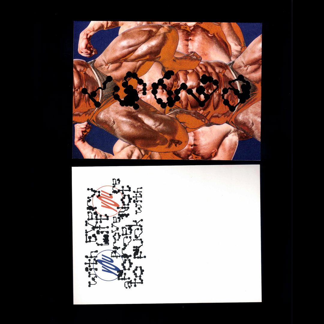
Drawing glyphs with this grid “became so fun,” says fellow co-creator Artem Taradash, “as if the font had started to create itself”. The letters soon began to morph and expand into abstract organic shapes, all while adhering to the grid and module limitations. “The result is a typeface where large, unpredictable segments expand, giving it a uniquely wild look and feel.”
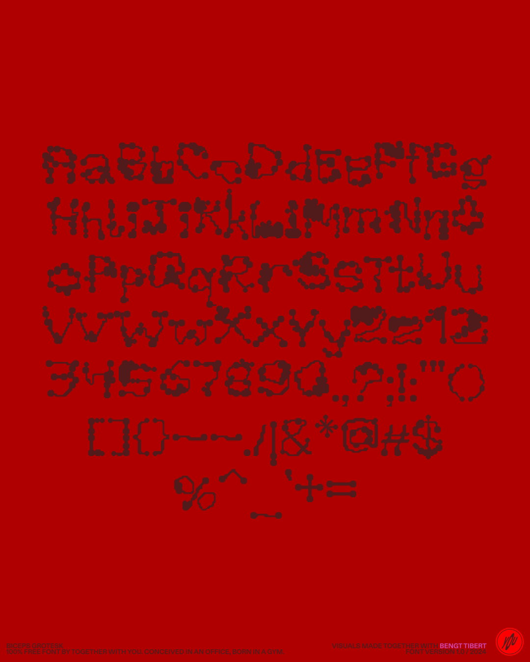
Fittingly for a design accident gone rogue, Bicep Grotesk is as unpredictable as it is functional. In many ways its design is also contradictory. It follows a strict set of modular grids, but breaks other typographic rules; its shapes are organic and abstract, but it’s still surprisingly readable. “The absurd idea that letters could grow hypertrophically, like muscles, is somehow giving a liberating effect, while the modular grid keeps everything within the right borders so it can still be usable,” says Artem Tarasov.
Best used for display typography or abstract vector illustration and free to download, the font is a product of its founders’ commitment to balancing commercial and self-initiated projects. “Its a crucial reminder that design and creativity should push boundaries,” Artem Taradash says. “It feels to us that Biceps invented and created itself, with just our minor help.”
GalleryTogether With You: Biceps Grotesk (Copyright © Together With You, 2024)
Copyright © Misha Gusev, 2024
Copyright © Misha Gusev, 2024
Share Article
Further Info
About the Author
—
Marigold Warner is a British-Japanese writer and editor based in Tokyo. She covers art and culture, and is particularly interested in Japanese photography and design.