“The right mix of approachable but urgent”: Tom Etherington on his cover design for Greta Thunberg’s book
The London-based graphic designer talks how not to slip into the same old monotonous designs.
In the five years Tom Etherington has worked as a book cover designer at Penguin, the London-based designer has touched some of the best-loved texts in the English language. Jack Kerouac’s On The Road, Grayson Perry’s The Descent of Man and most recently, Greta Thunberg’s No One Is Too Small to Make a Difference, are just a few titles gracing Tom’s graphic handiwork. Now, he’s decided to go down to part time at the historic British publishing house, spending more time on other creative projects and hoping to experiment with the art of bookmaking just for some plain ole’ fun.
Despite the mass of Tom’s masterly creations available to view or purchase on bookshelves worldwide, by his own admission, he still hasn’t solved the mysteries of cover design. “Sometimes everything falls together in minutes,” he tells us, “and other times, I’ll spend a week pushing ideas around a blank page.” Ultimately, he has learned not to panic no matter how frustrating the process, and with time, he’s learned to accept that doubt is just part of this exercise in creativity. For Tom, it’s imperative to do research away from the likes of Pinterest and Instagram, finding it “hard to stay in love with design when you are looking at a screen, sat at a desk for two thirds of your life.”
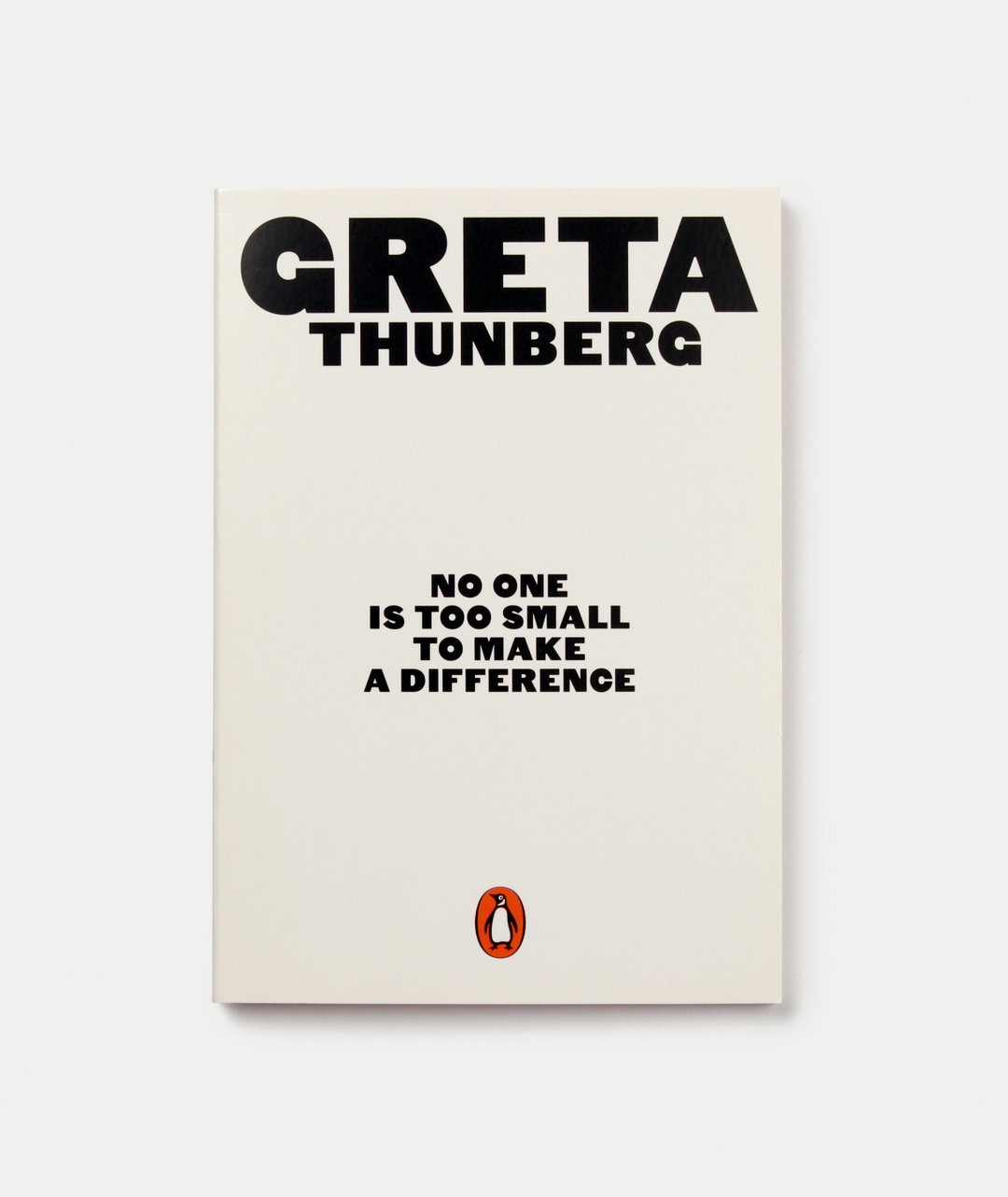
On a recent trip to Poland, he discovered the Polish School of Posters, now an obsession for the graphic designer. And on another trip to Bologna just last summer, he came across Corraini Editions, remarking, “I’ve never seen such beautiful, clever books. It reminds me how much I love what I do.” It’s not just about the visual beauty of a book design however. At the end of last year, Tom had the pleasure of designing the cover for a rather small paperback, but with a mighty message. The design for Greta Thunberg’s No One Is Too Small to Make a Difference saw Tom deliver the project in just one day. But despite the tight turnover, and as most of us can probably agree, Tom says of the brief: “I can’t think of a more important book to work on right now.”
GalleryTom Etherington
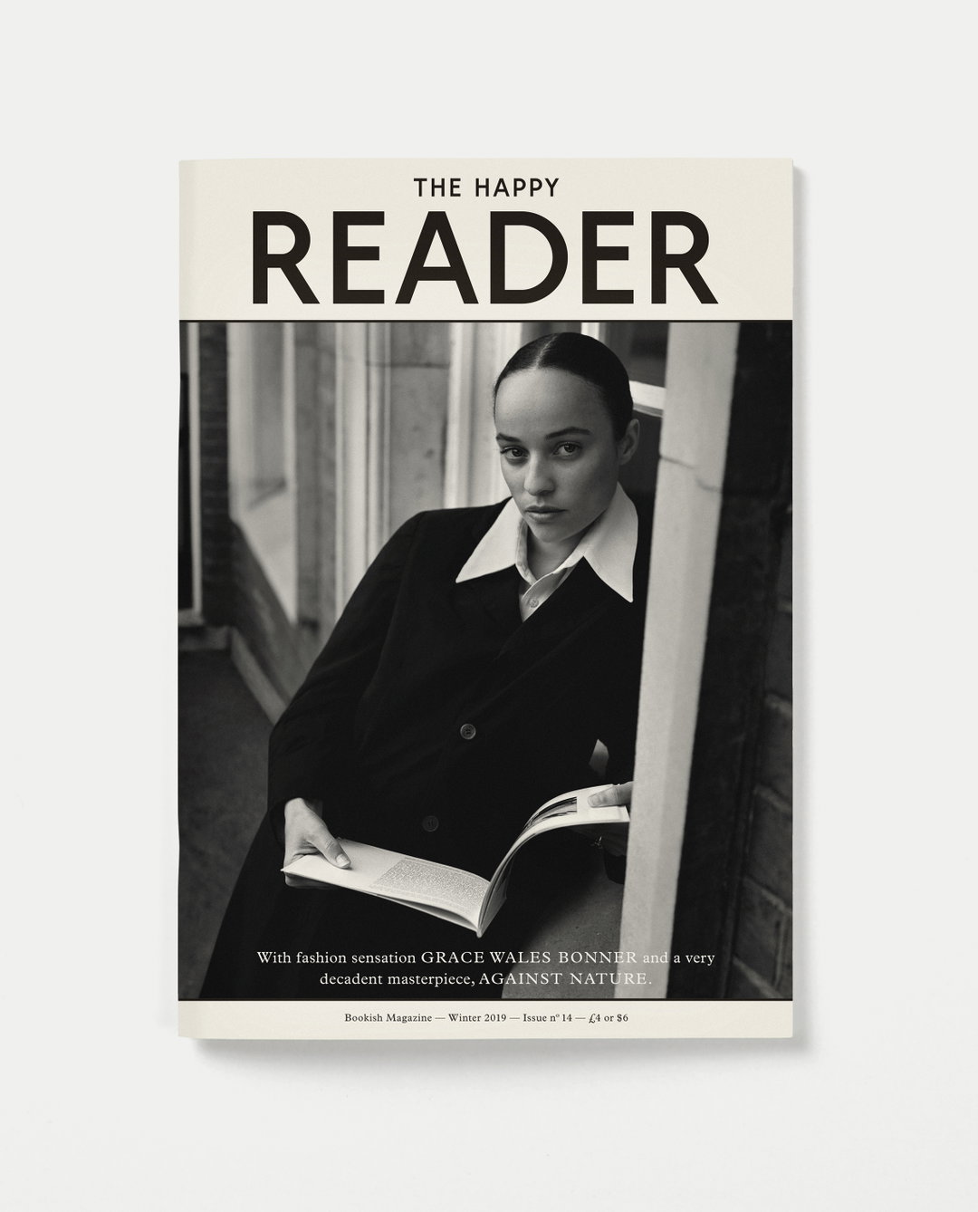
Photo by Alasdair McLellan
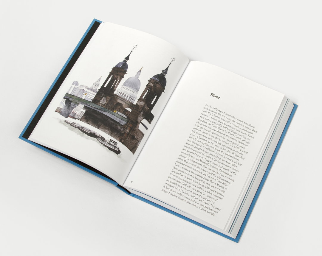
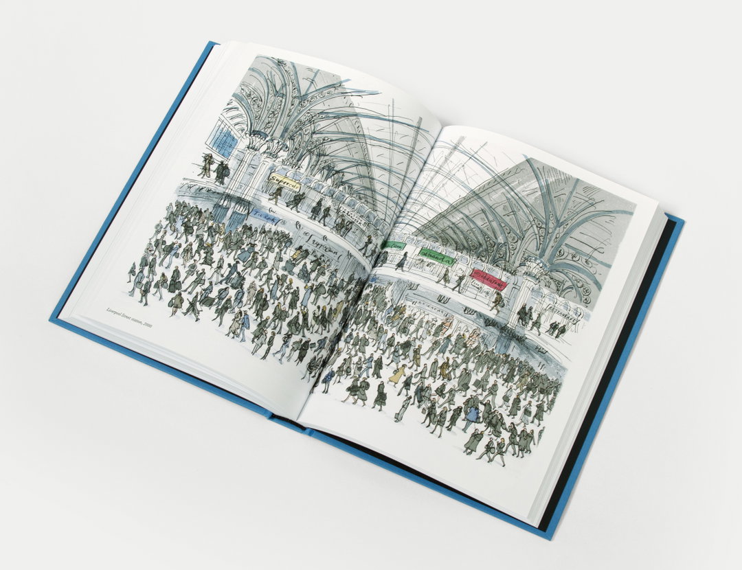
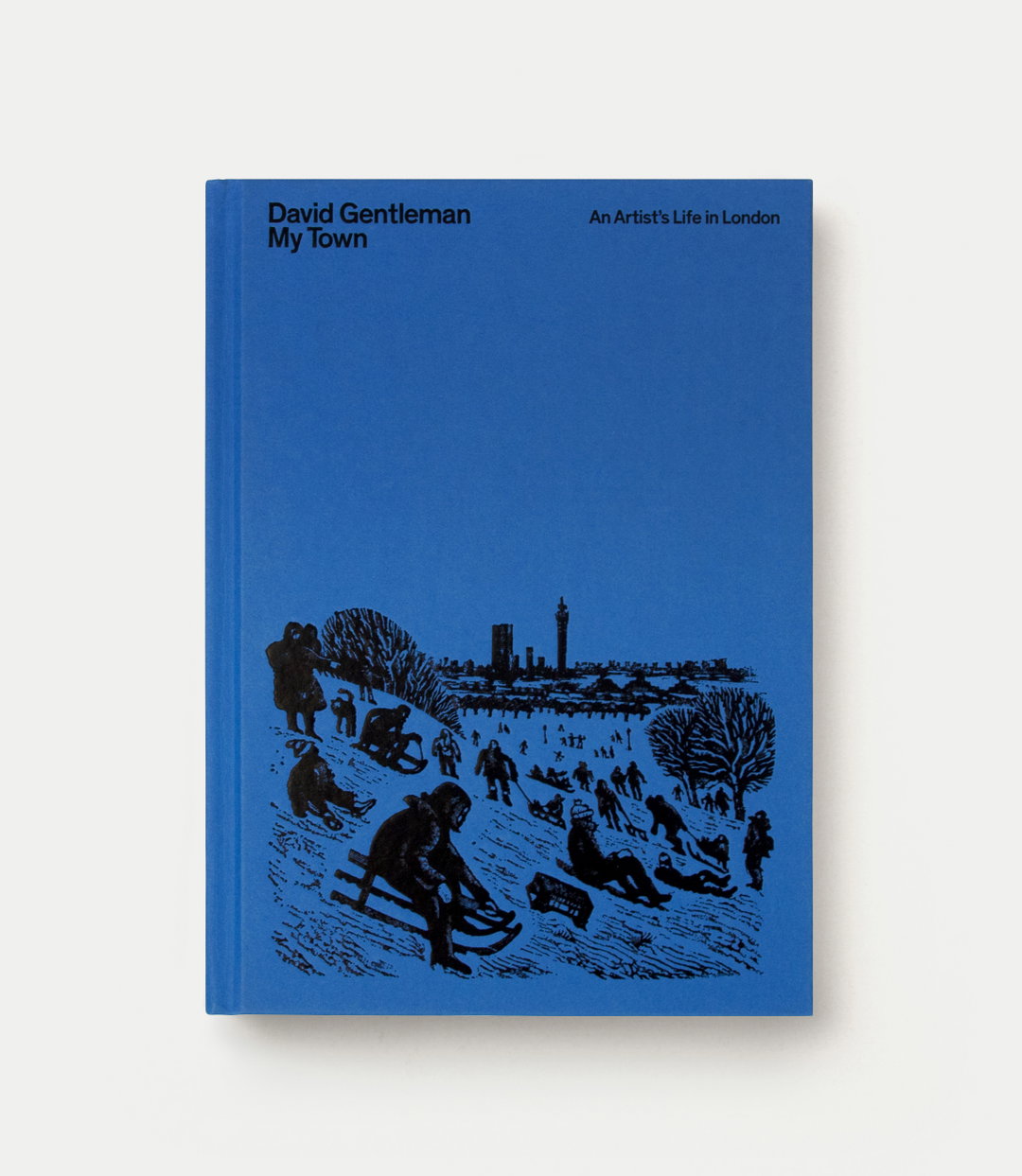
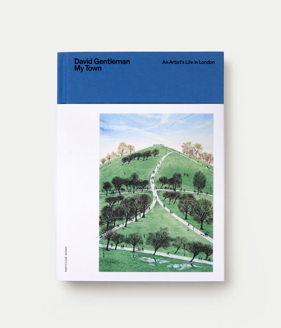
The obvious choice was to use Greta’s now-iconic handwriting and a photo of her for the cover, but Tom wanted to do something different. “I hope the bold, simple, black-and-white cover treats the book as the serious activism that it is.” He opted to use a revival of a very old sans serif designed by Commercial Classics, explaining, “I thought it was the right mix of approachable but urgent.” In other work, Tom had the privilege to design the cover for David Gentleman’s My Town; a design hero of Tom’s which allowed him to delve into the vast array of the artist-cum designer’s extensive work.
Though he’s a highly creative designer in his own right, for Tom, the measure of success doesn’t lie in a recognisable signature style evident from the outside. In fact, he “constantly worries that [he’s] slipping into patterns that create monotonous work.” Recently, he listened to a podcast featuring fellow book cover designer Jon Gray where he relayed a time when all his clients were asking him to do the same handwritten lettering for every brief. “He made a conscious effort to not do work like that for a while and explore new approaches,” adds Tom. “It was a brave move, but it is that kind of mentality that keeps a designer relevant and exciting.”
As the world becomes increasingly digital, for our beloved creative industry, the appreciation for printed goods is well and truly alive. Tom has a friend, a creative technologist at the BBC, who has a good way of putting it. When he’s asked “print or digital?”, he always replies, “both.” There are different purposes for different medias. It doesn’t make sense for a bus timetable to be printed nowadays, but you wouldn’t want an e-book artist monograph. For Tom, the duality is simple, “I think paperbacks are beautiful things.” He ends, “They fit in your pocket, don’t run out of batteries, and you can give them to a friend when you have finished reading them. I love the process of print, experimenting with materials, testing processes and creating a physical object.”
GalleryTom Etherington
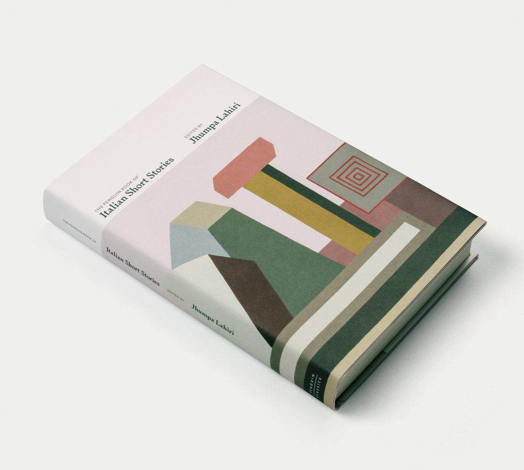
Painting by Nathalie Du Pasquier
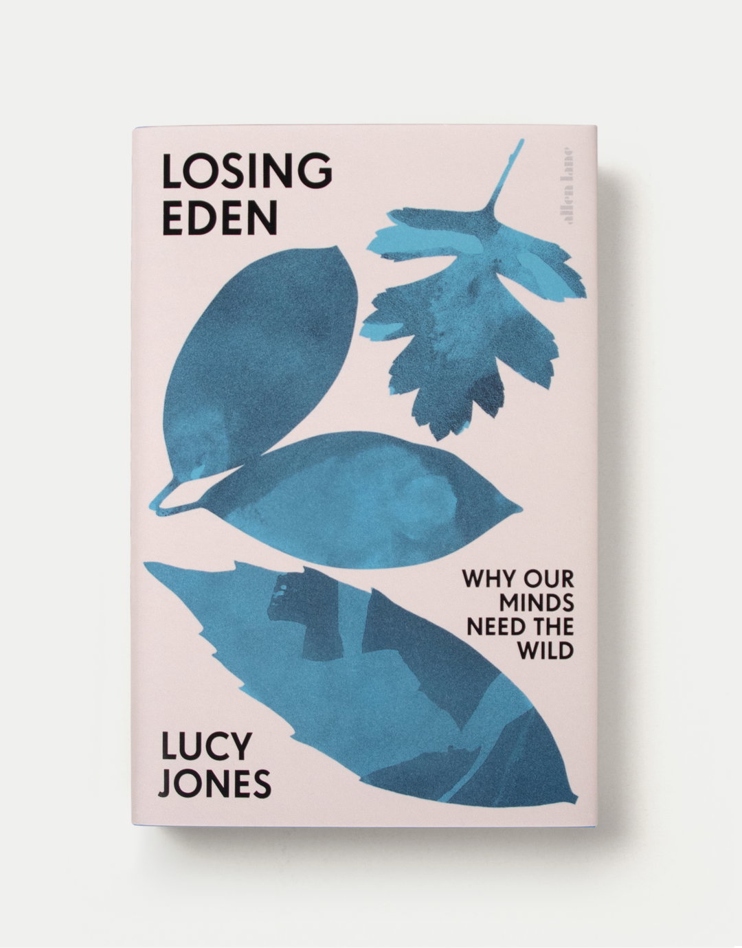
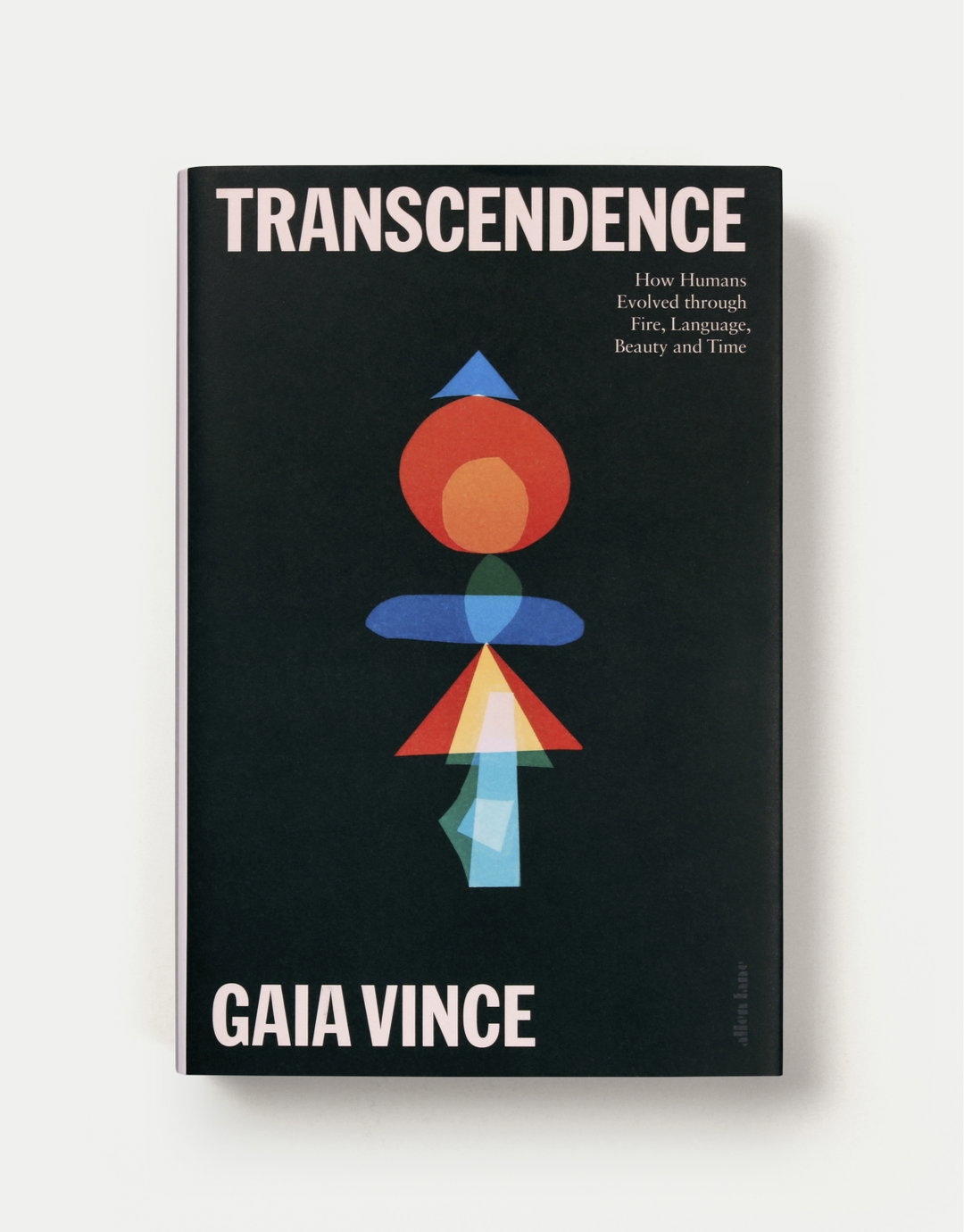
Photogram by Liz Nielsen
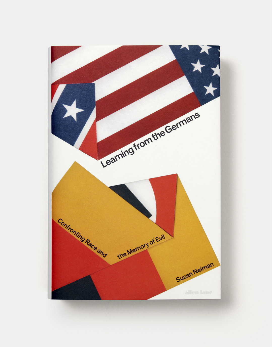
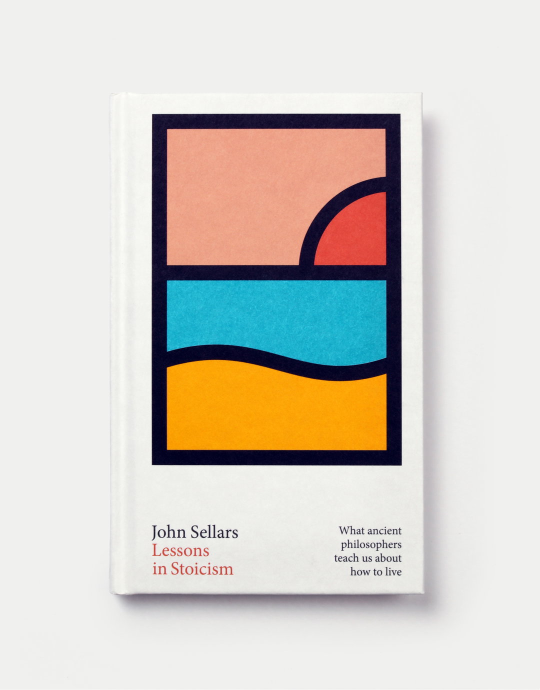
Hero Header
Tom Etherington: Greta Thunberg, No One Is Too Small to Make a Difference
Share Article
Further Info
About the Author
—
Jynann joined It’s Nice That as an editorial assistant in August 2018 after graduating from The Glasgow School of Art’s Communication Design degree. In March 2019 she became a staff writer and in June 2021, she was made associate editor. She went freelance in 2022.