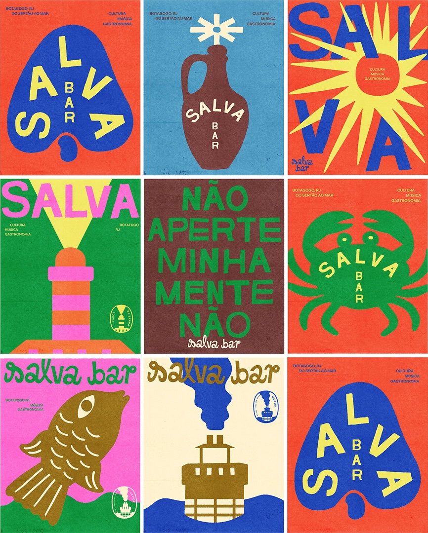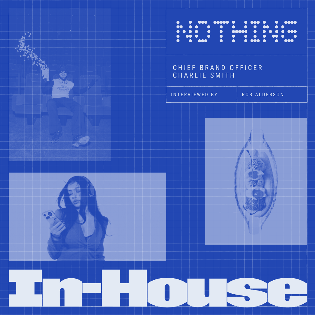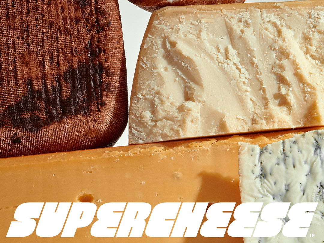
That’ll do the TRiC: The studio that feeds off companionship and culture
This Melbourne-based studio wields its understanding of type and form to craft work that is understated and exciting in equal measure.
Share
TRiC’s work has an ineffable Goldilocks quality – something that feels just right. Never over the top nor falling short, the multidisciplinary design studio seems to balance its practice effortlessly, drawing on strategic thinking, personal taste and original ideas to shape brands, books, events and websites. “We go beyond brand identity into execution, art direction, photography, and motion production, developing ongoing strategic partnerships, brand custodianship, and providing ongoing creative consulting,” says Tristan Ceddia, co founder of TRiC alongside Rick Milovanovic.
The studio’s founding is one built on companionship. Founded in 2020, the studio represented the merger of Tristan and Rick’s individual practices. “TRiC was born out of a long-time friendship and the parallel design journeys,” says Rick. “After partnering on some festival identity projects and lecturing on design together, we decided to create a studio.” Within this creative space, the duo dive into the adjacent industries they’re inspired by, from architecture, fashion and art, to music, film and history. “We draw extensively from the vernacular and our surroundings,” says Tristan, “and together these influences ultimately shape who we are as people and designers.”
As a result, the plethora of projects across its portfolio is diverse; as Rick suggests, the pair have “intentionally avoided specialisation to maintain a fresh approach,” in doing so keeping the studio (and importantly their clients) adaptable. “The most interesting part of our work is how the research process takes us into vastly different worlds,” Tristan concludes. “It’s exciting to see how this manifests into unique design outcomes every time across NGOs, corporate clients, and smaller cultural projects,” each as evolving and full of care as the last.
GalleryCopyright @ TRiC
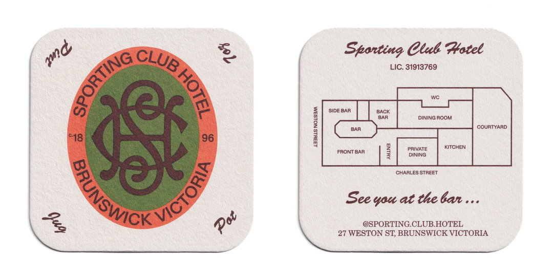
TRiC: Sporting Club Hotel (Copyright © TRiC, 2024)
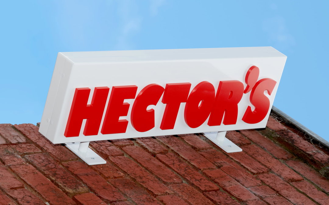
TRiC: Hector’s (Copyright © TRiC, 2024)
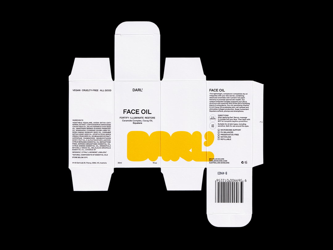
TRiC: DARL' (Copyright © TRiC, 2022)
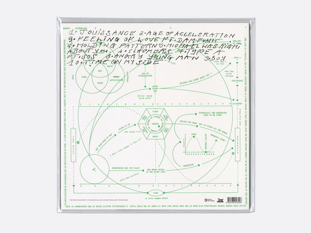
TRiC: Harvey Sutherland (Copyright © TRiC, 2021)
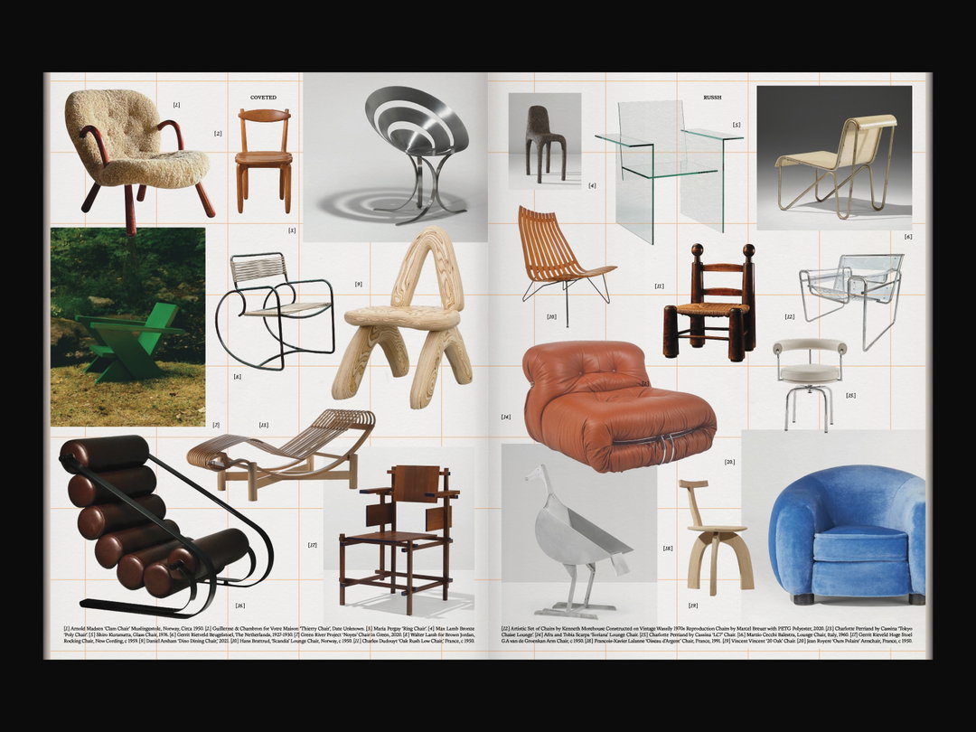
TRiC: Russh Home 01 (Copyright © TRiC, 2022)
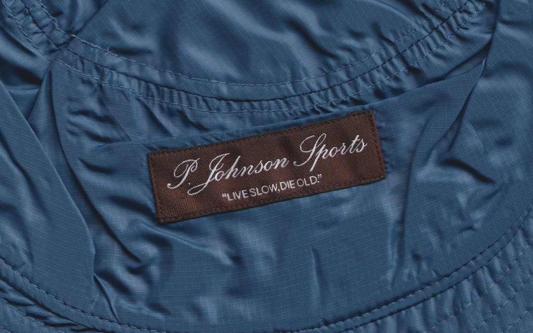
TRiC: P. Johnson (Copyright © TRiC, 2021)
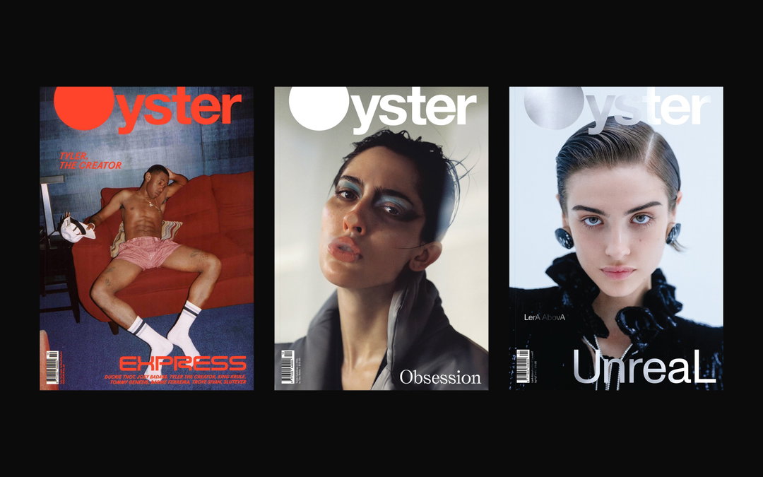
TRiC: Oyster Magazine (Copyright © TRiC, 2018-2021)
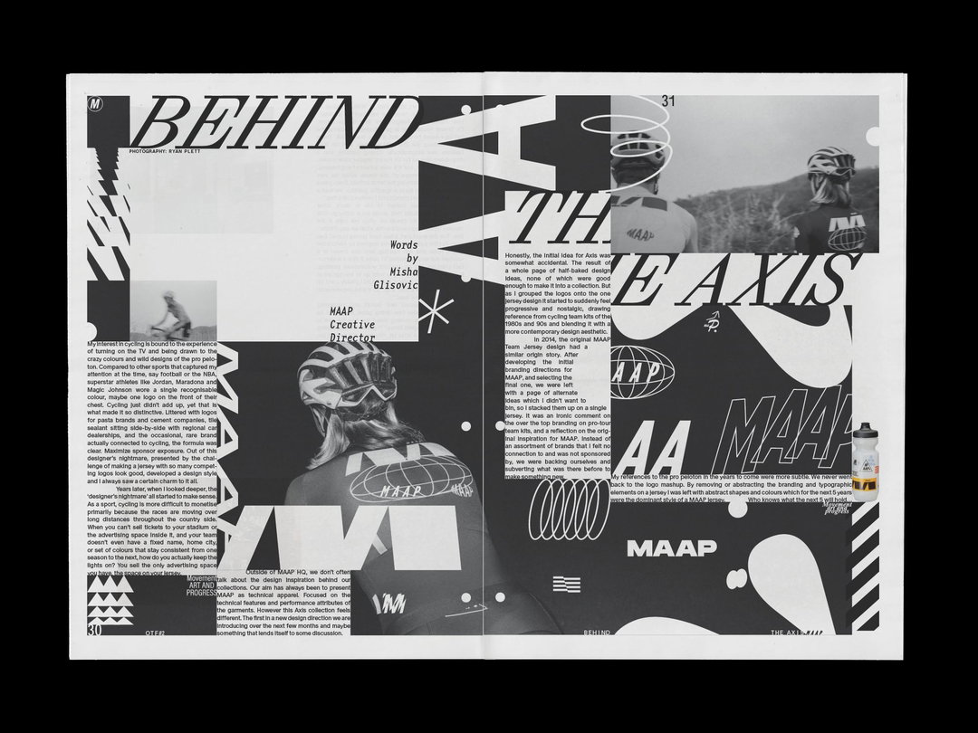
TRiC: MAAP Off The Front #2 (Copyright © TRiC, 2022)
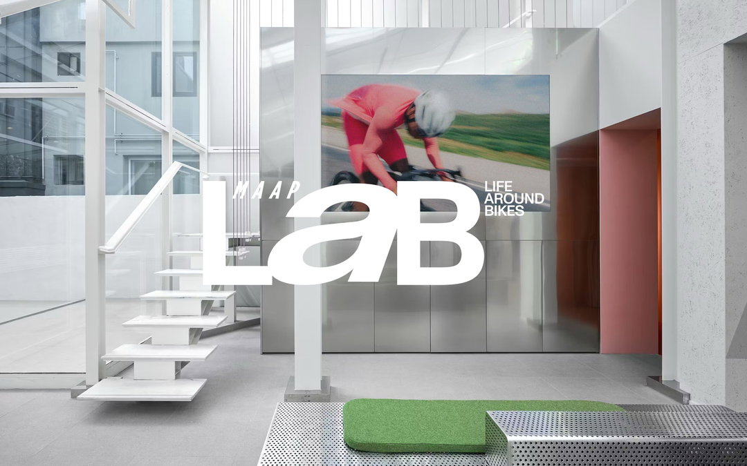
TRiC: MAAP LaB (Copyright © TRiC, 2022)
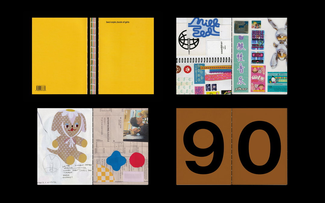
TRiC: Beci Oprin, Book of Girls (Copyright © TRiC, 2023)
Hero Header
TRiC: Sporting Club Hotel (Copyright © TRiC, 2023)
Share Article
Further Info
About the Author
—
Hailing from the West Midlands, and having originally joined It’s Nice That as an editorial assistant in March 2020, Harry is a freelance writer and designer – running his own independent practice, as well as being one-half of the Studio Ground Floor.