




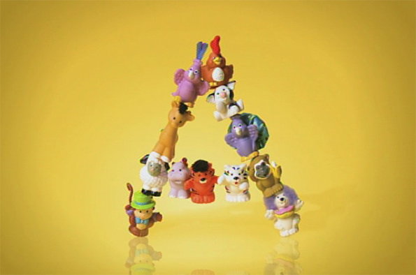
Typography in motion - Duchamp, Kanye and a wonderful 1897 cigarette ad
Marcel Duchamp, Kanye West and the cast of Star Wars – an unlikely dream team united by typography and the moving image. Liverpool’s FACT Gallery has selected these disparate figures among many more to explore typography in relation to the moving image, demonstrating in the Type Motion show that the two media combined act as powerful signifiers in society through art, film, advertising, computer games, and pretty much any other touchpoint from the past 100-odd years.
It’s a loose theme for a show, but one that touches on the extraordinary power of lettering when set free from the shackles of static print, and showing the extraordinary skill it takes to successful make words kinetic, whether by an ad-man or an artist. What’s fascinating is to see work from the likes of Marcel Duchamp and Terry Gilliam placed in the same realm as logos for Domino’s Pizza or Sega that are so ubiquitous that looking at them from a typographic standpoint feels quite unnatural.
For us, the highlights of what we’ve seen so far have to be the adverts – with the hilarious 1897 Admiral Cigarette Advert. In black and white silent footage, we see what appears to be a very early incarnation of the Village People having a natter, before an exuberant figure leaps from a box, brandishing cigarettes for all before chucking a load of them on the floor. The gang light up, before producing a banner proudly bearing the slogan: “we all smoke”. Watch it below, it’s rather brilliant.
Among the other 200 works in the show – described by the gallery as an “immersive sensory experience” – are pieces by Marcel Duchamp, Eduardo Kac and John Baldessari as well as title sequences from Psycho, Gone with the Wind and and Star Wars and music videos for tracks by Justice and Kanye West.
The show runs from 13 November – 8 February 2015 at Liverpool’s FACT Gallery.
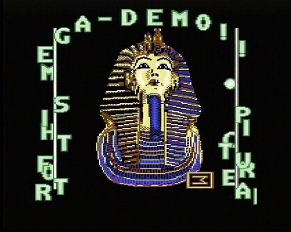
XAKK: No Sleep 2 (Part 2), 1987 computer demo-scene
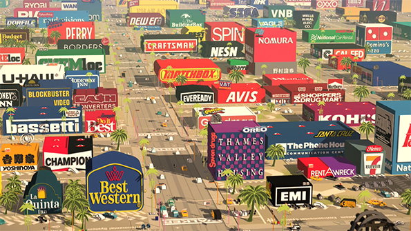
H5: Logorama, 2009 digital animation
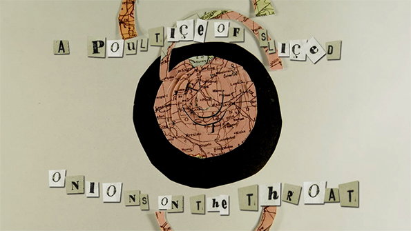
Alice Lyons and Orla McHardy: 2009, poetry clip
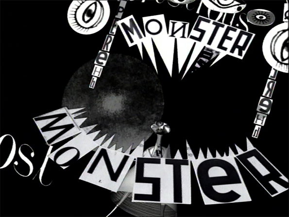
Lesley Barnes: Herzog and the Monsters, 2006, poetry clip
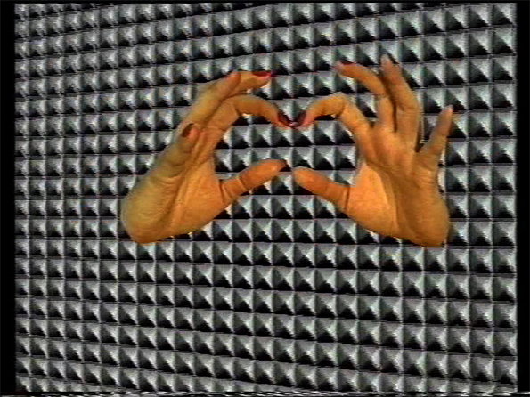
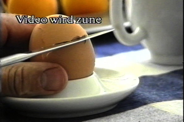
Dellbrügge & de Moll: Video-Theorie II, 1992 video art
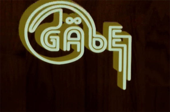
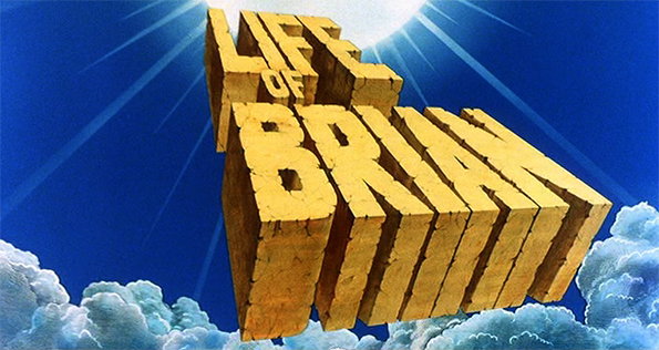
Terry Gilliam: Monty Python’s Life of Brian 1979 title sequence, director Terry Jones, © MPLC
Share Article
Further Info
About the Author
—
Emily joined It’s Nice That as Online Editor in the summer of 2014 after four years at Design Week. She is particularly interested in graphic design, branding and music. After working It's Nice That as both Online Editor and Deputy Editor, Emily left the company in 2016.


