Unit Editions resurrects popular 80s and 90s typography journal, Octavo, in new book
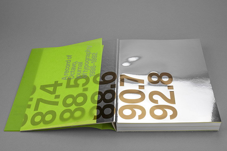
In 1986, the London-based design studio, 8vo, set up a typography journal that was, rather fittingly, named Octavo Journal of Typography. This ran as an eight issue series until 1992 and picked up a huge following for its radical diversion from traditional graphic design. A quarter of a century later, the journal is being resurrected by two of Octavo’s original makers, Mark Holt and Hamish Muir. The 384-page book is published by Unit Editions and showcases all eight issues in the original 1:1 size. Hailed as a major typographical event, the new publication, Octavo Redux, shines a light on a short-lived but influential journal.
Mark recalls the original motivation behind Octavo: “Simon (a fellow founder) in particular had an interest in words and language that went beyond how type is applied in graphic design. Octavo became a channel through which to explore our interest in how type is used in the arts, poetry, the environment, architecture and within education.” The journal shifted away from the pictures and drawings that had become a trademark of British design. Octavo’s designers didn’t perceive text as a secondary add-on to images, but rather re-imagined printed characters as an art form in their own right. Its textual layouts, fonts and colours anticipate computer-generated images in a pre-digital era.
Unit Editions has brought these compositions to life in a carefully-considered and expertly executed publication. After examining the historical significance of Octavo, the publisher produced a unique book that encompasses the journal’s original aims. “Octavo’s mission was to work against everything prevalent – attitudes, styles, commercialism, the reliance on big ideas and twee production tricks, the Britishness of British design,” Hamish says. Octavo Journal was the typographical Crass of its generation, disrupting the dominant design structures of its time. “Octavo stood out as being different, as having an attitude – that’s what people appreciated.” It is in this vein that Unit Editions produced Octavo Redux, a publication filled with unexpected details from reflective mirror paper to unique metallic gold and neon yellow inks.
“Unit Editions is a well-oiled publishing machine. They understand the need to communicate with their audience, the importance of promotional campaigns, newsletters and social media, and in the case of this book, how best to put a Kickstarter campaign together,” Mark says. In this way, the publishing house played a big role in breathing life back into the thirty-year-old magazine. Hamish also acknowledges that the publishing house worked as an “analytical filter”, picking up potential editorial and stylistic problems that the two designers were too close to the journal to see. As such, Unit Editions has produced a book that is a handsome document of what was considered a radical publication in its time.
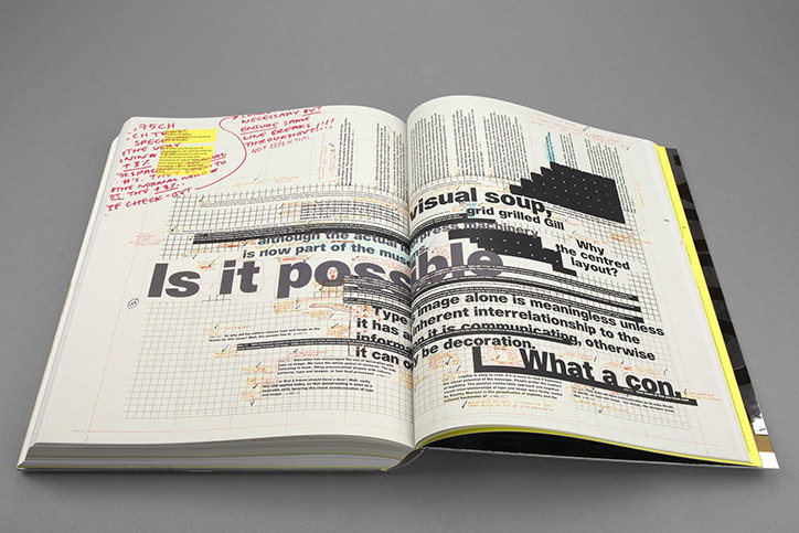
Unit Editions: Octavo Redux
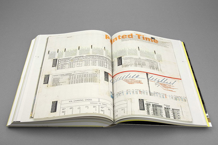
Unit Editions: Octavo Redux
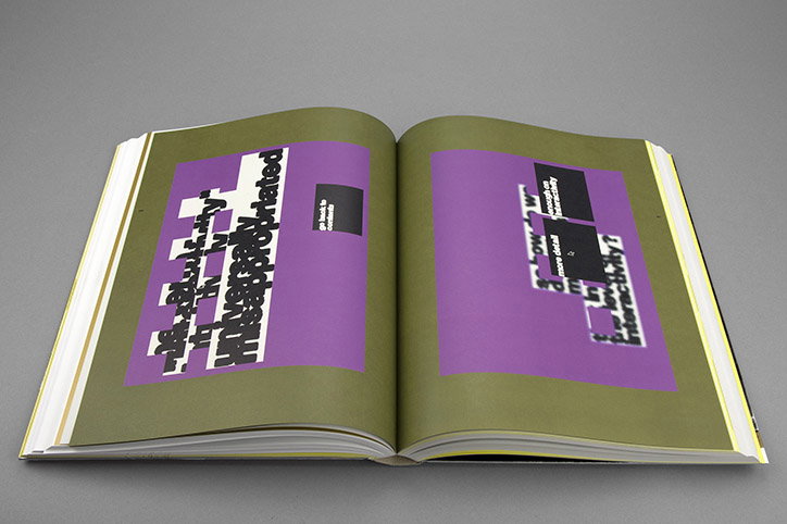
Unit Editions: Octavo Redux
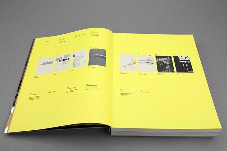
Unit Editions: Octavo Redux
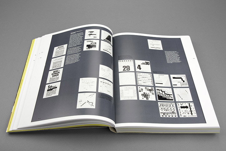
Unit Editions: Octavo Redux
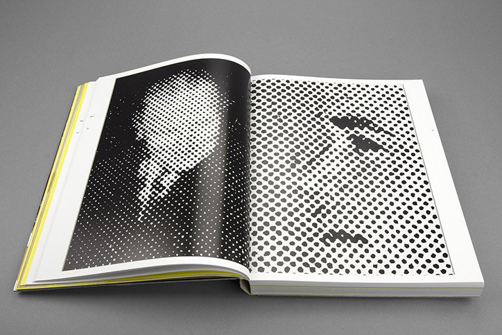
Unit Editions: Octavo Redux
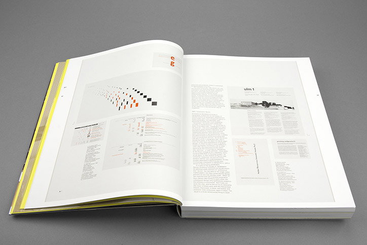
Unit Editions: Octavo Redux
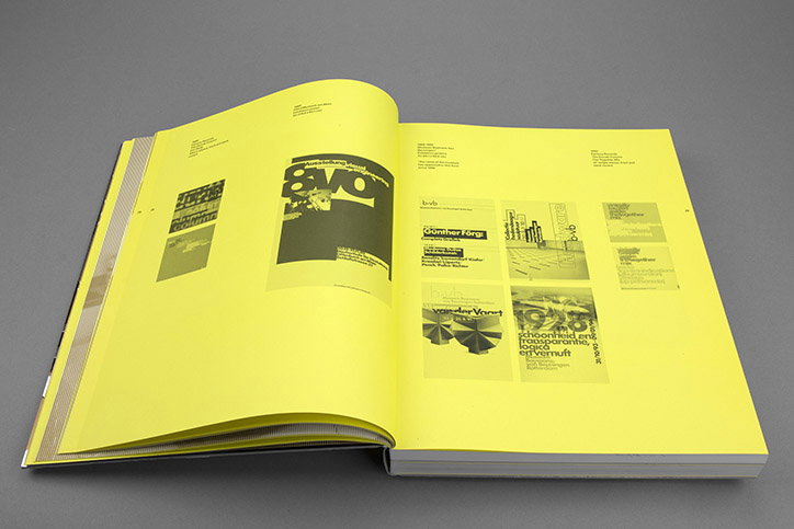
Unit Editions: Octavo Redux
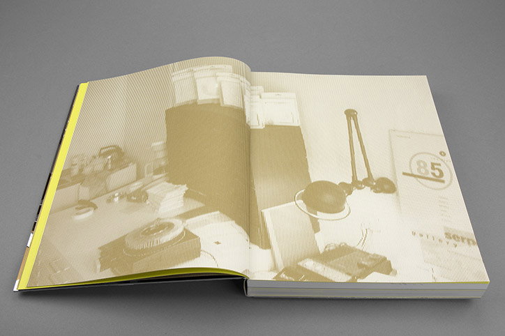
Unit Editions: Octavo Redux
Share Article
Further Info
About the Author
—
Daphne has worked for us for a few years now as a freelance writer. She covers everything from photography and graphic design to the ways in which artists are using AI.