




Design studio Varv Varv's well-reasoned practice is an enquiry into "making things public"
For a design studio which began life as an ambulating bookshelf, Varv Varv’s output of printed matter is suitably impressive. The culmination of Anders Stockman and Mathew Whittington, who are based in Malmö and London respectively, the studio works across visual identities, websites, typefaces, exhibitions and publications.
The pair met while studying at Central Saint Martins and, upon graduating, moved to Sweden where Varv Varv first began, although only under its former moniker: Varv. Hosting workshops in and around Gothenburg, Anders and Mathew also occupied themselves by installing their mobile bookshelf at various galleries and art institutions. A couple of years later the pair went their separate ways in order to work towards their masters’ but reconvened after this period of study as Varv Varv; “the second incarnation of Varv,” with a focus on “the dispersal and circulation of ideas and information, set up and formalised as a design studio.”
Although now functioning as a more traditional design studio, Varv Varv’s practice still places an emphasis on interaction with the public. “Nearly all of our work is rooted in some way to an enquiry of publishing and ‘making things public’,” Anders and Mathew explain. “The studio began as a perambulating bookshop, and over time developed into a studio and publishing project, so there are almost always books involved — or something that at least resembles a book in a very broad sense.”
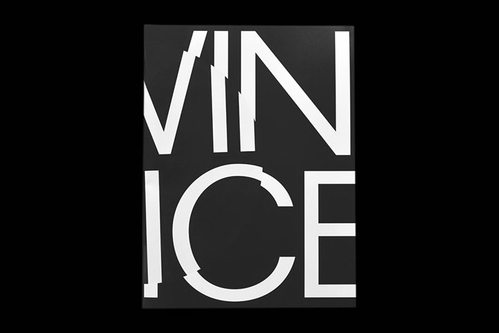
These books range in their stylistic output and format but are almost always collaborative, made in tandem with whichever artist, writer, curator or designer approaches the duo. For example, when working on Viewing Devices, a publication introducing the reader to a series of sculptures by Patrik Aarnivaara, Anders and Mathew spent time getting to know Patrik and his work. “Finding the most appropriate way to process that into a publication and then sharing that with a wider audience is a hugely rewarding experience for us as designers,” they add.
Patrik’s sculptures presented in Viewing Devices investigate the relationship between the body and the camera, influenced by various support structures for image production like tripods. The design of the book embodies this to the full, basing its structure on a matrix of aspect ratios. “Images run over and between spreads to emphasise browsing and to create an interaction between body and printed matter that is analogous of the experience of Patrik’s sculptures,” Varv Varv outlines.
Varv Varv’s process clearly produces gratifying and methodically produced outcomes which make sense. However, beyond this conceptual consistency, publications like Love by Steven Campbell (co-designed with Nicholas Bennett) and The Open Source Digest are finished pristinely, resulting in the perfect combination of aesthetically pleasing and well-reasoned design.
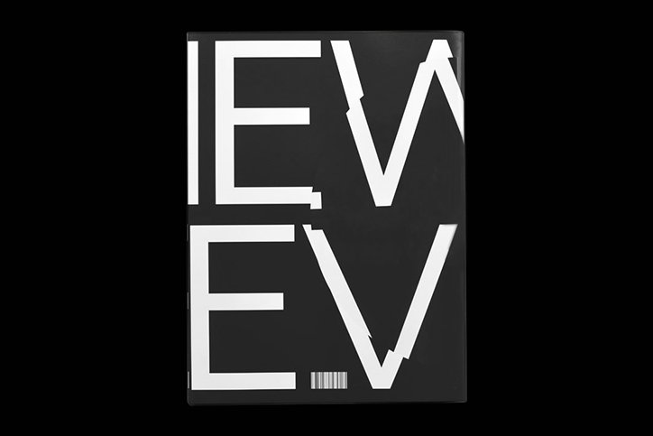
Viewing Devices by Patrik Aarnivaara. Published by Varv Varv and Woodpecker Projects, 2016.
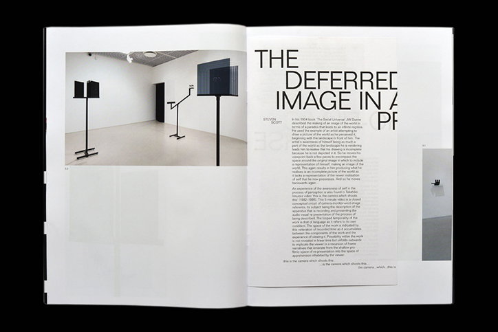
Viewing Devices by Patrik Aarnivaara. Published by Varv Varv and Woodpecker Projects, 2016.
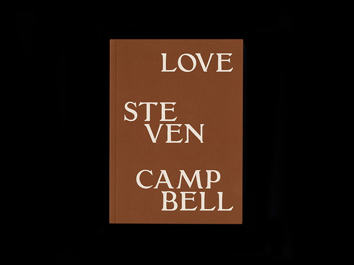
Love by Steven Campbell. Designed in collaboration with Nicholas Bennett. Published by Young Team, 2018.
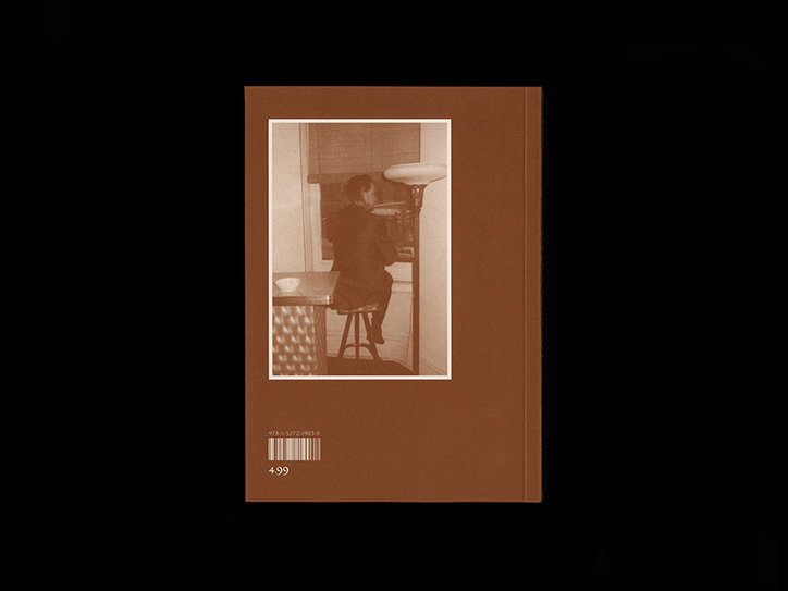
Love by Steven Campbell. Designed in collaboration with Nicholas Bennett. Published by Young Team, 2018.
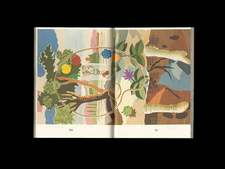
Love by Steven Campbell. Designed in collaboration with Nicholas Bennett. Published by Young Team, 2018.
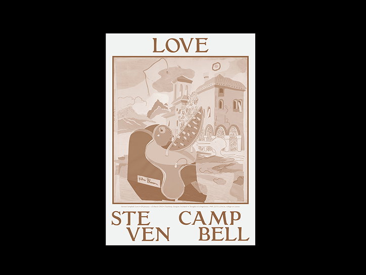
Love by Steven Campbell. Designed in collaboration with Nicholas Bennett. Published by Young Team, 2018.
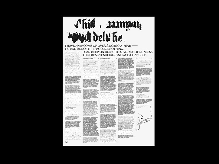
Confessions of a Drone by Joseph Medill Patterson. Edited and republished in 2018 by Varv Varv from the 1989 edition by See Sharp Press, San Francisco, USA, and the c.1910 edition of the Pocket Library of Socialism, no 45, Chicago, U.S.A. Images by Nicholas Bennett.
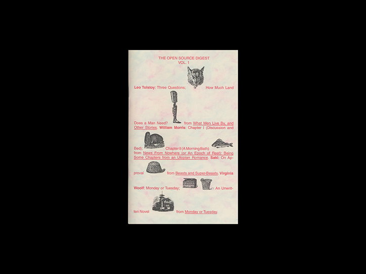
The Open Source Digest (vol.1, 2, & 3). Published by Varv Varv (2010—ongoing)
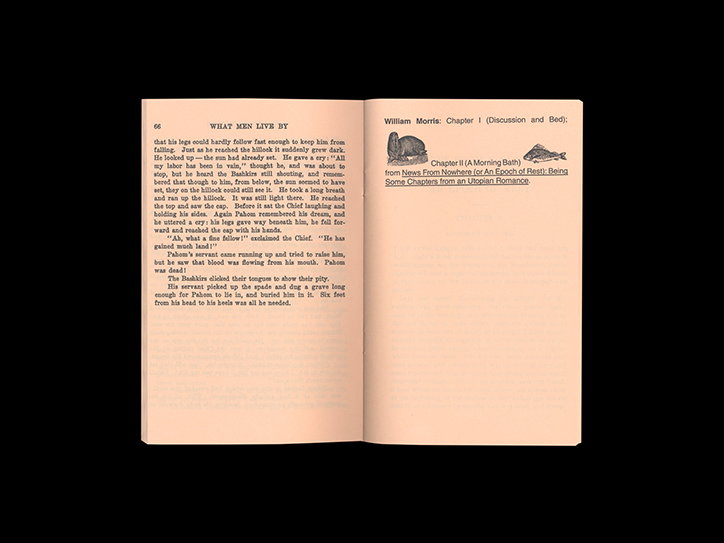
The Open Source Digest (vol.1, 2, & 3). Published by Varv Varv (2010—ongoing)
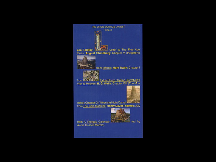
The Open Source Digest (vol.1, 2, & 3). Published by Varv Varv (2010—ongoing)
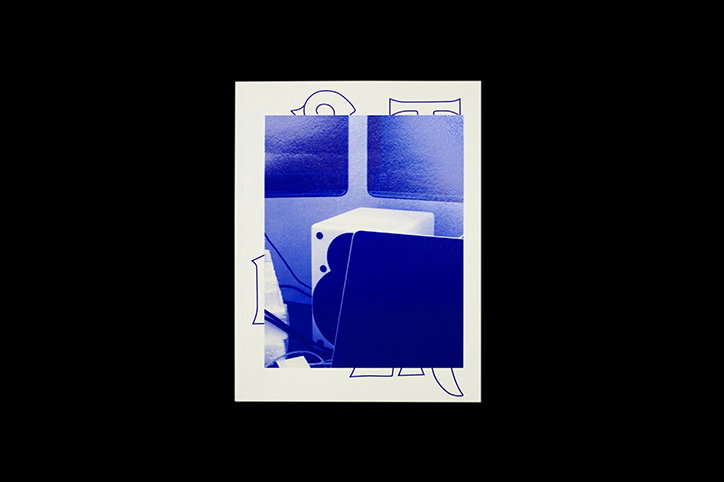
Outremer by Kevin Malcolm Published by Varv Varv and Woodpecker Projects, 2017.
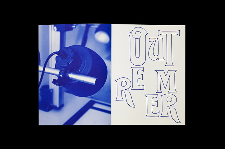
Outremer by Kevin Malcolm Published by Varv Varv and Woodpecker Projects, 2017.
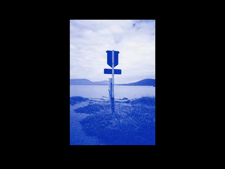
Varv Varv: Posted Poster
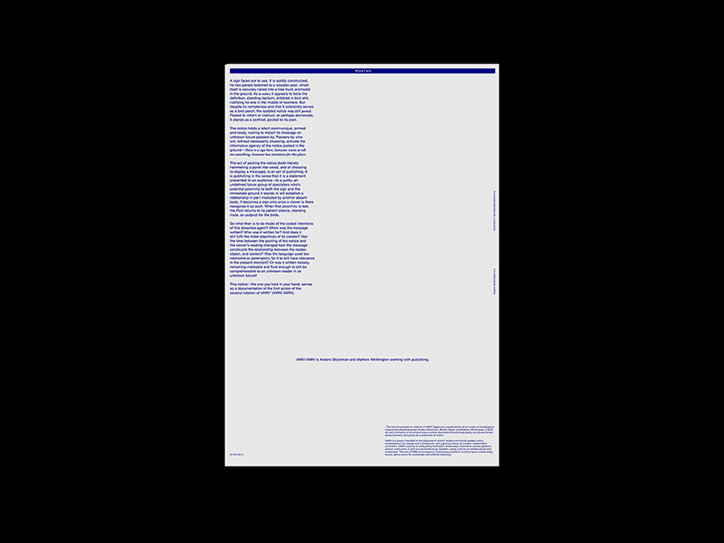
Varv Varv: Posted Poster
Share Article
Further Info
About the Author
—
Ruby is Senior Creative at It's Nice That, overseeing our visual output across platforms and projects. Before that, she was associate editor on the editorial team, after joining in September 2017 following graduation from Central Saint Martins.

