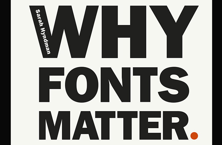
Why Fonts Matter, and how they impact your mood
Typography might just help you date, solve obesity and impact your mood; so we’ve learnt from type fanatic Sarah Hyndman. We’ve previously dubbed her “the one woman tour-de-force behind the Type Tasting enterprise”, which looks at the power typography has over our lives and senses. She’s now published a new book on the subject, Why Fonts Matter, and has kindly offered us an extract looking at the effects of typography on our emotions.
Physically, we use our voice, facial expressions. gestures and posture to convey a wide range of emotional cues from the subtle to the dramatic. Typefaces and the way they are used provide a similarly extensive emotional range typographically.
In 1933 Poffenberger and Barrows explored how shapes and simple as lines could communicate emotions. Their theory was that when we look at a line our eyes move along the shape. This turns it into a physical experience that reminds us of the body language we use to express our emotions. They asked participants to match emotions form a line to each of the 18 curved and jagged lines sloping in different directions. A line going downwards was shown to make us feel “doleful,” while a “joyous” like takes our eyes upwards.
Each of our emotions contains a whole range of feelings and these nuances can also be conveyed typographically. Psychologists Samuel Juni and Julie Gross asked 102 New York University students to read a satirical article from The New York Times. Each was given the reading randomly printed in either Arial or Times New Roman. Afterwards they were asked to rate their response to what they had read. They rated the article as being funnier and angrier, in other words more satirical, when it was read in Times New Roman.
There is a parallel between what we experience in the physical world and how this influences our interpretation of typeface shapes. Type can be seen as mirroring the emotions we display in the real world through our facial expressions and gestures. When we are happy our faces become round with a wide smile and our body language is open. By contrast, an angry frown expression is pinched and angel and an attacking animal is all jagged teeth and claws.
Type also mirrors the way your handwriting communicates your mood or emotions. When writing quickly your mood is italicised and when angry it becomes bold and deliberate.