



Launch Recite Me assistive technology
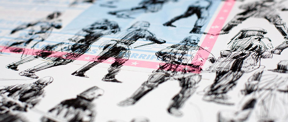
A series of rough ink sketches showing figures in dynamic, action-oriented poses. A translucent pink strip with white stars is laid over the center of the page.

Graphic Design: Old posters meet new drawings in new Why Not Associates project

—
Date
6 February 2014

The latest project from Why Not Associates started life as a wedding present. Founder Andy Altmann is an avid collector of printed ephemera of all kinds, and experimented with silk-screening an image over a 1950s film poster as a gift to mark Andy Stevens’ (of Graphic Thought Facility) nuptials.

With his creative interests piqued by the process, Andy asked his friend the artist Charming Baker if he could print some of his drawings onto both the movie posters and some 1970s British wrestling ones.

He worked with Jealous Print in Shoreditch to create the final pieces, defined by their unpredictability. “It was fascinating to see how the ink of the silk-screen reacted with that of the old posters. some colours bled through, some did not. Various colours seemed to intensify.

“It was quite random and we were never sure what would happen but that was the fun of doing them. As each was an original we were creating a unique poster – there was no going back once the ink was down!”
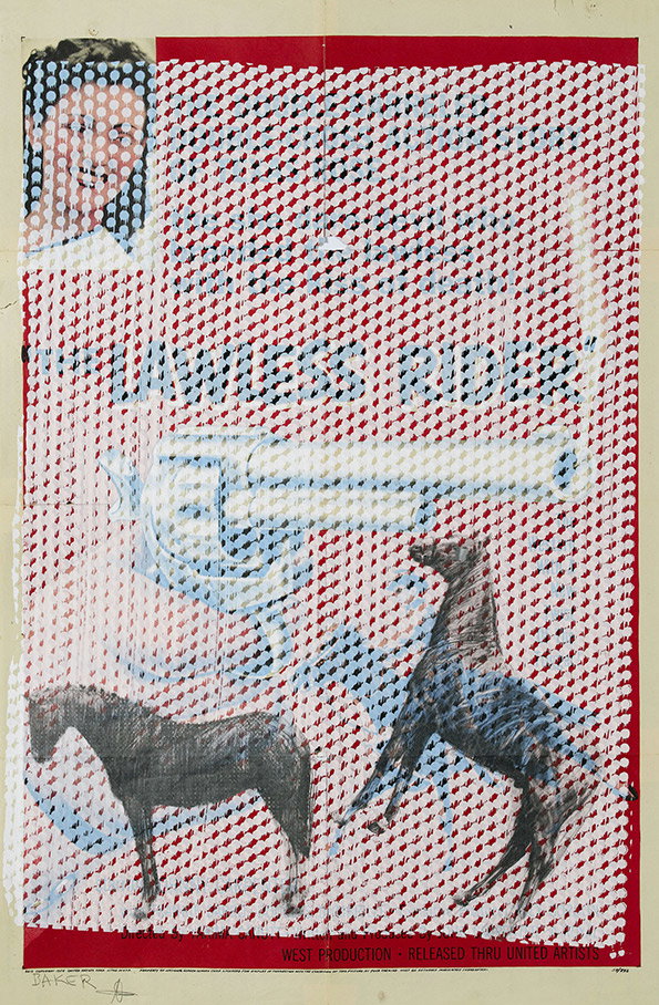
A collage featuring a red and white Ben-Day dot pattern. The text “LAWLESS RIDER” is layered over the pattern, alongside a cropped image of a smiling person and two horses.
Above

Why Not Associates/Charming Baker: Poster
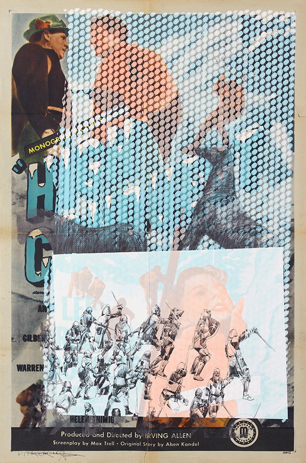
A collage featuring fragmented imagery and a halftone dot pattern. The bottom section shows a group of figures in armour with swords, overlaid on a pale blue background with a faint portrait.
Above

Why Not Associates/Charming Baker: Poster
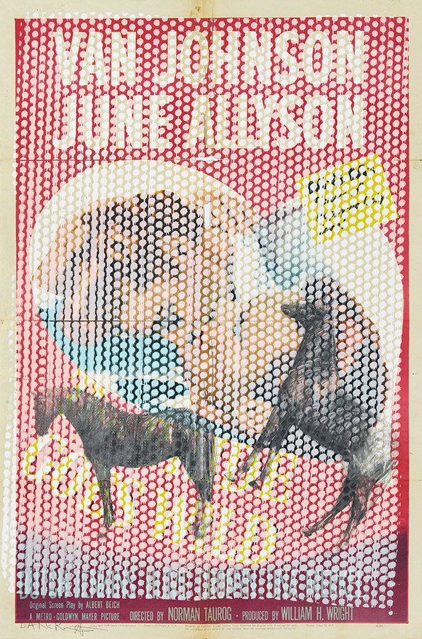
A vintage film poster featuring the names “Van Johnson” and “June Allyson” in large red type. A halftone image of two faces is layered over a red dotted background, with two horses appearing in the foreground.
Above

Why Not Associates/Charming Baker: Poster
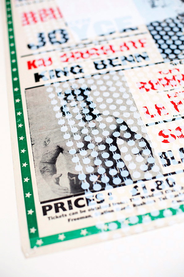
A close-up of a printed poster featuring a black and white image of a boxer. The image is overlaid with a pattern of light blue dots and bold red and black text, including the words “King Benn”.
Above

Why Not Associates/Charming Baker: Poster
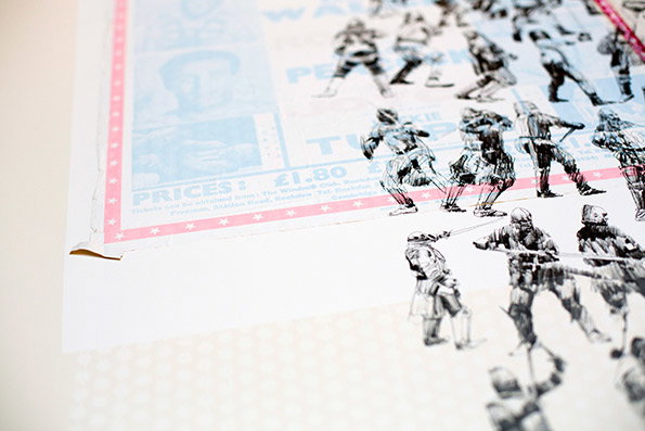
A close-up of a print featuring several black and white sketches of Stormtroopers from Star Wars. The figures are layered over a light blue background with the word “PRICES:” and the figure “£1.80” visible.
Above

Why Not Associates/Charming Baker: Poster
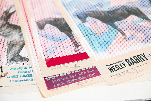
A series of overlapping film posters featuring stylised images of horses. One poster includes the text “Produced and Directed by WESLEY BARRY”.
Above

Why Not Associates/Charming Baker: Poster
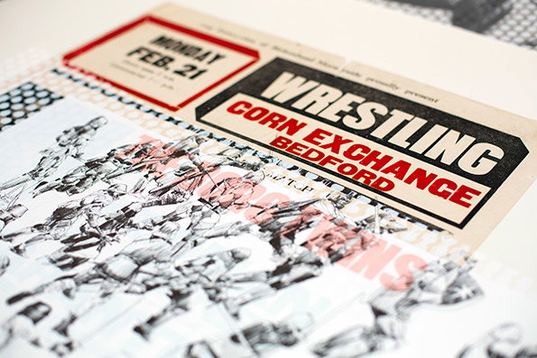
A collage featuring a vintage ticket for “Wrestling” at the “Corn Exchange Bedford” on “Monday Feb. 21”. Below the ticket, a black and white illustration shows a crowd of figures in dynamic, overlapping poses.
Above

Why Not Associates/Charming Baker: Poster
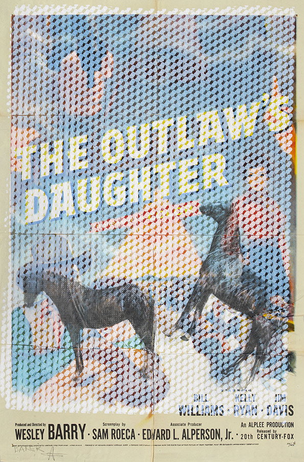
A movie poster for “The Outlaw’s Daughter” featuring two horses against a blue and white background. The image is overlaid with a dense, repeating geometric pattern of small grey and white shapes. Credits at the bottom list Wesley Barry, Sam Roeca and Edward L. Alperson, Jr.
Above

Why Not Associates/Charming Baker: Poster
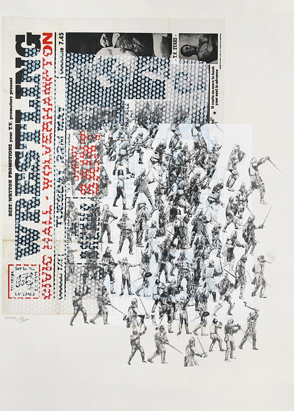
A collage featuring a crowd of sketched figures in dynamic, fighting poses. They are layered over a vintage promotional poster that reads “WRESTLING” in bold, vertical lettering.
Above

Why Not Associates/Charming Baker: Poster
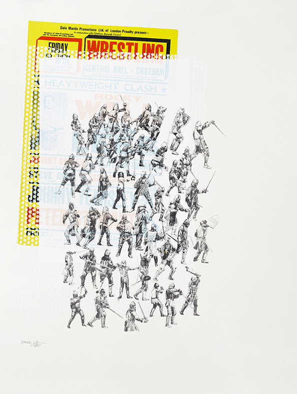
A collage featuring a crowd of sketched figures in dynamic, fighting poses. They are layered over a vintage yellow and red wrestling poster that reads “WRESTLING” and “HEAVYWEIGHT CLASH”.
Above

Why Not Associates/Charming Baker: Poster
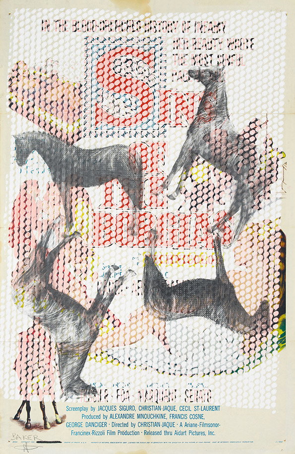
A collage featuring four charcoal sketches of horses in various poses, layered over red and blue patterned textures. Text at the bottom lists the screenplay, producers and director for a film released through “Ariadne-Filmsonor-Francinex-Rizoli Film Production”.
Above

Why Not Associates/Charming Baker: Poster

Share Article

About the Author

Rob Alderson

—

Rob Alderson is a freelance writer, editor and strategist. He was previously editor-in-chief of It’s Nice That and WePresent, and editor of Design Week. He publishes the newsletter Undo, which tries to make sense of how AI is changing design work, the design process and the design industry.


It's Nice That Newsletters

Fancy a bit of It's Nice That in your inbox? Sign up to our newsletters and we'll keep you in the loop with everything good going on in the creative world.