




Wrong Studio combines well-executed typography with “flaws and errors”
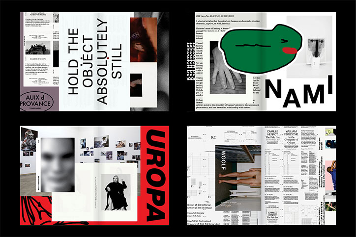
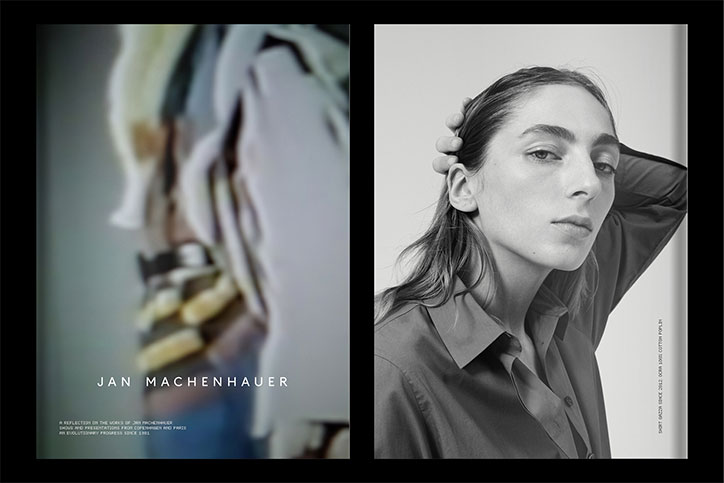
Inspired by “wrong” design and a fondness for “flaws and errors”, aptly named Wrong Studio has been championing well-executed typography and graphic expertise by adding a twist of their own signature style. The studio was founded in 2013 by two colleagues, Andreas Peitersen and Jess Andersen, who decided it was time to steer things in a more personal direction. Since its launch, the duo have dabbled in various projects with a close-knit and collaborative ethos. We spoke to Andreas to find out more about some of its most studio-defining projects.
Where did Wrong Studio all begin?
Jess holds a design degree from the Royal Academy of Fine Arts School of Design, and I went to Design School of Koling and The Royal Danish Academy of Fine Arts School of Architecture. Before starting Wrong Studio, we worked together at a larger commercial design agency… At some point we both grew tired of the ‘big business’ way of doing things and decided that it was time to do something more personal.
What’s the Wrong ethos?
The name Wrong sprung from the idea of embracing the errors and digressions that always appear during the design process. This was to achieve interesting results on a conceptual level — they were sometimes very visual and up front, but sometimes very subtle. This way of working co-exists naturally with a passion for typographic excellence and graphic craft in general.
Where do you draw inspiration from?
It feels like influences and sources of inspiration tend to morph and change day to day as our brains grow. We are highly interested in art; we often find art to be more stimulating to look at than actual graphic design. Of course we have numerous graphic design heroes, but we would prefer not to get that list started. Generally speaking we are most inspired by pre-digital graphic design, especially that from the 60s and 70s.
What’s the day-to-day like in the studio?
We’ve been working together for almost ten years now and have a quite tight-knit way of collaborating. We are usually working on the same projects at the same time. There’s only the two of us in the studio so we spend a lot of time discussing and talking about everything we work on.
Wrong Studio
Wrong Studio
Wrong Studio
Tell us about your on-going work with Kunsthal Charlottenborg.
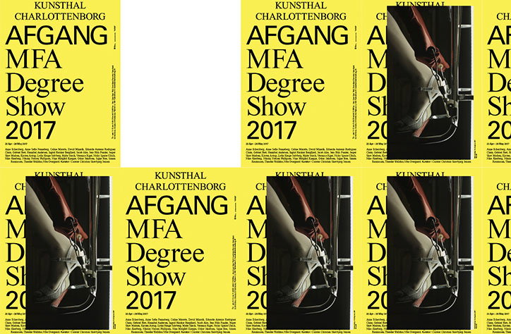
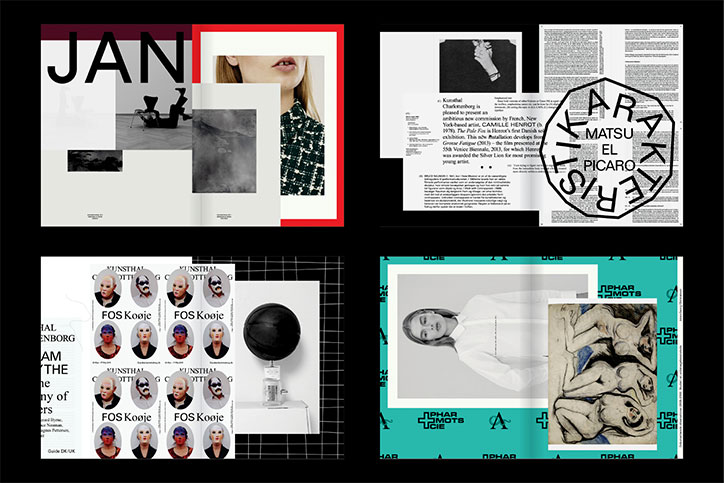
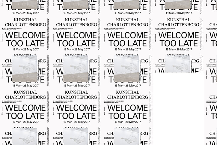
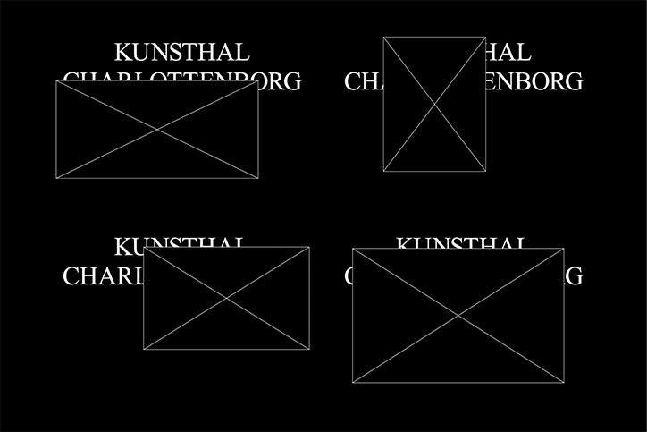
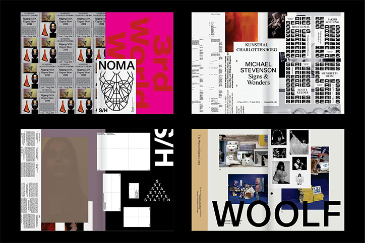
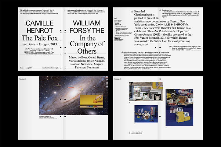
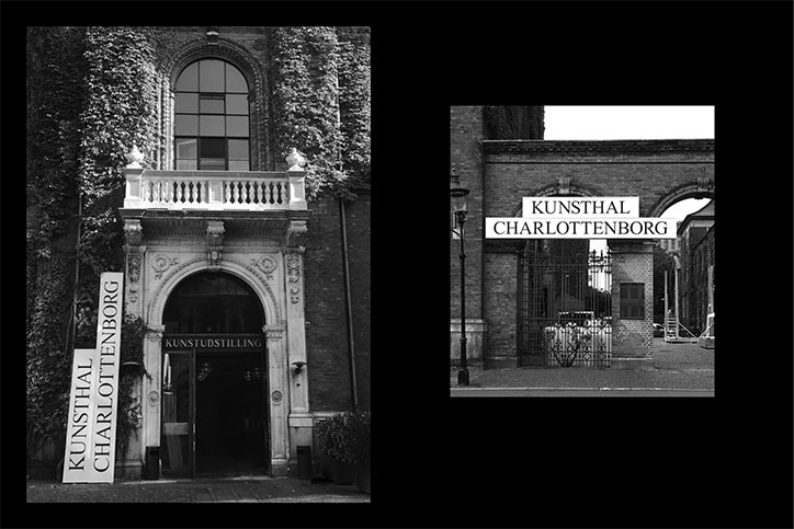
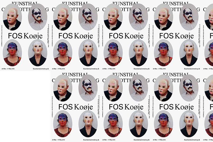
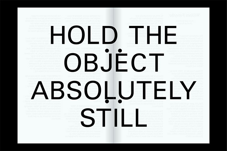
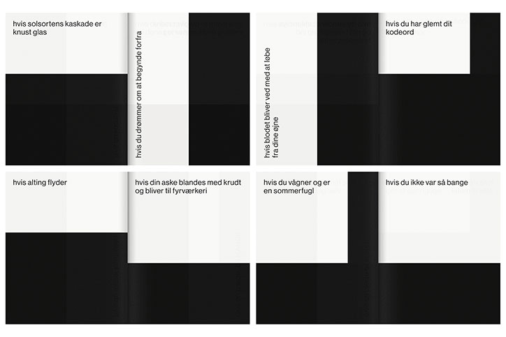
Kunsthal Charlottenborg has been, and still is, a super important project to us. Our very first job when we started up the studio was to design the new visual identity for the Kunsthal… The primary design concept builds on the idea of merging the physical space — a classic baroque building in the centre of Copenhagen — with the content. It’s where classic architecture meets contemporary art. The classic part is expressed by a rather dull and rigid system for typography, sizes and grids. The contemporary part is expressed by letting the content (pictures and artworks) float free on top of typography, logotype and graphics. We strongly wanted the art to rule the design instead of the opposite.
This concept really combines our passion for proper and well-executed typography with our fondness for flaws and errors. We are still occasionally having calls from printers telling us that something seems wrong with the design, because a picture is covering the logotype or other text elements. So you can say that this case is indeed very representative for our practice.
Favourite projects so far?
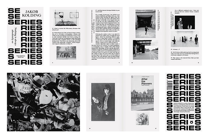
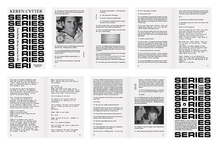
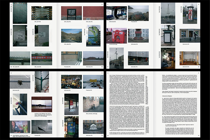
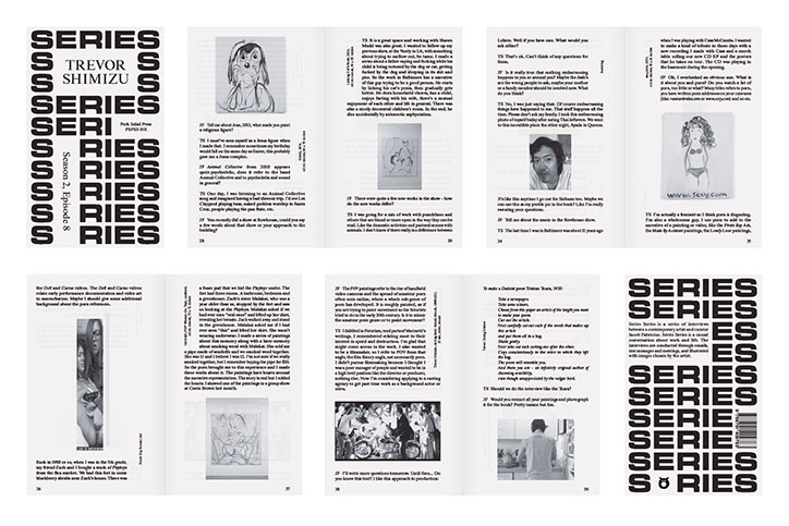
We are still very happy with the ever-expanding book series Series Series that we are doing in collaboration with Pork Salad Press. It’s a pocket book format containing semi-informal interviews with contemporary artists. The design is informal as well — it’s basically just one running text with pictures relating to the conversation plopped into it. The covers are just compositions with artist names and the title, which all sit on top of the word ‘series’ repeated again and again. We like how all the book covers in the series look very similar but when you have a second glance they are actually very different.
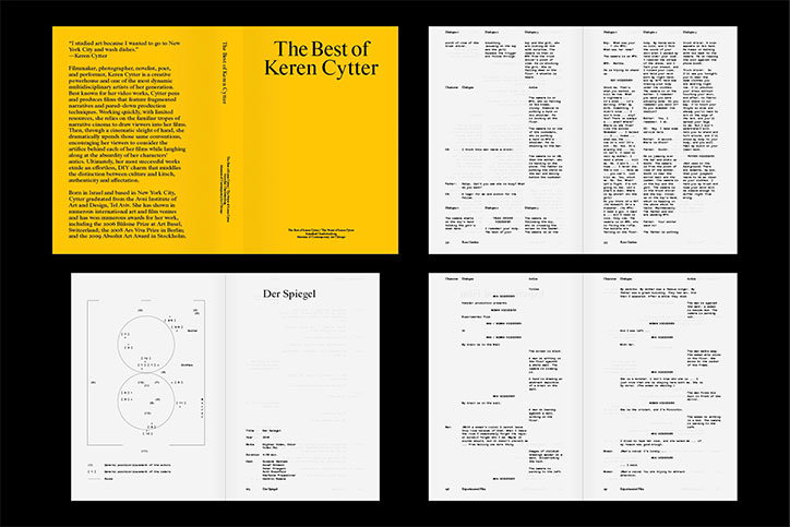
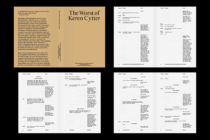
The Best of Keren Cytter/The Worst of Keren Cytter is another book that we are really happy with because of its consistency and wittiness. It was done in collaboration with MCA Chicago and Kunsthal Charlottenborg and contains close to 1200 pages with only transcripts of Keren Cytter movie scripts. It is split up into two books, one is The Best of Keren Cytter the other one is The Worst of Keren Cytter. The design mimics a classic movie script, which naturally makes the pages very lively and diverse.
Wrong Studio
Wrong Studio
Wrong Studio
Wrong Studio
Wrong Studio
Wrong Studio
Wrong Studio
Wrong Studio
Wrong Studio
Wrong Studio
Wrong Studio
Wrong Studio
Wrong Studio
Wrong Studio
Wrong Studio
Wrong Studio
Wrong Studio
Share Article
Further Info
About the Author
—
Ayla is a London-based freelance writer, editor and consultant specialising in art, photography, design and culture. After joining It’s Nice That in 2017 as editorial assistant, she was interim online editor in 2022/2023 and continues to work with us on a freelance basis. She has written for i-D, Dazed, AnOther, WePresent, Port, Elephant and more, and she is also the managing editor of design magazine Anima.



