Launch Recite Me assistive technology
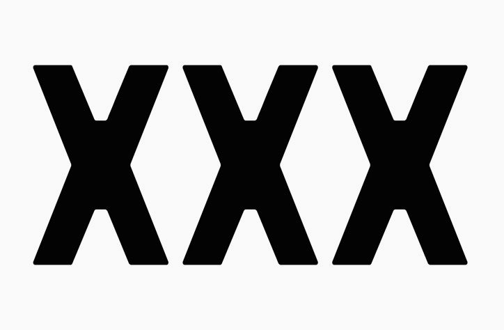
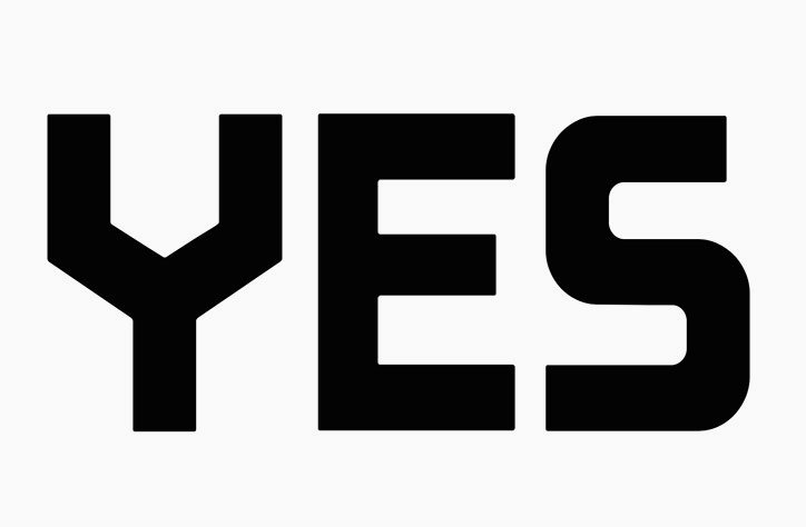
Bold black typography on a white background reads “YES”.

The Yarza Twins’ New Batavier typeface has been rescued from a 1928 travel poster

—
Date
5 September 2016

Design studio The Yarza Twins has rescued a font from a travel poster by Francesca Claussen, reviving it to create the New Batavier typeface.

The original poster from 1928 announces a ship route between Rotterdam and London by Wm. H. Müller & Co’s Batavier Line, and shows elements of classic Dutch graphic design with bold constructivist type. This is what Eva and Marta Yarza have traced to use as a basis for their new face.

“We found the poster when reading a book on travelling posters, and fell in love at first sight with the font,” say the twins. “We couldn’t find a lot of information about it, but we felt we wanted to be able to use it.”

After tracing the available letters, the twins created a whole set and then started redrawing each individual letter, refining them to give a consistent feel. The sharp, geometric shapes have been stylised, given slightly rounder edges, and are overall a bit chunkier, adapting the typeface for a contemporary context.
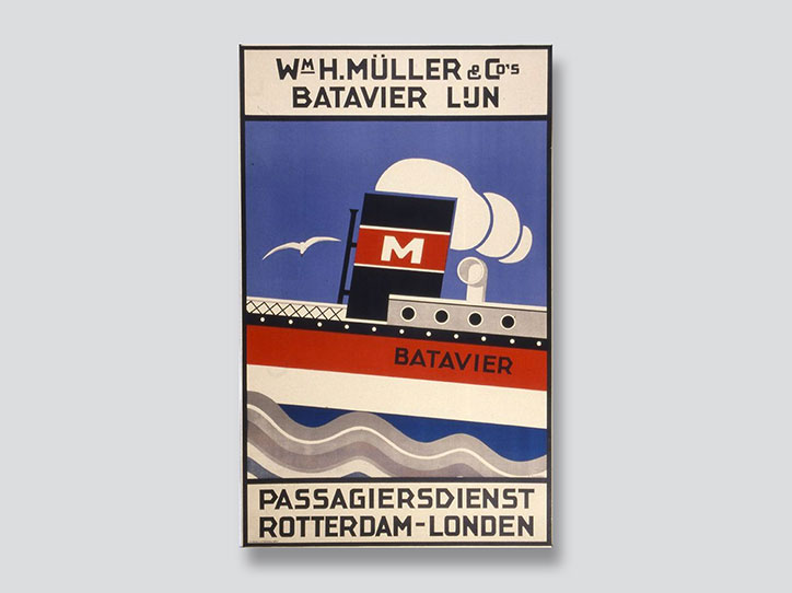
A vintage travel poster for a ferry service. A red and white ship with a black funnel marked with a white “M” sails across blue water under a pale moon. Text at the top reads “Wm H. Müller & Co’s BATAVIER LUN” and the bottom reads “PASSAGIERSDIENST ROTTERDAM-LONDEN”.
Above

The Yarza Twins: New Batavier

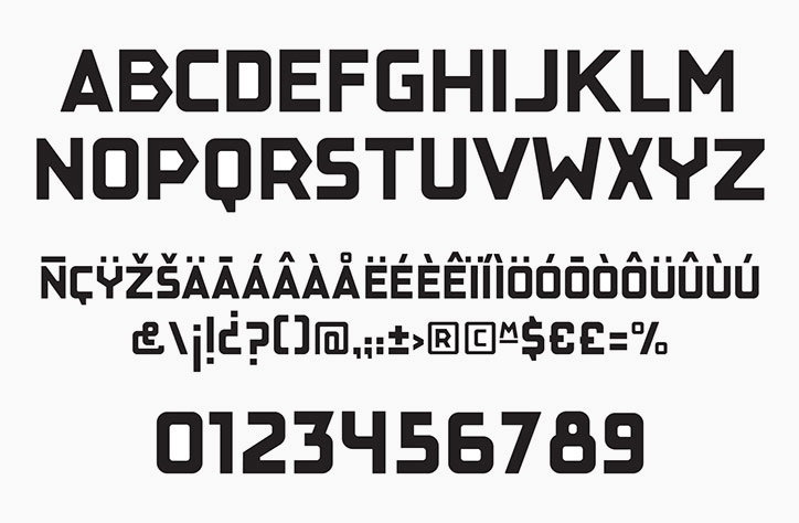
A bold, geometric sans-serif typeface shown in black on a white background. The image displays the full alphabet in uppercase, accented characters, symbols and numerals from 0 to 9.
Above

The Yarza Twins: New Batavier

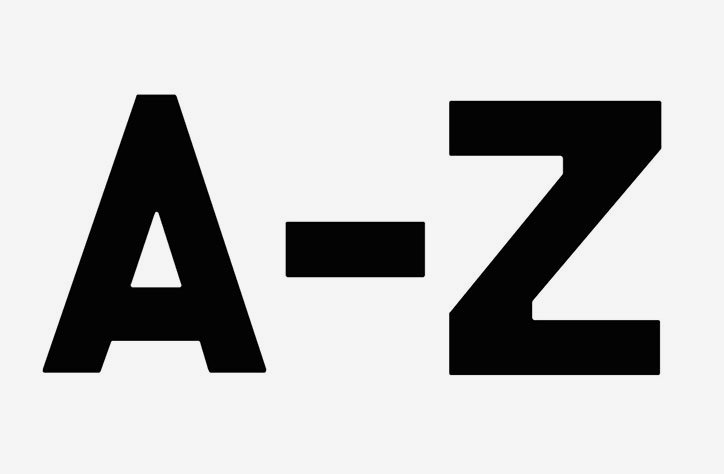
Bold black text on a plain light grey background reads “A-Z”.
Above

The Yarza Twins: New Batavier

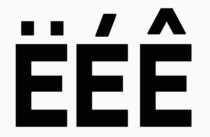
Three bold, black capital letters “E” are arranged in a row on a white background. Each letter features a different diacritic mark above it: an umlaut, an acute accent and a circumflex.
Above

The Yarza Twins: New Batavier

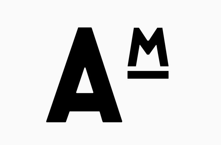
A black typographic logo on a white background. It features a large capital “A” next to a smaller capital “M” with a thick underline.
Above

The Yarza Twins: New Batavier

Three bold, black capital letters “XXX” are set against a plain white background.
Above

The Yarza Twins: New Batavier

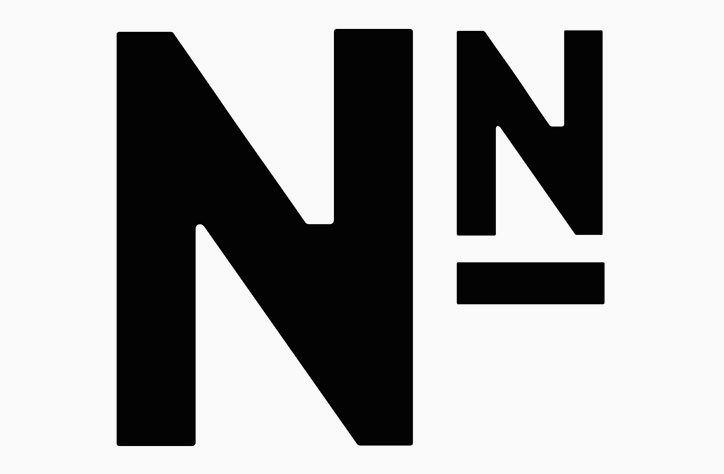
A bold black logo on a white background featuring a large uppercase “N” next to a smaller uppercase “N”. A short horizontal bar sits directly beneath the smaller letter.
Above

The Yarza Twins: New Batavier

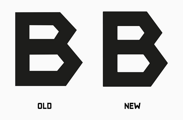
An animation of a bold, black geometric letter “B” on a light grey background. The text below the letter alternates between “OLD” and “NEW”.
Above

The Yarza Twins: New Batavier

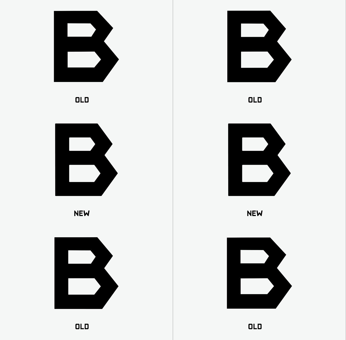
Two versions of a bold, black capital “B” are shown side by side on a white background. The letters are labelled “OLD” and “NEW” to highlight a subtle change in the shape of the letter.
Above

The Yarza Twins: New Batavier

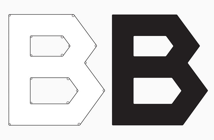
A graphic showing two versions of a bold, geometric capital letter “B”. The left version is a wireframe outline with anchor points, and the right is a solid black silhouette.
Above

The Yarza Twins: New Batavier

Share Article

Further Info

About the Author

Jenny Brewer

—

Jenny oversees editorial output across It’s Nice That. Get in touch with writing pitches for features or opinion pieces, big creative story tips, or questions about all things editorial. [email protected]

To submit your work to be featured on the site, please see our Submissions Guide.

It's Nice That Newsletters

Fancy a bit of It's Nice That in your inbox? Sign up to our newsletters and we'll keep you in the loop with everything good going on in the creative world.