Why Yutaka Satoh is always looking in his bin for graphic design inspiration
With a broad illustrative practice, the designer talks us through the importance of making a mess as a designer.
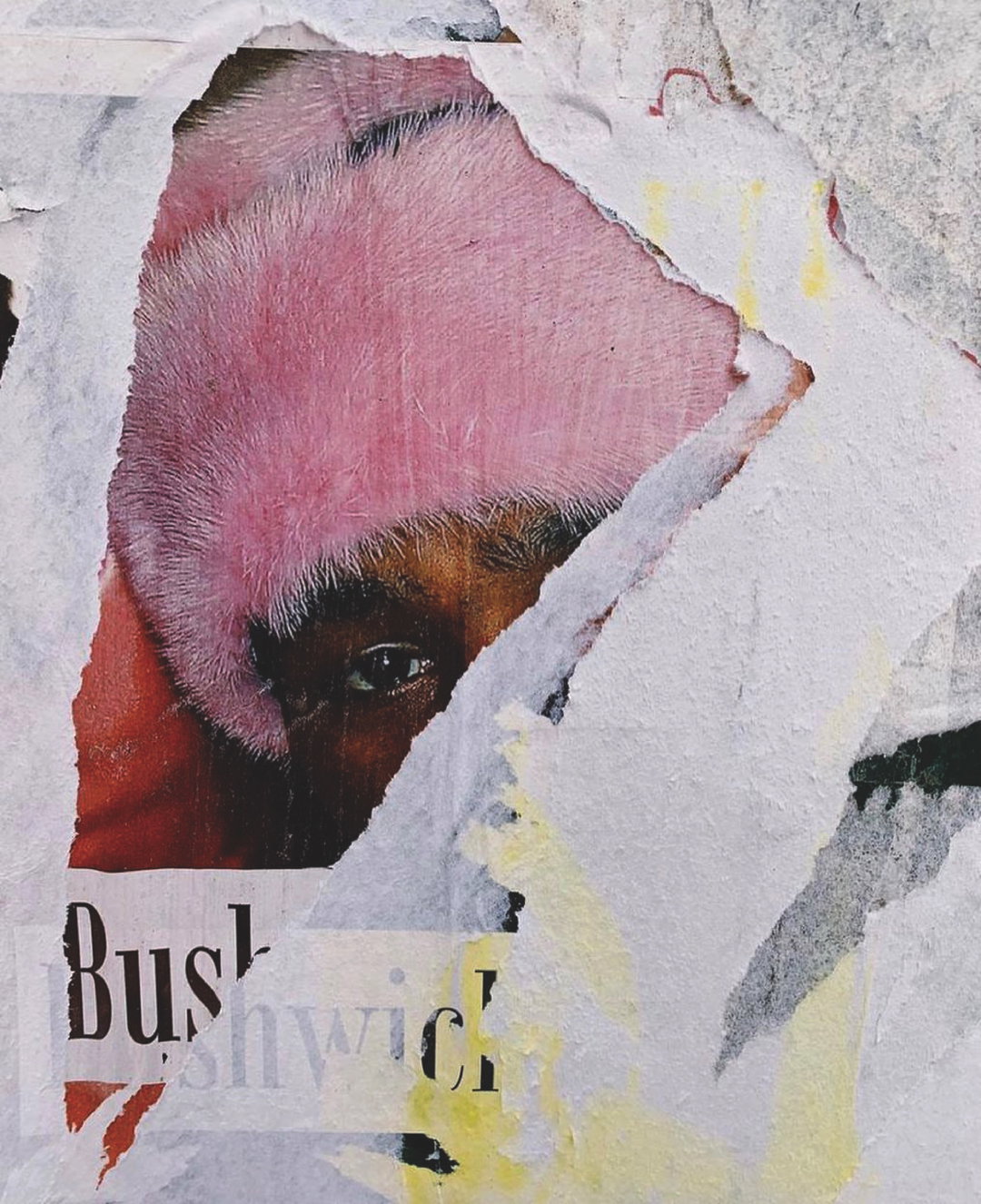
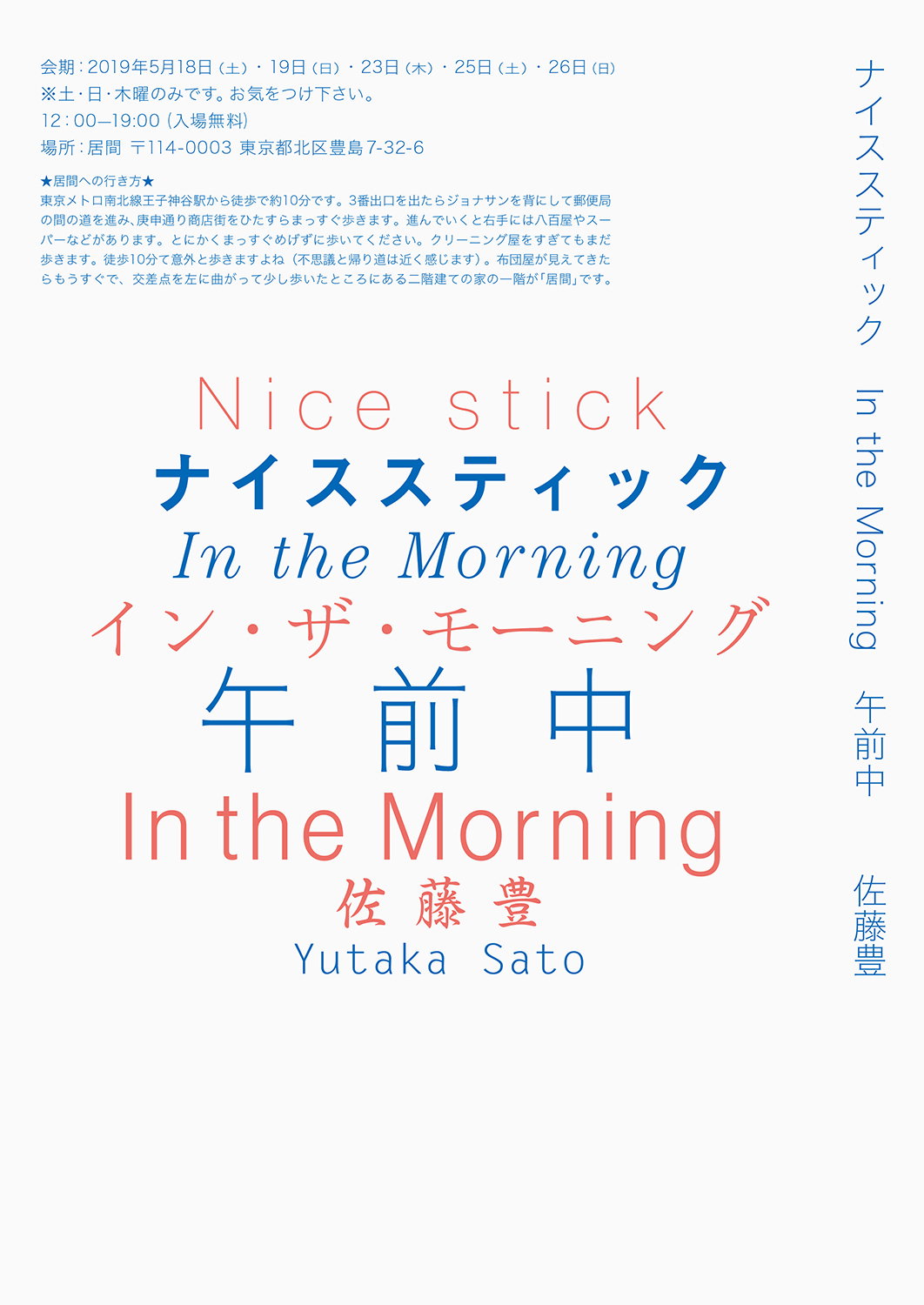
When describing his graphic design practice, Fukushima-born creative Yutaka Sato references rubbish a lot. For the designer, working creatively is largely a process of making a mess – and he never throws anything away, even if he may deem it as rubbish at the time. These ideas and experiments are then filed away as junk, but always find their way out again with a little reflection and a new concept in mind. “It’s important to look back on junk ideas,” Yutaka explains. “A piece I previously thought of as ‘not very good’ is now shining.” It’s led to a design approach that's “consciously looking for opportunities, without accidentally overlooking them.”
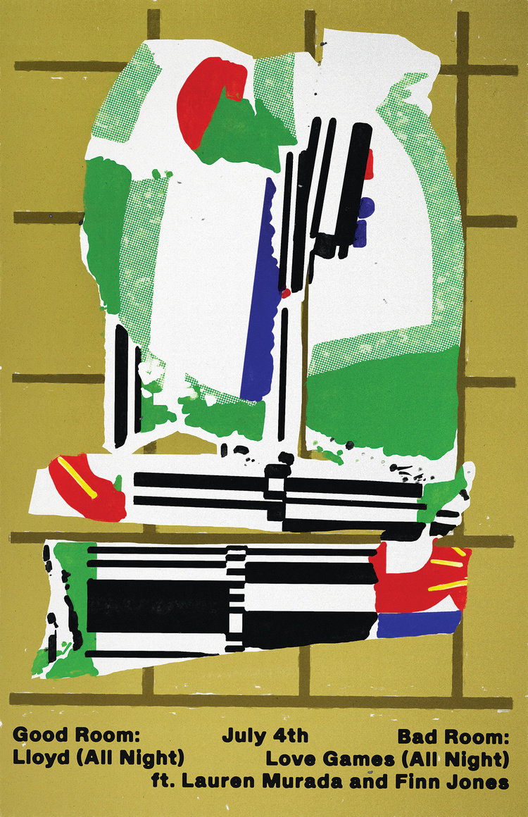
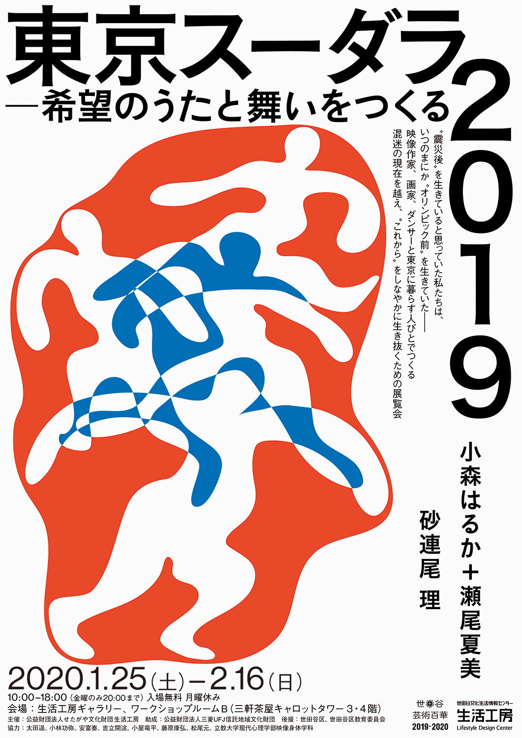
Resultantly, Yutaka’s design practice is brimming with concepts, usually executed in a poster format with plenty of texture and pattern. Now working as a freelance designer, he originally studied at Miyagi National College of Technology and then Kuwasawa Design School, but a love for design stems back to childhood. “When I was little, I liked reading books and listening to music,” the designer recalls. “Naturally, I was then attracted to the graphic design of book covers and CD jackets.” The way these covers spoke to him, somehow distilling the concepts of the artist inside visually, is still the end goal of Yutaka’s work today.
Copyright © Yutaka Satoh, 2021
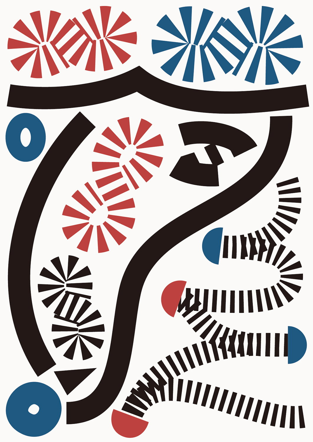
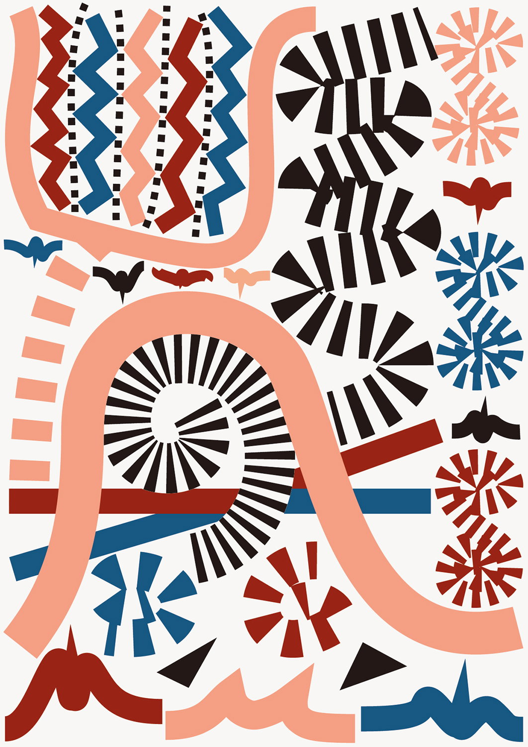
Creating work he describes as “non-academic and non-promotional”, Yutaka begins each project with “the desire to realise a deeper communication than just words”. This offers a way for both the designer and viewer to develop their own interpretations of the pieces, especially “as there are many things that cannot be put into words.” Actual ideas often hit the designer by chance, finding that a concept or route presents itself once he is fully relaxed, “and doubting common sense,” similar to when he’s just woken up.
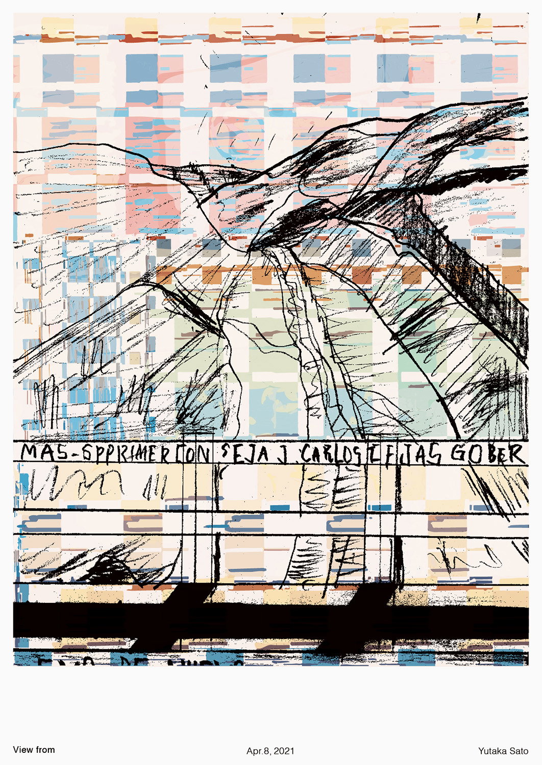
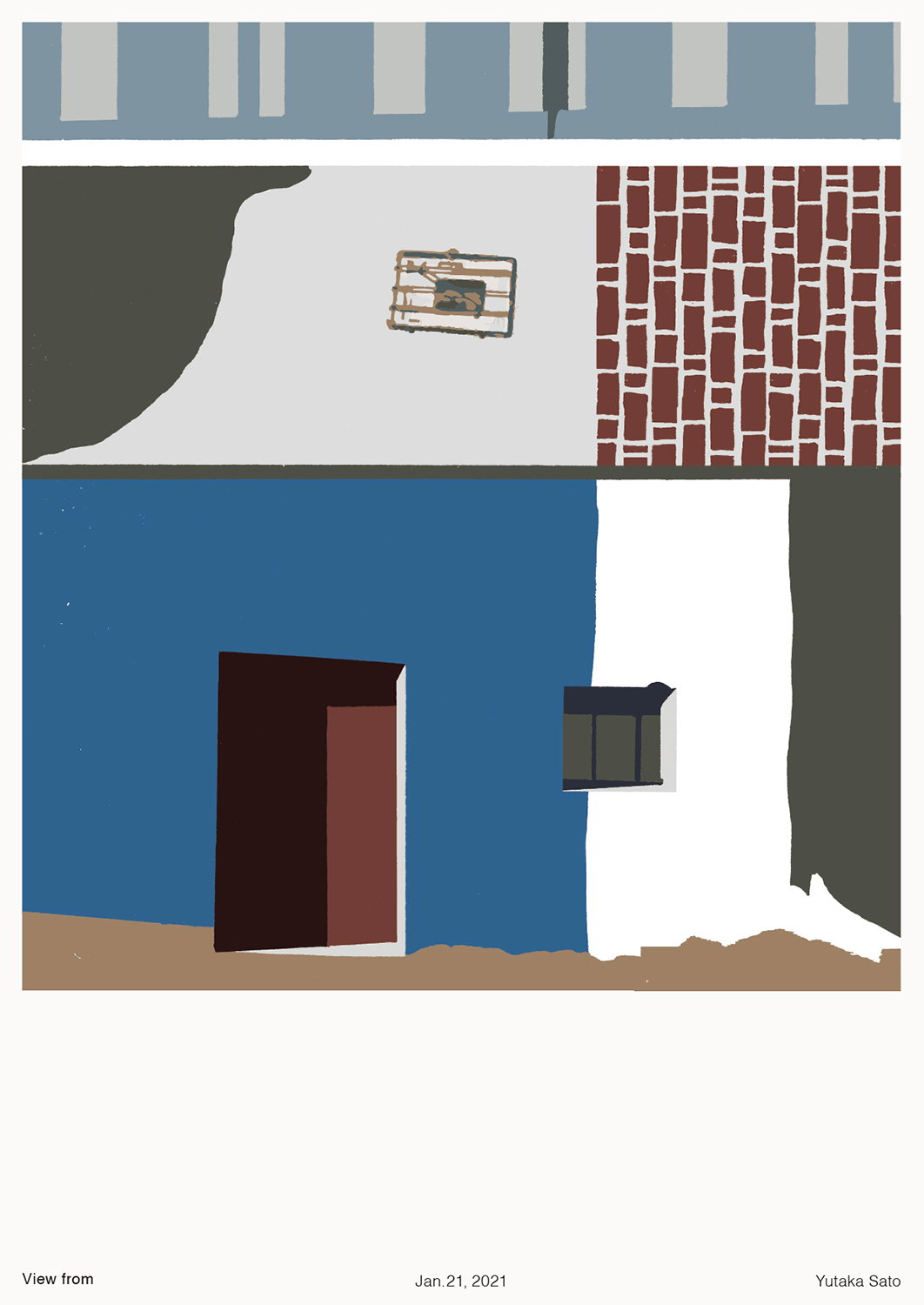
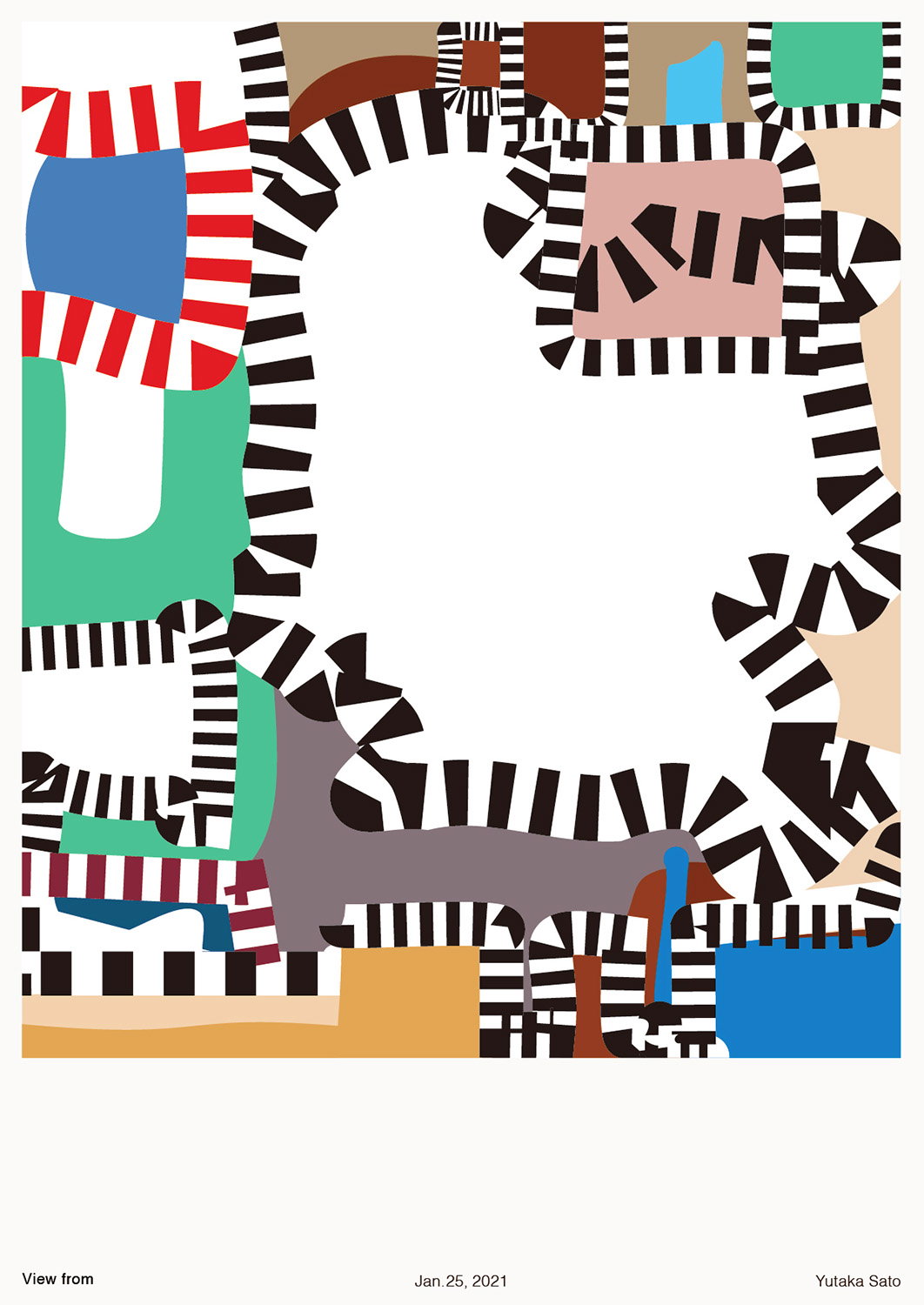
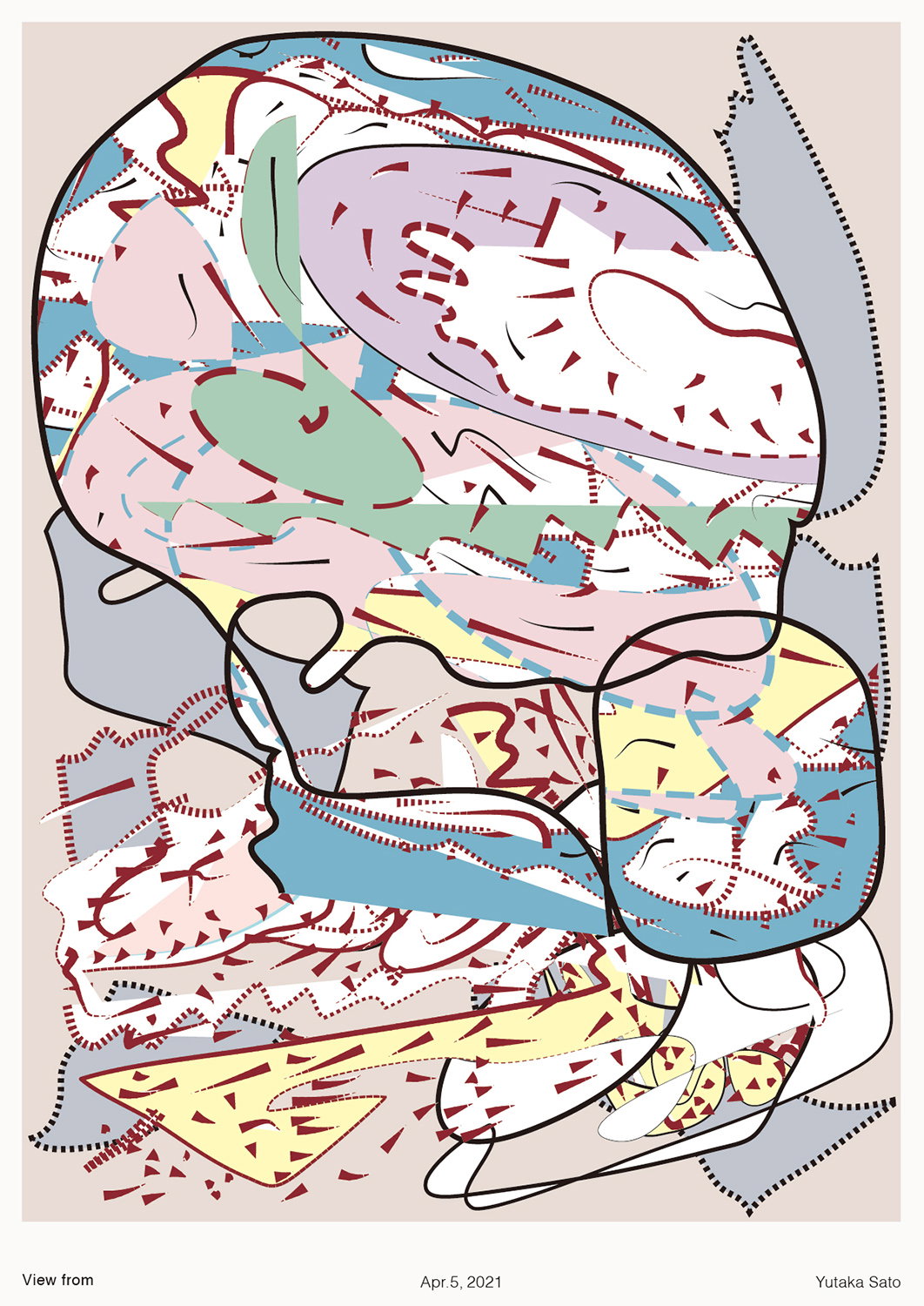
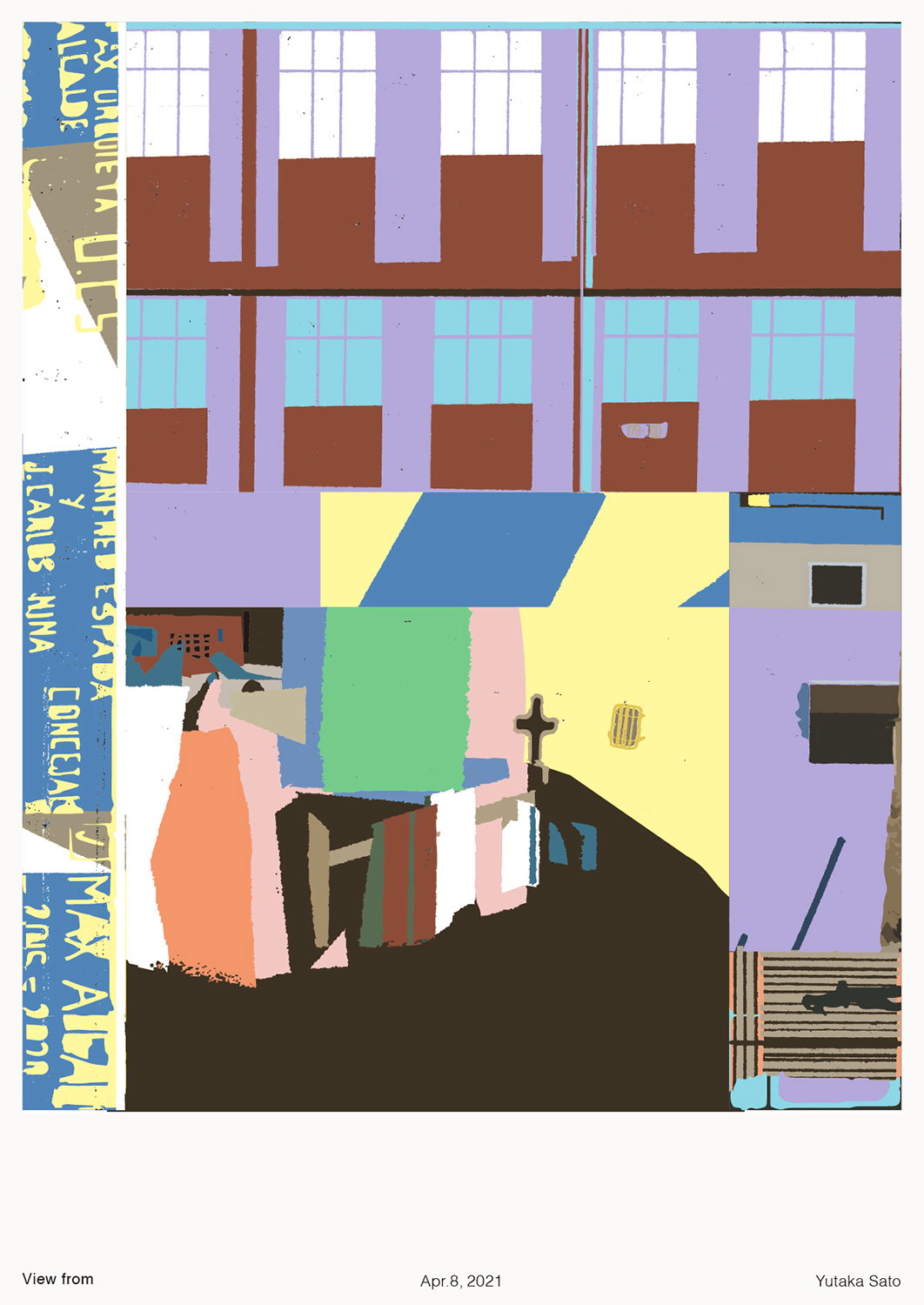
From here Yutaka will begin drawing on paper and fully trusting wherever his hand leads, especially as “I haven’t trusted myself in the past,” he explains. The result are pieces which merge illustrative approaches with design grids, sometimes offering an abstract drawing as the focus, or a more direct location. For instance, his series View from always features something the designer has seen – from a road sign, the shutters of a store or a building he has passed – remixed into his graphic interpretation and placed in the same poster format. Though this format may appear repetitive, the constraints allow Yutaka to keep his output fresh. “I’m always looking for something new,” he adds.
This practice is currently expanding beyond the pieces we’ve come to know Yutaka for, as the designer is currently working on a catalogue for the painter Yutaka Kawai. With his ability to deconstruct design and then reimagine it with his own ideas and references, we look forward to seeing how this translates to a publication format. Considering the relationship between words and image is a consistent train of thought in Yutaka’s design approach, soon he hopes to take the books he loves (that originally led him to graphic design) and reinterpret them visually in a full circle project.
GalleryCopyright © Yutaka Satoh, 2021
Hero Header
(Copyright © Yutaka Satoh, 2021)
Share Article
Further Info
About the Author
—
Lucy (she/her) was part of the It’s Nice That team from 2016–2025, first joining as a staff writer after graduating from Chelsea College of Art with a degree in Graphic Design Communication, eventually becoming a senior editor on our editorial team, and most recently at Insights, a research-driven department with It’s Nice That.