Launch Recite Me assistive technology
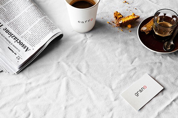
A white tablecloth holds a folded newspaper, a white coffee cup branded “caffè”, and a small glass of espresso. A piece of broken cake and a white business card reading “grano” lie nearby.

Graphic Design: Beautifully simple work from Sydney's Zé Studio

—
Date
20 August 2013

Over recent months we seem to have attracted more and more readers from Sydney and Melbourne but we don’t cover an awful lot of work from Down Under. It was a pleasure then to come across these really impressive new updates from Zé Studio in Sydney, set up by Joe Tarzia in 2011. In their online blurb they pin their design approach as “leaving no excess” – and this stripped back philosophy is easy to identify across their portfolio.

Recent eye-catching work includes a really subtle authentication card for photographer Ward Roberts (whose work we’ve long championed) as well as as really strong work for Italian restaurant grano and a neat identity for the Ristretto & Co café referencing the iconic Bialetti Moka.
The word “grano” is centred on a plain white background. The first four letters are black, while the final “o” is red.
Above

Zé Studio: gramo

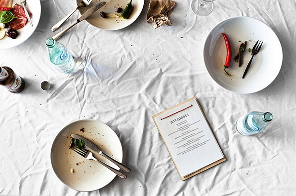
An overhead shot of a crumpled white tablecloth after a meal. Scattered across the surface are several plates with food remnants, used cutlery, water bottles and a menu with the heading “antipasti”.
Above

Zé Studio: gramo

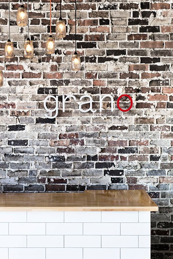
A weathered brick wall features a white sign that reads “grano”, with the final “o” in red. Below, a wooden counter sits atop a white tiled base.
Above

Zé Studio: gramo

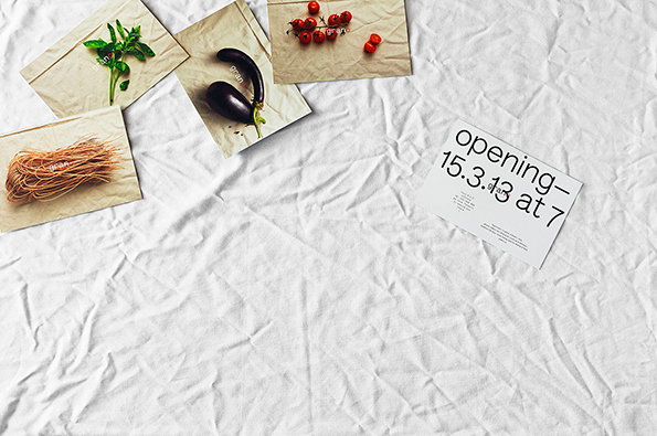
Fresh ingredients are laid out on a crumpled white cloth. An eggplant, cherry tomatoes, basil and pasta sit on brown paper envelopes, beside a card that reads “opening – 15.3.13 at 7”.
Above

Zé Studio: gramo

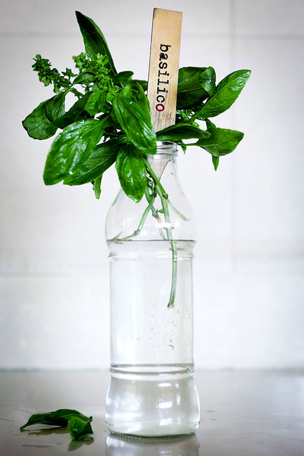
Fresh basil leaves sit in a clear glass bottle filled with water. A wooden marker tucked among the leaves reads “basilico”.
Above

Zé Studio: gramo

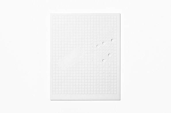
A white square card with a debossed grid of small squares across its surface. A few of the squares are punched through, creating small circular holes.
Above

Zé Studio: Ward Roberts Authentication Card
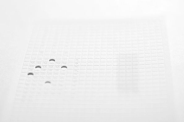
A close-up of a white, embossed grid on a white surface. Several small, circular holes are punched through the grid in a scattered pattern.
Above

Zé Studio: Ward Roberts Authentication Card
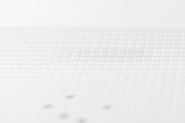
A close-up of a white, textured surface with a fine grid of embossed squares. The image is softly lit and blurred towards the top and bottom edges.
Above

Zé Studio: Ward Roberts Authentication Card
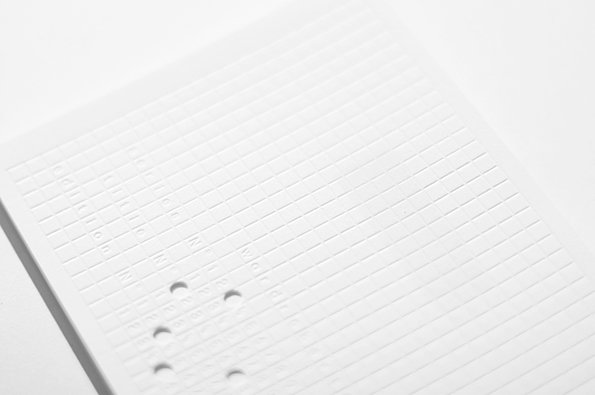
A close-up of a white, textured surface featuring a grid of embossed squares. Small, circular indentations and faint, raised lettering are visible across the tactile pattern.
Above

Zé Studio: Ward Roberts Authentication Card
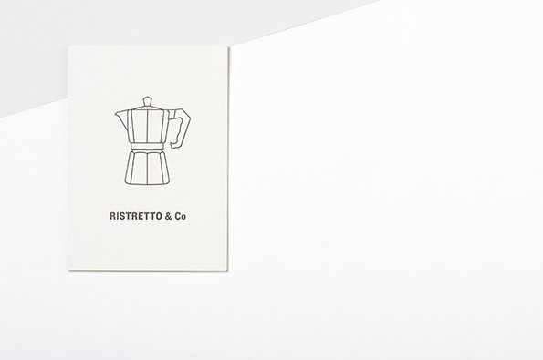
A white business card featuring a simple line drawing of a moka pot. Below the illustration, the text reads “Ristretto & Co”.
Above

Zé Studio: Ristretto & Co café

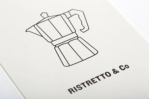
A simple line drawing of a moka pot on a white background. Below the illustration, bold text reads “Ristretto & Co”.
Above

Zé Studio: Ristretto & Co café

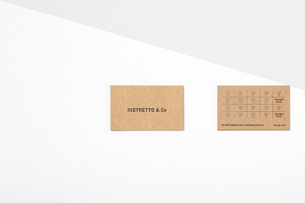
Two brown kraft paper loyalty cards lie side by side on a white surface. One shows the brand name “Ristretto & Co”, while the other features a grid of coffee cup icons for stamping.
Above

Zé Studio: Ristretto & Co café

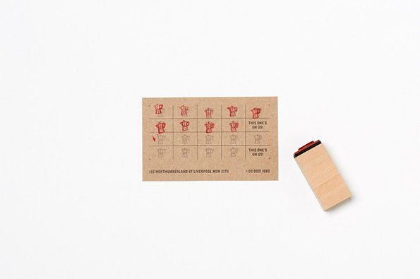
A brown card features a grid of red stamped t-shirt icons. Two of the squares contain the text “THIS ONE’S ON US!”. A wooden rubber stamp sits to the right of the card on a plain white background.
Above

Zé Studio: Ristretto & Co café

Share Article

Further Info

About the Author

Rob Alderson

—

Rob Alderson is a freelance writer, editor and strategist. He was previously editor-in-chief of It’s Nice That and WePresent, and editor of Design Week. He publishes the newsletter Undo, which tries to make sense of how AI is changing design work, the design process and the design industry.


It's Nice That Newsletters

Fancy a bit of It's Nice That in your inbox? Sign up to our newsletters and we'll keep you in the loop with everything good going on in the creative world.