Zero: A new publication that proves print and digital don't have to be mutually exclusive
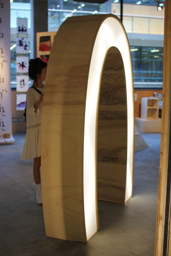
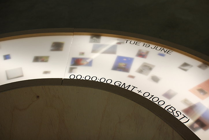
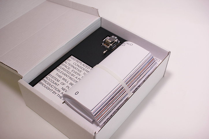
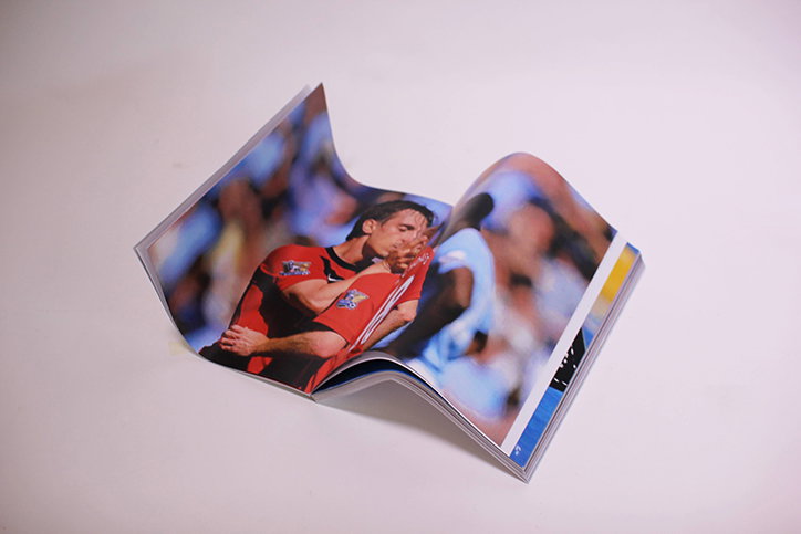
Zero is a digital and physical publication realised by Dagnė Petraityė, Inês Silva and Nathalie De Vallière of Central Saint Martins. The three creatives noticed that the publications that most inspired them, such as Aspen and Fluxus largely relied on “traditional analogue techniques”. Although George Maciunas incorporated objects into Fluxus, moving beyond the usual format of a magazine or a book, his was a project before the impact of digital technology. Many magazines today still cling to the archaic notion of print, and fail to interact with the internet – Zero aims to change this. “We thought it could be exciting to merge some of the things we love about magazines with more experimental characteristics of digital media”, they explain. The result is an amazing digital platform that explores the infinite possibilities of the internet and a printed, physical product that is “based on an unconventional folding system that mimics the online component”.
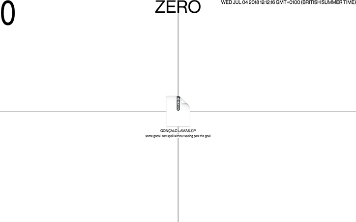
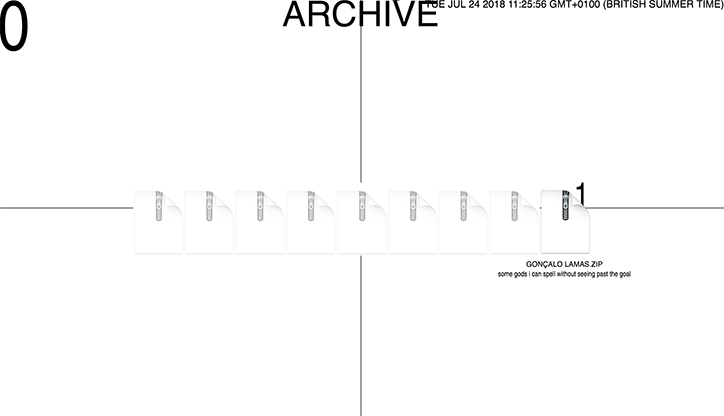
“In our project, we highlight the contrast between the ubiquity of digital content and the scarcity of printed matter”, Dagnė, Inês and Nathalie tell us. “Through this relationship, they influence each other’s value; the internet affects the accessibility of information and its methods of distribution”. Zero explores the infinite reach of the internet, its saturated content and endless possibilities. On its site you able to download the digital component of the project – a zip file made up of work by Gonçalo Lamas, the artist who has curated the first issue. Inside this folder are other folders, which open like Russian Dolls, leading to yet more folders, images, word documents and videos, all relating to the concept of football. The idea is that “the football star is some hyper-subject, a digital image of peak value”.
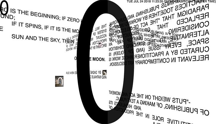
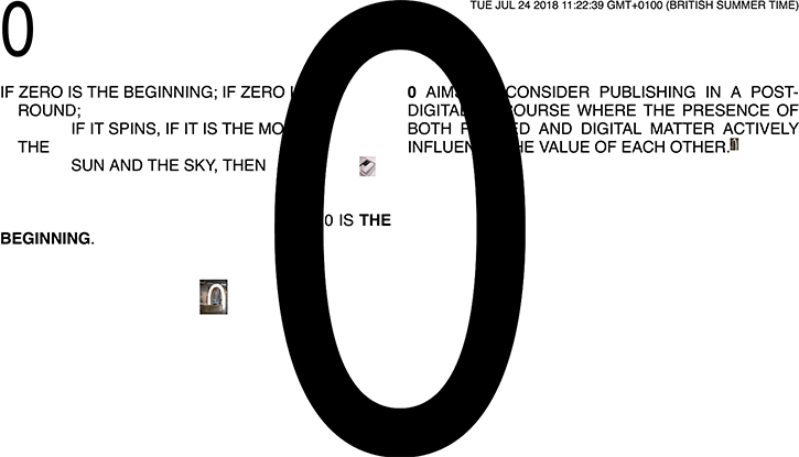
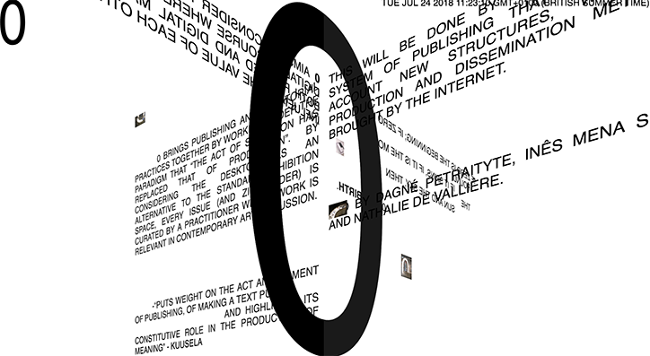
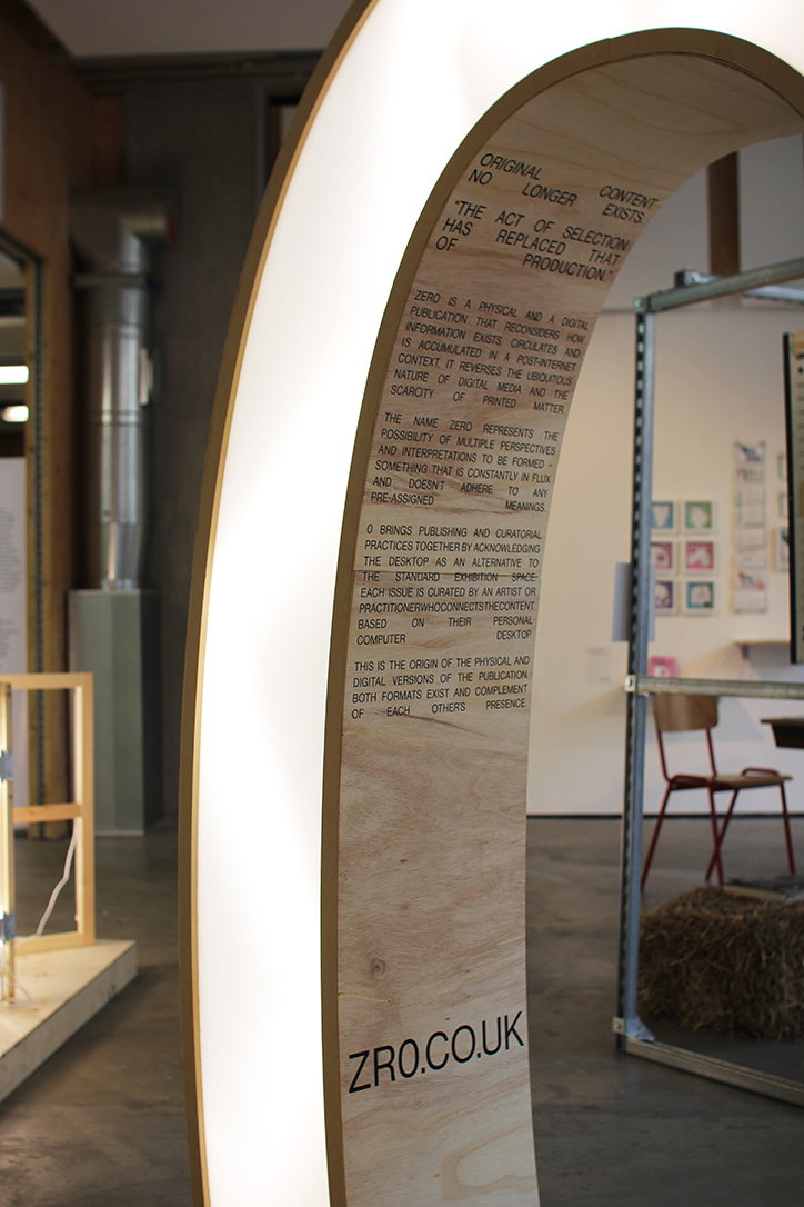
The term “Zero” has endless meanings to the founders, as they list on the website: “0 is purity. 0 is white. 0 is death. 0 is rebirth”. The name “urges the importance of different perspectives and declares that the core message of the project is constantly in flux and doesn’t adhere to any pre-assigned meanings”, the three creatives explain. The website design is beautifully brutalist, intelligent and clearly reflects the aims of the project. When you first enter the site you are met with a bold, black, resounding “0”, behind it is poetic, allusive text. As we scroll down the site, the zero suddenly spins, along with the text, mimicking the motion of the mouse and resembling an infinite tumble into space. “We acknowledge the desktop as an alternative to the standard exhibition space”, the team explains, and, indeed, they’ve brilliantly engaged with the possibilities that offers.
“The structure of the digital folder informs the design system of the physical outcome”, the trio tell us. “Because of the way the print is bound, the physical publication allows for non-linear navigation. The text in the physical publication – the curator’s main contribution – serves as a map and as a navigational tool of its digital counterpart”. Zero shows that print and digital don’t have to be mutually exclusive; instead they can work alongside each other to create endless, exciting possibilities.
Zero
Zero
Zero
Zero
Zero
Zero
Zero
Zero
Zero