Launch Recite Me assistive technology
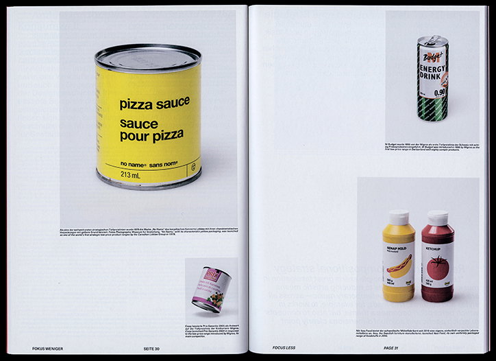
Two pages from a book showing examples of minimalist packaging. A yellow can of “pizza sauce” dominates the left page, while the right page features a can of “Budget Energy Drink” and bottles of “Ketchup” and “Senap Hold”.

Zett is the slick Zurich-based university paper for and about aspiring students

—
Date
29 March 2018

Think back to your student paper. If yours was anything like ours, it’s likely to have been a tired and typo-filled newspaper-wannabe. This, however, isn’t the case for the students of Zurich University of the Arts (otherwise known as Zürcher Hochschule der Künste or ZHdK). Zett, the ZHdK’s biannual art publication, is designed by four visual communication students – Michel Egger, Dominik Junker, Aurelia Peter and Silvan Possa – and functions as a printed version of the university’s online art and culture media platform. Following a redesign in 2016, Zett is a clean, slick and accomplished piece of work that consistently adapts according to its content. The magazine showcases a variety of student work, from photography to design, as well as student portraits and upcoming events.

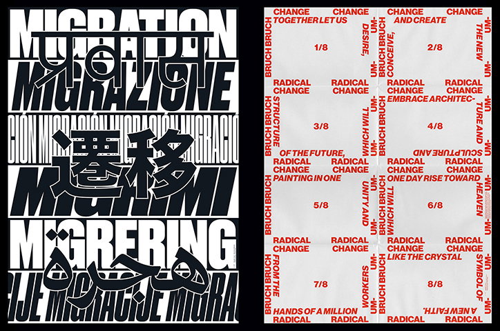
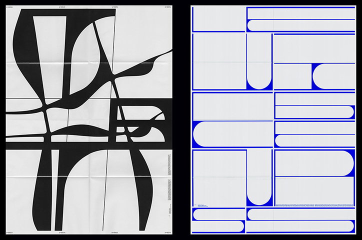
“Our approach since day one was to create a design that could be applied over a number of issues. The content is structured and divided into different sections. Every issue contains articles, which fit the theme of the current magazine,” Silvan, one of Zett’s designers, tells It’s Nice That. The latest issue is centred around the topic ‘Less’ while past editions were centred around themes like ‘Migration’, ‘Radical Change’ and ‘#TBT’ each of which were assigned a distinct colour. “The notion of ‘less’ has been inspiring artists and designers for a long time.” Each theme is also interpreted into a foldout poster; ‘less’ has been visualised as a number of minimal, abstract shapes and forms that fit together like a pieces in a puzzle. Every issue also contains a series of general articles about people, projects and discussions that are taking place at ZHdK.

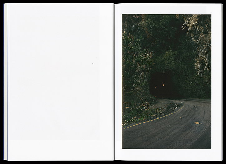
Zett’s masthead sees a gap between the ‘z’ and the ‘ett’. It is this blank space that sets the framework for the magazine’s content design. “Our goal was to create a magazine that works with interesting white spaces, which can handle versatile content and that reflects the current visual state of ZHdK,” Silvan explains. It feels apt that blank spaces permeate the magazine considering Zett is a paper for and about aspiring students; the white intervals evoke a sense of space for new aspiring students’ work to be showcased. “There is a photo gallery in every issue. We try to feature artists, photographers or illustrators which are currently working on a project that fits to the topic of the issue. We work very closely with them to strike a good balance between the magazine and the work published in it."
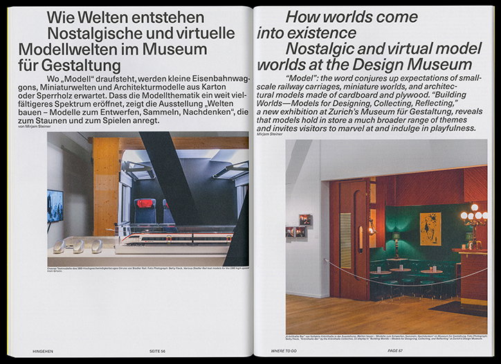
A two-page magazine spread featuring an article titled “How worlds come into existence”. The left page shows a model of a high-speed train in a gallery, while the right page shows a detailed miniature room with red walls and green furniture.
Above

Zett

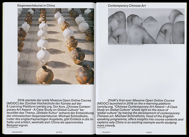
An open book shows two pages titled “Gegenwartskunst in China” and “Contemporary Chinese Art”. The left page features a photograph of rows of white and patterned ceramic vases. The right page shows a black and white photograph of several rounded, pale figures huddled together.
Above

Zett

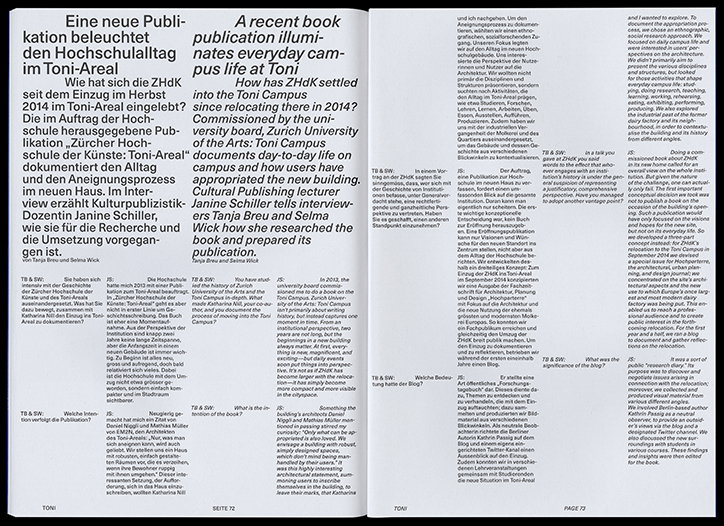
A two-page spread from a book featuring a layout of German and English text. The left page begins with the headline “A recent book publication illuminates everyday campus life at Toni”.
Above

Zett

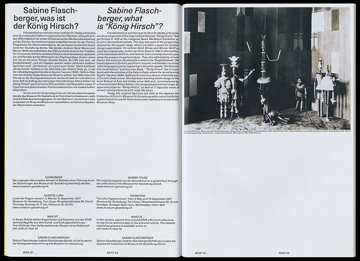
An open brochure featuring a text-heavy page on the left and a photograph on the right. The left page contains a bilingual article titled “Sabine Flaschberger, what is “König Hirsch”?”. The right page shows a collection of small, dark puppets and props arranged on a grey floor.
Above

Zett

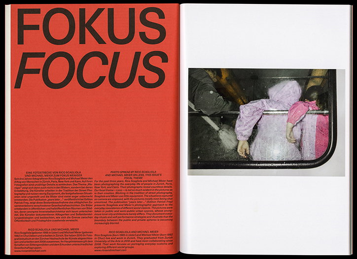
An open magazine spread with a bold red page and a white page. The red page features the words “FOKUS” and “FOCUS” in large, black sans-serif type, with two columns of text below. The white page contains a photograph of a person in a pink raincoat sitting on a train.
Above

Zett

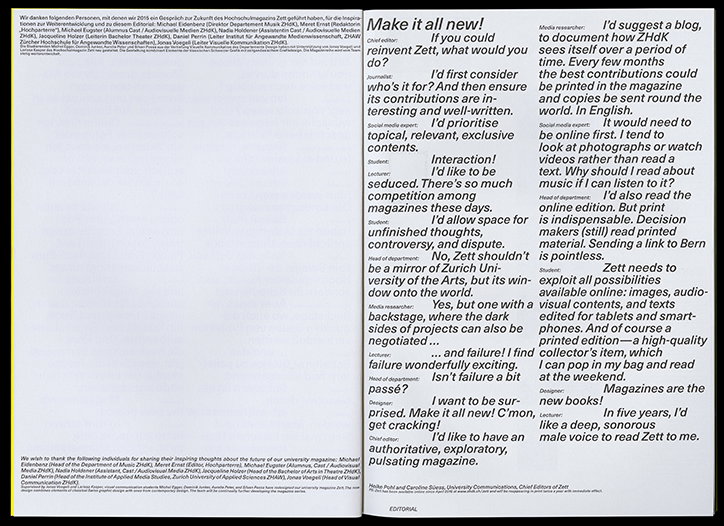
A layout of a magazine spread featuring a conversational interview. The main headline reads “Make it all new!” followed by a series of questions and answers arranged in columns.
Above

Zett

An open book shows a photograph on the right page and a blank white page on the left. The photo depicts a winding road disappearing into a dark, wooded tunnel with two small orange lights visible in the distance.
Above

Zett

A black and white typographic poster features the word “migration” translated into several languages, including Hindi, Italian, Chinese and Arabic. The bold, white lettering is stacked in varying sizes and styles against a black background.
Above

Zett

Two abstract graphic posters side by side. The left is black and white with fluid, organic shapes that intersect across a grid. The right uses a similar grid with bold blue geometric forms and rounded edges.
Above

Zett

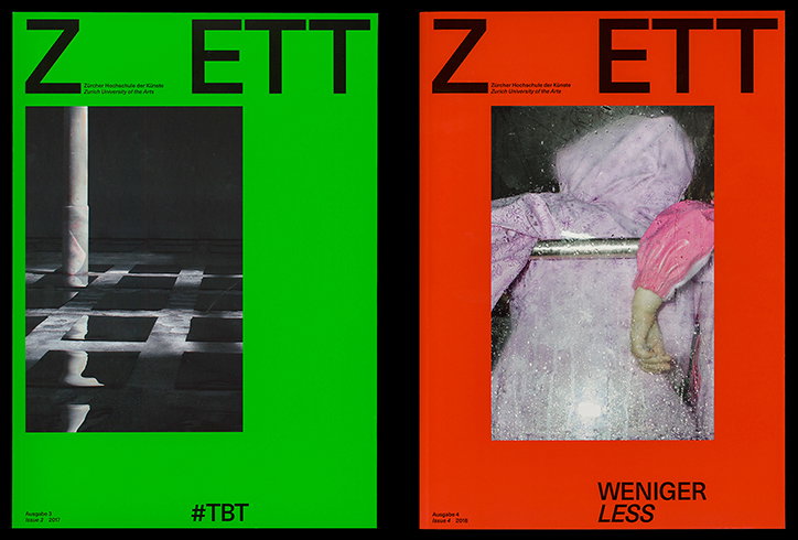
Two magazine covers for Zett, a publication by Zurich University of the Arts. The first is bright green with a black and white photo of a column on a checkered floor and the text “#TBT”. The second is red with a photo of a person in a pink hooded garment and the text “WENIGER LESS”.
Above

Zett

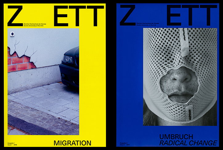
Two magazine covers for “Zett”, a publication by Zurich University of the Arts. The first is yellow and features a photo of a cracked wall and a car, with the word “MIGRATION” at the bottom. The second is blue and shows a close-up of a person’s face behind a perforated white mask, with the title “UMBRUCH RADICAL CHANGE”.
Above

Zett

Share Article

Further Info

About the Author

Daphne Milner

—

Daphne has worked for us for a few years now as a freelance writer. She covers everything from photography and graphic design to the ways in which artists are using AI.


It's Nice That Newsletters

Fancy a bit of It's Nice That in your inbox? Sign up to our newsletters and we'll keep you in the loop with everything good going on in the creative world.