




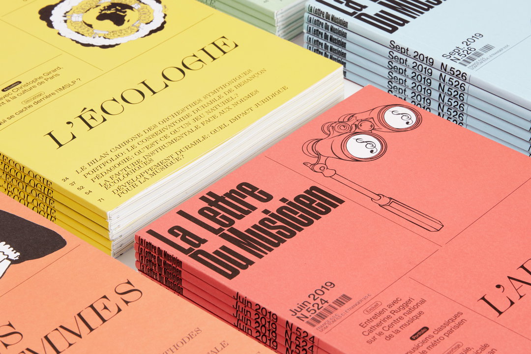
Zoo on its fresh redesign of publication La Lettre du Musicien
The Parisian graphic design studio took inspiration from musical scores when redesigning the publication, a key reference for the classical music industry for over three decades.
Share
Since 2014, the Paris-based graphic design studio Zoo has established a name for itself for its elegant and refined printed matter. Founded by Baptiste de l’Espinay, Julie Galand and Valentine Thébeaut, the print specialists work across identities, signage, and even web design, with clarity of language always at the heart of their practice. “Our mission is to make simple what is complex,” Baptiste tells It’s Nice That. And through crisp yet accessible, functional design, the studio relays information in exactly that way.
In a recent project, the French studio rebranded the monthly music magazine La Lettre du Musicien. For over 35 years, the publication has served as a key reference for the classical music industry, covering the latest news, surveys and international reports across the sector, not to mention editorial profiles and interviews. The magazine also delves into issues such as life in the orchestra and conservatory, investigates the cultural politics found in these groups, offers insights into the market for musical instruments, and, to top it all off, provides legal information.
When a new editorial team took over the magazine in 2018, it made sense for La Lettre du Musicien to also undergo a visual makeover. The new chief editor, Antoine Pecqueur, approached Zoo with the challenge of creating a new global image for the publication. As Baptiste explains, the editors wanted “a fresher, more dynamic image, in a media spirit and much more connected to our contemporary world”.
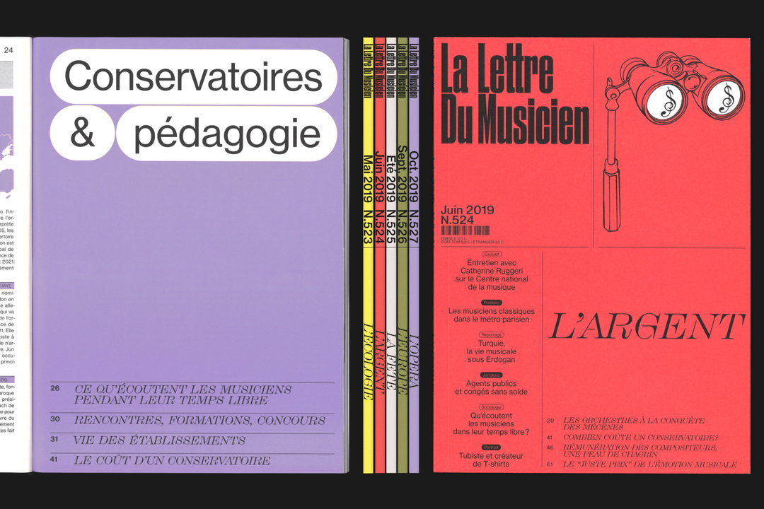
Zoo: La Lettre du Musicien
For a long time, Baptiste, Julie and Valentine had “really wanted to draw a stencil font,” to exercise their type design skills and implement them in a wider context. Fortuitously, the rebrand presented the perfect opportunity to make use of a new font, and so the designers set off, working in tandem on the new alphabet along with the new editorial system and overall revamp. First off, the team embarked on a study of musical language and scores to get inspired. In turn, the studio “injected a musical dimension into the rhythm of the letters and some of the details,” resulting in a type design that is specific to the journal.
Eventually, the designers came back with two styles: LDM Book for text and LDM Grande for display use. They also chose two fonts from Commercial Type – Druk and Neue Haas Grotesk – for the journal and a third character for the book series, Grilli Type’s GT Super. After discussing with the editorial team, the two parties decided that the new journal would have “a vivid mind” led by functional grids across both print and web. In the case of the web, the studio also ensured the website would correspond accordingly to a scroll, pop up and so on.
Bringing their prowess in print design to a clean, clear and bold magazine rebrand, the final output makes use of large spans of vivid colour and a delicate balance of type. The rebrand feels both minimal and lyrical at the same time, accentuated through the variation of typefaces and playful use of scale. One colour is assigned to each issue, and the spreads are printed on basic off-set paper, except for an eight-page booklet insert which is printed on gloss. Above all, the memorable redesign is certifiably easy on the eye and represents a shining example of how tasteful graphic design can elevate densely packed information and infographics into a work of art.
GalleryZoo: La Lettre de Musicien
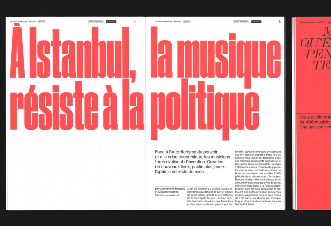
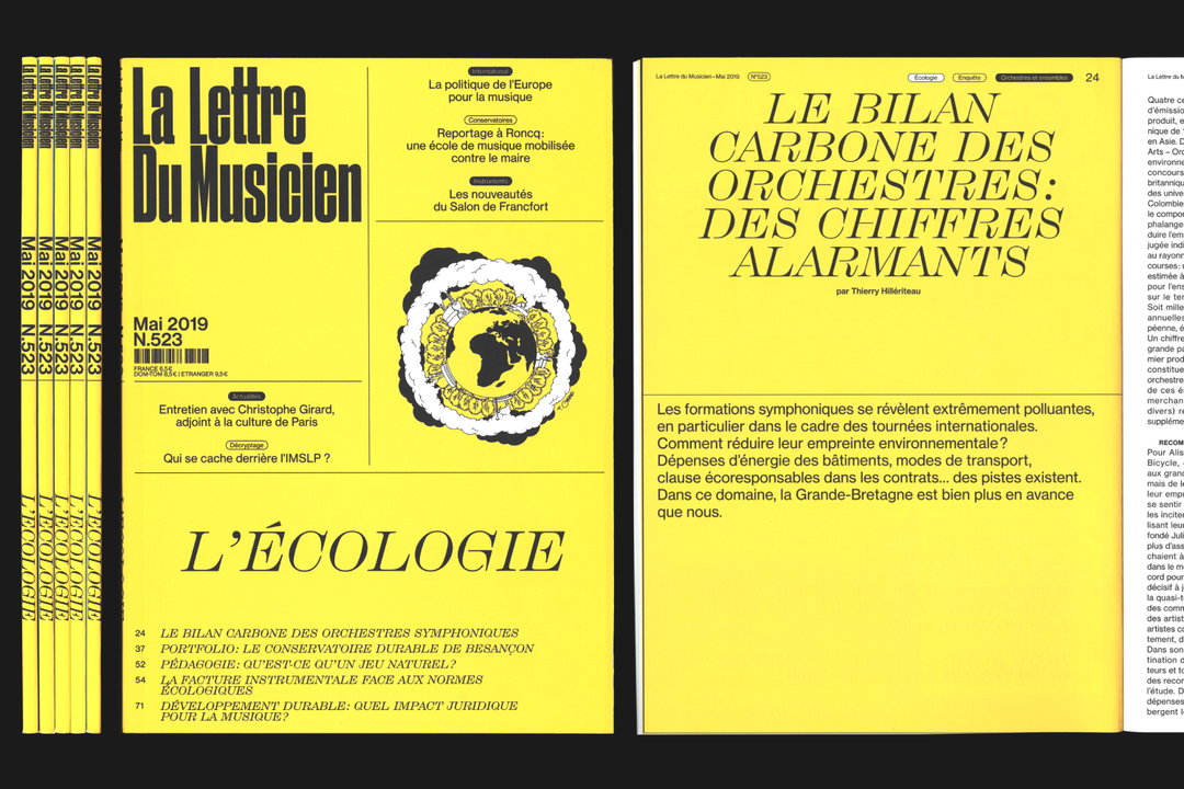
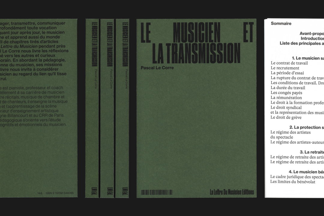
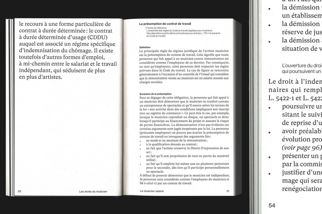
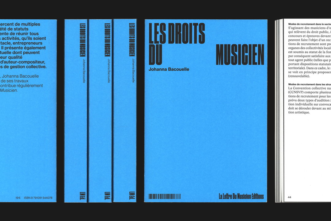
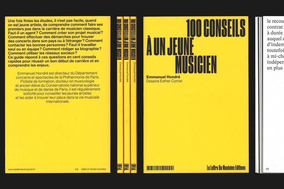
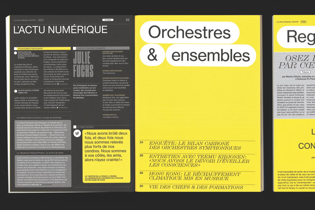
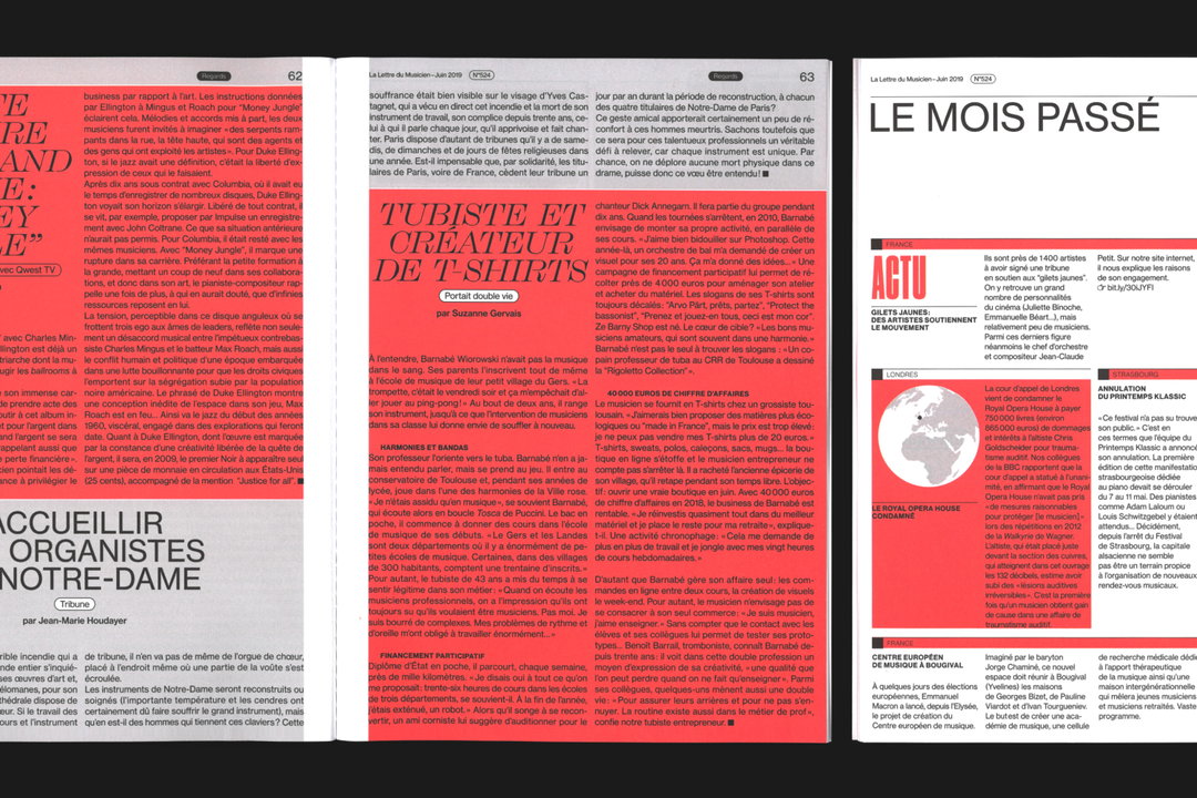
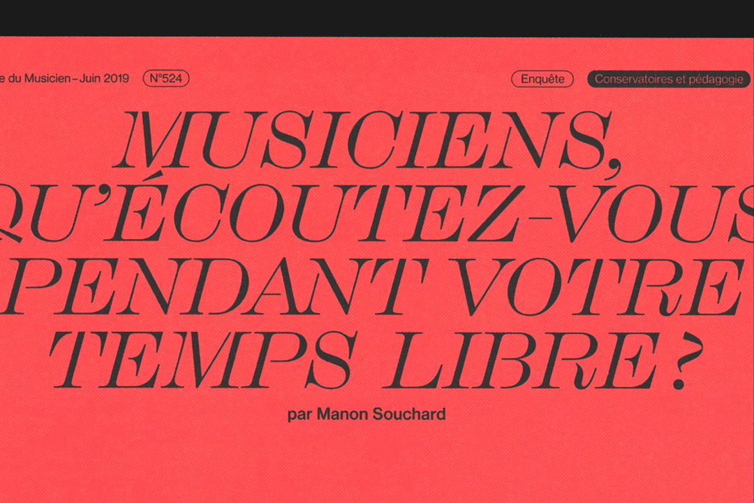
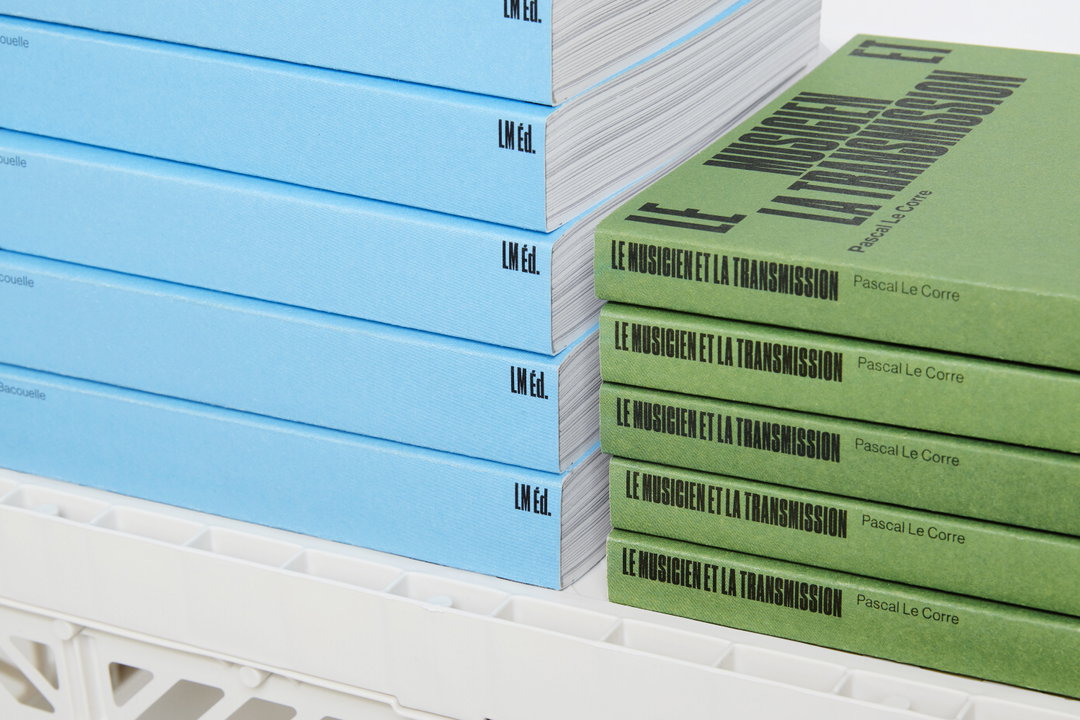
Zoo: La Lettre de Musicien, photography by Laura Bonnefous
Share Article
Further Info
About the Author
—
Jynann joined It’s Nice That as an editorial assistant in August 2018 after graduating from The Glasgow School of Art’s Communication Design degree. In March 2019 she became a staff writer and in June 2021, she was made associate editor. She went freelance in 2022.
