- Words
- Ruby Boddington
- —
- Date
- 10 May 2018
- Tags
“Something bold, something pure” – the 50-year long legacy of 2001: A Space Odyssey
Share
Share
When 2001: A Space Odyssey premiered on 10 May 1968 – 50 years ago today – it somehow captured the imagination of its viewers: an audience who was yet to experience footage of the moon landing over a year later. Packed full of lengthy sequences and free from dialogue or even sound, its imagery, directed by Stanley Kubrick, is tranquil to the point of being static at times. This combined with its understandably puzzling ending meant the film received mixed reviews from critics upon its release. Despite this, it quickly garnered a ferocious cult following and became the highest grossing film of that year: the only Kubrick motion picture to hold this status.
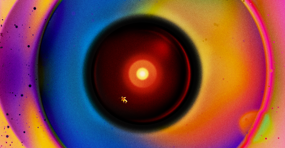
Kubrick’s visuals, score and concepts made waves throughout the film industry and beyond; waves which are especially pertinent today among growing polarisation concerning artificial intelligence (AI). Richard Strauss’ Also sprach Zarathustra which features on the film’s soundtrack is, as a result, synonymous with space travel and was used by the BBC in its coverage of the Apollo 11 Missions. More notably in recent times, the disembodied yet sentient voice of Hal 9000 is echoed in Samantha, the AI love interest of Joaquin Phoenix in Spike Jonze’s Her.
Not only did 2001: A Space Odyssey create a discernible language that has bled into every facet of visual communication, it helped form our understanding of the cosmos at a time when the world was gripped by the space race. The film’s visual effects by Douglas Trumbull, kickstarted a VFX arms race, massively impacting the visuality of the pictures we now see in the cinema, on TV and in books. To celebrate this enduring legacy, we reached out to several creatives to hear how the film has impacted their own practice half a century after 2001: A Space Odyssey first wowed global audiences.
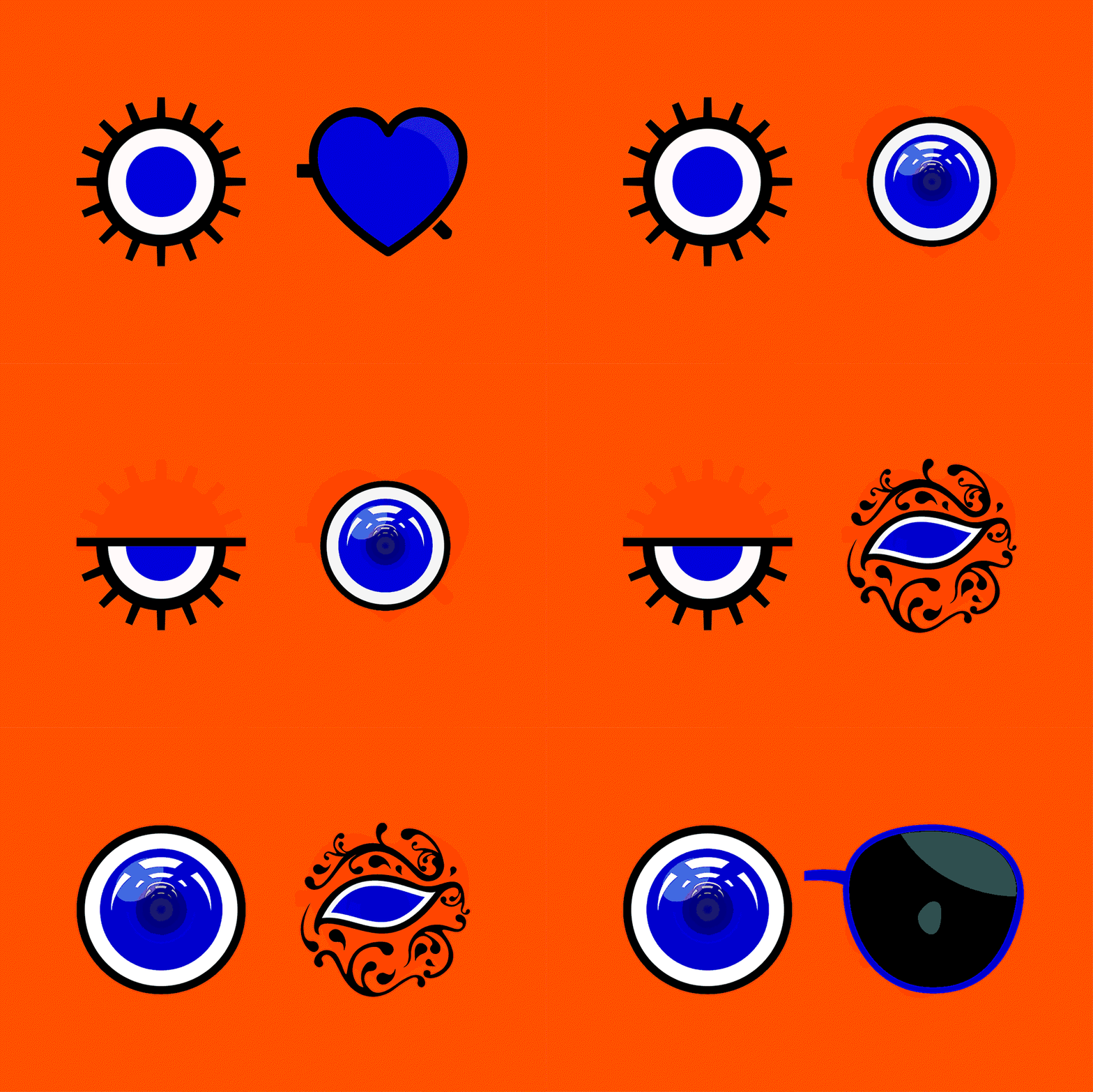
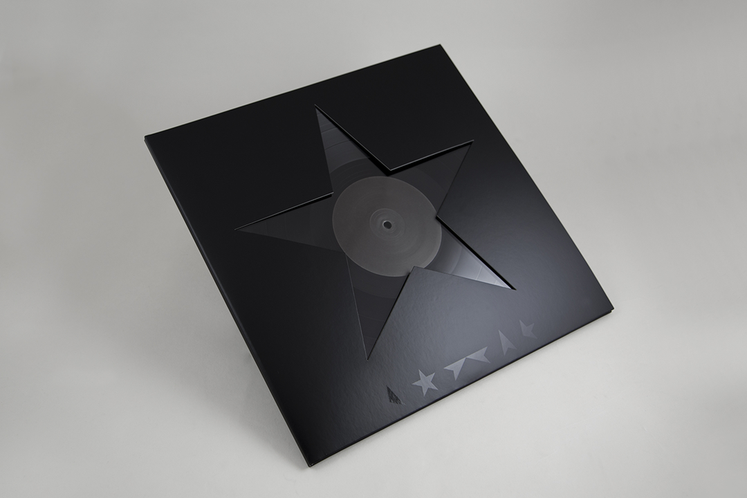
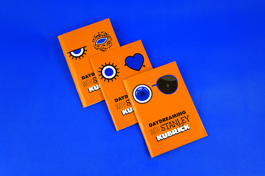
Graphic designer, Jonathan Barnbrook
“For me, it was how design can create a complete and total environment that is believable in every way even though it is unreal, meaning (literally in this film) the viewer enters a completely new universe. That attention to detail, where choosing exactly the right typeface is as important as the overall design of the spaceship, is a good lesson for any creative and it is something I have taken with me when designing record covers, especially for Bowie.
The release of a new album by an artist that is followed by a lot of people is a whole new universe for them to explore and it resonates through every part of their lives. So everything has to be right, every detail has to be cared for and every symbol, font or whatever you choose is chosen not just for the aesthetic – although that is important, but because of the wider philosophical meaning, the symbolism and what that will trigger in peoples’ minds."
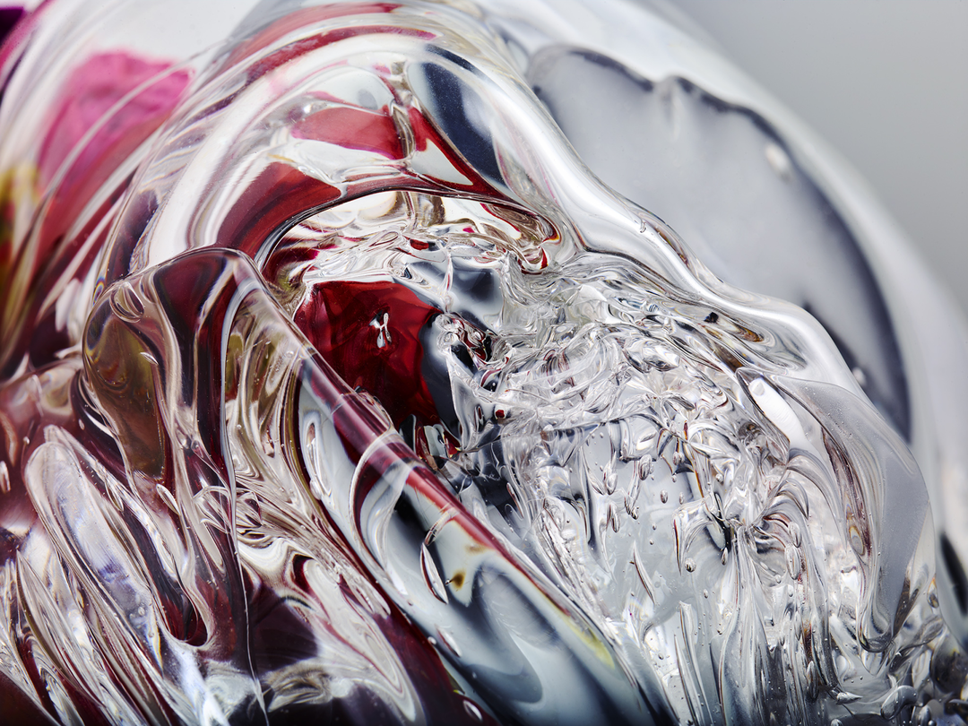
Visual artist, Lucy Hardcastle
“2001: A Space Odyssey, for me, is uniquely futuristic yet stylised; it appeared to be the post-modernism version of space but was shot on the precipice of the movement starting.
The perfect balance of what the future probably would be like and feels like now, cold interiors and colourful technology.
For me, it was the first time in cinema that there was an object that represented an AI – Hal. The first time I had seen this exist in any way that was associated with assisting yet intimidating and controlling a humans life.
I love the fact it was the shape of a button or the spherical CCTV camera that we regularly see now, to me it opened up endless possibilities of how an AI could be represented. It definitely influenced how I went about building my project Qualia, which was an interactive hand-blown piece of glass that showed how an interface or AI could have organicness and humanisation, that I always felt Hal was missing. It was the beginning of AI routinely existing in hostile situations on the silver screen, influencing how we view artificial assistance and intelligence."
"It appeared to be the post-modernism version of space but was shot on the precipice of the movement starting."
Lucy Hardcastle
BladeRunner 2049 © 2017 Warner Bros
Ghost In The Shell © 2017 Paramount Pictures, DreamWorks Pictures
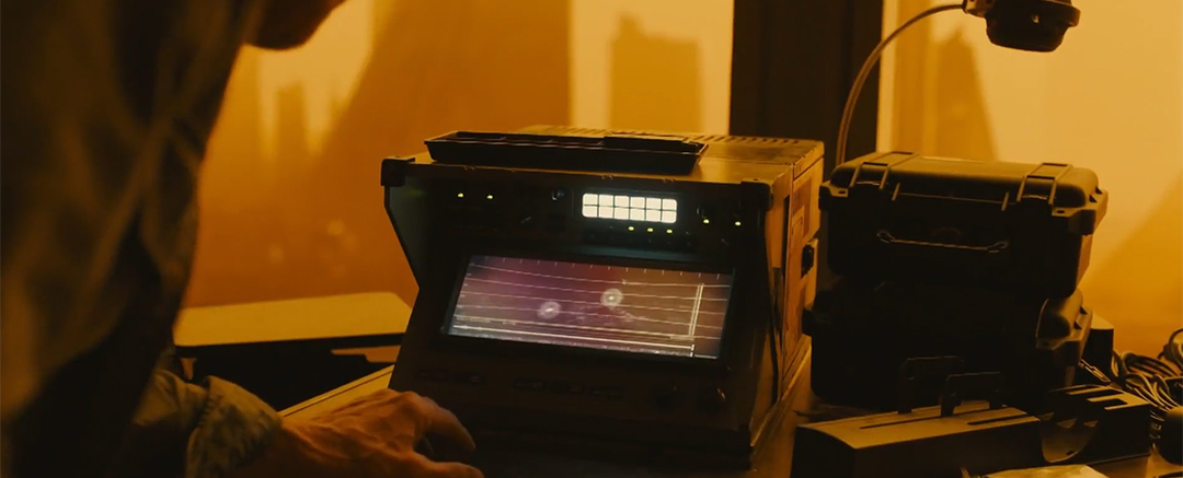
BladeRunner 2049 © 2017 Warner Bros
Ghost In The Shell © 2017 Paramount Pictures, DreamWorks Pictures
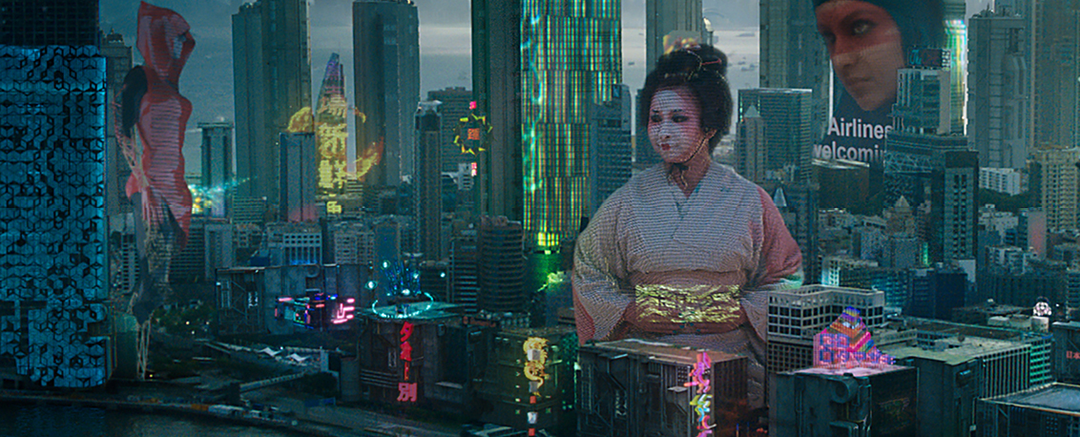
Ghost In The Shell © 2017 Paramount Pictures, DreamWorks Pictures
Prometheus © 2012 20th Century Fox
The Martian © 2015 20th Century Fox
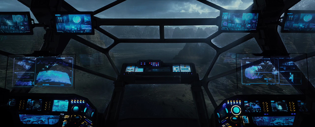
Prometheus © 2012 20th Century Fox
The Martian © 2015 20th Century Fox
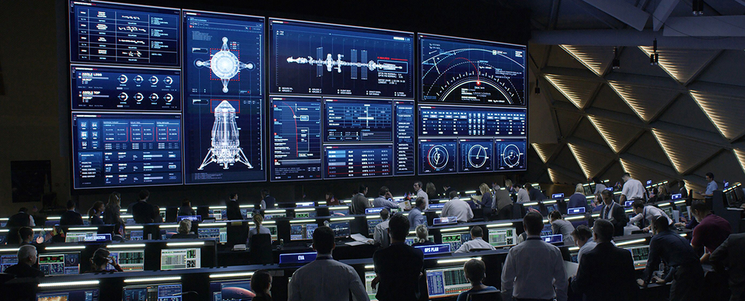
The Martian © 2015 20th Century Fox
Prometheus © 2012 20th Century Fox
Ghost In The Shell © 2017 Paramount Pictures, DreamWorks Pictures
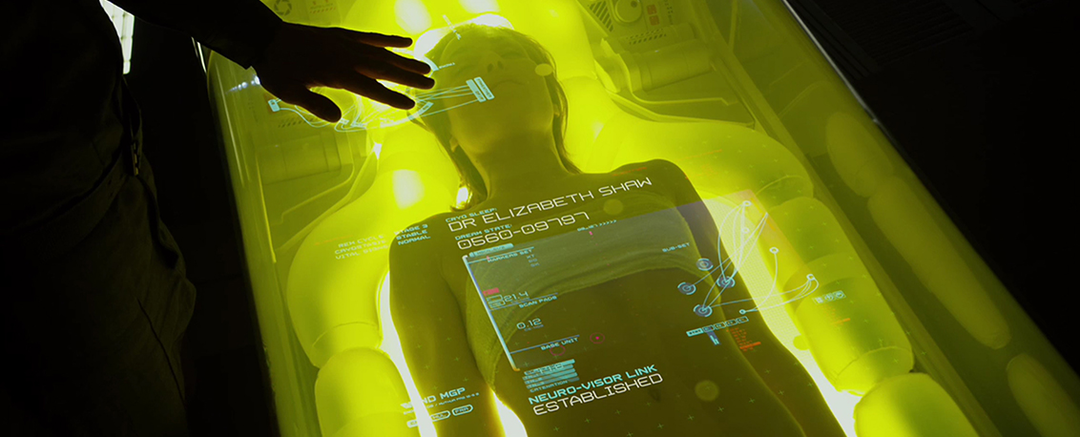
Prometheus © 2012 20th Century Fox
Ghost In The Shell © 2017 Paramount Pictures, DreamWorks Pictures
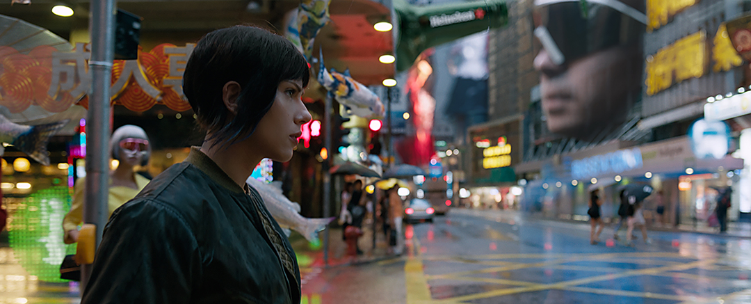
Ghost In The Shell © 2017 Paramount Pictures, DreamWorks Pictures
Bladerunner 2049 © 2017 Warner Bros
The Martian 2015 © 20th Century Fox
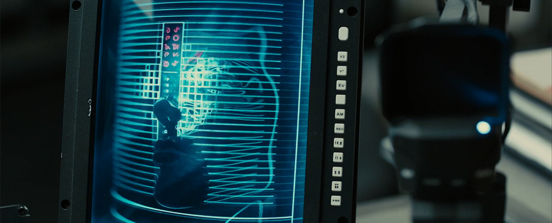
Bladerunner 2049 © 2017 Warner Bros
The Martian 2015 © 20th Century Fox
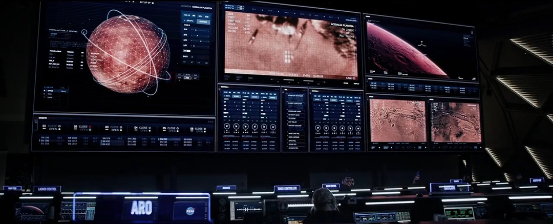
The Martian 2015 © 20th Century Fox
Co-founder and executive creative director of Territory Studio, David Sheldon-Hicks
“2001 hit me in the eyeballs in my teens. It was the beginning of a Kubrick binge for me, catching up on his work, but is still my favourite film of his. So much of my love affair with film comes from the craft of making. Seeing the miniature model work of that film, the practical effects and sheer inventiveness, just fuelled my passion for getting involved in film using my own design skillset. And, the film’s graphic compositions, world building and avant-garde themes still ring true today. Even now, in contemporary films, the themes of AI and the iconic use of Hal in the film are referenced time and time again. Kubrick’s vision, process and attention to detail has stood the test of time and is a testimony to the creative passion that ran through those projects. I continue to be inspired by the film with every fresh viewing, and I hope some of my own work can one day achieve this timelessness.”
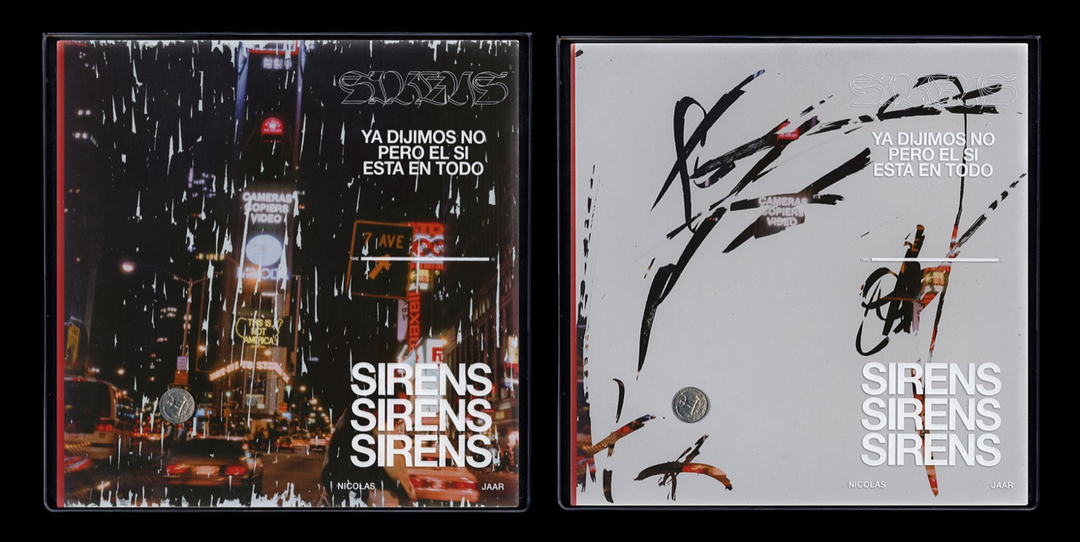
Graphic designer, David Rudnick
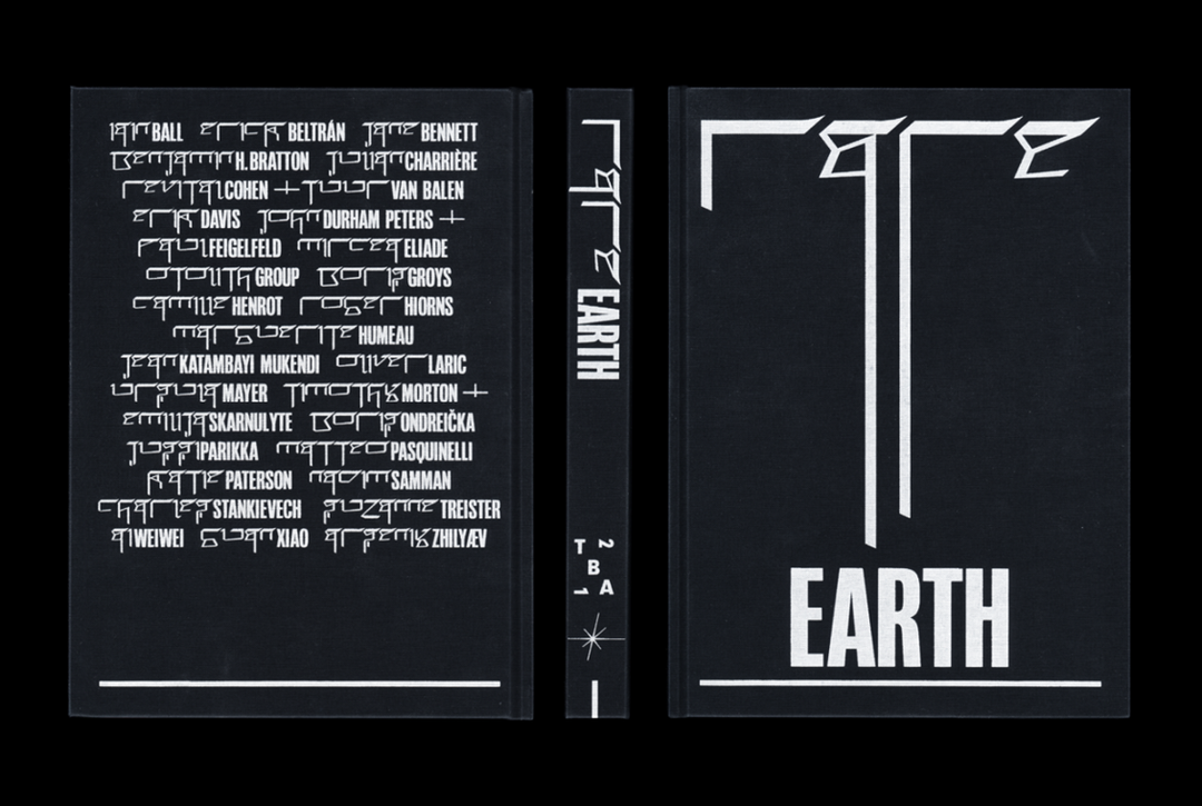
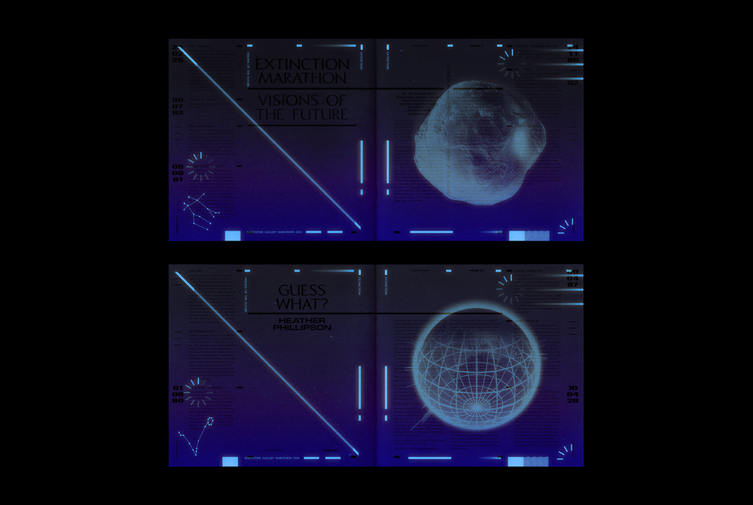
“It’s difficult to write this little article or tribute. Sometimes art can be so powerful that you begin to ration your access to it. We live in a paradigm where, technologically, you could watch this movie every night. And yet, it feels so sacred that loving 2001 becomes almost an exercise in avoiding watching 2001, holding off until particular moments or screenings, almost trying to forget, to let years pass, life go on, maybe most importantly, to control a little the way it changes you by allowing yourself to have changed before you see it again. You begin to understand why festivals happen once a year in religions; later when I would study painted altarpieces it was one of the ways I would rationalise how things so astonishingly beautiful could be kept closed for all but one moment of the year.
Forgive me for not talking about the film directly. These symbols mean everything to most everyone who’s seen them. It feels rude to interpret them, so please forgive me for talking about my experience of it. I’ve found at moments in my life myself the recipient of freak luck; that my journey has me in a place where 2001 was being screened on 70mm, three times. Firstly, at the BFI in London, then in Los Angeles at the Egyptian Theater and later in New Haven at Yale when Kier Dullea came to the screening. He was the most extraordinarily quiet and gracious person. All the questions were about Kubrick, or Trumbull of course. Somehow he wasn’t insulted, that he had been appointed to this position of interpreter, haruspex; an acolyte parsing the meanings of departed Gods when he was a character in the text. I realised that he must have been fielding those questions for 50 years. Mr Dullea is a remarkable man and his kindness and his time for those questions moved me very much.
I’ve tried to understand what the gift of silence feels like in the film and what the visual analogue might be in my practice. I prefer to think about the disparity between silence and voice in composition than “positive and negative space” and I owe that completely to Kubrick.
My dad used to subscribe to Sight And Sound [magazine]. When I was very young, three or four, barely a reader, I remember lying on the carpet on the floor of his office mesmerised by its issues. One had a feature on shooting or editing the Hal deprogramming sequence:
Kier Dullea as Dave, weightless in the red room. I had the feeling of recognition, which was impossible. I was fascinated. Years later I would get the same strong feeling when asked what my first memory was of being in the womb. Of floating in a space lit by yellow light through red walls with my eyes open. Only years after that would I read that Kubrick and Trumbull constructed the chamber with this visual metaphor in mind. My ‘earliest memory’ is probably a false memory; a thought that was Kubrick’s, not mine.
That’s probably true of more of the world and the art that followed 2001 than we would like to admit."
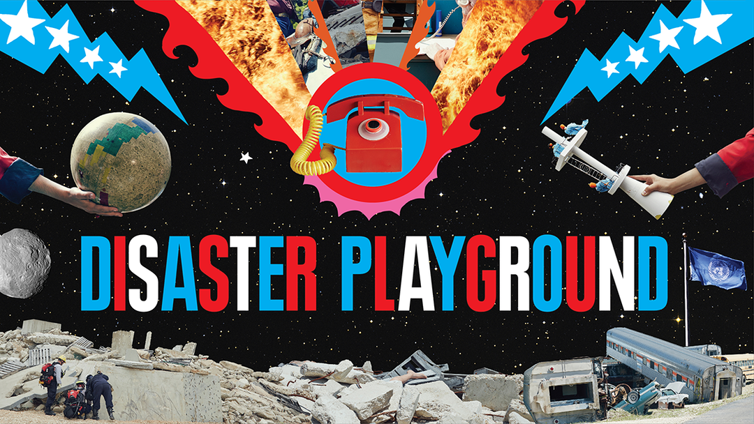
Disaster Playground by Our Machine
Nick Ballon
International Space Orchestra by Our Machine
Nick Ballon
International Space Orchestra by Our Machine
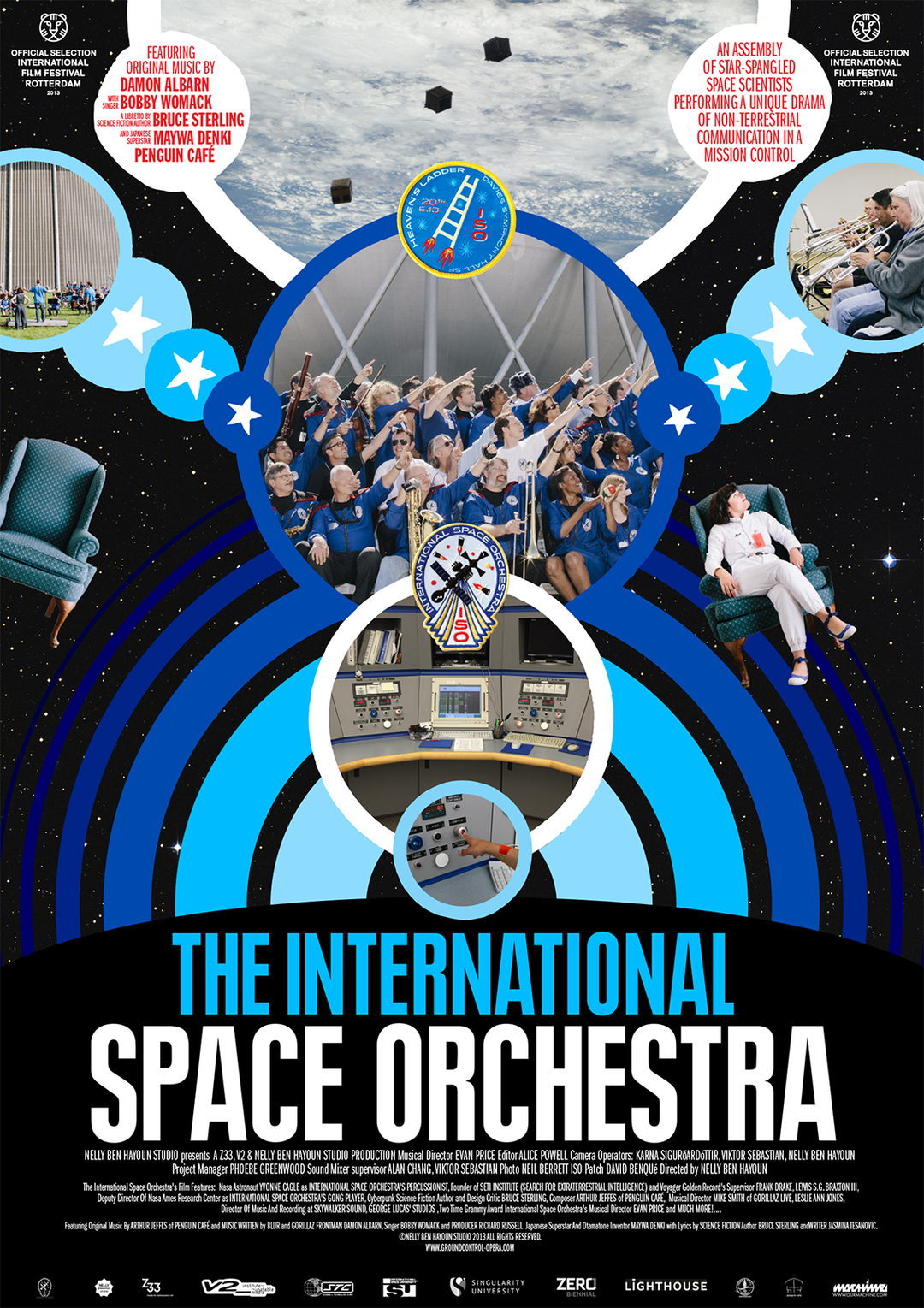
International Space Orchestra by Our Machine
Director and experience designer, Nelly Ben Hayoun
“2001: A Space Odyssey has been a great influence on my practice in soooooo many different ways; I can’t even list them all!
After reading The Voice in Cinema by Albert Chion, I was fascinated by the way that the voice of Hal 9000 exists between the universe and connects our world, with the one of outer space, the ground and the one of the machine. So much so, that when I created my feature documentary Disaster Playground – on the chain of command in place in case of an asteroid impact – I decided to be only seen from the back and re-recorded my voice in the studio to amplify that omnipresence.
I have the poster of the film in my bedroom: “an epic drama of adventure and exploration” and, of course, the International Space Orchestra – an orchestra of NASA and SETI Institute scientists performing music – was very much informed by 2001.
I also had the great opportunity to meet with Douglas Trumbull, the special effects director on the film, who went on to direct Silent Running and Brainstorm at a conference held by the one and only Prof Rachel Armstrong. Douglas has been mentoring me since, and he is currently one of the board members of our tuition-free university, the University of the Underground. You can listen to him talk about 2001 in this podcast we created for the research seminar I run monthly at design institute A/D/O in Brooklyn.
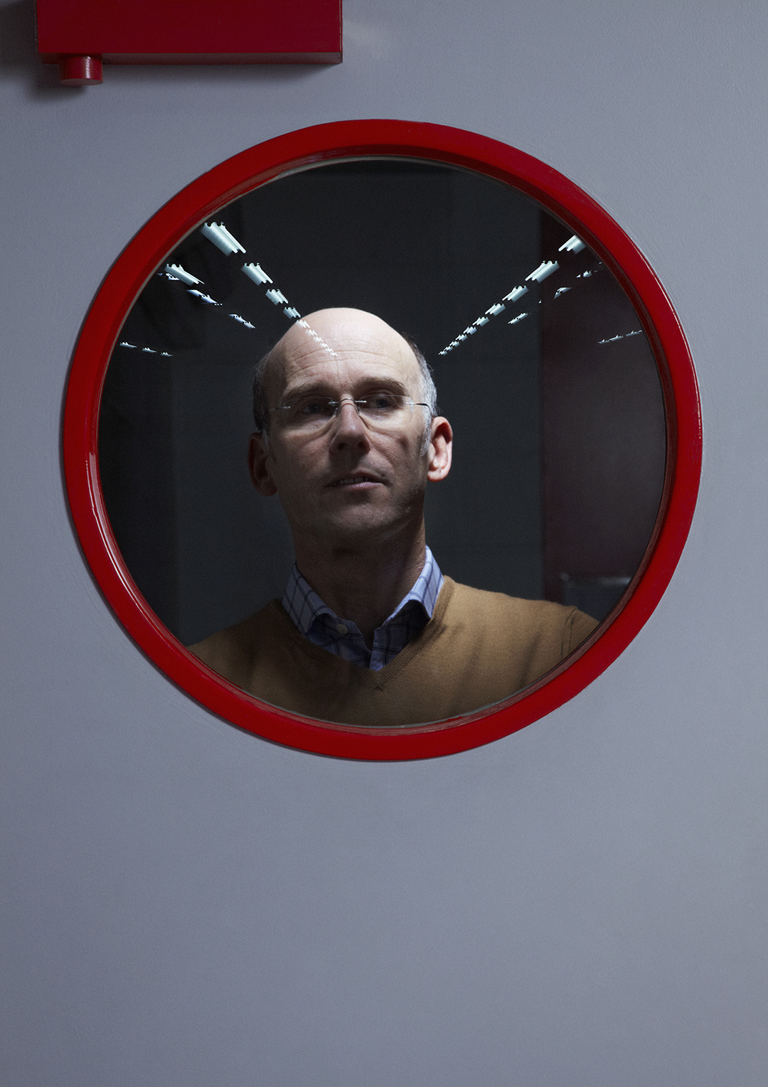
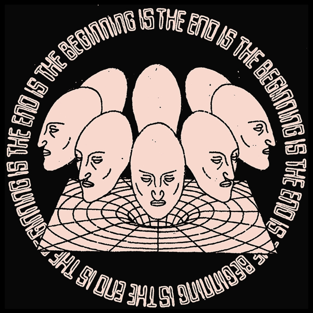
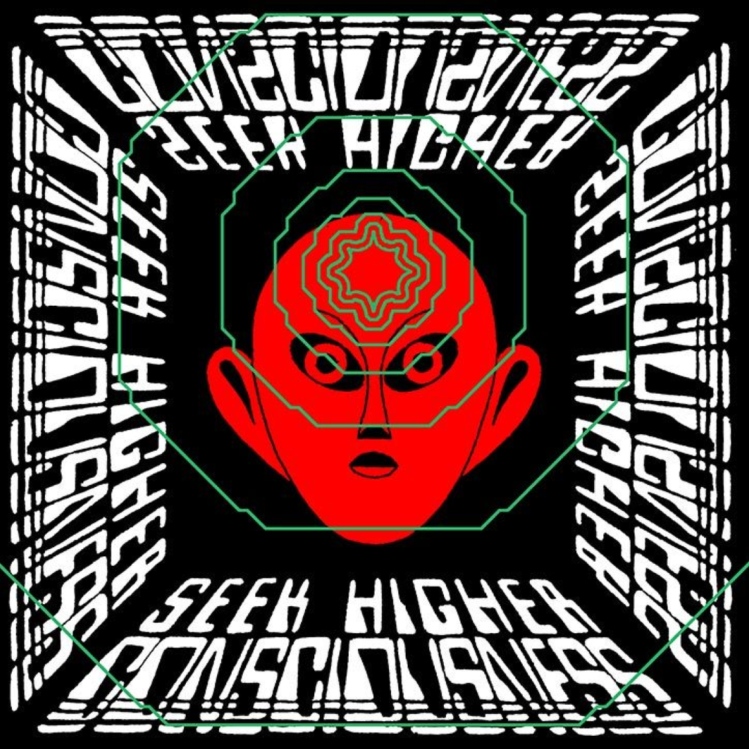
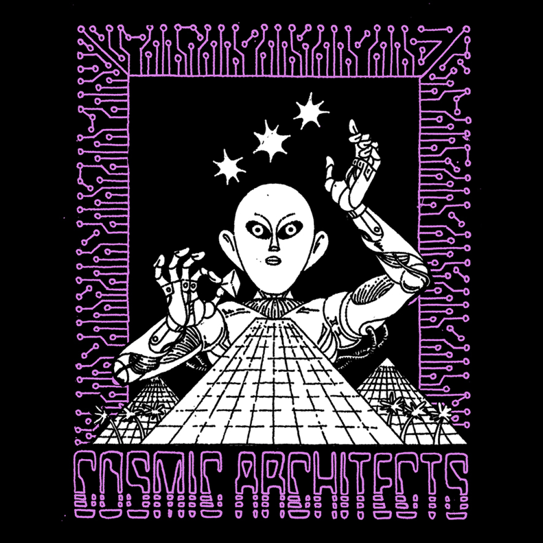
Finally, with my long-term partner in crime photographer Nick Ballon, I worked on a series of photographs at the paper factory Fedrigoni. One of the pictures in the series reproduces the effect of the helmet in 2001.
So all in all…. vive 2001!"
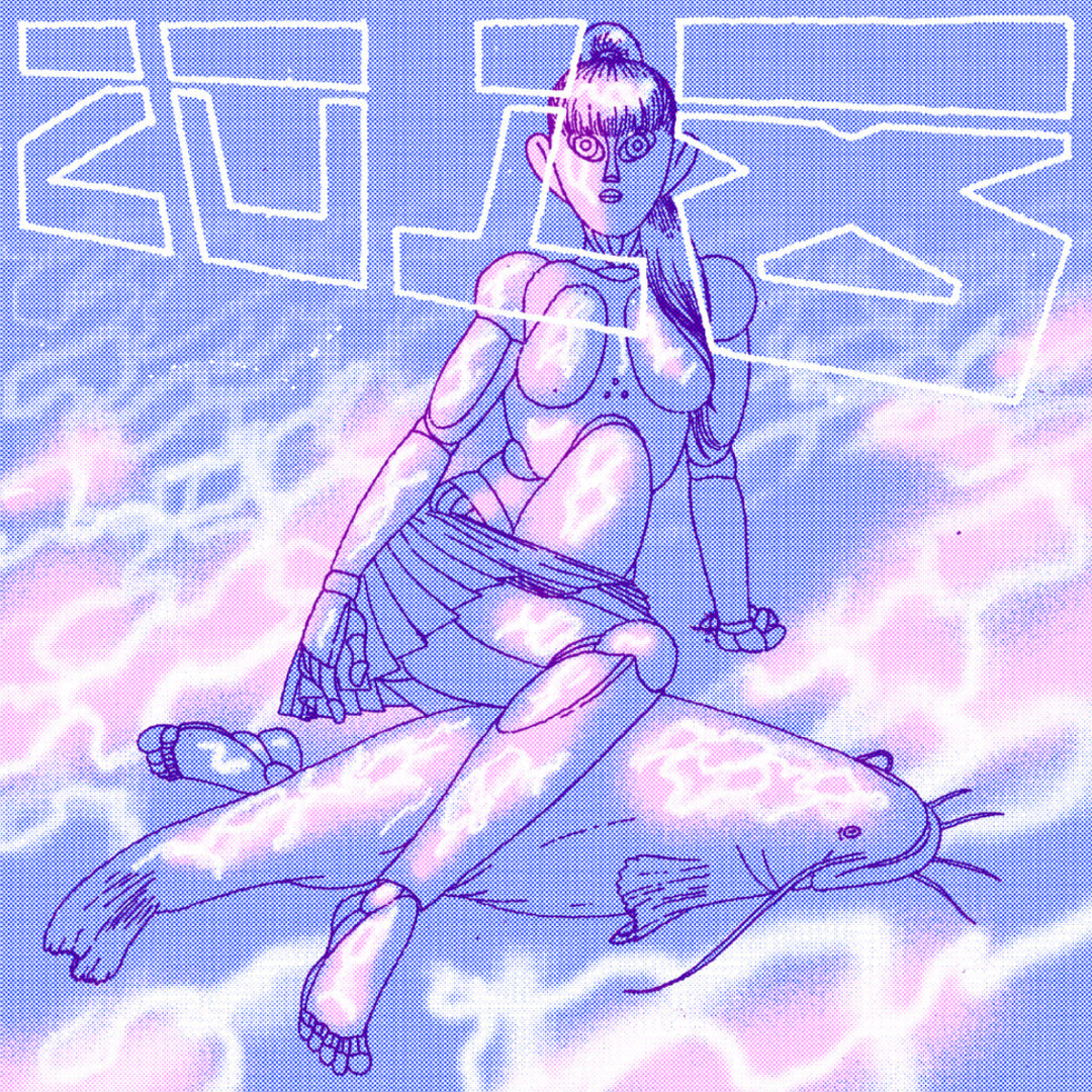
Ilustrator, Pete Sharp
“I remember my Dad going on at me for years as a kid to watch 2001 – he had it on VHS and would go on about that, as well as a number of other iconic sci-fi classics, but I was always dismissive. I finally agreed to watch it with him at about the age of 14 and I was completely torn between being mind-blown and utterly confused. If I’m being honest – I still am.
The film is a prophetic vision, an overwhelming blend of unsettled chaos and beautiful inertia which set an early precedent for sci-fi films which is still near impossible to beat: I can’t help but wonder where we would be now without it. The design is classic and (despite being optimistically named 2001) the story is timeless. The overall theme of merging past and future is something I have drawn direct inspiration from in my own work as well as the heartless Hal who I think has influenced the way so many people envision an AI future. I only hope that one day my work may also inspire the same feelings of awe and excited confusion that 2001 did for me so many years ago."
"The film is a prophetic vision, an overwhelming blend of unsettled chaos and beautiful inertia..."
Pete Sharp
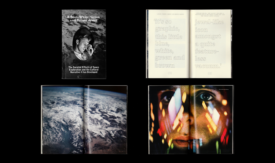
Graphic designer, Ben Hutchings
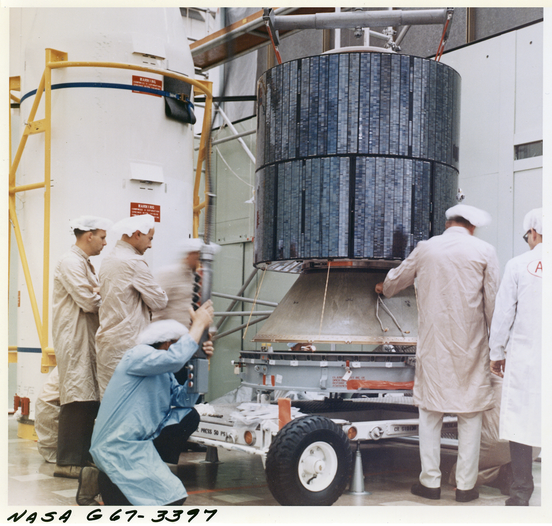
“My project A Blue, White, Green and Brown Jewel explores several cases where the creative community has interacted with and been inspired by the world of space exploration, and 2001: A Space Odyssey is a quintessential proponent of the field. At the time, in the late 1960s, the general public was just starting to see photos of the Earth from space for the first time, due largely to the efforts of American activist Stewart Brand who published the Whole Earth Catalog.
The film portrays a powerful image of mankind’s relationship with the Earth and space, particularly in the final scene of the film which presents us with the dichotomy of the familiarity of the human baby juxtaposed with the magnitude of the Earth in the distance. The need for introspection as implied by that scene was hugely significant within the creative industries, as shown within the morals of Kubrick’s 2001, and images of the Earth from space campaigned for by Brand. Kevin Kelly, the founding editor of Wired magazine, described the Whole Earth Catalog as ‘looking the reader right in the eye and holding nothing back’, and I think this is a fantastic description of what 2001 became to me and many others: something bold, something pure, and holding nothing back."
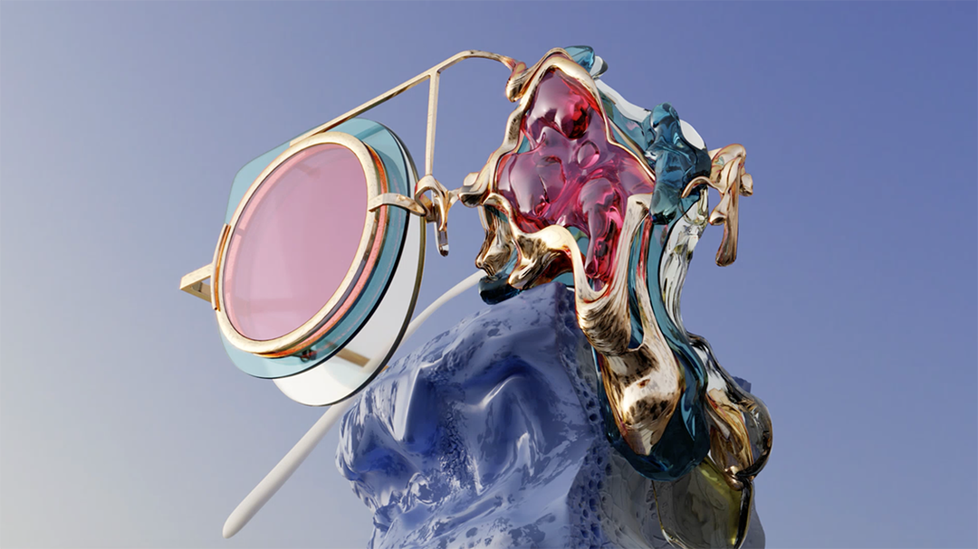
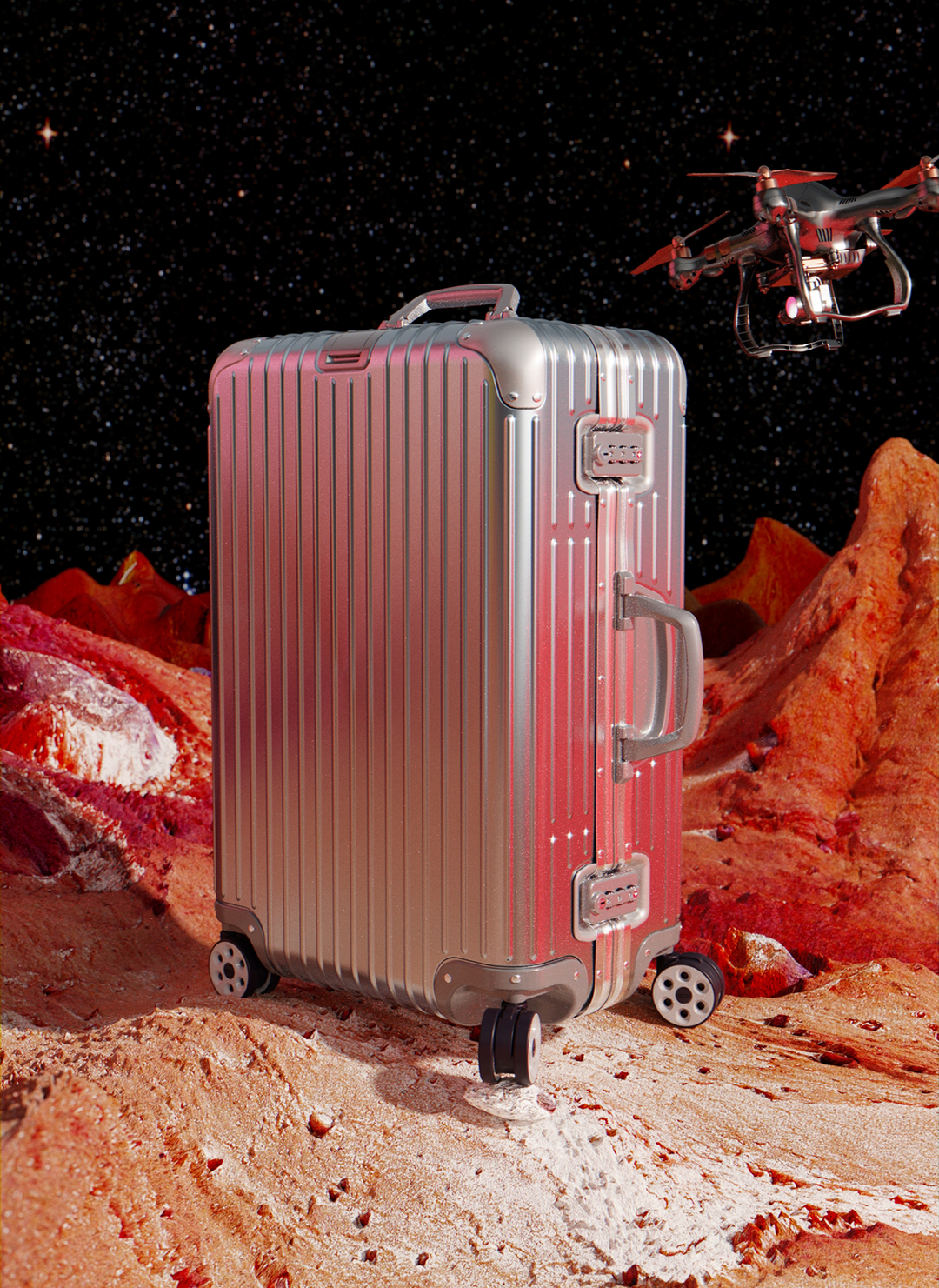
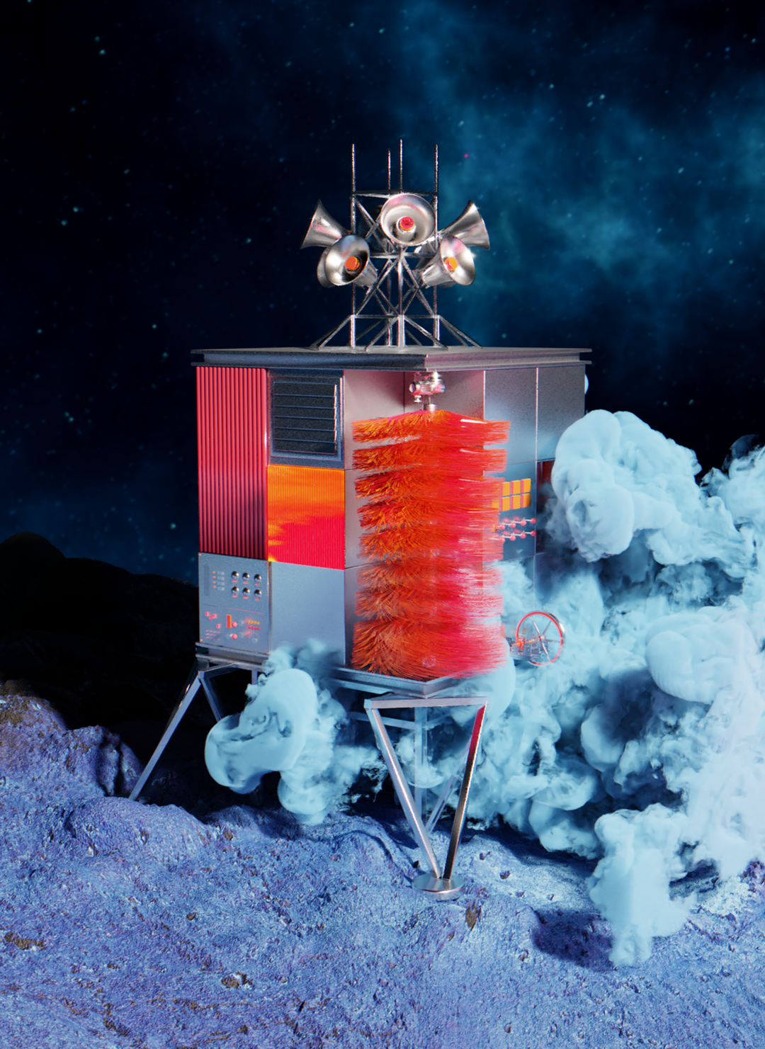
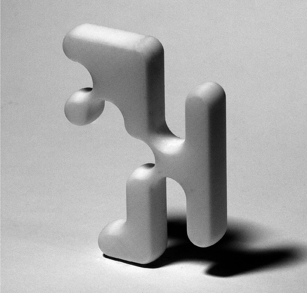
3D designer, Ada Sokol
“Stanley Kubrick is a master of visuals. He was a professional photographer before he worked in movies. This had a huge impact on his ability to frame a scene and compose visually. In 2001: Space Odyssey his visual opus felt monumental because he used centripetal framing, wide angles and strong primary colours to weave in emotional and philosophical themes. Space Odyssey is not just a beautiful looking movie, it looks at how humans, from the beginning of time to the present day, are losing control over the tools (technology) that we are creating.
As a 3D designer and visual artist heavily reliant on computers, software, internet and all things technological, I believe we need to have a healthy distance from technology. When we start believing that AI will solve all our problems or become uncritical of how technology can impact behaviour or personal security – we no longer become our own independent masters. I think this is what Stanley Kubrick was trying to warn us about: that no matter the technology from video chats, tablets and video games (which he predicted in 2001: Space Odyssey) we will not find the truth of who we are in our tools."
Share Article
Further Info
About the Author
—
Ruby is Senior Creative at It's Nice That, overseeing our visual output across platforms and projects. Before that, she was associate editor on the editorial team, after joining in September 2017 following graduation from Central Saint Martins.