- Words
- Owen Pritchard
- —
- Date
- 7 April 2017
- Tags
The re-revolution of Air Max: ManvsMachine celebrates 30 years of a sneaker icon
Share
Share
The Nike Air Max was launched in 1987 and has gone on to become one of the most famous trainer designs of all time. For Air Max Day 2017, ManvsMachine was commissioned to celebrate 30 years of Air Max with a huge campaign. Here, creative director Adam Rowe takes us through the project and shares insight into the processes that saw it realised.
Background and brief
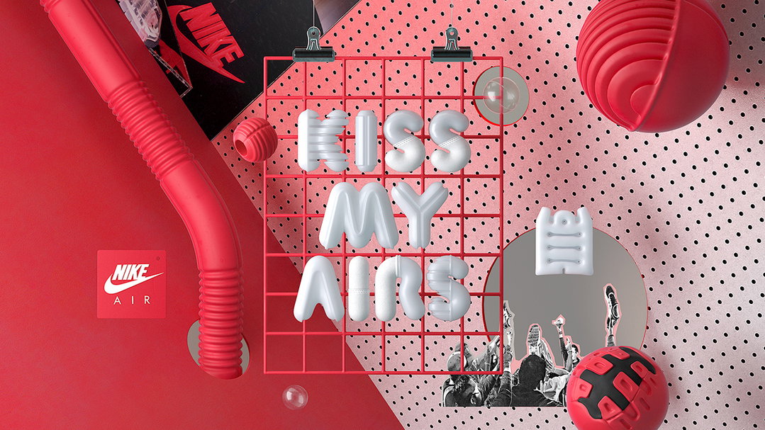
In 1987, Nike launched one of the most innovative and groundbreaking sneaker designs of all time: the Nike Air Max. With this design, Nike made the invisible visible, opening a window to the sole like never before. This technology became a game changer in the sneaker world, as the public was intrigued and runners were hooked. What began as a window, transformed into the sole of the shoe and then into the soul of sneaker culture. Our brief for Air Max Day 2017 was to celebrate thirty years of Air Max and bring its revolutionary spirit to life again, redefining the present and future of Air.
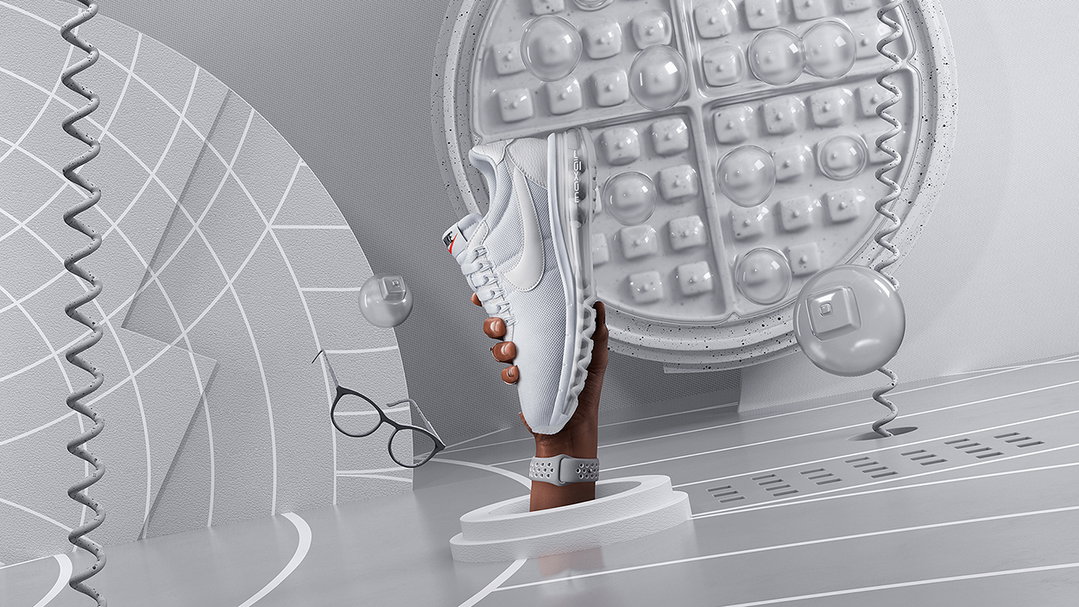
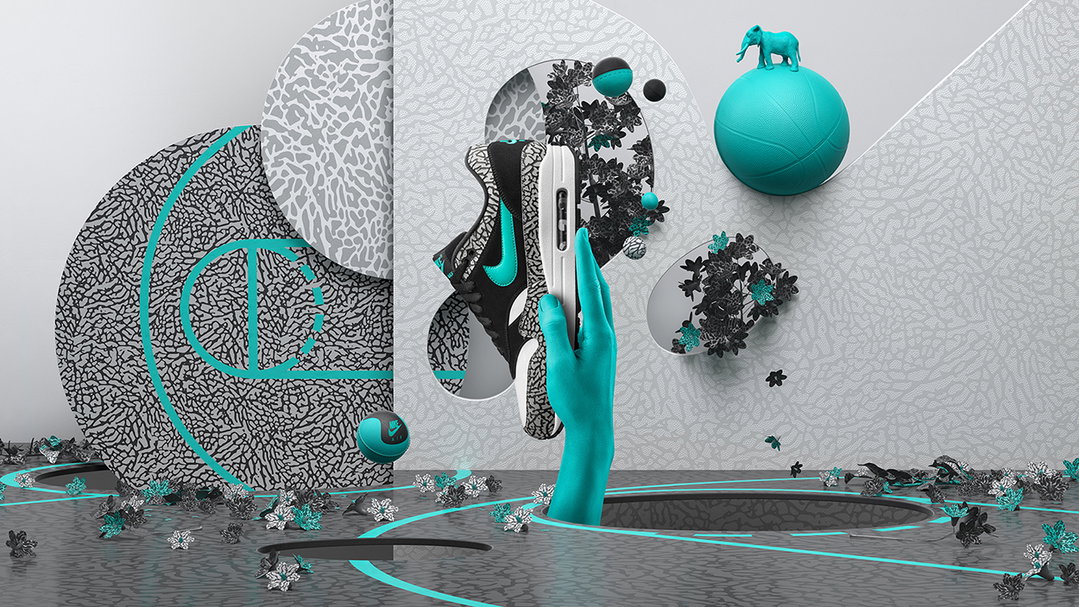
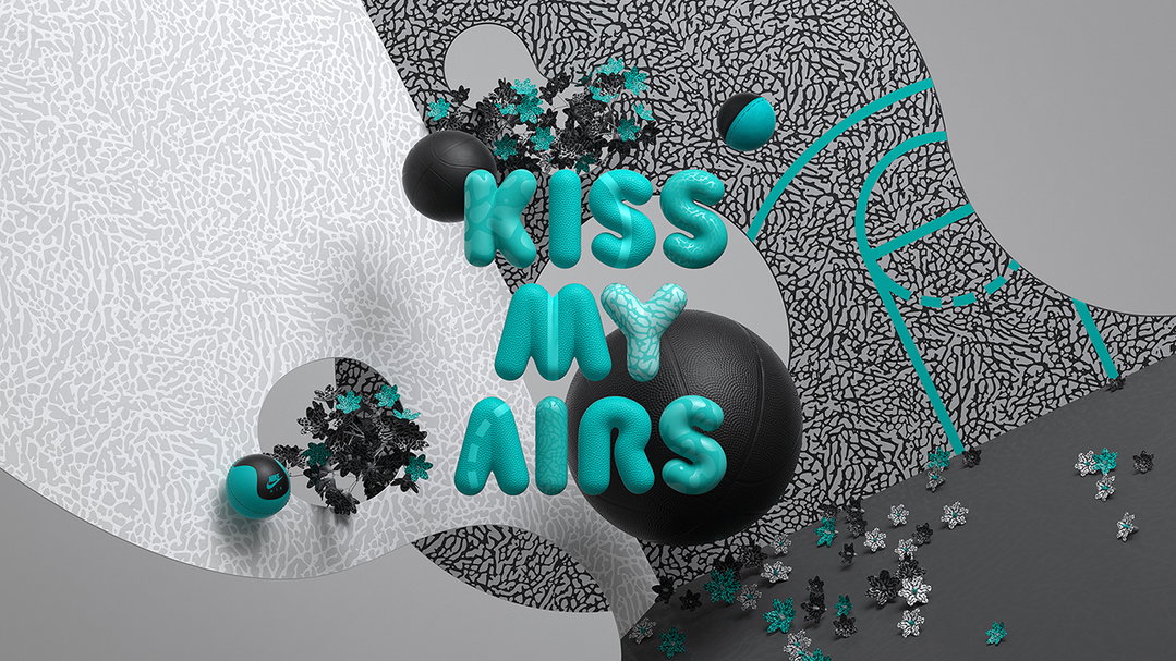
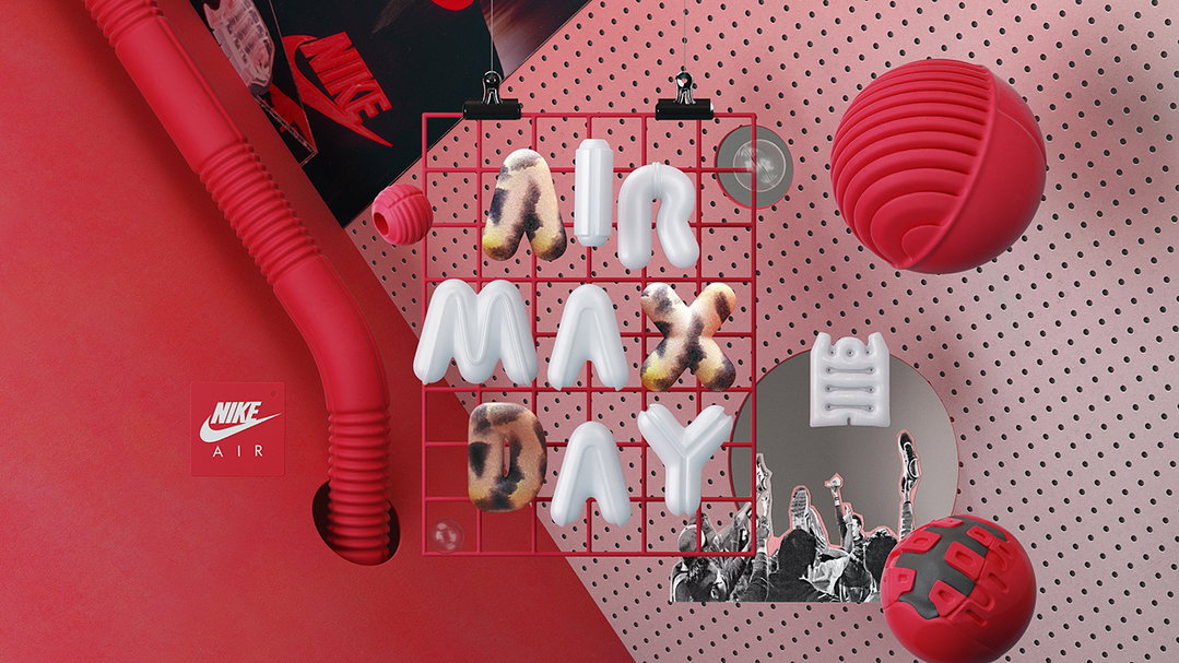
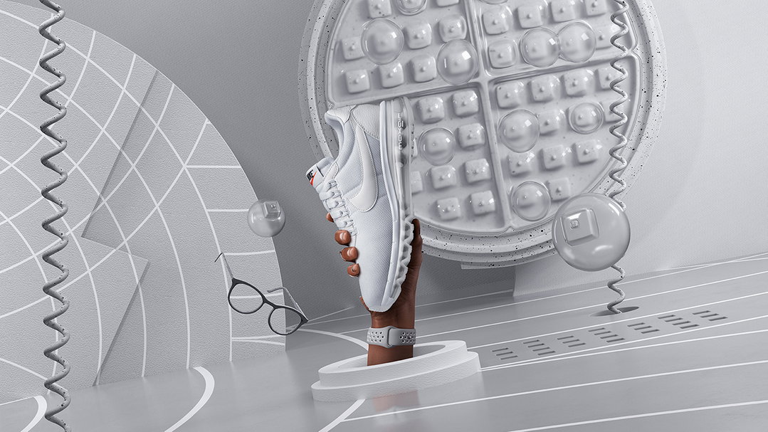
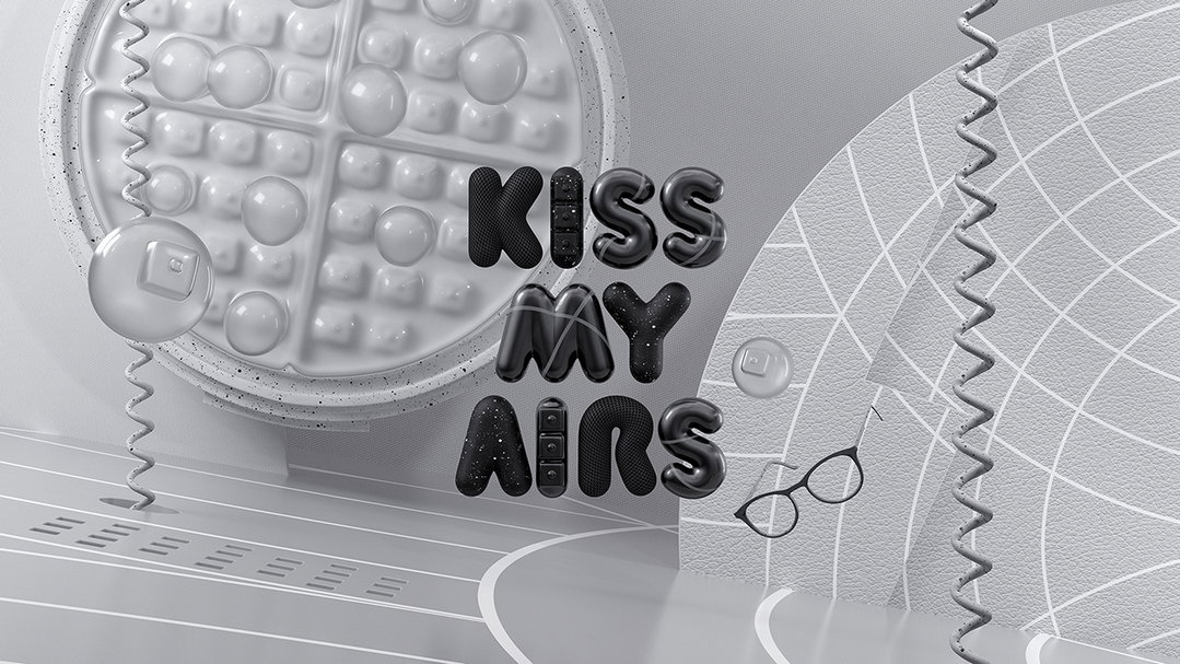
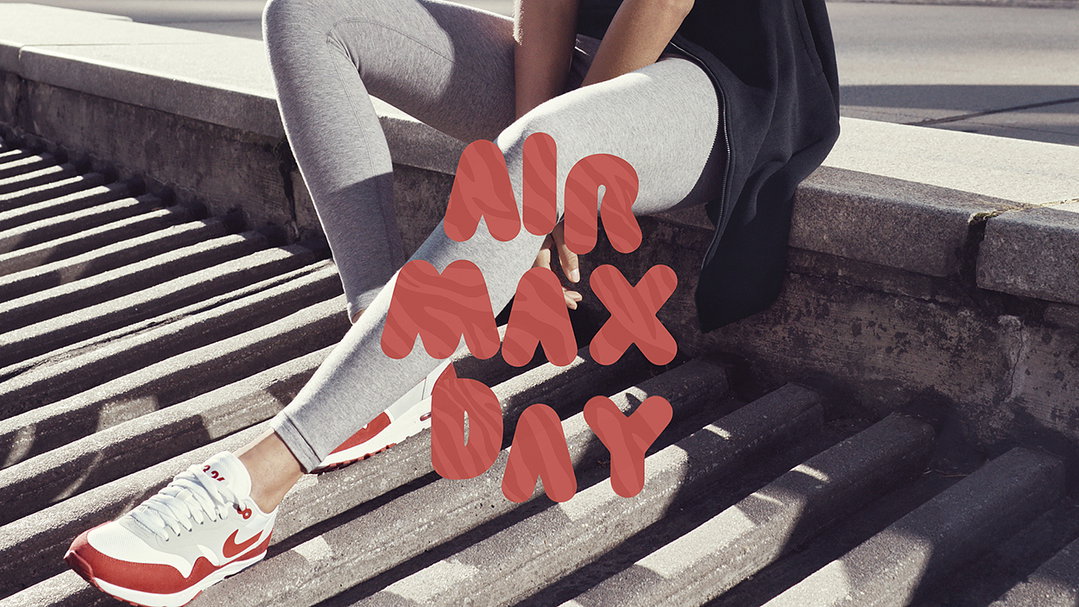
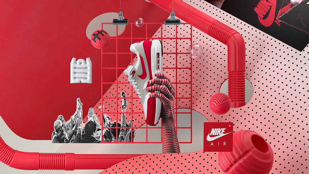
Bringing 30 years of Air together
We wanted to tap into that rebellious OG spirit and build an homage to the passion that started the Air Max revolution, as well as the evolution of Air over the past 30 years. We’ve worked on so many Air Max projects by now, we have a pretty solid understanding of the product and its heritage, so were in a great position to explore 30 years of Air.
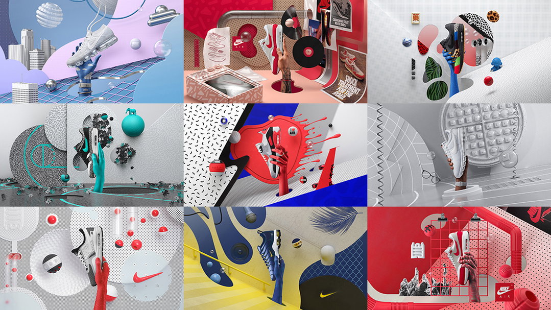
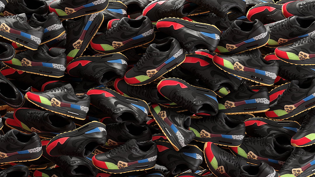
Nike are excellent historians, and provided an amazing resource for back stories on all seven of the products we launched this Air Max Day. For each we were given insights into the inspiration and thinking behind the product, from basketball courts and elephants for the Air Max 1 Atmos to plants, animal prints and Kid Robot for the Air Max 1 Master. Having such detailed storytelling elements made our lives easy when bringing the visuals to life and creating a rich landscape of Air Max history.
A seed of an idea
We were fortunate to have a clear goal from the off: visualise a Re-Revolution and ignite the Air Max community with the product’s rebellious spirit. Having such a strong steer gave our concept development a solid foundation.
Our initial creative approach was to identify and explore the “methods of revolution”; the different ingredients that come together to make a revolution spontaneously evolve. Themes such as mass-mobilisation, revolutionaries, iconology, flags, paint, smoke, etc. started to emerge. We then began to sketch concepts that were tightly wound around any one of these elements, which we thought would make for a succinct campaign. We soon realised this wasn’t the way to go, as any one of these themes on its own didn’t challenge convention – it was a combination of all these elements working in unison that empowered a revolution.
Many weeks of research and distilling of information lead us to the following summary which became our mantra – “The Re-Revolution is a global movement. It’s an epic coming-together of risk-takers & rebel spirits from all corners of the globe, challenging conformity and ushering in the future of Air Max.”
Remixing a Re-Revolution
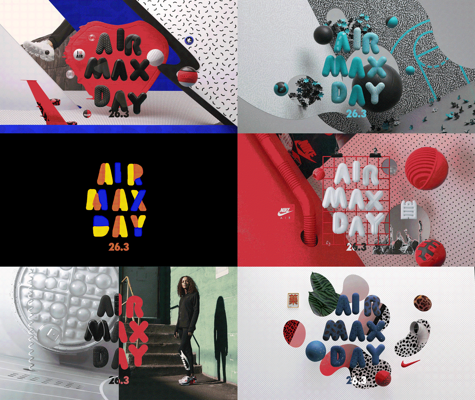
At this point we had a clear understanding of the Air Max’s heritage and the product storytelling boxes that needed ticking and we had a strong notion as to what informed a Re-Revolution. Our next challenge was figuring out a way of gelling both together to create something that was visually different and defied convention.
A remix is an interpretation that gives new life to its original. It’s an homage to the past but it speaks to the current moment in a way that’s fresh and ownable. This is what we were going to do: remix 30 years of Air whilst having the Re-Revolution as an overarching theme.
Rebellion vs. Celebration
Probably the biggest conceptual challenge along the way was finding the sweet spot between being rebellious and defying convention and maintaining a fun, celebratory mood. We did not want to veer into the realm of political revolution, so this is where we drew the line. Too many explosions, vandalism and negative connotations made for a confrontational campaign as opposed to something that celebrated a 30-year anniversary. For us it was more about championing values such as inspiring a community or creating a cultural movement rather than literally creating an aggressive revolution that mimicked too closely ones seen in the real world.
Typography
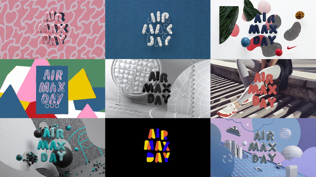
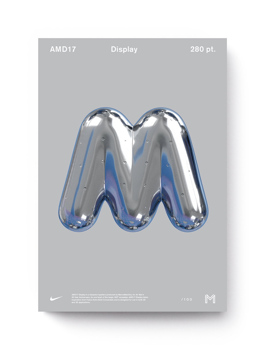
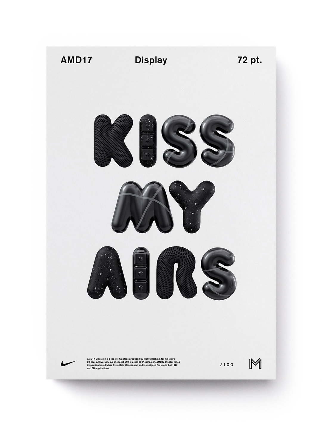
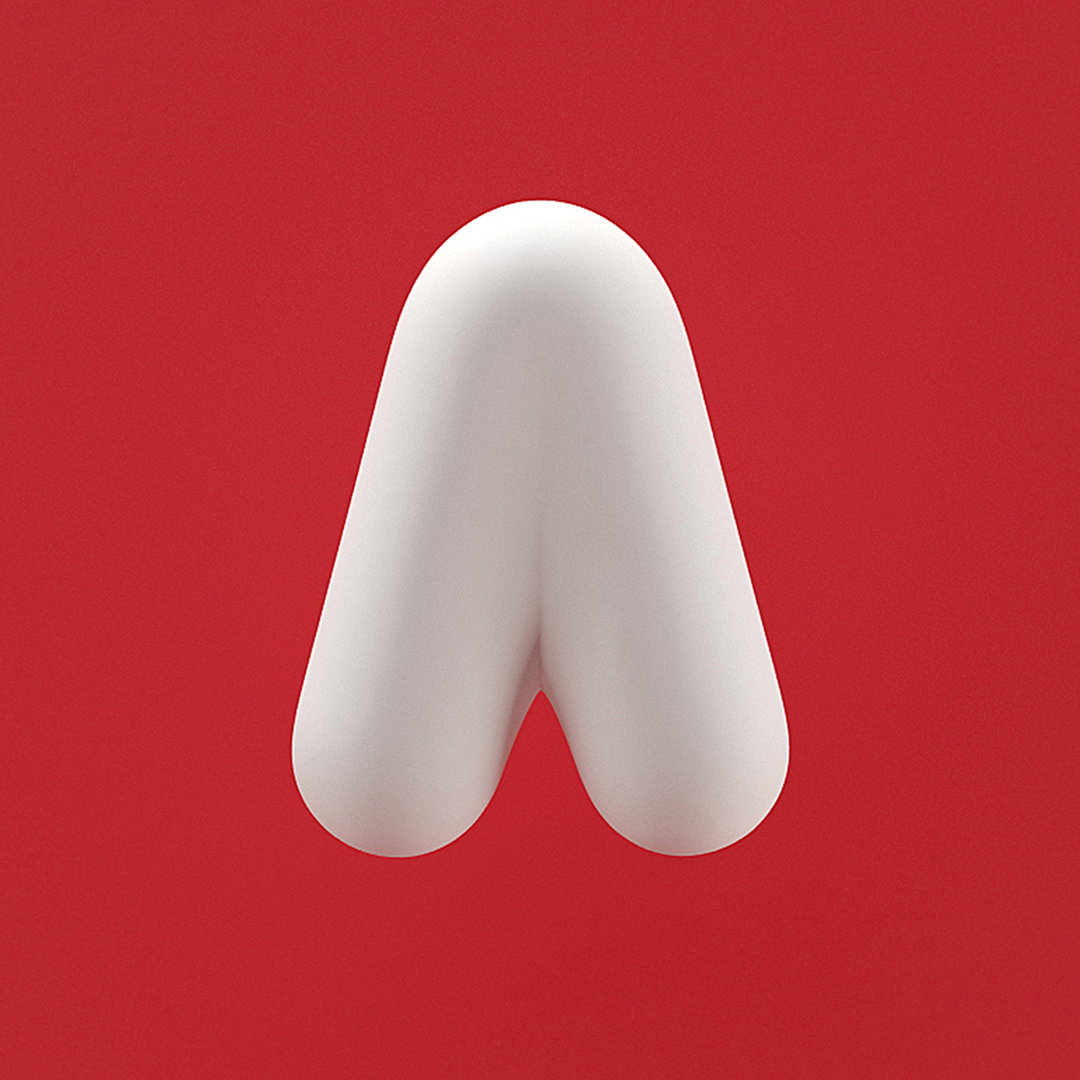
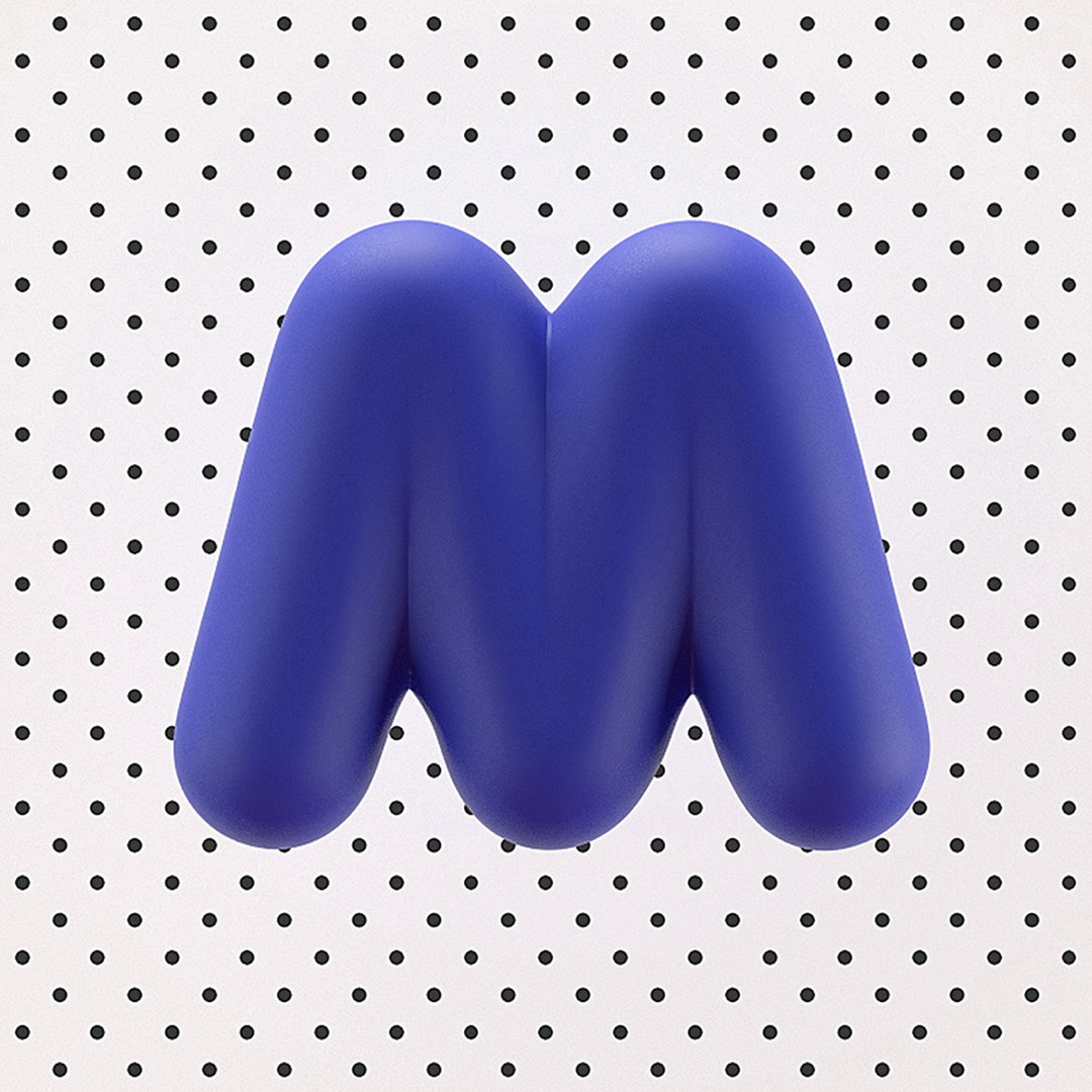
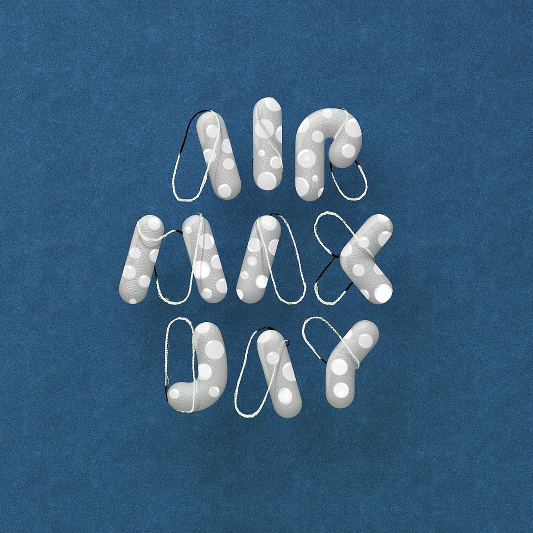
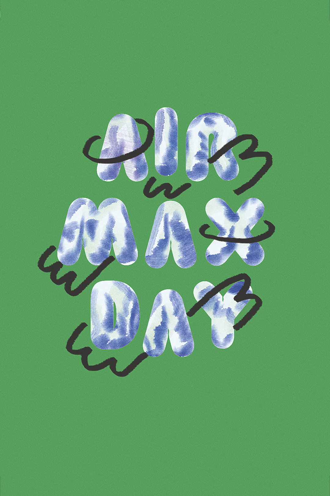
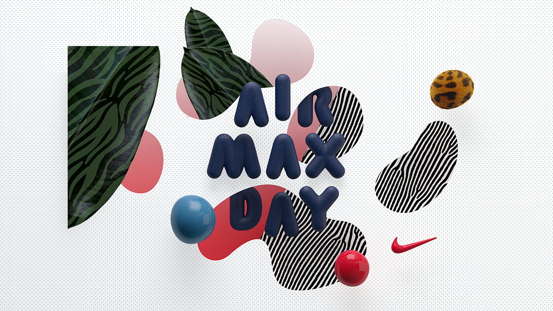
Our process is pretty organic in general: the typography was built out alongside the graphics, and the two influenced each other along the way. Of course, there was a lot of trial and error just to see what looked good, but taking this more collaborative approach with our varied skill-sets helped to tie together the overall campaign aesthetic a lot more seamlessly. Most of the time, the way you’ll be seeing these letterforms is within a CG context, so testing out how these forms held up with texture, and in 3D environments, was pretty crucial along the way.
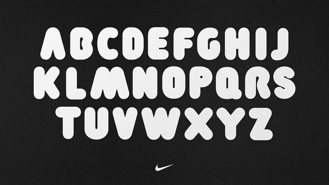
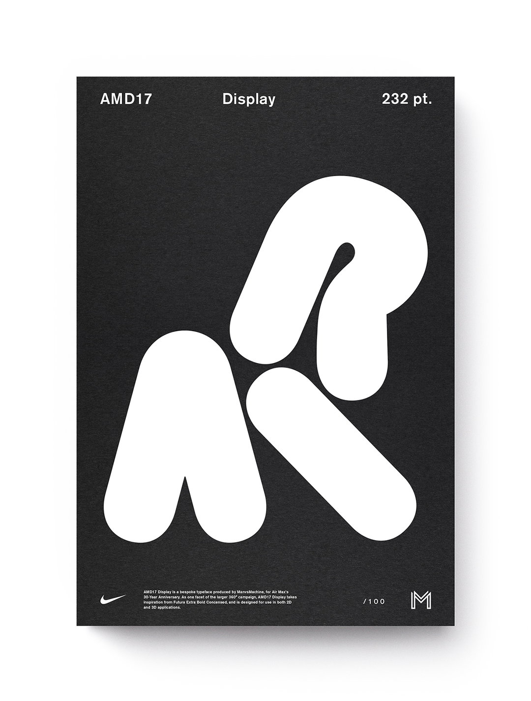
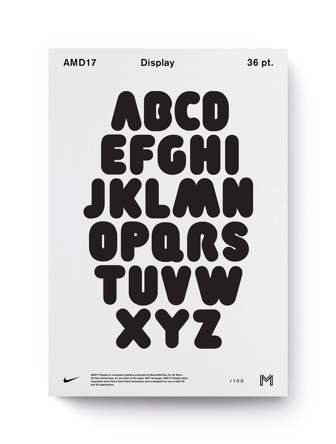
We knew that the aesthetic of this year’s campaign was going to be pretty eclectic, so we wanted to take a route with the typography that was a little simpler than what we’ve put together in previous years. By stripping things back quite a bit, we could ensure that the type could live well in a slew of graphic worlds.
Specific to this campaign is the aesthetic decision to bridge 2D and 3D graphic languages, so it was important that our typeface was successful in both.
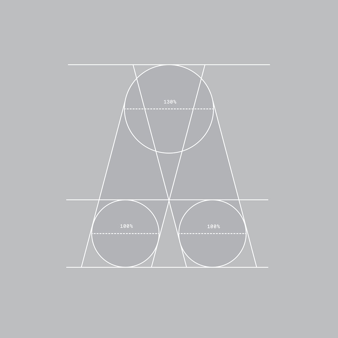
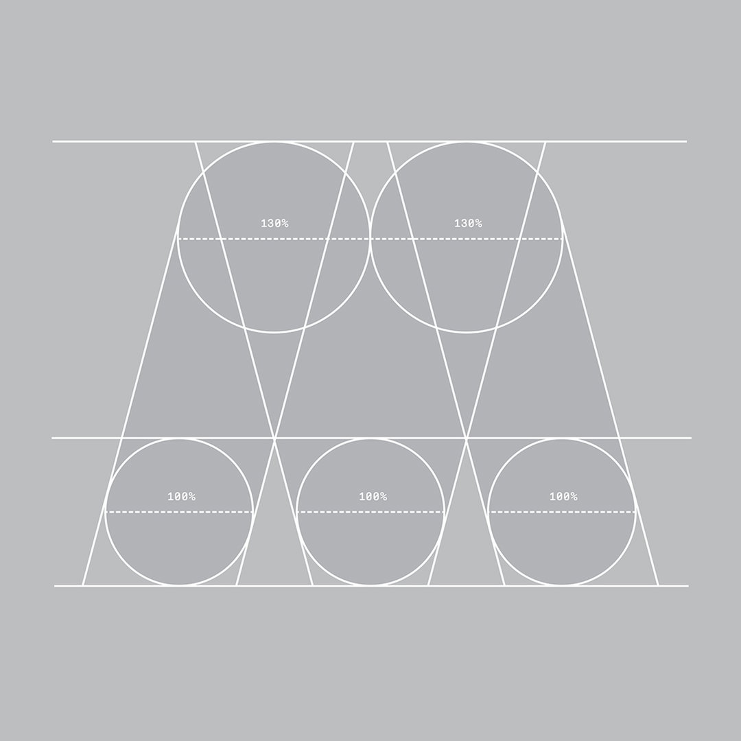
As with the logotypes we’ve built out for previous years, the letterforms are based on the geometries of Futura Bold Condensed and inspired by the Air Max air bubble. Initially, our approach to typography was going to be limited to the Air Max Day logotype, but given the breadth of this campaign, we thought that building out a full typeset would cover a lot more ground. The campaign’s aesthetic is quite broad, so having a common thread across these visuals was another way of helping tie everything together.
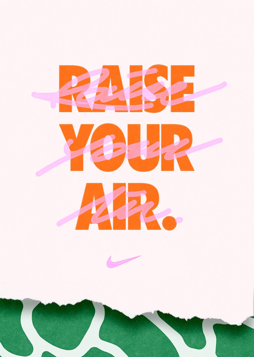
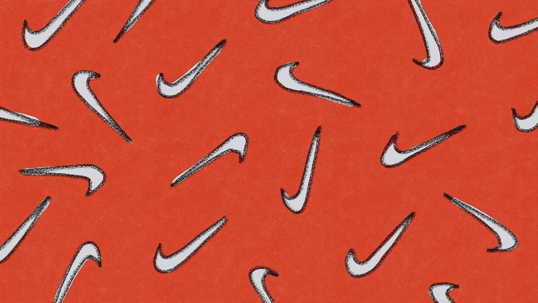
Graphics and Illustration
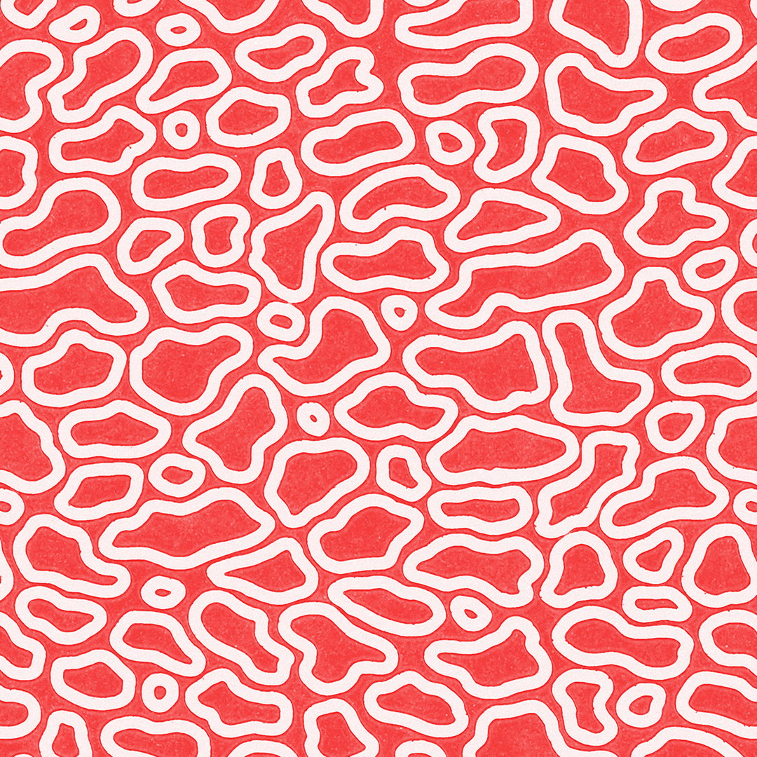
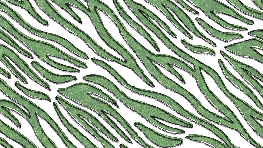
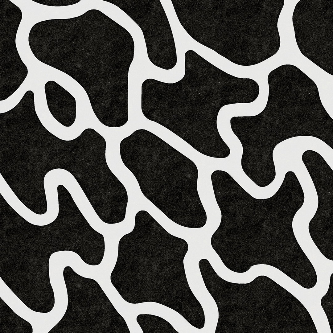
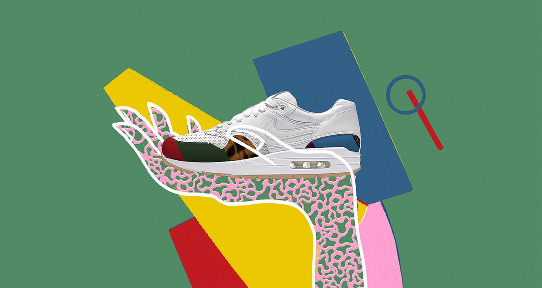
For some time now we’ve wanted to create visuals which have an illustrative, graphic element to them but quite often clients come to us for our “signature 3D style”. We’ve got a wealth of talented creatives across our two studios, many of which come from more traditional graphic backgrounds and this was the perfect opportunity for them to push a visual which a lot of people wouldn’t necessarily associate with ManvsMachine.
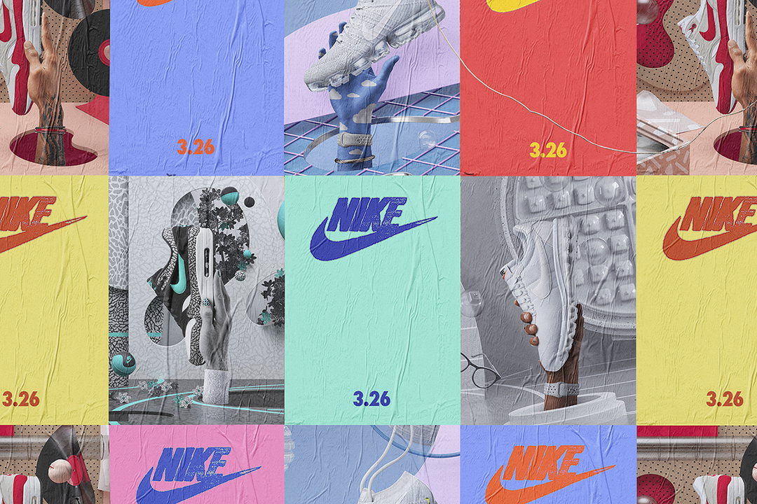
We initially wanted to create a campaign purely based in the illustrative, graphic realm but were wary of it feeling like we were mimicking studios who do this kind of work regularly, and that it wouldn’t have our signature touch. It made much more sense for us to create a mixed media campaign that pushed the notion of a remix as far as possible with no restrictions as to the type of design we used. That’s why it was important for us to remix illustrations, high-end 3D, graphic design and photography together. The result being a rich, soulful, fun campaign with layers of storytelling and compelling imagery.
This was also a way for us to push the rebellious side of a revolution without literally being aggressive. Having visuals that didn’t maintain strict rules and comply with the norm was a way to gesture to a cultural movement and make the campaign feel alive. The “illustrative layer” played a huge role in this.
Process
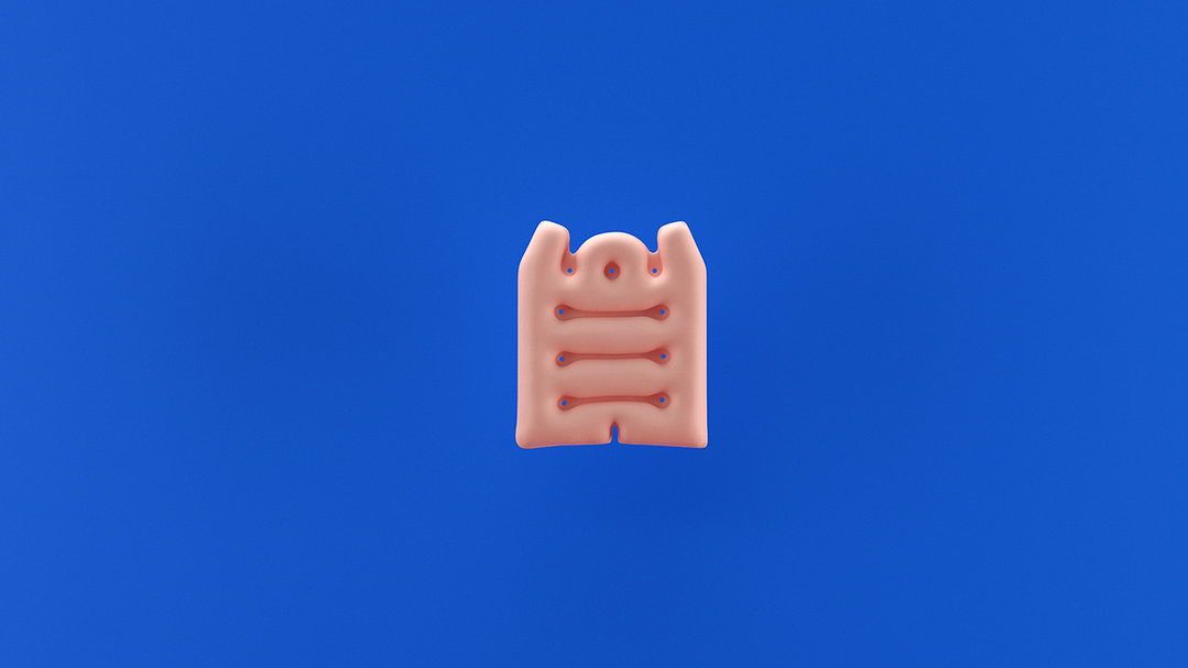
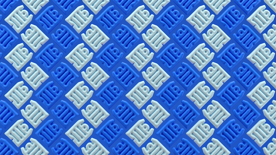
Once we’d locked down the creative and mixed media art direction we set out to work our way through the mammoth deliverables list. Whereas in previous years it was much more about creating one or two hero pieces, this year was much more about quantity, enough so that it felt like a cultural takeover as a dizzying array of visuals were drip-fed into the Air Max community. This was probably the biggest technical challenge we had to overcome; how to deal with around ten hero films (and the attendant versions) and over twenty high res print stills in a tight timeframe.
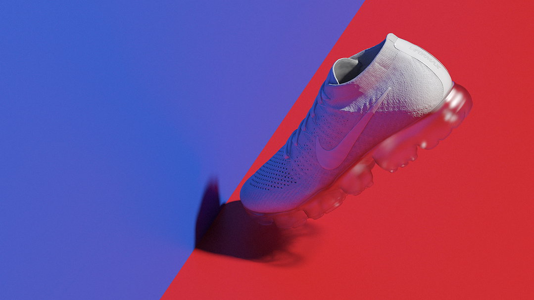
We started working through the stills, building rich storytelling worlds which spoke to the heritage of each of the products; these in turn would inform the films. For the films we set a rule that the camera would always be moving forward which helped to emphasise the future – “a window into what’s next” – which Nike were keen on pushing. It also made for a system where we could easily cut between films with a flowing edit due to the consistent momentum of the camera.
Once we had storytelling films for each of the products, we started to work on the piece that summed up the entire campaign and the notion of remixing a Re-Revolution which was “The Remix Film”. This piece brought together 30 years of Air: all of the storytelling moments behind each of the products, 3D, illustrations, graphic design, photography and mashed them together in an amalgamation of rebellious joy.
As for software, we used many of our typical pipeline tools such as Cinema 4D, Houdini, After Effects, Vray and so on.
The total team that worked on the project was fairly hefty and it’s hard to put an exact number on the team size, between collaborating with other studios and having multiple freelancers coming and going. All in all, it was the largest team we’ve had working on a Nike project purely down to the sheer volume of deliverables.
ManvsNike
We’re fortunate enough to work with such an amazing client and have developed a strong partnership with the global behemoth. Over the years our relationship has gone from strength to strength and after many projects and years of collaborating with almost all of Nike’s categories, we now truly understand the brand and its vision.
We’d like to think we’ve played a big part in shaping the formula for many of Nike’s design-driven motion pieces you see today and we aim to continue playing a big role in pushing forward their messaging in fresh ways in the future.
Share Article
Further Info
About the Author
—
Owen joined It’s Nice That as Editor in November of 2015 leading and overseeing all editorial content across online, print and the events programme, before leaving in early 2018.