Illustrator Peter Grundy brings fun to an Australian fintech brand
Bear Meets Eagle on Fire rebranded the company using illustration to articulate complex ideas in an accessible, friendly way.
Fintech brand Wisr has had a complete redesign courtesy of Australian agency Bear Meets Eagle on Fire (BMEOF) and New Zealand-based creative digital agency, Resn. Wisr’s rebrand not only includes an aesthetic overhaul, but also sees the brand launch a new platform driven by its purpose of “financial wellbeing”.
In terms of BMEOF’s approach to Wisr’s rebrand, the agency looked to publicise the brand’s “functional and rational” personality amongst competitors. “They look like banks, who’ve read a few tips on how to be ‘fun’ on Instagram, and they all end up looking the same; simple, human, bright, but without any real idea or craft,” describes Micah Walker, founder and chief creative officer of BMEOF. “We wanted Wisr to be different.”
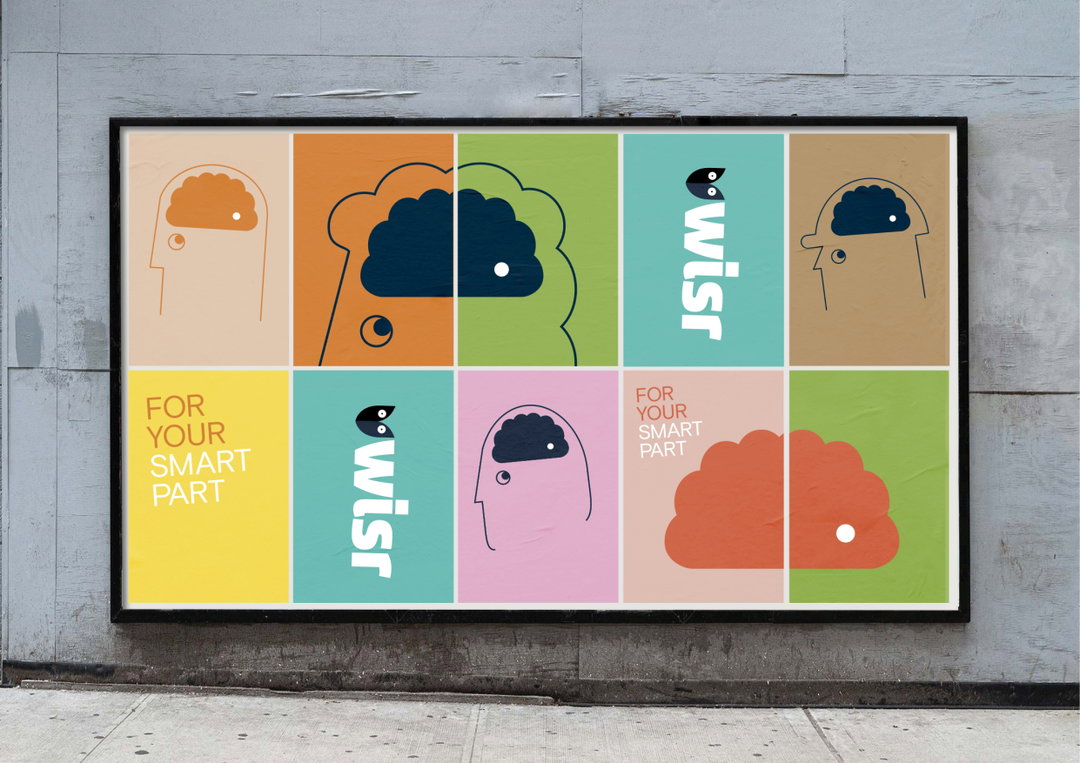
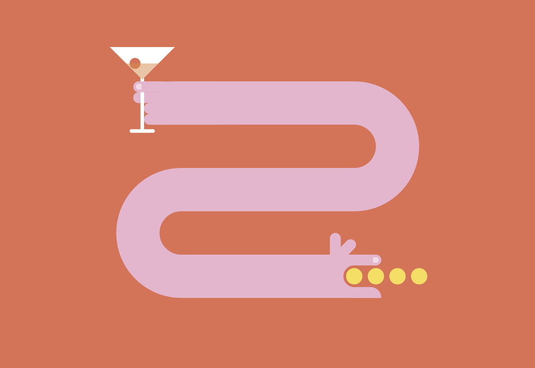
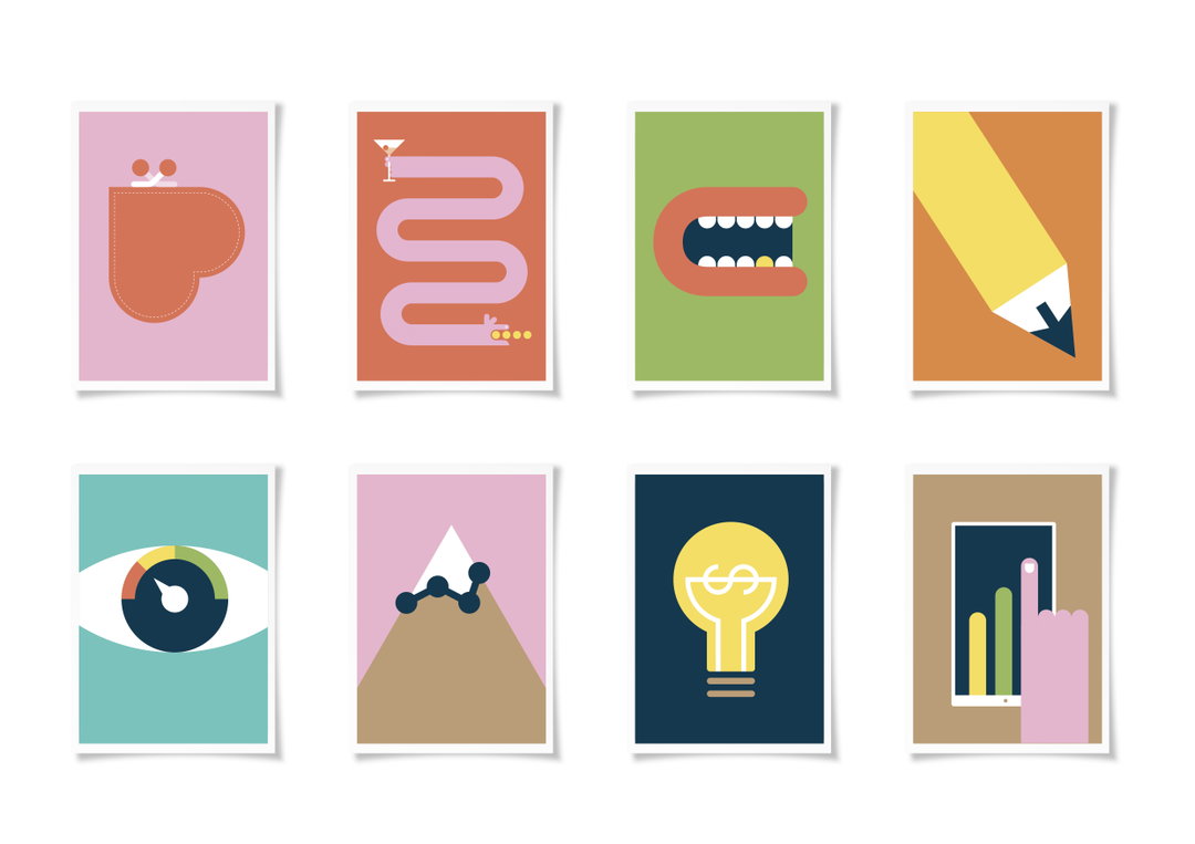
As a result, the redesign offers varying creative approaches both in digital and out of home activations. When it comes to sharing the brand’s mission, BMEOF lead Wisr’s tone of voice with a varying colour palette and personable illustrative visuals by Peter Grundy. Choosing to work with Grundy due to his “wonderful way of articulating complex ideas in very accessible and graphic concepts,” the illustrator distills otherwise serious details from credit card consolidation to medical loans.
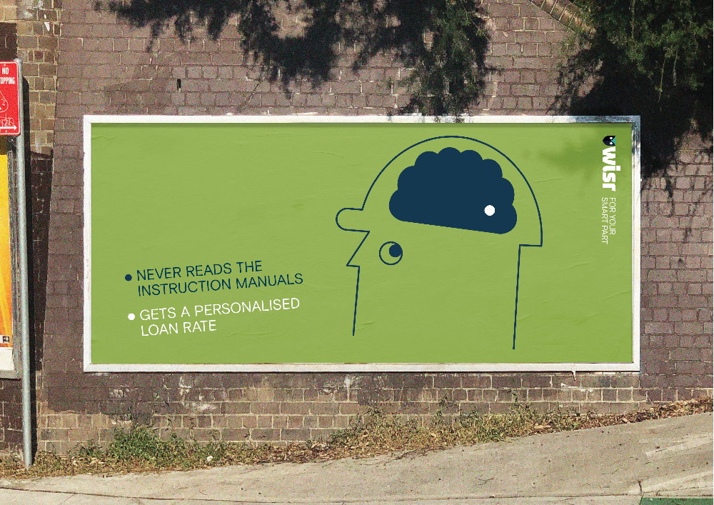
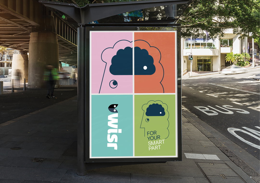
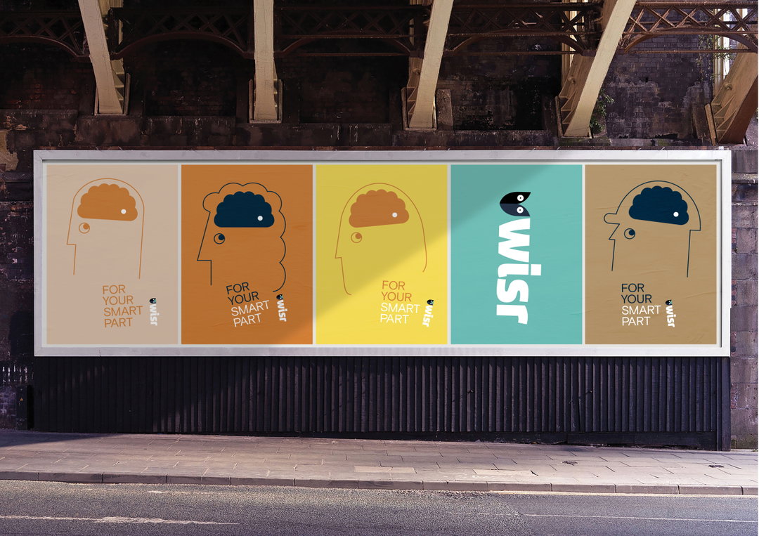
On billboards, this is brought to life via a character to represent Wisr, always featuring a little white dot in the corner of its brain. This symbol is a visual embodiment of Wisr’s tagline “For your smart part”, referencing how the brand can aid individuals in making smart decisions on their personal finances. “The idea was that each of us, no matter who, has a small part of our brain that does the smarter stuff,” explains Walker. “The part of you that shuts off the lawn mower before you stick your hand underneath, well that’s the part of you Wisr can speak to about financial stuff.”
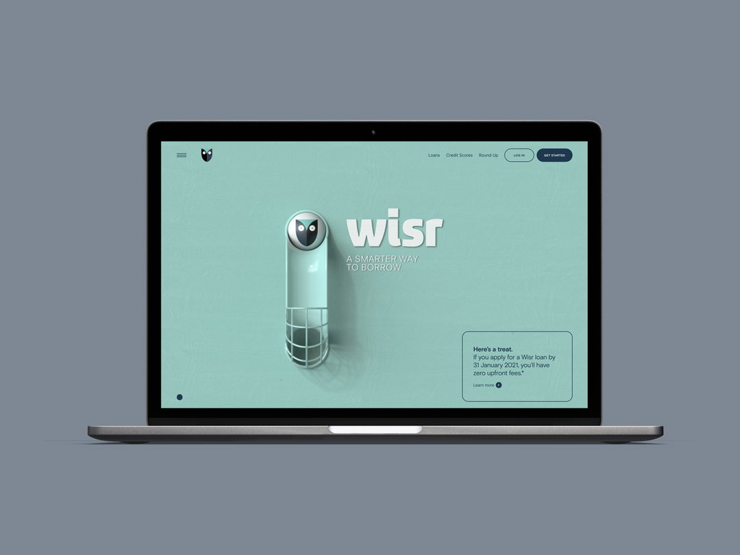
Moving online, these personable elements were then handed to Swedish animator Oscar Petersson. Acting as sibling-like visuals to Grundy’s 2D illustrations, Petersson’s interpretation of the brand are 3D renderings. “It was less about matching luggage and sticking with 2D-based graphics because that’s what we did in OOH, and more about taking some of those principles and giving them shape,” describes Walker. These animations visualise the “smart” personality of the brand through crafted sequences on Wisr’s landing pages. “For a category that quickly jumps to forms and fields, it’s pretty different approach, but we believed that engagement and craft only strengthened the overall idea.”
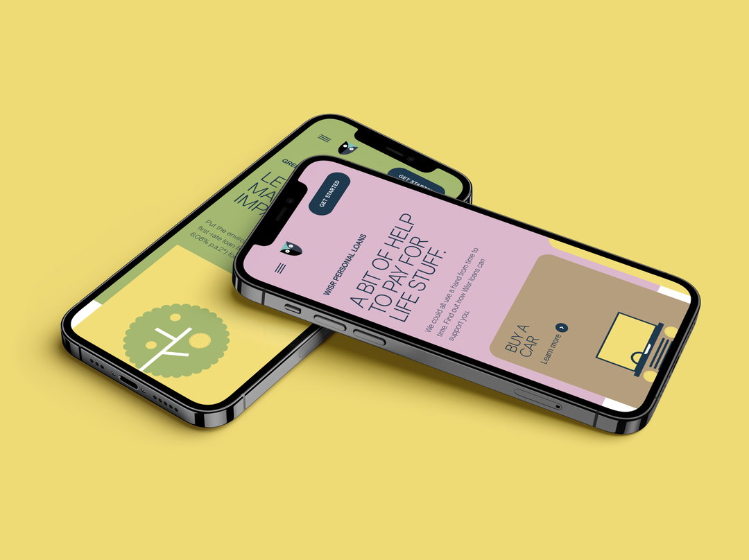
These two directions are then paired with some remaining elements of Wisr’s previous branding, tied together via a new website design for both desktop and mobile. To further amalgamate these elements, BMEOF additionally created a series of launch films to emphasise this new direction. Each of these elements speak to an audience on a one-to-one level. “Again” continues Walker, “we were just trying to be disarming and help people see that smart financial decisions are something we’re all capable of.”
A campaign of many moving parts and styles, as well as featuring quite a serious core message, Walker concludes that Wisr’s rebrand is “one idea, brought to life in a variety of expressions, rather than a rigid toolkit applied everywhere approach,” he says. “And each element is considered.”
GalleryBear Meets Eagle on Fire: Wisr brand identity (Copyright © Bear Meets Eagle on Fire, 2021)


Hero Header
Bear Meets Eagle on Fire: Wisr (Copyright © Bear Meets Eagle on Fire, 2021)
Share Article
Further Info
About the Author
—
Lucy (she/her) was part of the It’s Nice That team from 2016–2025, first joining as a staff writer after graduating from Chelsea College of Art with a degree in Graphic Design Communication, eventually becoming a senior editor on our editorial team, and most recently at Insights, a research-driven department with It’s Nice That.