Camden Market rebrand by Ragged Edge features typefaces inspired by its iconic bridge sign
Ragged Edge: Camden Market rebrand
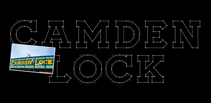
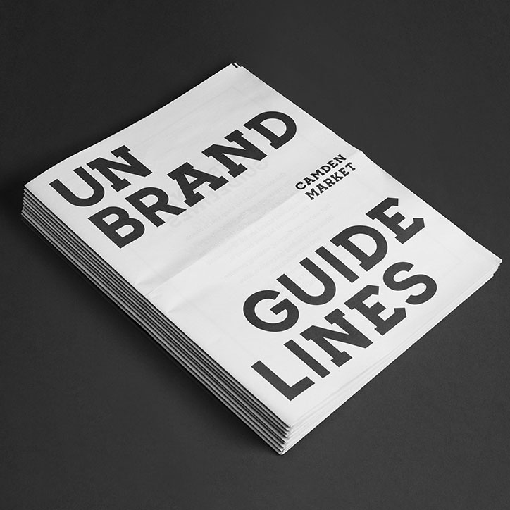
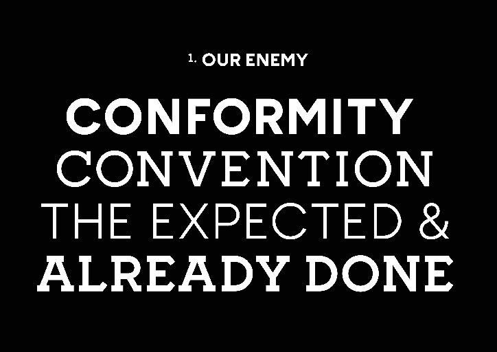
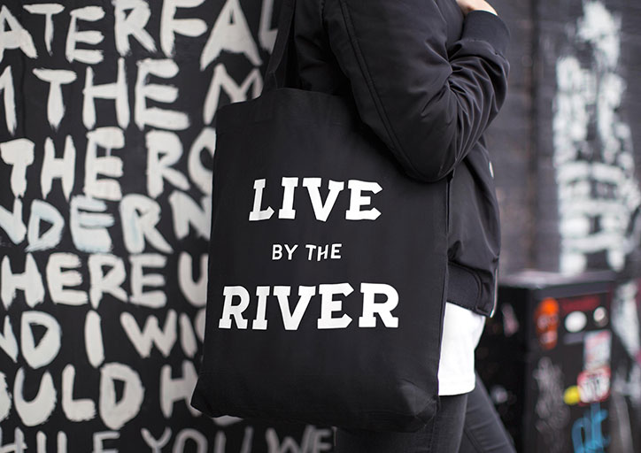
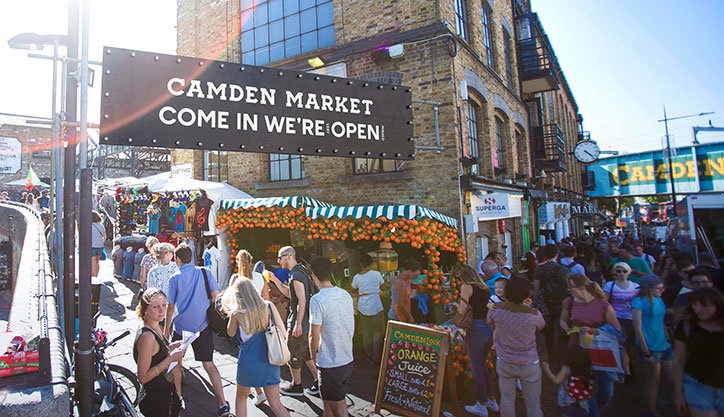
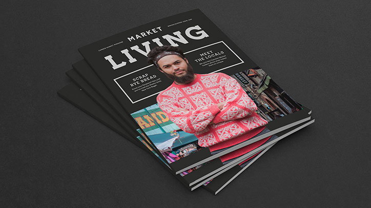
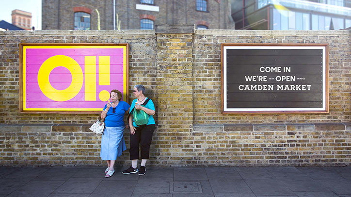
Design studio Ragged Edge has created a brand identity for London’s Camden Market, including two custom typefaces inspired by the area’s iconic bridge sign by John Bulley. Following the overarching concept of “unfollow convention”, which aims to connect with Camden’s long-time reputation for creativity and subculture, the identity is designed to be adapted by the market’s eclectic population.
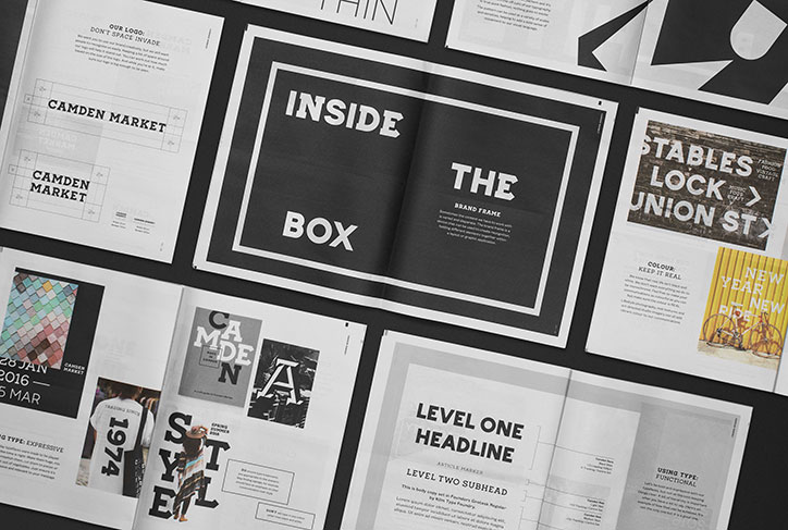
Ragged Edge surveyed stallholders, residents, workers and tourists, and came up with “a set of tools for self-expression,” says studio co-founder Max Ottignon, “to give people the flexibility to use them in an infinite range of ways. Most retail destinations have a strict corporate identity, but this would be the antithesis of Camden’s individualistic, creative spirit.”
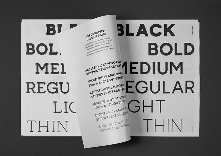
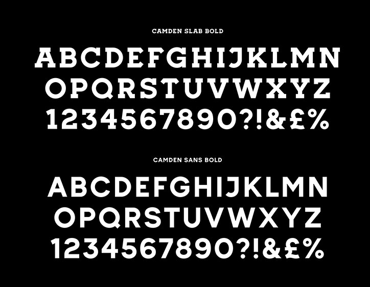
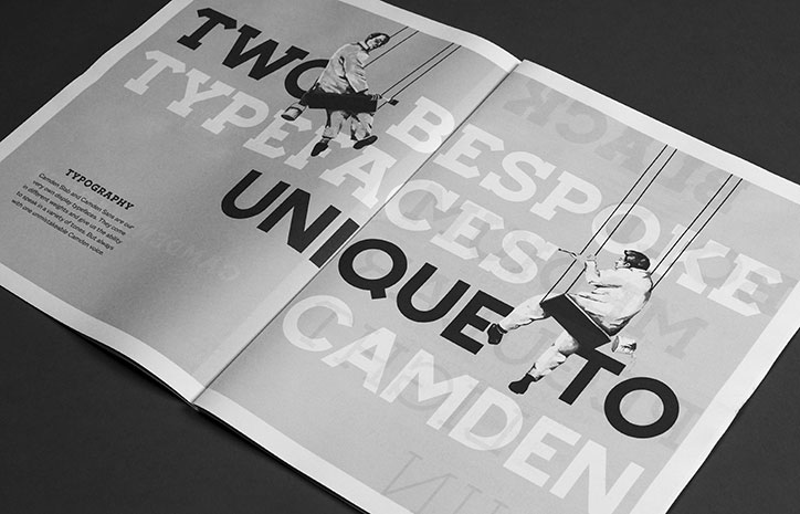
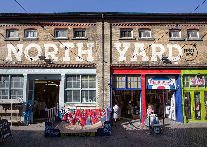
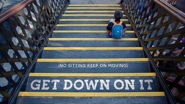
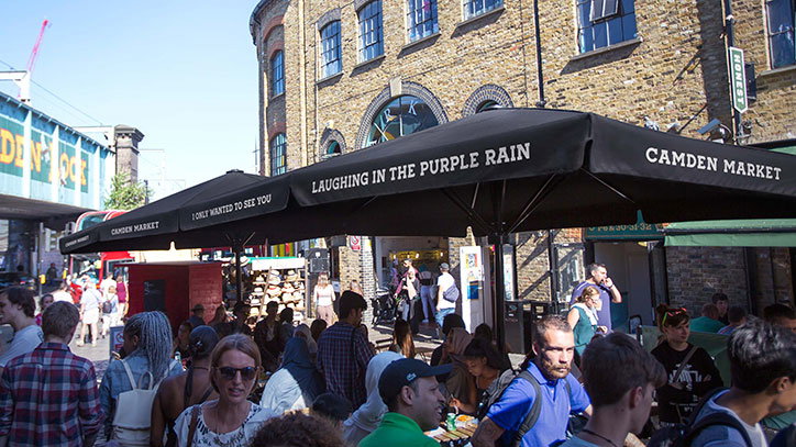
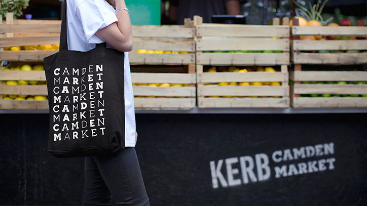
Part of this toolkit are the two typefaces, which take inspiration from the hand-painted Camden Lock sign on the bridge at the centre of the market. Ragged Edge used the letterforms as a template to create the faces, Camden Slab and Camden Sans, each in four weights. This means every aspect of the market can be subtly branded without using a logo. “It allows for a diverse range of communication styles, all with a consistent thread running through them,” says Max.
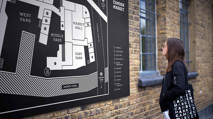
The entire brand colour scheme is black and white, aiming to stand apart from the market’s visually busy surroundings. “Camden Market is a cacophony of colour,” Max explains. “There’s so much going on, we needed to find a way for the identity to cut through, particularly for wayfinding and signage. Also, it enables the colour to come from the Market itself.”
Negative spaces around the letters have been used to create a pattern of shapes, which can also be applied as part of the identity. “They can be thrown together in random ways, or used in 3D form. There are no rules, just the individual shapes to play with.”
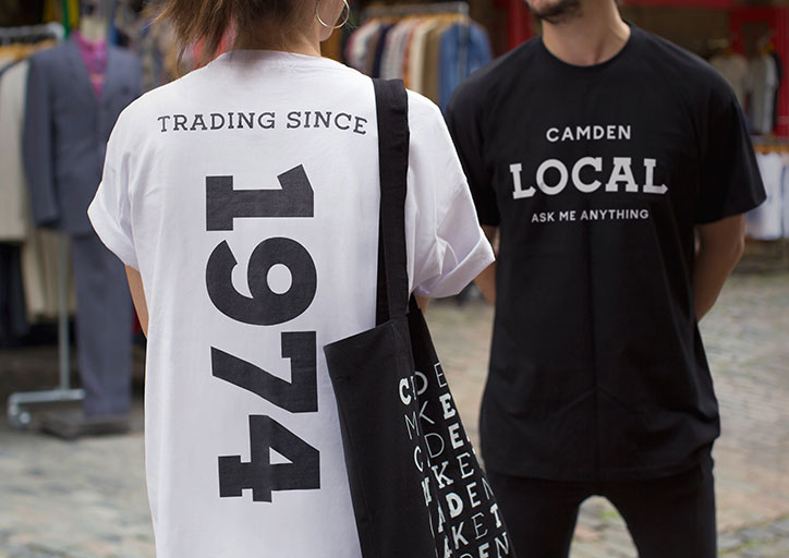
Together these can be used in myriad combinations, unifying the market’s varied mix of content without having to compromise on personality or independency. “Most importantly it encouraged the Camden Market internal creative team to play with it. Effectively you can throw any combination of elements into the frame, and they will become instantly ‘Camden’.”
Camden Market also collaborated with street artist David Samuel, who used the typefaces for a set of hand-painted signs on Chalk Farm Road. It is also currently working on a range of Camden Market products, wayfinding signage throughout the market and some experiential installations.
Ragged Edge: Camden Market rebrand
Ragged Edge: Camden Market rebrand
Ragged Edge: Camden Market rebrand
Ragged Edge: Camden Market rebrand
Ragged Edge: Camden Market rebrand
Ragged Edge: Camden Market rebrand
Ragged Edge: Camden Market rebrand
Ragged Edge: Camden Market rebrand
Ragged Edge: Camden Market rebrand
Ragged Edge: Camden Market rebrand
Ragged Edge: Camden Market rebrand
Ragged Edge: Camden Market rebrand
Ragged Edge: Camden Market rebrand

Ragged Edge: Camden Market rebrand
Ragged Edge: Camden Market rebrand
Ragged Edge: Camden Market rebrand
Ragged Edge: Camden Market rebrand
Ragged Edge: Camden Market rebrand
Share Article
Further Info
About the Author
—
Jenny oversees editorial output across It’s Nice That. Get in touch with writing pitches for features or opinion pieces, big creative story tips, or questions about all things editorial. jb@itsnicethat.com
To submit your work to be featured on the site, please see our Submissions Guide.