




The Centre for American Politics and Design explores the graphic vernacular of American politics
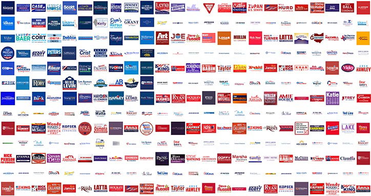
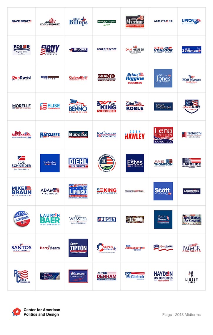
In the lead up to the congressional elections across the US taking place today (6 November), The Centre for American Politics and Design (CAPD) have archived past campaign logos into an interactive database designed for research purposes. It is the first collection of its kind, consisting of every single campaign logo from the United States Congress election this year.
The archival database can be used as a tool to explore graphic trends and typologies that reveal a vernacular insight into our visual associations with political objectives. The team of designers “set out to show the visual landscape of American politics” which in turn provides evidence towards “the intersection of design and political power” in the US.
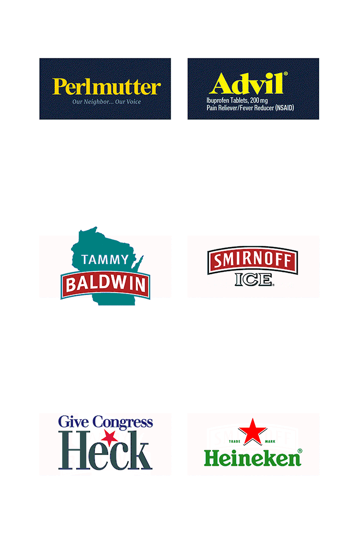
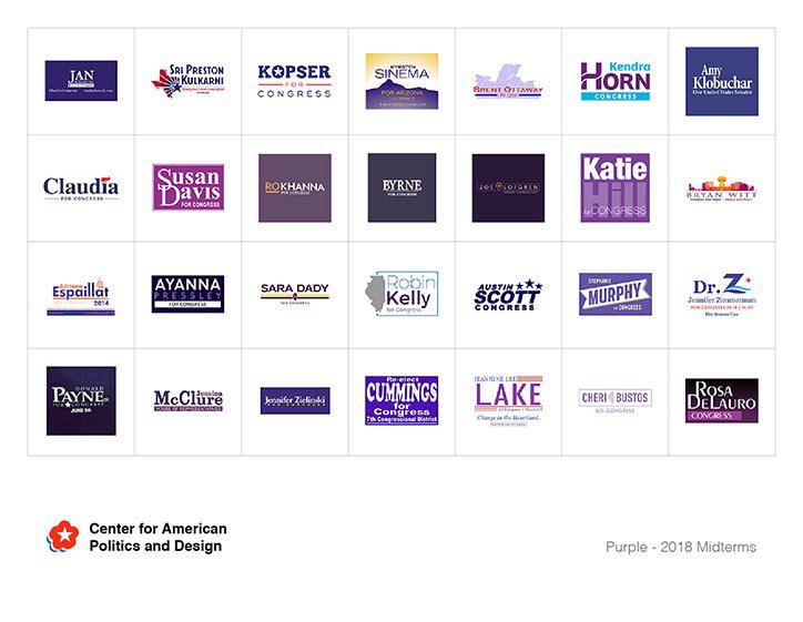
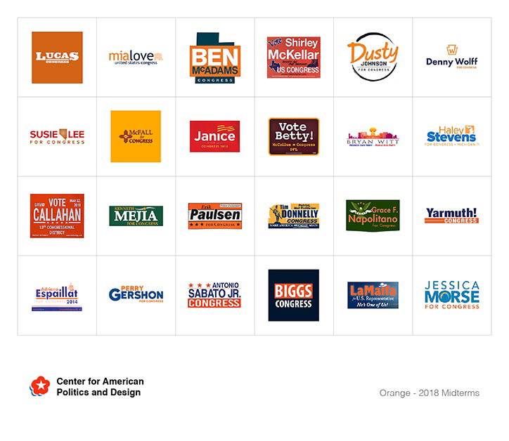
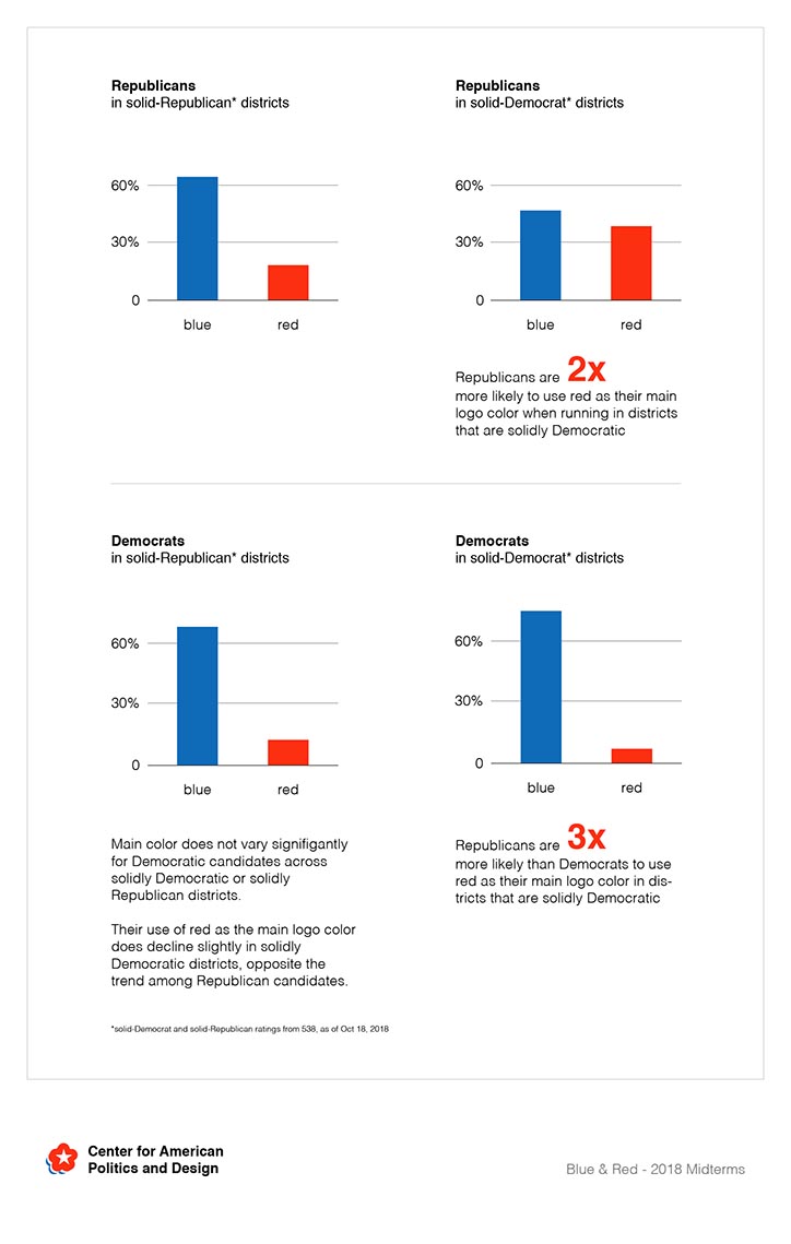
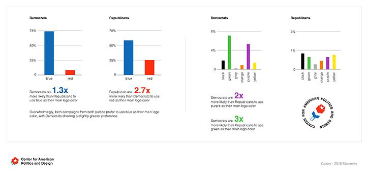
In this year’s election, the database has already established that Republicans do not use more serif fonts whereas all the purple logos are in fact used by female candidates. Other notable statistics include the single use of the controversial Comic Sans, and the confirmation that Democrat’s do indeed use more blue in their visual identity’s than Republican’s who use more red.
This one-of-a-kind logo archive uniquely demonstrates “the scale of the US election in a way we rarely see, akin to a single field of grass with a country’s worth of lawn signs”, states CAPD member Kevin Wiesner.
Center For American Design And Politics
Center For American Design And Politics
Center For American Design And Politics
Center For American Design And Politics
Center For American Design And Politics
Center For American Design And Politics
Share Article
Further Info
About the Author
—
Jynann joined It’s Nice That as an editorial assistant in August 2018 after graduating from The Glasgow School of Art’s Communication Design degree. In March 2019 she became a staff writer and in June 2021, she was made associate editor. She went freelance in 2022.